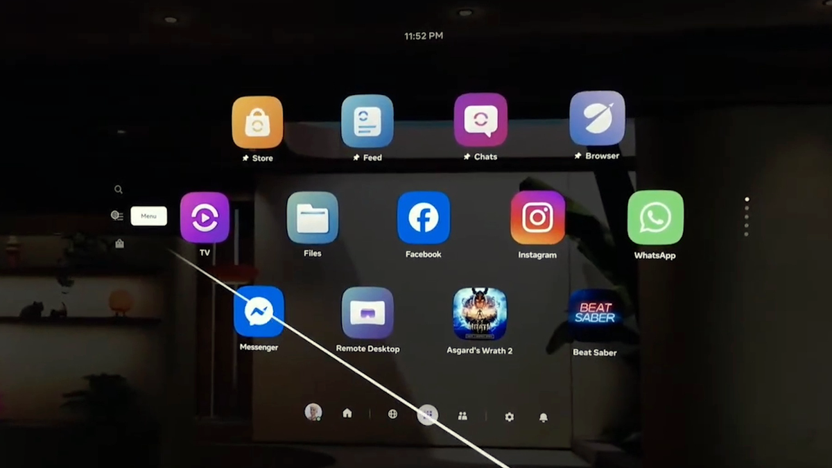
During the Connect 2025 Developer Keynote, Meta teased a short clip of the next evolution of Quest’s Horizon OS system interface.
Meta CTO Andrew Bosworth called it “our spatial UI navigation”, and described it as “a work in progress”.
Meta’s tease during the Connect 2025 Developer Keynote.
It looks to be an evolution of the ‘Navigator’ system UI overhaul Meta started slowly rolling out to the Horizon OS Public Test Channel (PTC) in May, which it first teased at last year’s Connect.
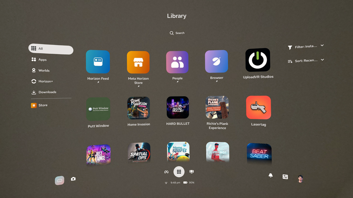
Navigator moves the main system interfaces like Library, Quick Settings, Notifications and Camera into a new large overlay that appears over both immersive and 2D apps, a major improvement from the previous approach of these being in panels that are treated like any other 2D app. It means system interfaces will no longer shift around when opening other windows, and makes it easier to launch new apps. Navigator’s library also allows you to pin up to 10 items, somewhat akin to the Start Menu on Windows.
At launch, Navigator also had a murky grey background with an oval shape. It was seemingly intended to improve contrast. But as well as obscuring your view of what was behind it, be it passthrough or a virtual world, it just didn’t look good. So Meta got rid of that and made bringing up Navigator dim the background instead.
After One Key Change, Meta’s Quest UI Overhaul Has Gone From Bad To Great
The Quest system UI overhaul launched to testers in May, with key improvements but an ugly semi-opaque grey “cloud” background. Now, Meta has gotten rid of it.

But Meta doesn’t seem to think Navigator is quite ready yet. With Horizon OS v81, Meta said it’s reverting to making the old Universal Menu UI the default for “most people”, in order to “keep things simple and familiar”.
“While we continue to experiment and improve Navigator, it’s still available”, Meta noted when starting to roll out v81 PTC.
The Connect 2025 tease shows the direction Meta is taking to improve Navigator.
The clip shows a Library with interleaving offset rows, similar to Apple’s visionOS, though it still looks to scroll vertically. Search, Menu, and Store icons are visible on the left. Further, the bottom buttons like Library, Friends, Profile, Notifications and Quick Settings have all been centered, rather than also being spread between left and right. The time is now at the top, rather than the bottom, and the Wi-Fi and battery status icons seem to be gone.
There’s no word yet on when Meta might roll out the evolved Navigator UI, and we reiterate that Bosworth described it as a work in progress. We’ll keep a close eye on Horizon OS updates in the coming months for any signs of it shipping.

