
Commuters rushing through London Bridge station may have missed it, but on Thursday morning a new era in railway timekeeping and design was looming above them: a 1.8-metre-high digital timepiece, hanging above the concourse, the first physical manifestation of the Great British Railways’ signature station clock.
The design, the first such for more than 50 years, will appear in digital form on electronic information boards at stations across Britain.
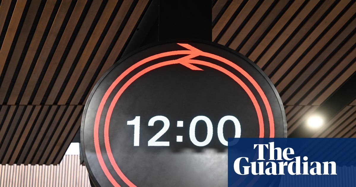
The black and red clock face draws on the old British Rail logo, which the rail minister, Peter Hendy, said “represents a bridge between the historic past and a new future for our railways”.
The railway, 200 years old this year, played a pivotal role in creating a unified national time zone, with cities previously setting their own clocks by the sun; Bristol remained 10 minutes behind London for some decades before the demands of fast trains and a railway timetable made it catch up.
London Bridge was chosen for the prestigious first clock and ceremonial opening as it was the second station in 1852 to have an electronic clock linked by telegraph to the Greenwich Observatory (the first was Lewisham, earlier that year).
The design, chosen in an international competition for architects and designers, was selected for ease of reading as well as reflecting the railways’ brand. Mark Wood, a creative partner at the winning agency, Design Bridge and Partners, said he hoped it would become “the face of time across the railway for many years to come”.
London Bridge was chosen for the prestigious first clock as it was the second station in 1852 to have an electronic clock linked by telegraph to the Greenwich Observatory. Photograph: Matt Crossick/PA
The new clock at London Bridge features only hours and minutes in numerals, with seconds represented by the “double arrow” of the British Rail logo – splitting in two before circling the face as if on opposing tracks, rejoining hypnotically every minute. According to the designers, “this subtle yet powerful visual metaphor speaks to the constant flow and convergence of journeys”.
After the garish advertising boards at Euston, could this once again risk passengers missing their train? The Network Rail chief executive, Andrew Haines, was quick to dispel suggestions the rebrand would signal a more relaxed attitude to time. “There will be seconds displayed in full on platforms,” he said. “As a railwayman, there was no way I was having a clock without seconds.”
While the success of the clock will be measured over decades, some are already enthusiastic. Gerry Barney, who created the old British Rail logo in 1965, was approached by the clock’s designers and pronounced himself “thrilled … what [they] have created is really magic”.
At London Bridge, Tim Dunn, a rail historian, said of the design: “When I first saw, it I cried.” (In a good way.)
A pop-up shop at the mainline station was selling expensive rail-branded merchandise and the swish design of the clock face could be another design hit, the rail industry hopes. An app is planned to allow smartwatch wearers to download the clock face for their own wrists.
Hendy, who was proudly sporting a (borrowed) smartwatch with the new design, said that as the government continues in its labours to rebuild a nationalised, integrated railway for passengers, “good design, like this brilliant, clever timepiece, is a fundamental part of achieving this”.
The unified design would make stations instantly recognisable, following a plethora of different clocks after rail was privatised and fragmented, the rail minister said.
Hendy, who has worked for many years alongside Haines who is retiring on Thursday – fittingly, after the clock presentation – said they could be pleased if this was their legacy: “If people know where they are and what time it is, we’ll have done something good.”