
Meg Richardson‘s debut novel, Paradise Pawn, draws on her experiences working at a pawn shop. The writer/translator/cartoonist earned her MFA from Columbia and is releasing her debut novel on July 14, 2026, from Tin House. It is available for pre-order now.
In Paradise Pawn, Richardson follows two best friends who can sell anything. When the girls, Jackie and Kayla, realize that Kayla won’t be able to attend the private school Jackie will due to family money troubles, the two teens hatch an embezzling scheme against the pawn shop where they work alongside their families. What follows is a heist gone wrong, and the fallout the two teens must navigate as their world comes crashing down.
Debutiful is honored to reveal the cover, designed by Beth Steidle, along with a Q&A with Meg Richardson about its creation.
 Paradise Pawn is available for pre-order now.
While writing the book, did you have any ideas for what you wanted the cover to look like?
It’s still so exciting and surreal to me that the book is a book at all, and that it has a cover. That being said, I always had a clear mental picture of the book’s two main characters, Jackie and Kayla. I think that comes from being a cartoonist as well as a prose writer. When I’m drawing a character, I consider every detail of their body, how they move through spaces, what they wear, what objects they carry with them. In prose, I try to do that with words. Having a teenage girl as a narrator was helpful for doing this, because she is very aware of her own body, her best friend’s body, and the bodies of people around her.
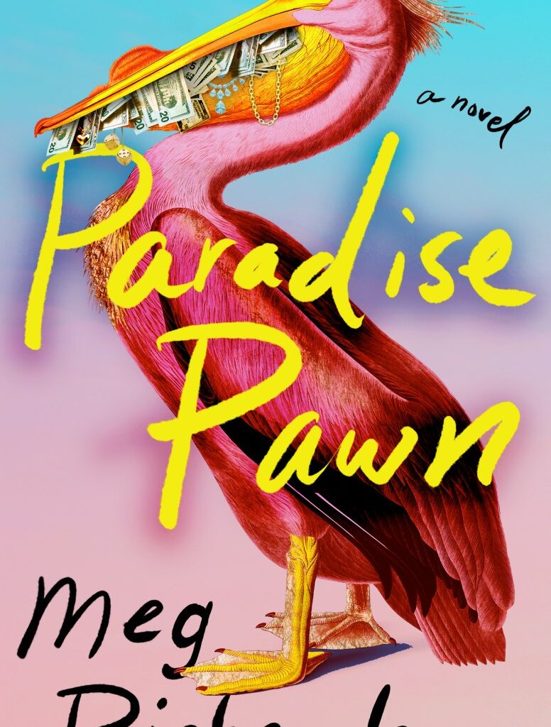
When I knew the book was going to be published and I was thinking about a cover, I started picturing a cover with an image of two girls on it. But when my wonderful editor, Alyssa Ogi, sent me this cover with the pelican on it, I absolutely loved it. I feel like the pelican has the same awkward, hopeful, bright energy as the book’s narrator, Jackie. After seeing the cover, I even added a line into the book about how Jackie feels like the parts of her body are mismatched, like a pelican. Now, I’m glad that the cover doesn’t have an image of specific girls on it, so readers can put together their own unique mental pictures of Jackie and Kayla from reading about them.
Can you explain what the design process was like once you started working with your publishing team? What was it like seeing your finalized cover for the first time?
I got tears in my eyes (happy tears of course) when I first saw the cover. It made this dream of publishing a book that I have had for years feel real. The cover still makes me so happy when I look at it. Beth Steidle, the designer, did an incredible job. I showed the cover to my family and they were very excited. I, along with my editor and the rest of the Tin House team, loved the pelican with the money and jewelry in her beak so much that we didn’t really talk about many other designs. The main design decision I had to make was whether the title should be in white or in yellow. I printed out both options and looked at them in different lights and thought about it a ton. Ultimately, I picked yellow. To me, the yellow with the purple and pink behind it makes the title feel like a glowing neon sign, which I love.
How does the cover work to convey what the contents of the story are?
I love how bold and bright the cover is. A lot of the book takes place in a pawn shop that is full of shiny necklaces and bright overhead lights. The colors of the cover do a great job capturing that brightness. The book also takes place in settings where human-made structures like parking lots, swimming pools, and pawn shops overlap with nature. I think it’s so cool how the cover incorporates elements of nature, like the bird and the background colors that feel like a sunset. Then those elements contrast with things that are human-made—money, jewelry, and neon words. I also like that the cover is a little zany and unexpected. I want people to do a double-take when they walk past it in bookstores or libraries and think, “Wait, why is that pelican holding a bunch of cash in her beak?” The book examines the world through the eyes of a teenager who is questioning everything and starting to realize how bizarre the adult world is. I hope that seeing this cover will prepare readers to see weirdness in the world that they might not have noticed before.