
Sign up for the Slatest to get the most insightful analysis, criticism, and advice out there, delivered to your inbox daily.
As 2025 ends, two things are clearly true about generative A.I. in America. One, tons of people are using it. Two, most people don’t like it. Led by ChatGPT, the No. 1 app in the App Store this year, more than a billion people are using one of a handful of generative A.I. platforms every week. Use of these products at work is on a sharp upswing, Gallup has found. But a series of Pew surveys reveals that Americans collectively are more worried than excited, joining most of our fellow global citizens. Americans also think A.I. is untrustworthy as a tool. According to a YouGov poll, 68 percent of Americans wouldn’t let an A.I. act on their behalf without maintaining approval over each action.
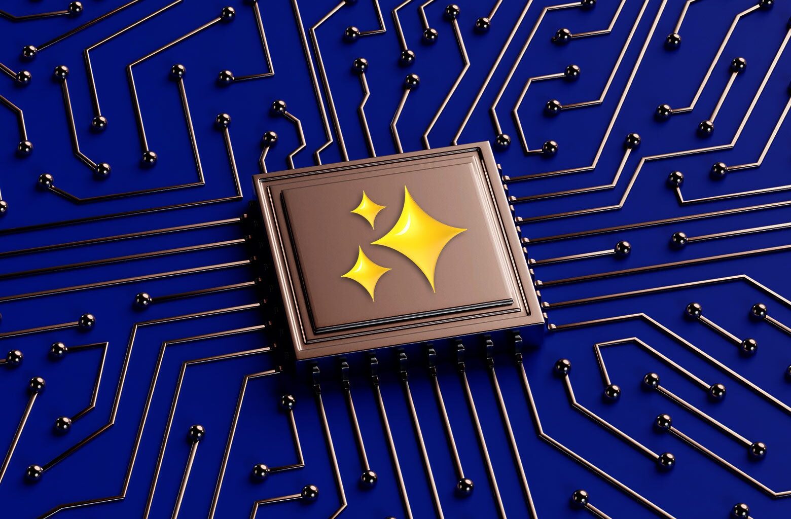
Lately, I’ve been returning to a bespoke theory about this A.I. malaise. It’s not that our tech barons are appearing on panels and delivering over-the-top proclamations about its usefulness. (I’m not even convinced it’s the obscenely misleading advertising, though that doesn’t help.) It’s not the uncomfortable reality that our retirement accounts now depend on a load-bearing Nvidia stock to remain moonbound forever. No, I think it’s something different: the clickable icons that signify an A.I. feature and get certain ideas into our heads about A.I.’s benefits and potential. I am talking about the little four-pointed stars, misshapen diamonds, or “sparkle-looking things” (my term) that tech companies are using as shorthand to tell users that the thing they’re about to click on is a generative A.I. tool.
Variations of this four-pointed star—I’m going to call it a sparkle from here on out—have become part of countless technologies in the past few years. Google designers may have been the ones to initiate this trend; they started using the sparkle for A.I. products in roughly the mid-2010s, before ChatGPT kicked off an industrywide arms race. The sparkle is now part of Gemini’s logo, and it also appears in various logos or buttons in a million other A.I. products. It has a minimal presence in ChatGPT but occasionally shows up when the user wants the machine to rework text. It’s all over the place in Adobe’s suite, including on the logo of Firefly, the creative giant’s stand-alone generative A.I. app. In Zoom, it’s part of the button that brings up the AI Companion, a notetaker.
Why are we so underwhelmed by A.I.? I don’t think it’s because Sam Altman’s or Satya Nadella’s grandiose statements haven’t matched their products’ use cases. No, I think it’s because of the goddamned buttons.
“The sparkle has a metaphorical meaning that suggests magic,” Heather Turner, an associate chair and professor in the department of English at Santa Clara University, where she teaches about user experience and accessible product design, told me. “In myth and folklore, magic is not always positive. It’s used to teach lessons. So when companies choose this metaphor, they’re shaping how users view the product and how developers think about the technology.”
Few in tech would dispute this implication. (In Canva, the sparkle even appears on a button for a “Magic Media” feature, which brings up a generative text-to-image tool.) Nik Kale, a principal engineer and product engineer for Cisco A.I. tools, explained to me the design principle: “The icon should indicate that it’s that superintelligence, that automation, that insight, that magic, to use your word. The metaphor is familiar, right?” Indeed it is. I place myself on the skeptical end of the A.I. spectrum and have tried to highlight adversarial commentary on the industry. But my little human brain is only so strong, and I still think of magical powers whenever I see Gemini’s logo. It’s friendly magic, the sort that lets you ride around on a broomstick instead of the kind that splits your soul into a bunch of little pieces.
Turner is an academic whose concern lies with user experience and the way A.I. will affect society. Kale is a tech decisionmaker whom I didn’t find, by any means, to be ignorant of A.I.’s many downsides. But it was striking that both of them acknowledged, from different vantage points, how this vague sense of magic is supposed to juice our use of A.I. products. The sparkle is gentle, a little ethereal, feeling not quite of this world. And it’s ambiguous enough to apply to a gamut of A.I. tools, whether they’re writing someone’s essay, making up a fake revenge-porn picture, or serving as a targeted search engine. Come and see what’s behind this door, the icon says.

Laurie Clarke
It’s One of the Hardest Confrontations Anyone Can Have. It Might Be One Good Use of a Controversial Technology.
Read More
“Not every experience should be pleasurable. Sometimes we need friction, safety warnings,” Turner said. Those disclosures aren’t part of typical work with generative A.I. Imagine Adobe blaring a big warning box that says, “Don’t use this for political misinformation.” The sparkle implies heavenly powers but not the type that a person might misuse.
I asked Turner: If she were back at the beginning of the generative A.I. boom and had the power to dictate the industry’s UX moves, what would she use as the signifier of A.I.? She rummaged around for a second and suggested a triangle with an exclamation point in it, which would signal a bit of excitement but clear danger too. That plane, however, wouldn’t fly for obvious reasons. “Someone has a design principle. They have to then advocate to the business folks, to the market folks, and it’s kind of like design by committee,” she said. “You’re trying to design, let’s say, a horse, and you end up with a zebra.” And so we’ve gotten the friendly, magical sparkle and its variants.
Yet the sparkle hasn’t quite won the war to become the definitive, lasting symbol of A.I. Getting users to make the association has been trickier than I’d figured. As recently as September 2024, something like 17 percent of people thought that a sparkle icon signified favoriting or saving an item, according to research from the Nielsen Norman Group, which does UX research and consulting. (The apparent problem there: The sparkle looks a lot like a star, which 73 percent of people associate with fave-ing or saving a piece of content.) Perhaps in the long run, something like the many A.I. company logos that look a bit like human buttholes will carry the day. (I suspect that the logo designers would say they look more like a series of objects revolving around someone’s life, but then again, I’m not an artist.)
Tech Companies Love Using This Tiny Symbol. It’s More Insidious Than You Think.
But the sparkle has real momentum. The longer it’s part of huge tech companies’ A.I. products, the more entrenched the association will become. “There’s a convergence where industry is collectively moving towards defining how A.I. looks and feels inside of user interfaces,” Kale said. “So I think that’s happening as we speak, but it’s going to take time for it to get into people’s minds.” Already, if you search for “AI” on the Noun Project, a massive icon repository, you’ll see mostly variations of the sparkle up top.
The bullish case for the sparkle is that it will become to A.I. what those four curved bars in the shape of a baseball field became to wireless internet. In the case of Wi-Fi, the design iconography became not just a symbol but the shorthand unit of measurement for something (internet strength) that has an actual metric, megabytes per second, behind it. That sort of measurement with generative A.I. is more binary: Either these products work or they don’t. The genius of the sparkle is that even if they don’t, can you ever really rule out a transformative future when the button you’re about to click could summon literal magic?
Sign up for Slate’s evening newsletter.