
The classic three-button navigation has been Android’s identity for years. Back, Home, and Recent Apps are almost second nature for millions of users because they’re simple, familiar, and reliable. But Android has changed a lot since those buttons first appeared. It now has gesture-based navigation that feels much faster and easier.
While some phone manufacturers still ship their devices with 3-button navigation enabled by default, it’s time to switch. Gesture navigation makes better use of screen space and streamlines everyday actions. It’s better suited for most people, and once you actually try it, there’s no going back.
The biggest problem with Android’s 3-button navigation system
Buttons take up space you could actually use
Pankil Shah / MakeUseOfCredit: Pankil Shah / MakeUseOf
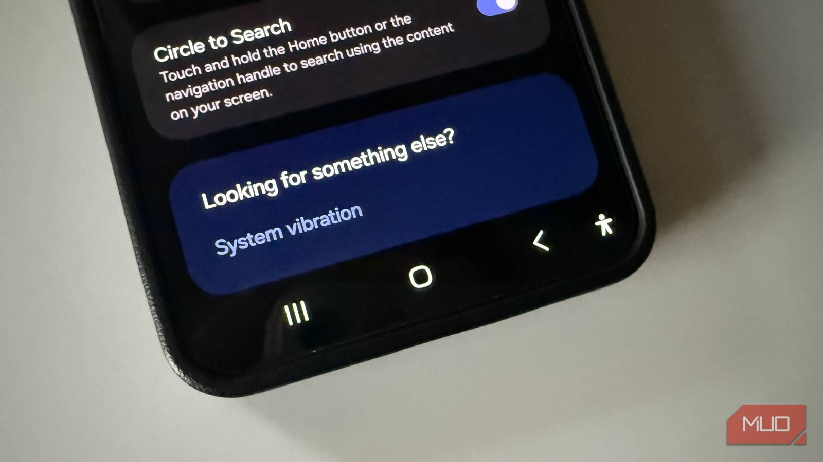
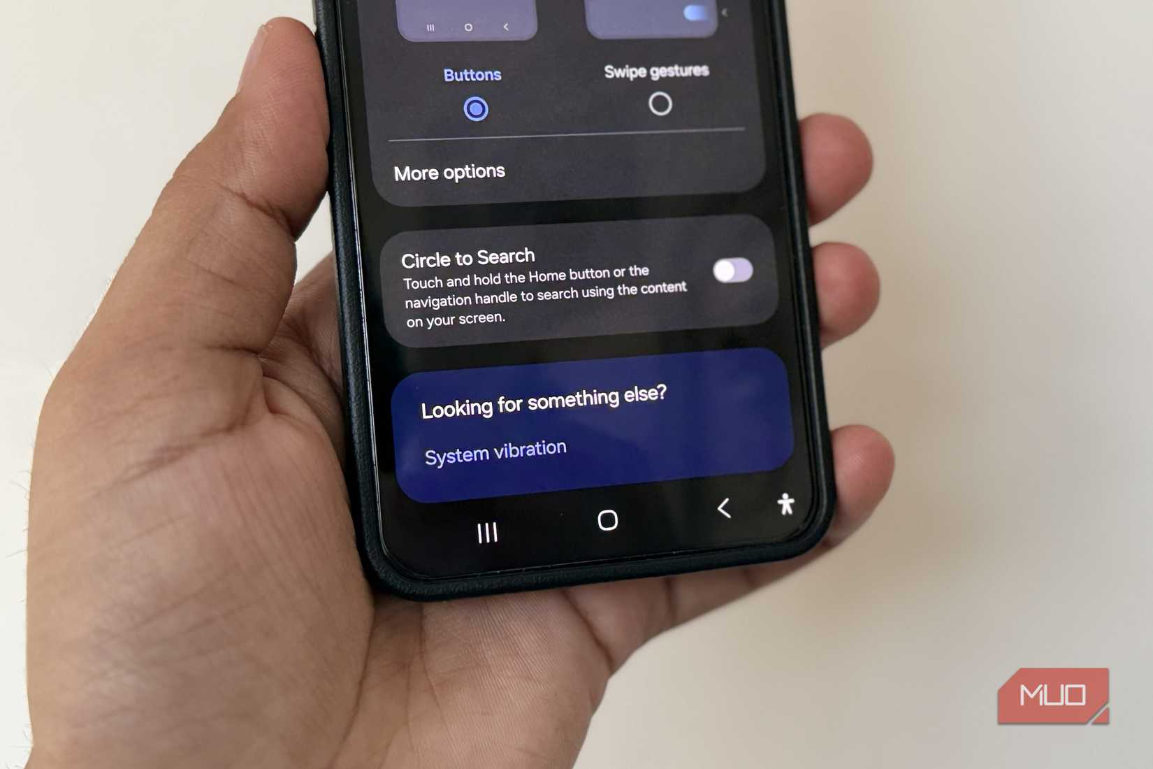
Android’s 3-button navigation is undoubtedly useful, but when you compare it to gesture navigation, one thing clearly stands out. It wastes space. With the traditional button layout, a part of your screen is permanently reserved for those three buttons. It may not seem like much, but on modern phones, where the display stretches from edge-to-edge, that strip at the bottom is valuable real estate.
This becomes even more noticeable inside apps. Open something like Instagram or YouTube, you’ll see a problem. These apps already have their own navigation bar at the bottom, and the Android buttons sit right below it. This means you’re left with even less space for the actual content. The same goes for reading apps and document viewers, where every extra space can make a difference.
Sure, some apps like video players and full-screen games often hide these buttons so you get a more immersive experience. But that creates another problem. Whenever you want to use them, you first have to first swipe from the bottom or side of the screen to bring up the buttons. In a way, this adds an extra step that shouldn’t be necessary.
Gesture navigation solves this problem by removing the need for visible buttons altogether. All you see is a thin navigation bar at the bottom. That’s it. Everything works through that, whether it’s going back to the home screen or bringing up the app switcher. Also, when you compare both layouts side by side, gesture navigation gives a cleaner look to apps. The entire interface feels less cluttered, and there are no two ways about it.
Switching apps is slow and going back is inconvenient
It’s not just about the lost screen space
Another major issue with Android’s 3-button navigation system becomes obvious when you actually try gesture navigation for the first time. Switching between apps you’ve just opened or used is much easier with gestures.
While using the 3-button setup on Android, you can tap the Recent Apps button twice to switch to the previous app. This is handy if you want to bounce between two apps, but that’s where the convenience ends. You can’t go to an app you used before. With gesture navigation, you can simply swipe left or right on the navigation bar to switch apps. Each swipe lets you jump to the next recently used app. This is way faster than actually opening the recents menu and selecting an app.
A bigger inconvenience with the 3-button layout is the Back button. It’s placed at the bottom of the screen, which means any time you want to use it, you have to stretch your thumb all the way to the bottom. This may seem easy enough on phones with smaller screens, but it’s not always convenient on large-screen devices, especially when you’re using your phone with one hand.
Gesture navigation simplifies this. You can swipe inward from either side of the screen to go back. It’s easy and works no matter where your thumb is resting.
Related
I made my Samsung phone’s buttons way more useful with this trick
Who knew volume and power buttons could do so much?
Gestures are fast once you learn them
Don’t be stuck in the past
One of the biggest reasons people stick with Android’s 3-button layout is familiarity. It’s what most long-time users started with, and muscle memory is a powerful thing. Sure enough, using gesture navigation at first can feel slightly uncomfortable. Swiping up to go home, swiping and holding for the app switcher, and swiping from the edge to go back can take a bit of getting used to. But the learning curve is usually short.
And once you get used to these gestures, you’ll also find it easier to use some of Android’s other gestures. For instance, swiping down on the navigation bar enables one-handed mode. Performing that same gesture reverts your phone back to normal. Long-pressing the navigation bar brings up Gemini. On certain phones, such as Samsung Galaxy devices, swiping up from the bottom with two fingers even launches the split screen.
Once these gestures become part of your routine, switching back to the old 3-button layout definitely feels outdated. The traditional layout still has its place for people using a smartphone for the first time or for those who rely on accessibility features. But for most people, it’s something that they should move on from.