
As Peter Zumthor‘s highly anticipated Los Angeles County Museum of Art opens, local writer Shane Reiner-Roth examines how the structure reflects the current moment.
The CEO and director of the Los Angeles County Museum of Art (LACMA), Michael Govan seems to believe that the highs and lows of quick decision-making are irrelevant in the pursuit of immortality.
Since joining 20 years ago, Govan has transformed a publicly funded cultural institution of moderate acclaim into a laboratory for global stardom by commissioning distinctive permanent works by contemporary artists. His first commission, Chris Burden’s Urban Light (2008), a grid of restored street lamps near the entrance, positioned LACMA as one of the city’s most popular tourist destinations.
Others, such as Michael Heizer’s Levitated Mass (2012), which clumsily positions a 340-ton boulder above a desolate walking path in a 2.5-acre sand pit, have drawn ridicule – the more common consequence of impetuousness.
But no commission, for better and worse, will ever be as consequential as the recently opened David Geffen Galleries, the new home of LACMA’s permanent collection.
The layout allows for a fragmentation of self-awareness on the museum’s part
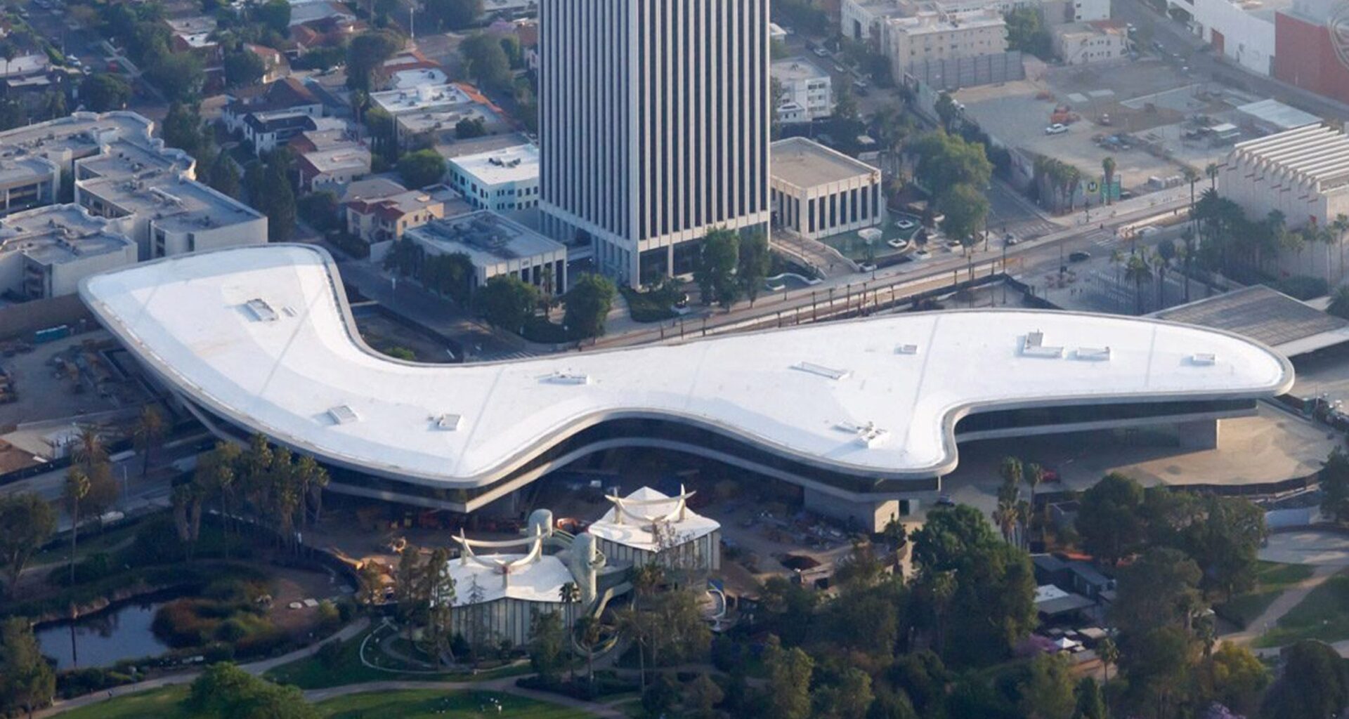
The project has attracted local criticism and concern since day one. This is the first project built in the United States to be designed by Zumthor, the Swiss architect world-famous for minimalist works of remarkable spatial and material sensitivity. It is also his largest by far, with 347,000 square feet (32,237 metres) spread across 3.5 acres (and yet it only offers 110,000 square feet of gallery space – 10,000 fewer than in the galleries it replaces).
Composed of more than two million cubic feet of concrete (65,000 cubic metres), and boasting a price tag of $750 million (125 million of which would come from local taxes), the project even dares to span a major boulevard, like a freeway overpass – a visual statement about the fast-moving and elevated position of the art market in Los Angeles, perhaps.
But if all that could somehow be put aside, the public may well experience the final product as one that captures the strangeness of our times. It is overwhelming in multiple ways; some are sublime, as art should be, while others are distracting, as life often is today.
Unlike the neoclassical Metropolitan Museum of Art in New York, which neatly arranges rooms within a windowless grid, visitors here navigate a vast open floor plan that treats the time and space of art history as visual playthings.
Art installations bring colour to Peter Zumthor’s austere LACMA addition
It is certainly not obvious at first, but the gallery space is geographically split into four sections, each one loosely inspired by a different oceanic network of cultural exchange. The main entrance brings visitors to the Pacific Ocean, where 14th-century Chinese pottery and Spanish-colonial paintings drift in a sea of concrete alongside Raymond Loewy’s own custom-designed Studebaker Avanti.
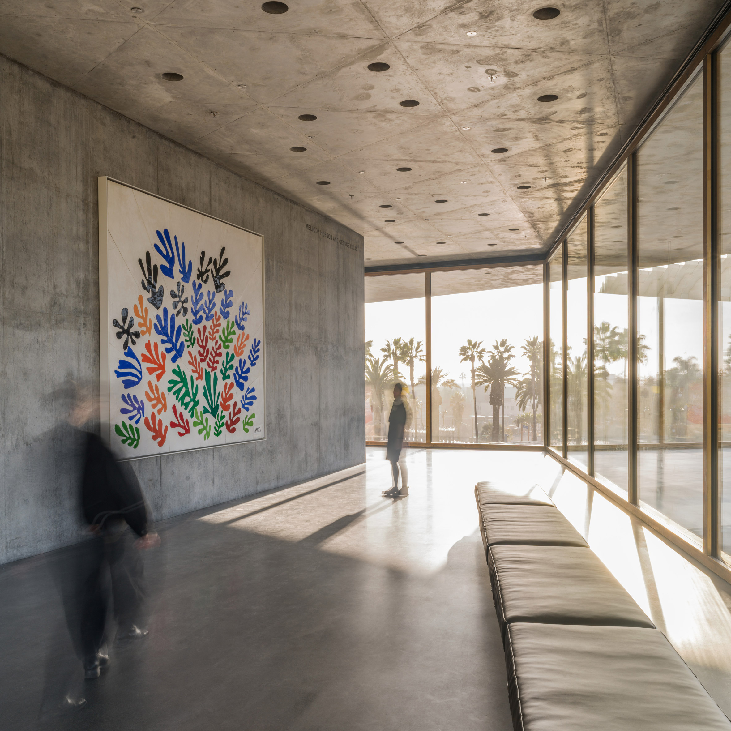
This awareness of these complex global exchanges is evident even in the smaller, monastery-like gallery spaces scattered throughout the space, designed to provide brief moments of concentration amid windowless walls and mood lighting. The layout allows for a fragmentation of self-awareness on the museum’s part.
Picturing the American West, for instance, treats that region as both a real place and a myth by juxtaposing 19th-century Anglo-American paintings of Sequoia with contemporary Indigenous responses to their consumptive romanticism. The cross-cultural dialogue grows louder when one notices that the installation is labeled with a sponsorship from the state of Qatar. Together, these reveal art’s tricky relationship with exposing power dynamics while being caught up within them.
Is the building’s suspension in service to the public, or is it just a symptom of its monumentality?
Thanks to Zumthor’s madcap idea of hoisting the entire gallery space 30 feet (nine metres) above the ground, the artwork is additionally engaged in dialogue with unobstructed views of the museum campus and the city beyond. While the original museum buildings turned their backs on the treasures of its immediate surroundings, such as the Pavilion for Japanese Art, designed by Bruce Goff in 1988, Zumthor frames them as an artwork in themselves.
Even Wilshire Boulevard gets the star treatment, inviting visitors to turn their backs on the artworks to contemplate traffic patterns. If you weren’t already overwhelmed by the juxtaposition of art, the awareness of the city only adds to the feeling. With the bridge over the boulevard and the views, is the building’s suspension in service to the public, or is it just a symptom of its monumentality?
At a time when cultural institutions struggle to compete with the allure of our smartphones, LACMA has created a museum space that feels as though one is swimming through the bottomless scroll of Instagram. Viewers follow a trail of dopamine hits of their own curation, chasing visual stimulation around every corner before realizing where they are or how long they’ve spent on the hunt. As a well-seasoned museum goer, I found myself lost in the maze.
“In the rush to draw a line under the age of the starchitect, we’re at risk of losing more than we think”
But for a gallery space so attuned to the contemporary attention span, it is filled with technical shortcomings that even those glued to their phone might notice.
Many of the artworks facing the exterior are blasted with natural light that blows out details in paintings and casts glare onto protective glass. The Nuno textile curtains lining the windows, while sometimes elegant, are altogether too lightweight to mitigate overbearing natural light, and fail to hang straight up and down without immediate ironing.
Early critics of the design can feel vindicated for their concern that a museum composed of the same materials as a parking garage would be echoey. Gallery talks and eavesdropping – some of the potential highlights of a day at the museum – are compromised until Zumthor approves the installation of acoustic paneling.
And for all its visual allusions to the indoor/outdoor concepts of local mid-century modernists, the David Geffen Galleries feel insulated from the rest of the museum campus, with hardly any elevated outdoor spaces of their own. How many visitors will muster the energy to visit LACMA’s two other museum buildings afterwards, or even remember they exist?
The act of lifting up the museum does as much for the general public as it does for the celebrity
Exiting the freeway overpass-esque museum brings viewers to the parking lot-esque park beneath. It may appear like another oversight, at first, but the ground is actually Mariana Castillo Deball’s Feathered Changes (2026), a 207,000-square-foot (19,230-square-metre) concrete artwork that feels out of scale without benches, tables, and the other basic features of an open public space.
Two works originally incorporated in the original buildings –Tony Smith’s Smoke (1967) and Alexander Calder’s Three Quintans (Hello Girls) (1964) – are reintegrated across the grounds as photogenic backgrounds for the galas that the plaza had been designed to host all along.
Yet the act of lifting the museum does as much for the general public as it does for the celebrity. While the original buildings sat blankly in the middle of the 34-acre public park, Zumthor’s parti allows the public to walk across without impediment. Parkgoers can now look up at any time and catch the drama of art history on display through the galleries’ windows without even considering admission.
But if it wasn’t obvious at this point that Govan’s primary goal was to leave a permanent footprint on Los Angeles, he literally just did exactly that. On April 16, three days before opening to LACMA members, Govan and Zumthor imprinted their bare feet onto the last concrete pour for Castillo Deball’s Feathered Changes plaza art. This entwined their pathmarks with those of the snakes, coyotes and roadrunners that the artist incorporated as a meditation on the geologic history of the museum’s site. It’s an act of hubris, but not of mere fantasy.
The photo is by Iwan Baan.
Shane Reiner-Roth is a writer, photographer, curator and educator. He is a lecturer at the University of Southern California and is studying for a PhD at the University of California, Los Angeles. His writing has appeared in The Architect’s Newspaper, Architectural Record and Architectural Digest.
Dezeen In Depth
If you enjoy reading Dezeen’s interviews, opinions and features, subscribe to Dezeen In Depth. Sent on the last Friday of each month, this newsletter provides a single place to read about the design and architecture stories behind the headlines.