
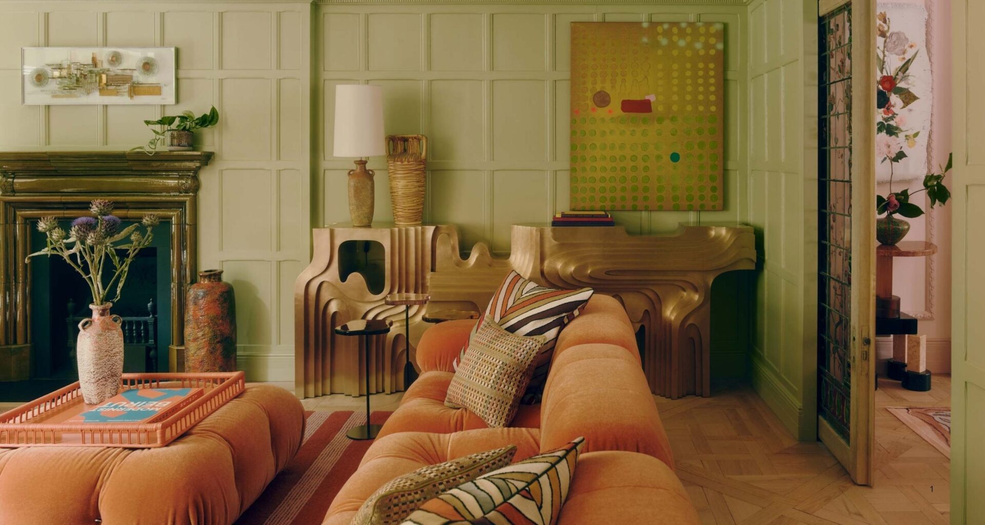
With all the recent talk about using bolder, more experimental colors in interiors, it feels important to define what those colors are and how to actually bring them into your home. Taking risks reaps big rewards, right? But it’s not always so simple. So, what are the risky colors designers are using right now? And how should we introduce them into our homes?
“People are definitely becoming more expressive in their homes, and decorating with color plays a big role in that,” shares interior designer Scott Maddux, who is no stranger to saturation. Interestingly enough, Scott hints that the colorful risks we take in our wardrobes and fashion can be the best indicator of what kind of ‘risky’ colors we might like in our homes. “Fashion plays a big role in our familiarity and acceptance of colors,” he says. “There is the larger, slower-moving cycle, and then there are seasonal ‘pops’ which are shorter in duration but help to move the larger cycle forward.” Much like within interior design color trends.
Taking a risk on a specific shade or tone because it speaks to you is “when color can feel fresh and even a bit edgy,” adds Scott. “I love all the colors; it is important to use them when the time feels right. Color is instinctual.” So, are you feeling a pull to use a color slightly out of your comfort zone this season? Below are the risky color choices that designers wish more people would try, plus how to feel more comfortable using them.
Latest Videos FromLivingetc
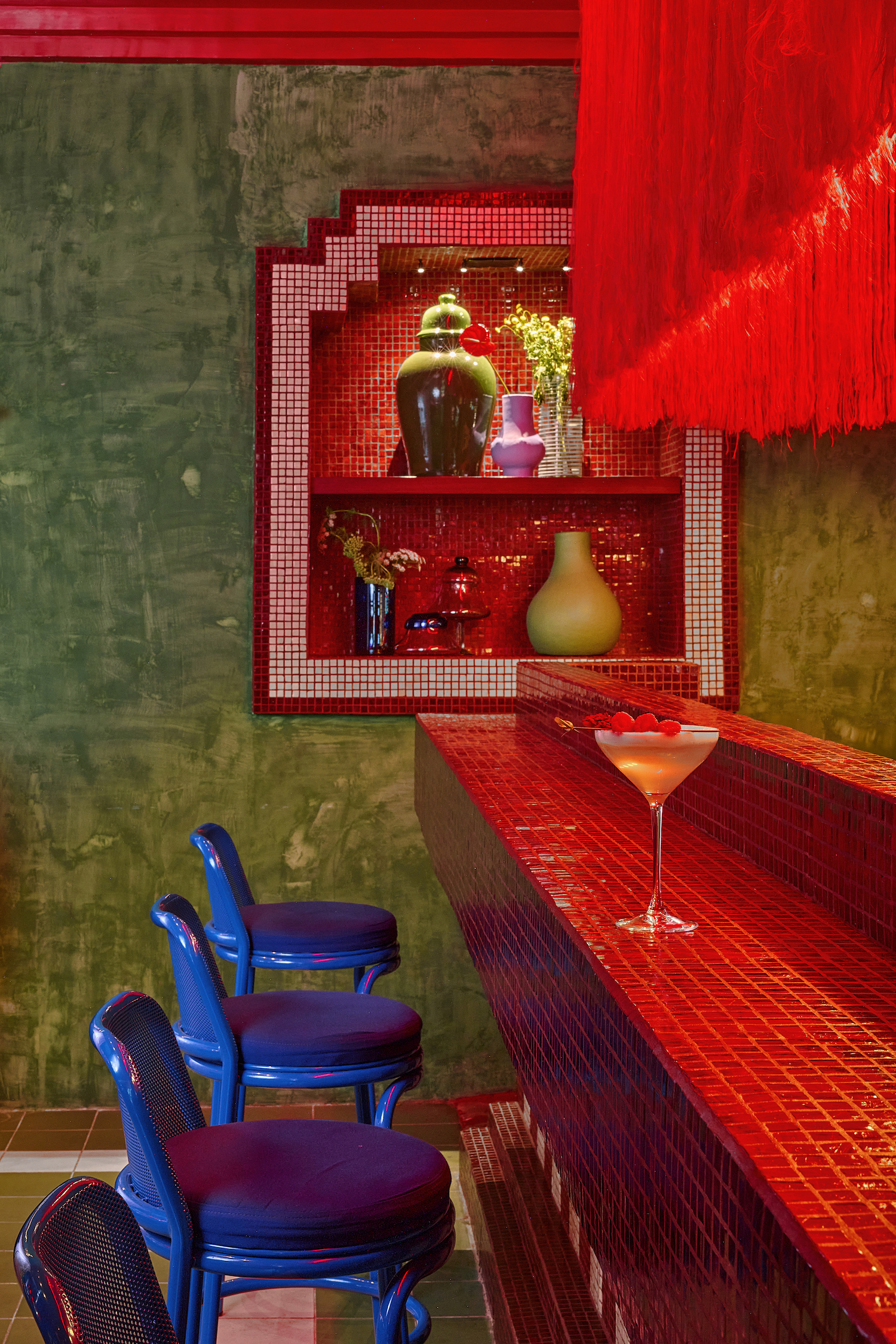
Risky colors can be as bold and maximalist or as subtle and accented as you want them to be.
(Image credit: Pepe Molina. Design: Maye Interiors)
First and foremost, to recognize what a ‘risky color’ for your home is and how to start using it more, “one must first understand the form of color,” says color expert and founder of The Colour Academy, Fiona de Lys. “Turn the question inside out and ask not ‘what is a risky color’ but instead ‘what is risky about color?'”
This is the same idea Scott Maddux hints at: thinking about interior colors from a more personal perspective. A color can feel risky both because it is outside your home’s typical color palette and because it generally feels more daring to the eye.
You may like
For example, “Think of a soft, pale, sky-blue hue reminiscent of early morning haze,” says Fiona. “Now take the same blue and crank up the pigment — the blue is now intense, a rich, piercing azure with more saturation and chroma. The blue has become riskier to use. So a great way to experiment with a risky color is to begin with what feels familiar and increase the saturation and chroma until you feel the ‘tension’ of something playful and exciting.”

Fiona de Lys
Social Links Navigation
Color Expert & Founder of The Colour Academy
Fiona de Lys is a UK-based interior color expert with English-Italian heritage. In her work, Fiona strives to unite the relationship between light, color, and history when designing a space. Her heritage is part of the influence that inspired her to explore the roles of identity and history in developing a personal dialogue with color. Now she works as an industry-recognized color consultant in the UK and overseas, and partners with the British Institute of Interior Design (BIID). Plus, she created the Delysian Color System for her color consultancy service.
For many people, that chromatic tension is where the risk lies. But you can also feel that a soft lilac or chartreuse shade of green is ‘risky’ if the rest of your home’s palette is made of deep earthy tones.
To help you start, below are four colors typically considered to be ‘risky’ by designers, but that they all agree would make very fashionable additions against current interior design trends.
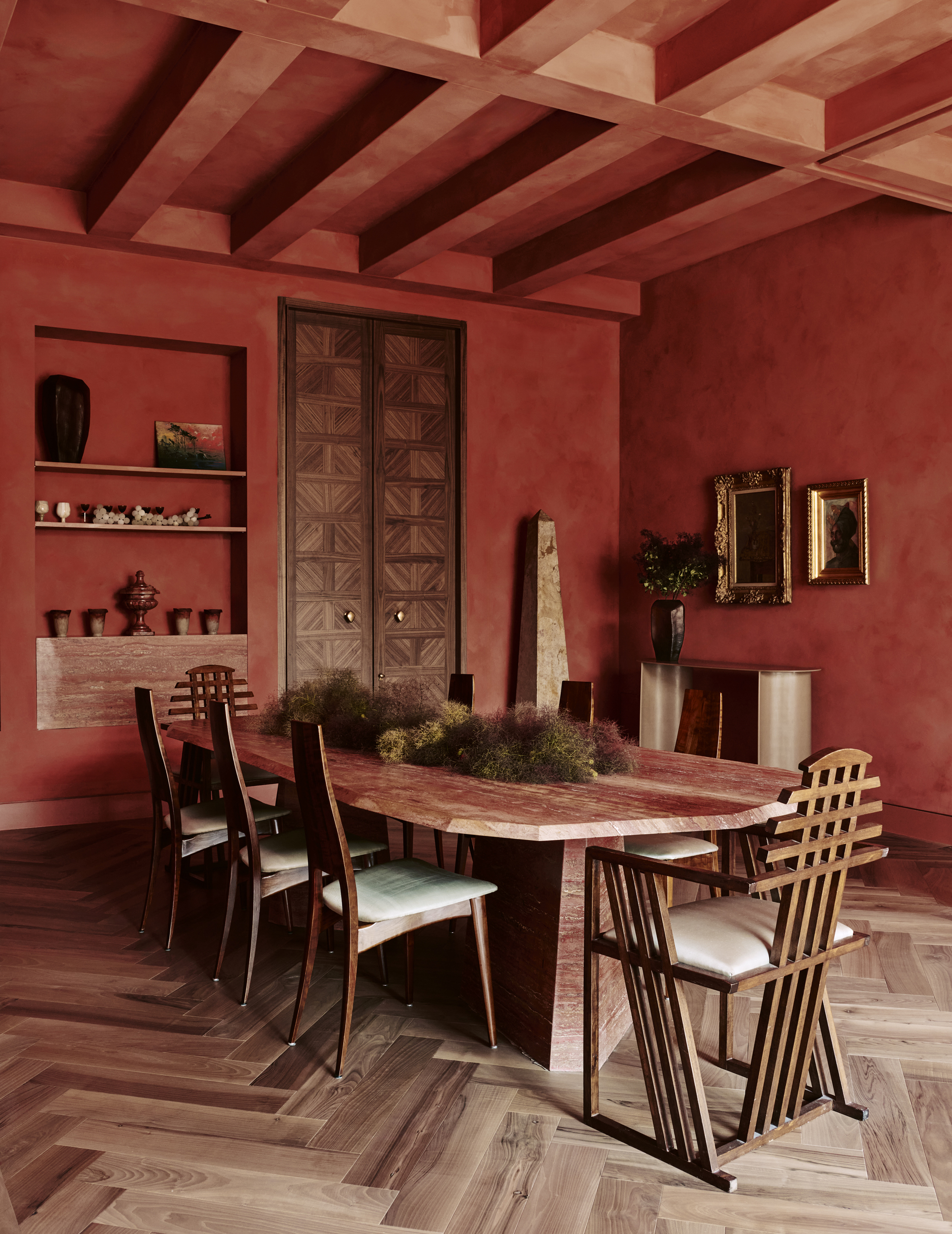
Red is a power color, but that doesn’t always mean it has to be used as a powerful letterbox red to make a statement.
(Image credit: Michael Sinclair. Design: Geraldine Dohogne Design)
In a lot of ways, decorating with red is one of the most obviously risky color choices — it’s bold, it’s powerful, and it’s full of personality. It’s also a favorite in the design world as of late. So, what’s the designer take?
“People are often afraid to use red because of its boldness, but it is the undisputed powerhouse among colors, and has long been infused into interior schemes as a source of energy and excitement,” London-based designer Erik Munro explains.
What to read next
One of the main reasons it’s such a striking choice is because it’s still technically part of an earthy color palette. “Red draws from the natural world’s vivid palette — roses, blood, and fire — all evoking a sense of passion, love, and authority. So naturally, when we see this color in a space, it ignites our inner lion and stirs our instincts,” says Erik.

Erik Munro
Social Links Navigation
Interior Designer
Canadian-born and now a Londoner, Erik Munro is the founder of Munro Design — a studio known for its emotive, layered interiors that blend classic proportions with bold personality. Raised on Vancouver Island, Erik’s global travels and early career in fashion shaped his eye for detail and storytelling. After cutting his teeth at high-end firms, he launched his own practice, Munro, in 2015.
While the risky among us might be drawn to a color-drenched red room (which can be very beautiful when done well, as you can see above), Erik adds: “I find using red in my schemes either sparingly with restraint — such as a carefully curated painting or cushion — or employed boldly in an all-encompassing display, such as a floor-to-ceiling lacquered red library, works best.”
“Nothing should be unexpected in design but rather considered and engaging — this ‘unexpected red theory‘ is simply a new generation discovering how to work and experiment with color, which is fantastic,” Erik adds. And, if you are going to use red, be bold and go for big contrasting colors. “The front door to my pastel powder blue house is a bright coral red, and it looks magnificent,” the designer adds.
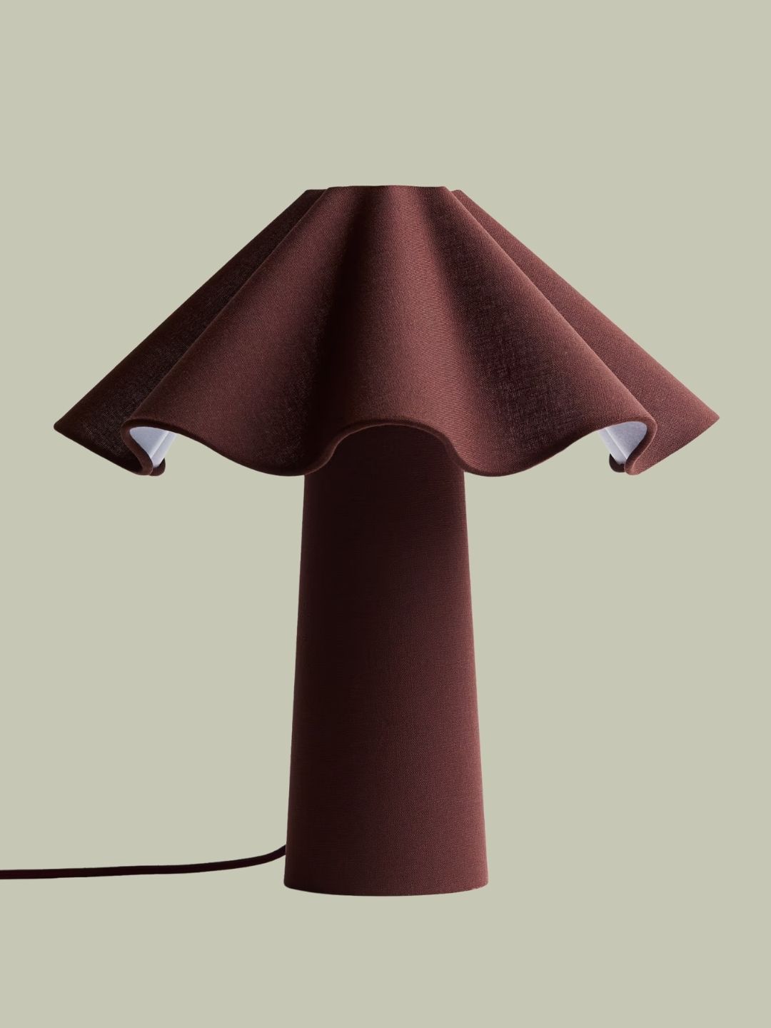
H&M Home
Wavy Table Lamp in Burgundy
Habitat
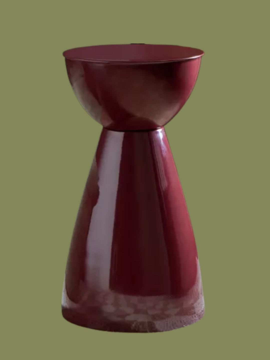
Mel Side Table in Dark Red
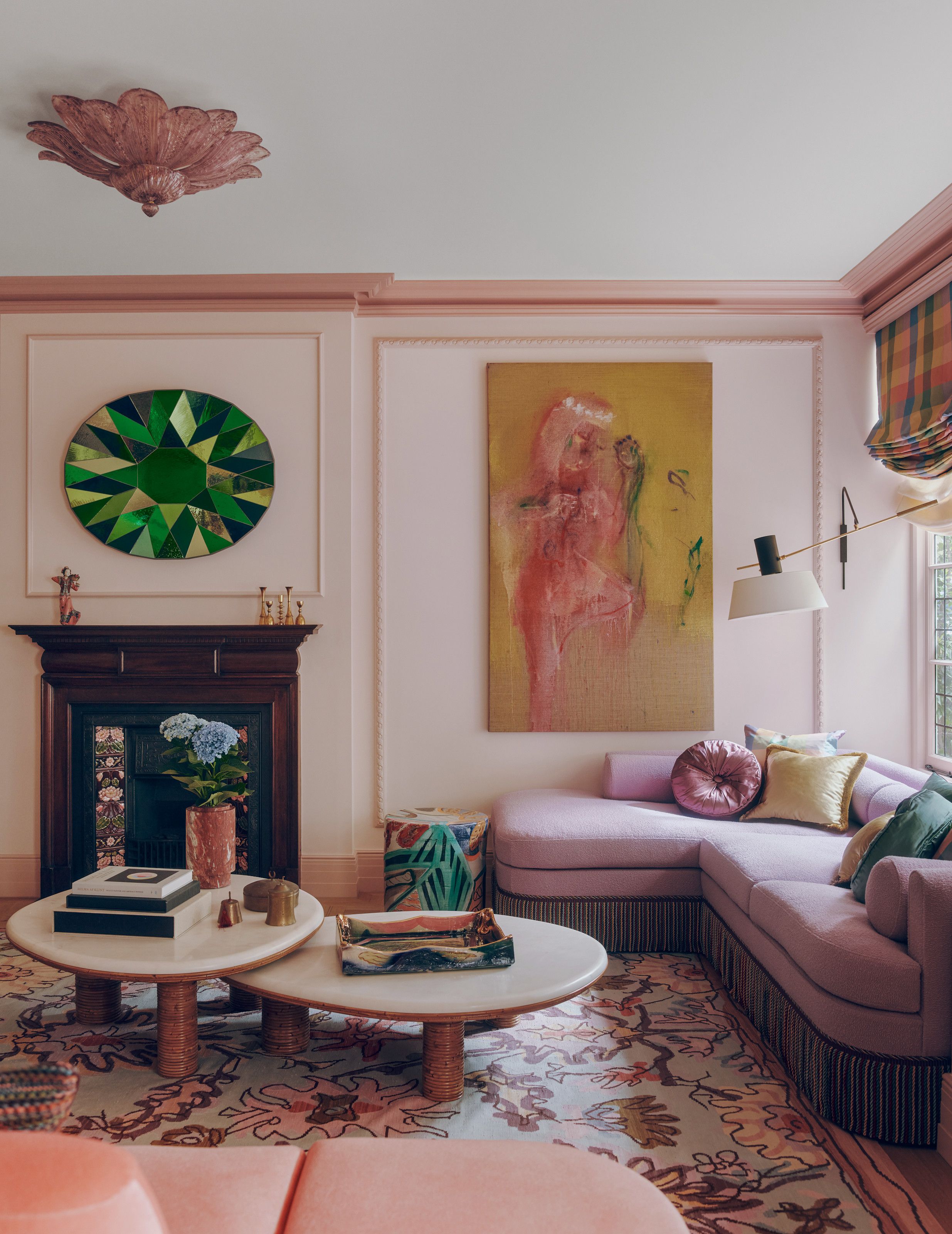
Light purple doesn’t have to be reserved for pastel palettes; it also works as a pop of color.
Image credit: Michael Sinclair. Design: Maddux Creative
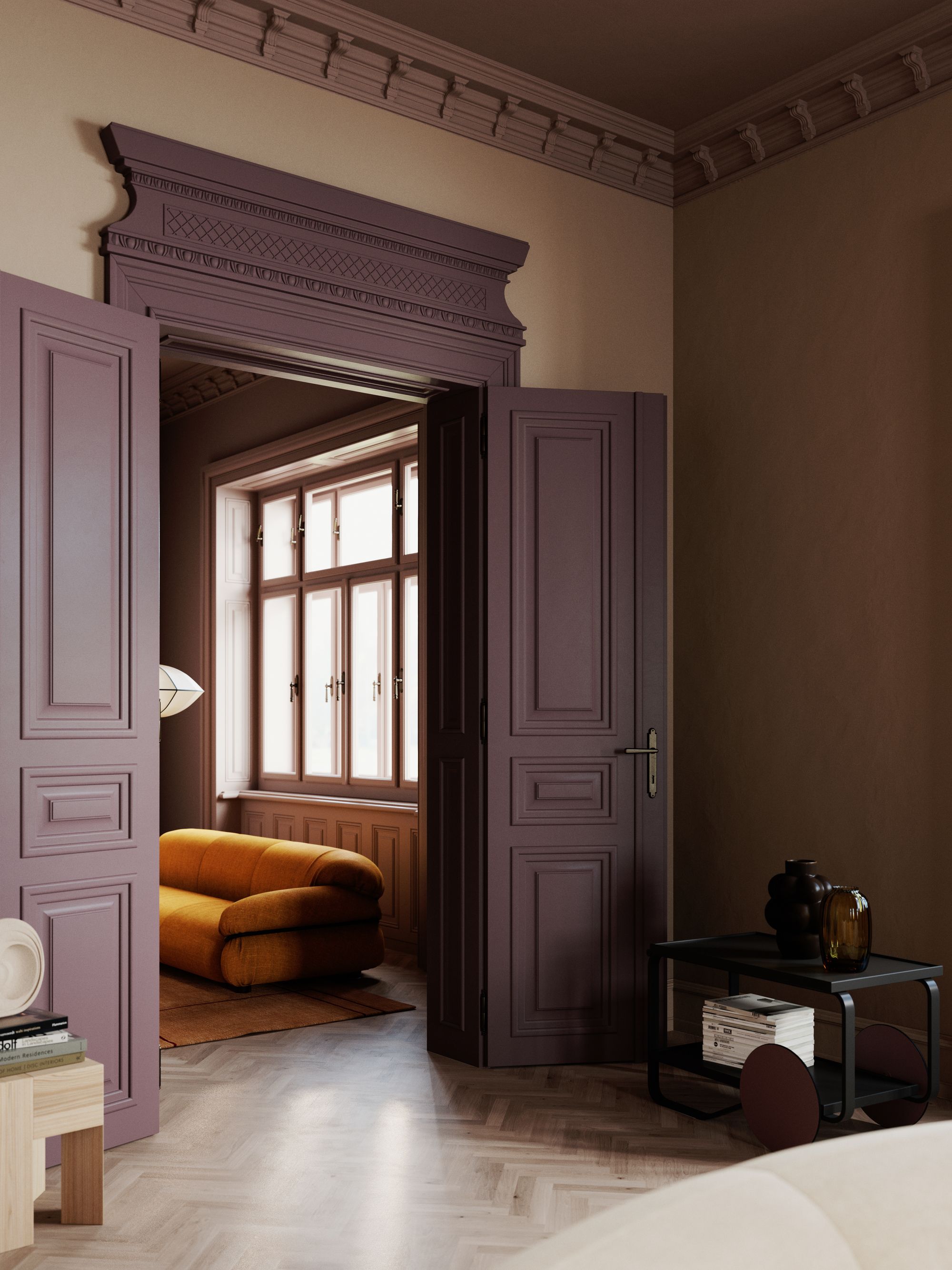
Darker, moodier purples have definitely gained in popularity in the interior design world.
Image credit: Notes of Colours
Decorating with purple is definitely one of the more controversial design decisions, but it’s one with a high reward if you are willing to take the risk. As moodier colors have become more favored in design, deep plums and aubergines are the obvious choice amongst purples.
These deep shades can feel enveloping and cozy within a space, but they can also feel sexy and bold; it’s all in how you use them. A purple sofa can be a really rewarding risk to take, while a tonal drench can take the edge off.
Or, you can opt for a purple on the other end of the scale. “I have been on a lilac kick for some time now, and I’m enjoying seeing it appear more often in various hues,” says Scott Maddux. Lilac doesn’t have to be part of a strict pastel color palette; pair it next to a deep aubergine and watch it shine.
Scott Maddux
Interior Designer
Scott Maddux launched his eponymous interior design practice in 2025, after 15 years as creative director for the award-winning and internationally recognised studio Maddux Creative. His instinctive use of color, along with his often playful and irreverent approach, makes for warm and characterful spaces that go beyond the superficial and aesthetic. They are deeply relevant, rich in dimension, and easy to live in.

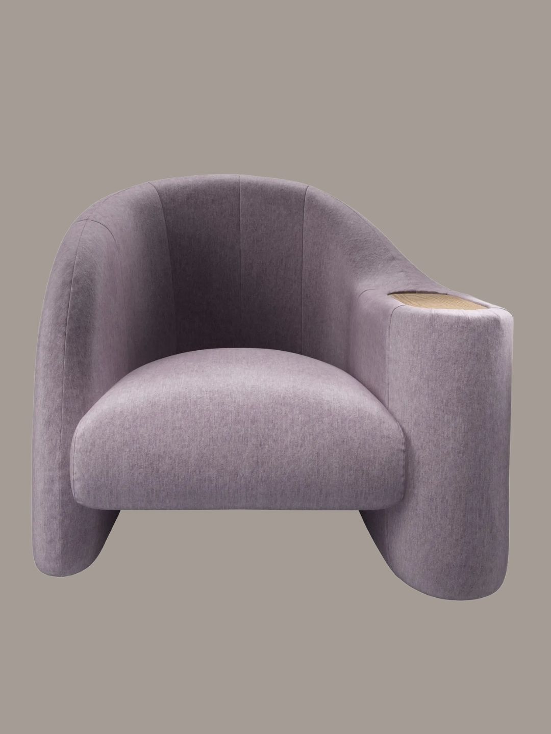
Sofa.com
Stellar Armchair in Thistle

Image 1 of 3
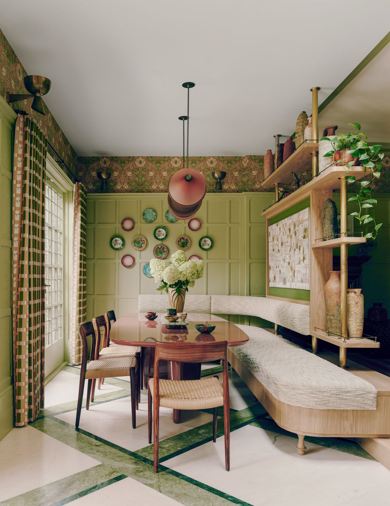
The lime green is bold, but with the other elements of design, it works.
(Image credit: Michael Sinclair)
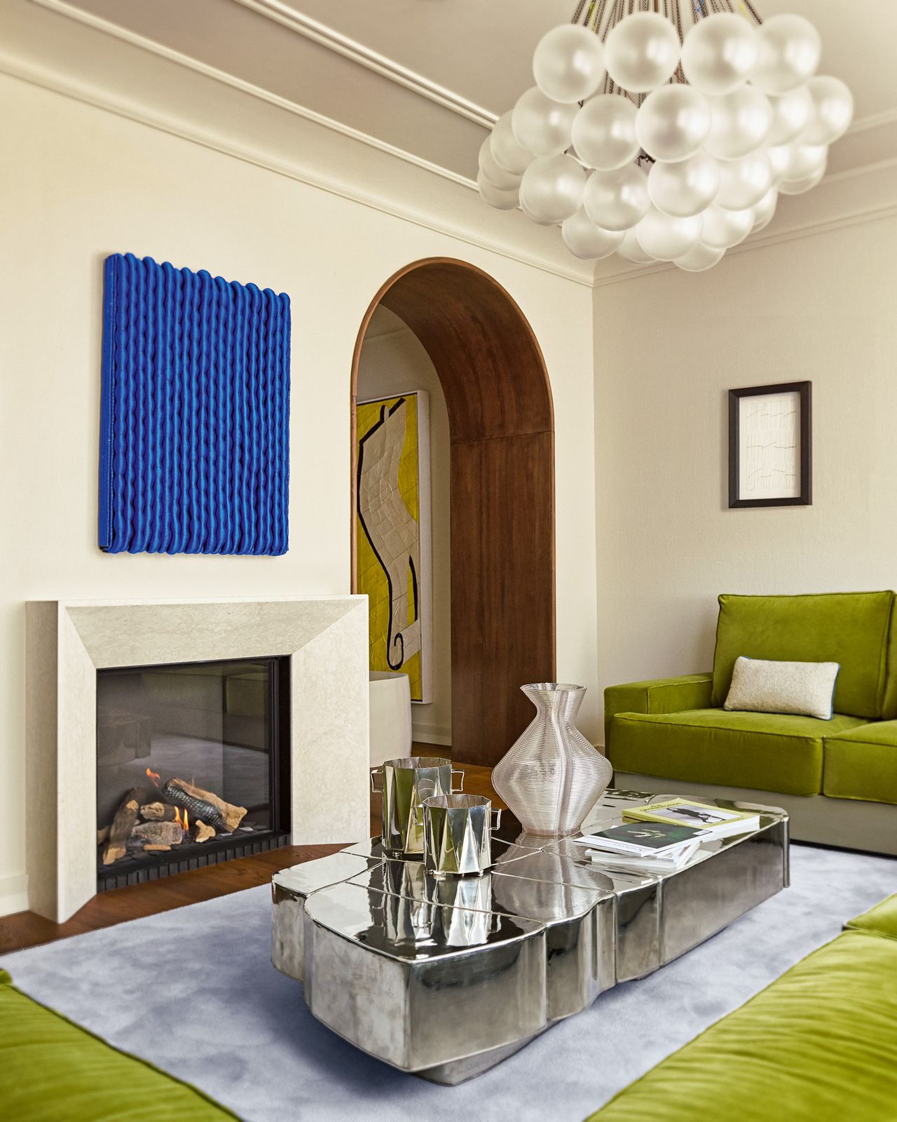
A bold green sofa in an otherwise neutral room is another way to try this trend.
(Image credit: Kasia Gatkowska)
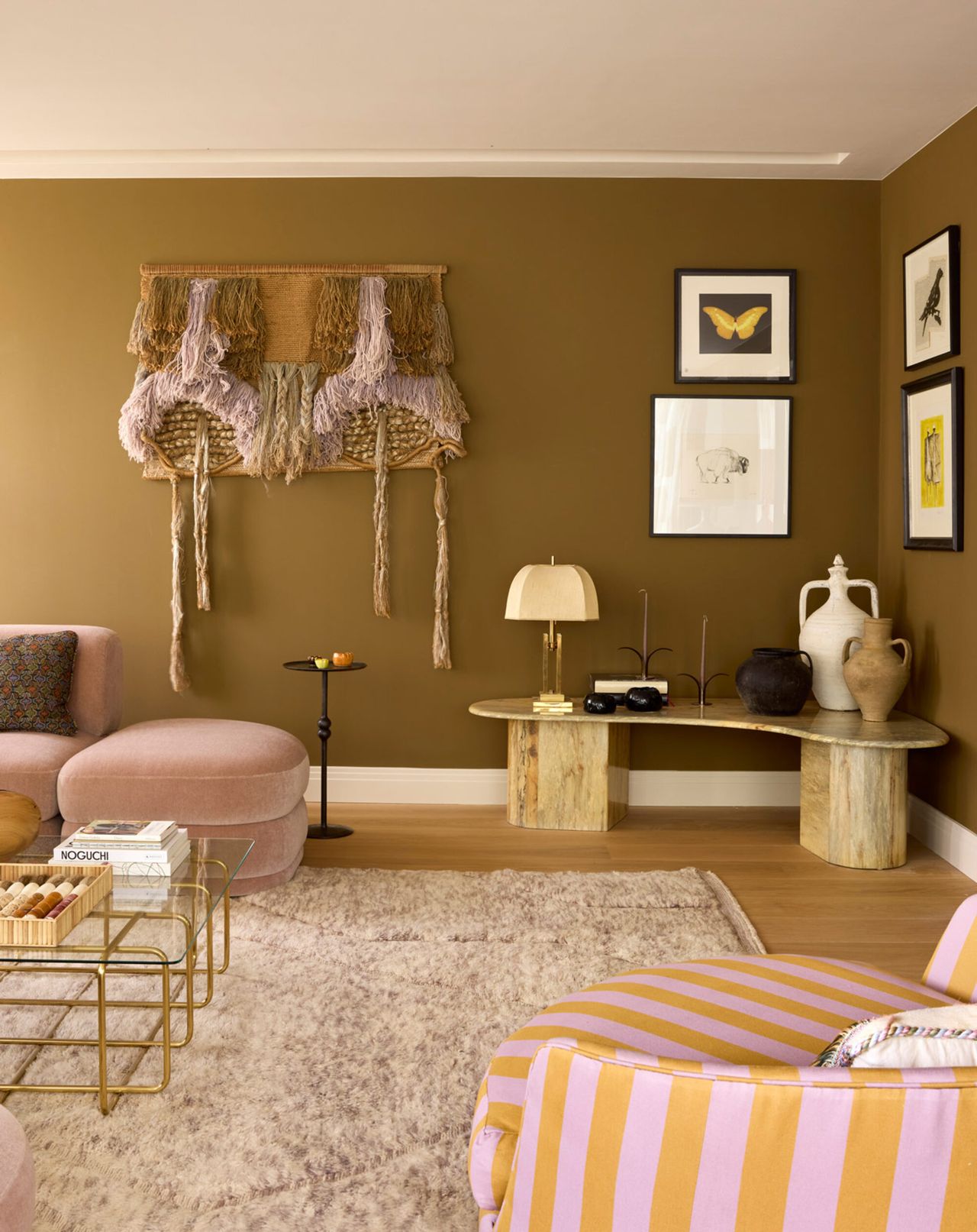
This Khaki feels more like a neutral when styled this way.
(Image credit: Ricardo Labougle and Valentin Meneveau. Design: Maddux Creative)
The next risky color worth introducing? Sour greens and bold variations of this natural color. “I think minimalism and the ‘wellness aesthetic’ have championed beige for too long now, and I am excited to see even these genres embracing deeper mineral shades like the vast array of greens that occur in nature, creating spaces that still feel calm,” says Scott.
Yes, that’s right, even a bold chartreuse green or lime can still be grounding. “There is so much color in nature to draw from, and I find beige a bit of a design cliché,” says Scott. “I love seeing the bright springy green of the kitchen at the end of the moody hallway, drawing you into the light-filled room.”
Rather than a risk, a more interesting green color trend becomes an exciting contrast or an energetic relief against other, more traditional shades. But to take a risk with green, you don’t necessarily have to go light and bright. Olives and khakis become more interesting when you amp up the saturation or undertones.
“In our Parkside project, we used an ‘ugly’ shade of sludgy khaki green, which in its own right was kind of revolting, but was the perfect shade of sludge to set off the lilacs and ochres in the room,” says Scott. Creating the right amount of contrast in design helps the ‘risk’ feel more balanced.
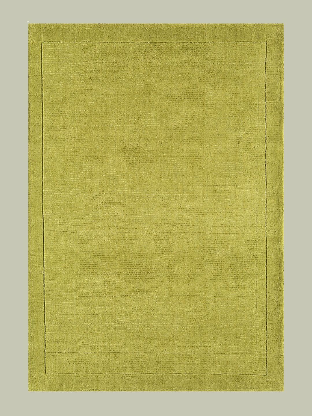
SO’HOME
Hand Woven Wool Rug

Little Greene
Light Bronze Green
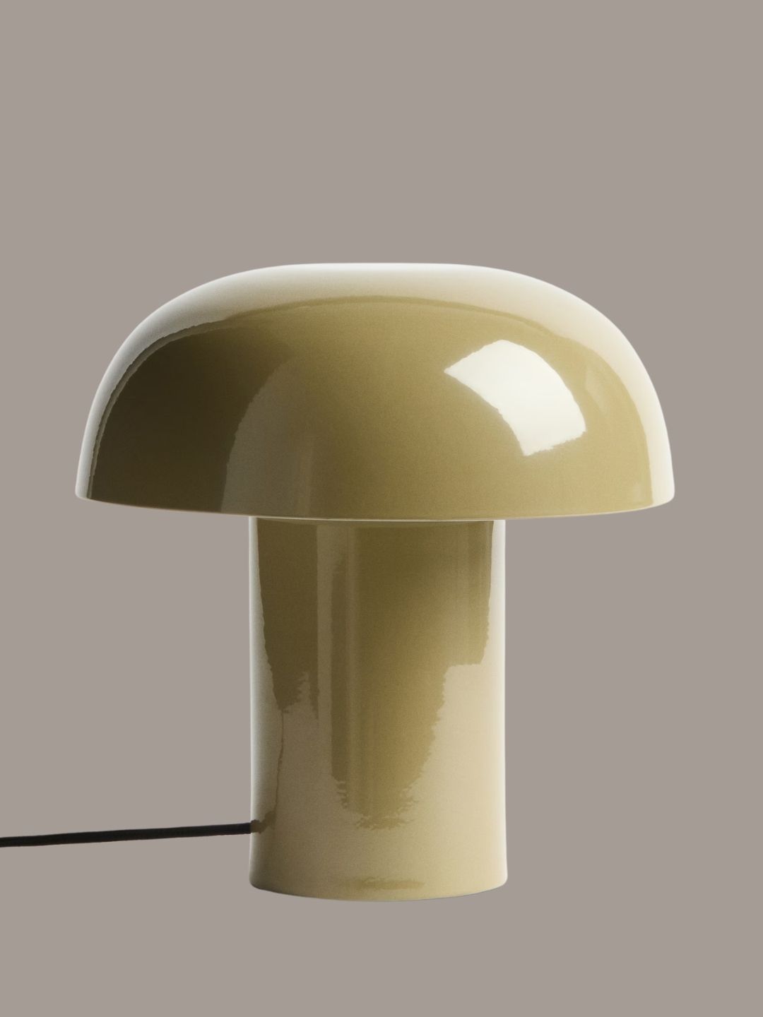
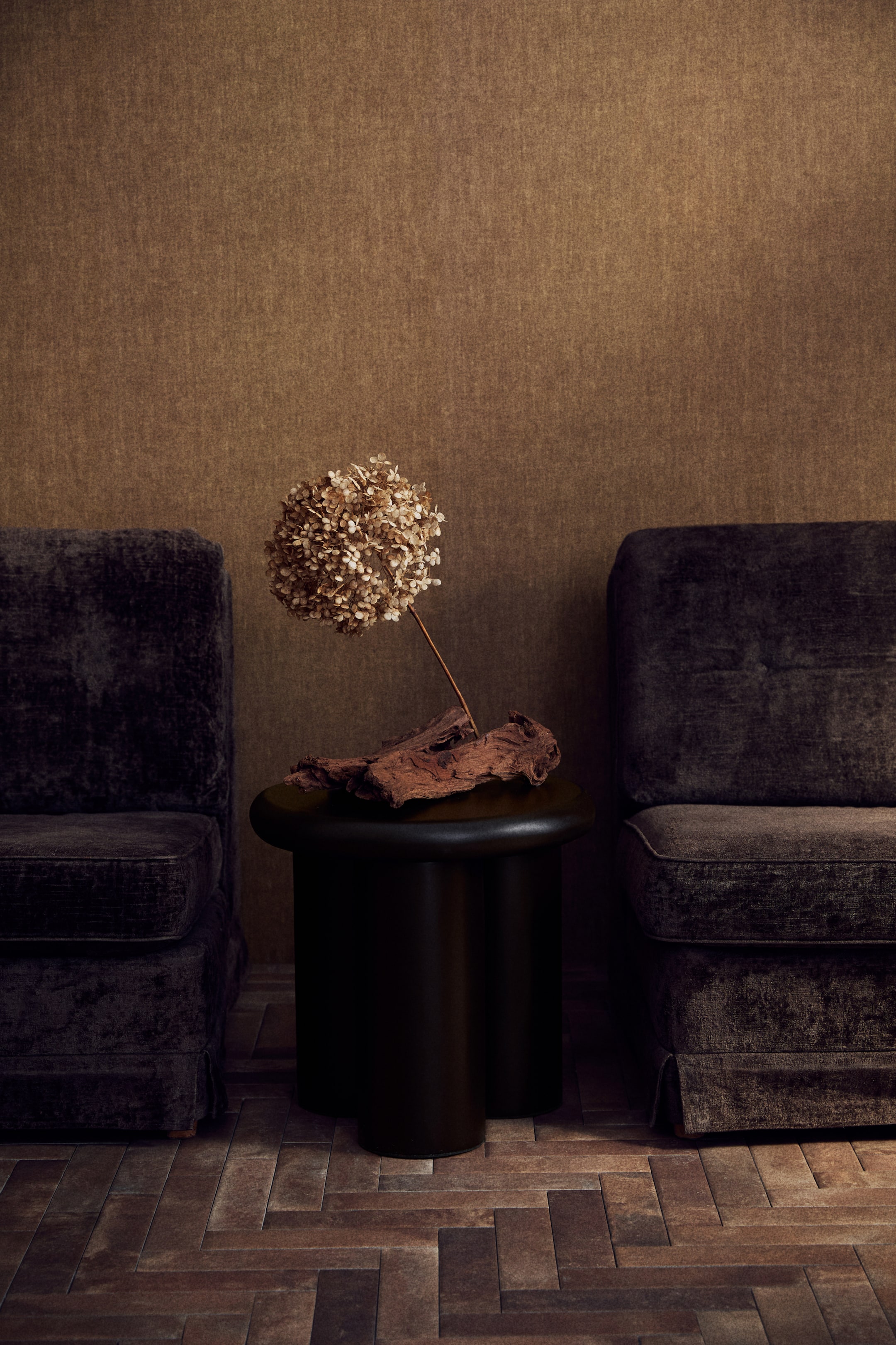
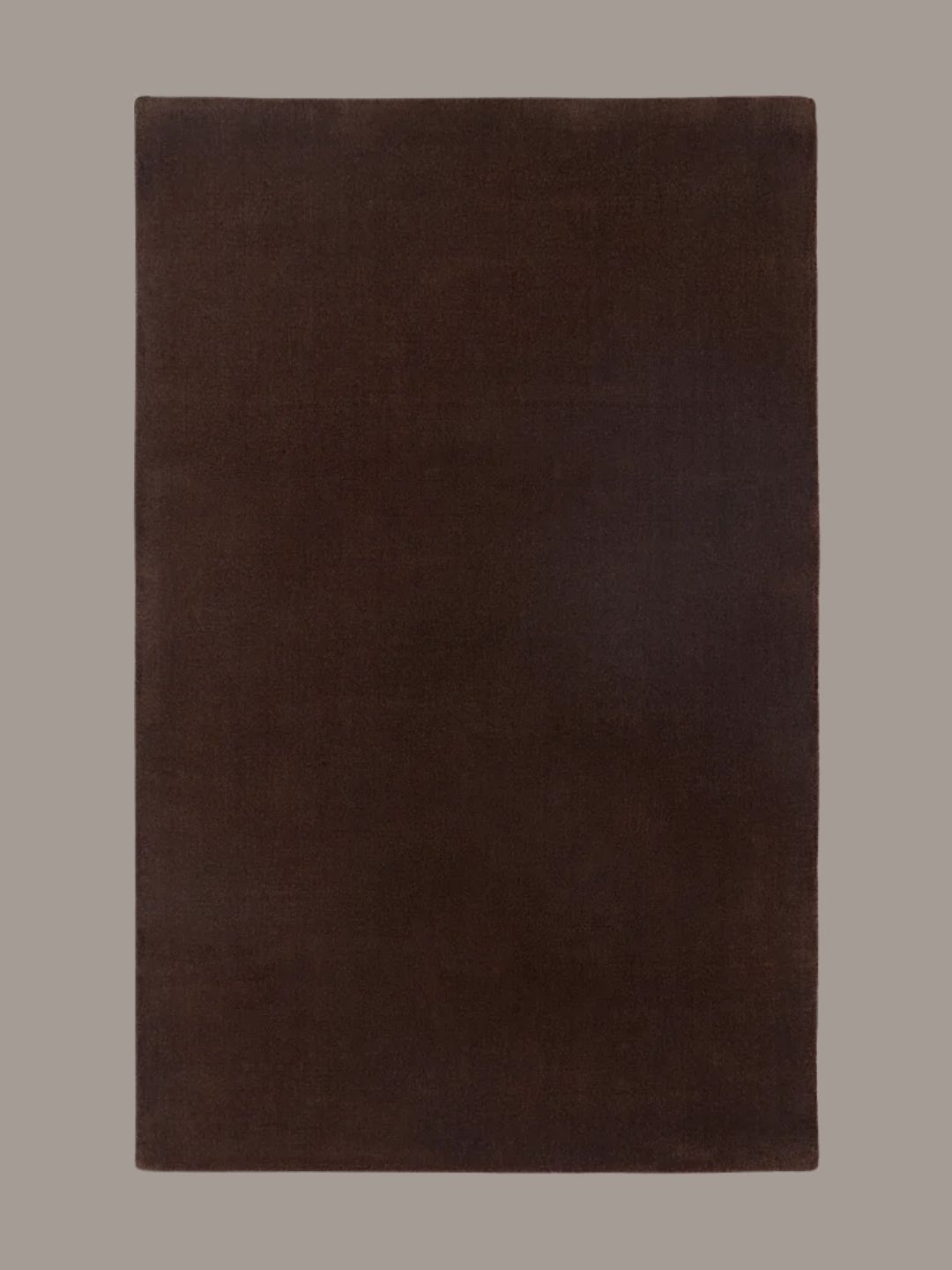
Chocolate brown has become a divisive color, but when done well, works.
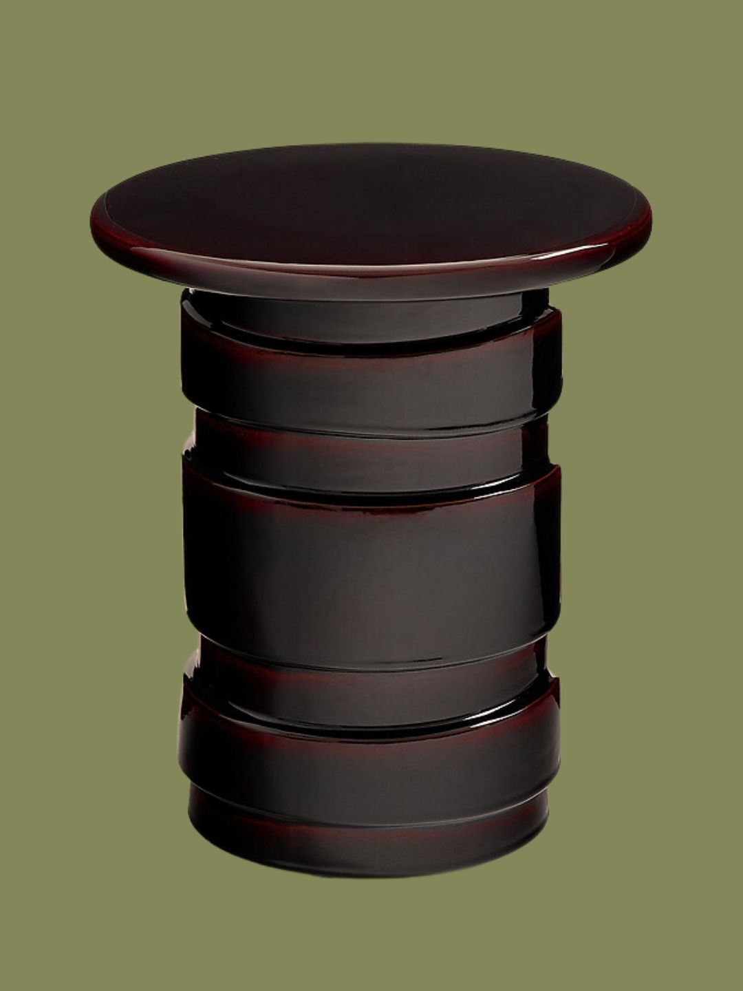
Chocolate browns may not seem like a huge risk, especially in today’s design world. However, when you begin to implement them in your own home, the darkness and rich saturation can be an intimidating contrast in actuality. But decorating with brown in a cozy living room or moody entertaining space creates a fashionable and enveloping atmosphere.
“I definitely have a thing for chocolate browns in a space,” says Scott. “Especially as a lacquer paint finish or a large decor moment, like a carpet. These types of applications make brown feel rich and exciting and evoke the sexiness of the 70s, like a fantastic David Hicks interior,” adds Scott.
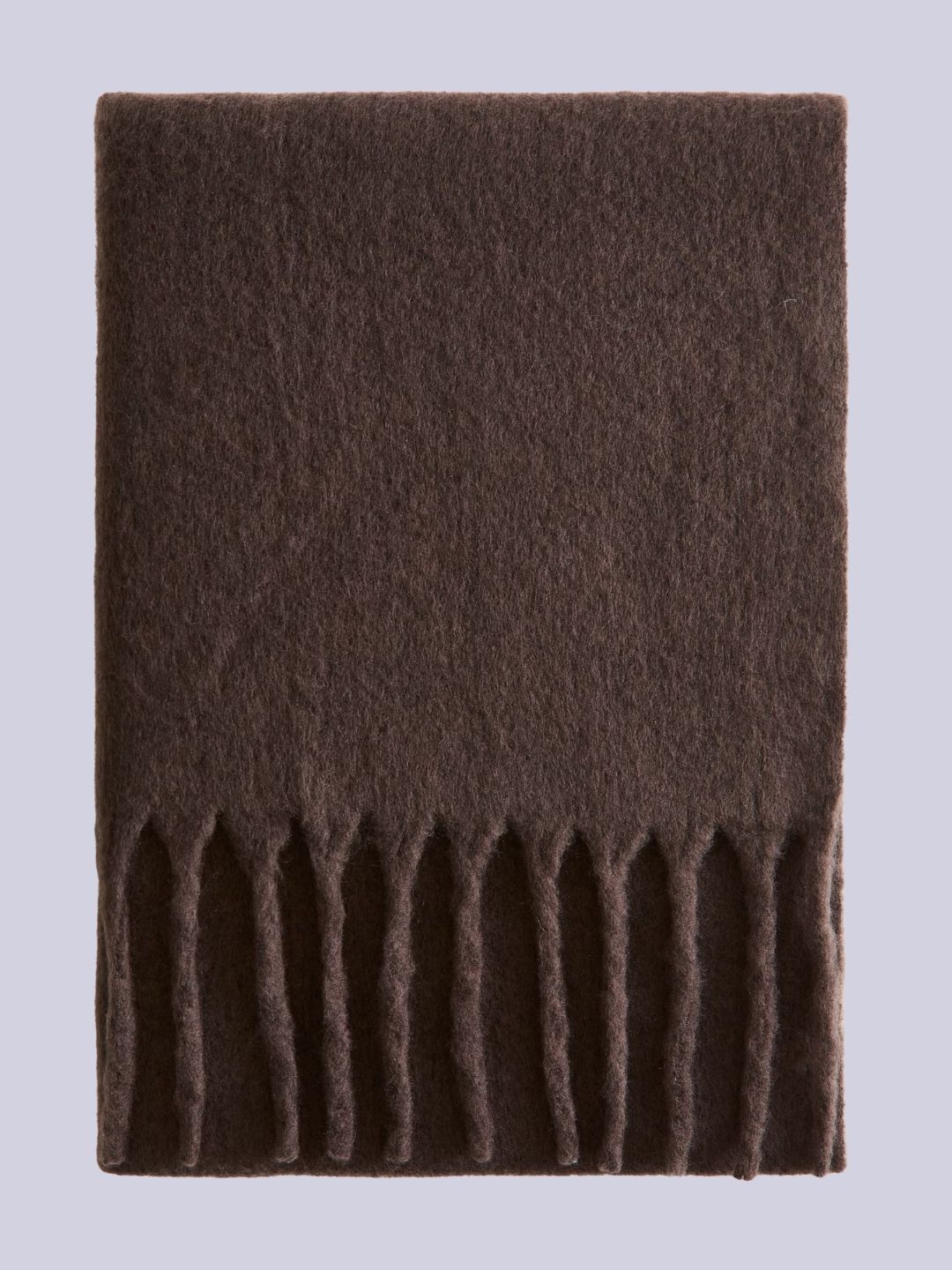
H&M
Fringed Wool-Blend Blanket
Westwing Collection
Hand-Tufted Wool Rug Zayne in Dark Brown
AM.PM
Torres Glazed Ceramic Side Table
“Color is also a great device to help you transition or move from room to room,” says Scott. “Catching a glimpse of a bold contrasting color in the next room draws you into it, and keeps your journey through the house surprising and delightful.”
He urges you to consider these risky colors just as you would with an outfit; “Use color to underline something, or to throw it off.” Ultimately, risky colors are just colors that are bold in saturation or go against the other colors in your home. While they may feel intimidating to try, high risk reaps high reward.
For more inspiration, subscribe to the Livingetc newsletter.