 By MI6 Staff
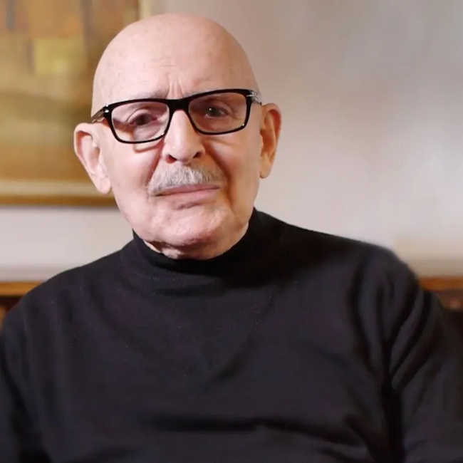
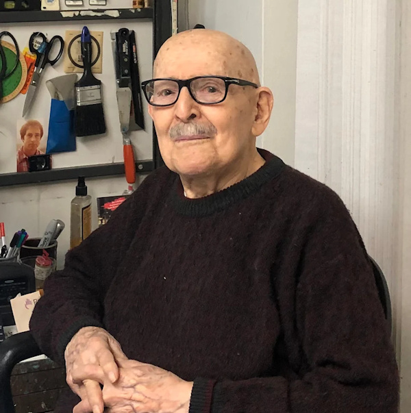
Joe Caroff – the unassuming New York graphic designer whose quick stroke turned ‘007’ into a gun and, in doing so, branded an entire cinematic universe – has died at 103, a day shy of his 104th birthday. His sons, Peter and Michael, confirmed his passing in hospice care in Manhattan to The New York Times, as reported by several outlets.
Caroff’s most famous idea arrived with disarming speed. Commissioned to create a small device for the ‘Dr. No’ publicity letterhead, he remembered writing the “7” in 007 and seeing, in its stem, the handle of a pistol. “It was very spontaneous… an instant piece of creativity,” he recalled in a filmed interview late in life. That glint of insight – then finished with a trigger and barrel – would become the Bond franchise’s visual heartbeat for more than six decades.
The assignment was modest, the legacy anything but. He was paid a flat $300 for the mark and, like so many commercial artists of his era, received neither on-screen credit nor royalties as the logo proliferated across posters, trailers, books, games, and merchandise. In 2021, EON Productions acknowledged the milestone with a 100th-birthday watch engraved “007” – a small flourish for a giant contribution.
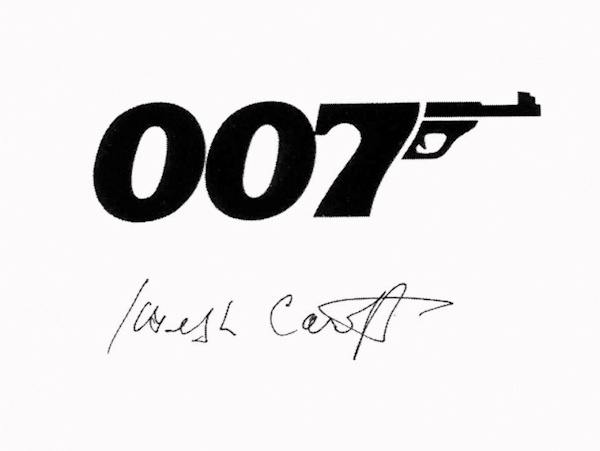
Over the years, writers often linked the logo’s silhouette to Bond’s Walther PPK; design historians close to Caroff have repeated that association. Others note the art’s abstraction – less a blueprint of a specific sidearm than a perfectly legible gesture that fused number and weapon. Either way, the idea re-wired how the public pictured Bond: numerals as character, typography as story.
Though Bond made him immortal, Caroff’s portfolio stretches across the 20th century’s movie canon. He designed the era-defining ‘West Side Story’ poster, frequently misattributed to Saul Bass, and brought the same typographic clarity to ‘A Hard Day’s Night’, ‘Cabaret’, ‘Last Tango in Paris’, ‘Manhattan’, and hundreds more campaigns. He also created title sequences for films including ‘A Bridge Too Far’, ‘Death of a Salesman’, and ‘The Last Temptation of Christ.’
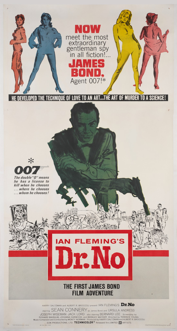
Caroff’s route to the movies was old-school and hands-on. He studied at Pratt, assisted the famed French poster artist Jean Carlu in Manhattan, served in the U.S. Army in wartime England, and returned to build a studio that produced design at industrial scale – book jackets under the pseudonym “Joseph Karov” (including Norman Mailer’s ‘The Naked and the Dead’), corporate marks, and more than 300 film campaigns. He launched J. Caroff Associates in 1965, later partnering as Kirschner Caroff, and finally retired to painting at 85.
Late recognition found him. In 2022, the documentary ‘By Design: The Joe Caroff Story’ aired on TCM and screened at New York’s Film Forum, where audiences greeted the centenarian like a rock star. In that film, he described his goal for any piece of graphics with a single word – “effervescence”: work that feels alive, never flat.
For Bond fans, it’s hard to overstate what Caroff’s logo accomplished. Long before any actor says the name, before the gun barrel swirls or the score hits its brass, those three digits signal a world – cool, lethal, unmistakably Bond. The device sits comfortably beside the series’ other motifs; yet unlike a theme tune or a gadget, it requires no translation and no era. It is Bond.
Caroff’s passing comes after a life that largely resisted the spotlight even as his work lit marquee after marquee. In the history of the series, he is the designer who, with a pen and a perfectly judged curve, gave Bond a symbol as enduring as any catchphrase.