
Bold and energetic colours are out as we see a return to comforting neutral tones and a preference for berry shades, according to a 2026 colour forecast.
Architects, designers and home renovators eagerly await the annual findings of the Dulux Colour Forecast, which is renowned for predicting the colour trends for the upcoming year.
The new 2026 report has turned up some surprising changes in the preferred tonal palette for interior spaces.
The major shift in popular interior shades reflects a yearning to create calming spaces in ‘response to continued global uncertainty and digital fatigue’.
Dulux Colour and Communications Manager Andrea Lucena-Orr said that ‘in times of uncertainty’ our choice of colour and design ‘tends to gravitate toward stability’.
Amid a cost of living crisis and growing political uncertainty, there’s been a perceivable shift away from previously popular bright and bold colours and accents in favour of gentler ‘warm, comforting colours’.
‘Colour has the power to lift spirits, offer emotional reassurance and bring a sense of calm into our homes,’ Andrea said.
Accordingly, the expert highlighted the type of colours that are predicted to be hugely popular in residential and even commercial spaces over the upcoming year – and it’s led by a notable return to ‘neutrals’.
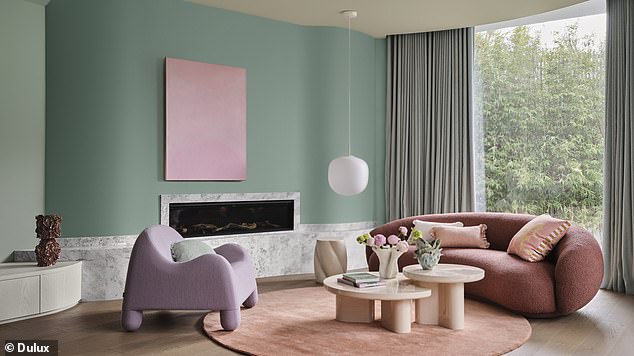
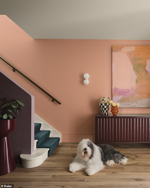
The colour trend report predicted the rise of soft pinks, mauves and blush. Spearmint green also had emerged as a surprising shade on the rise
The 2026 Dulux Colour Forecast predicted that all manner of berry tones offered a gentler way to add an accent colour to an interior space
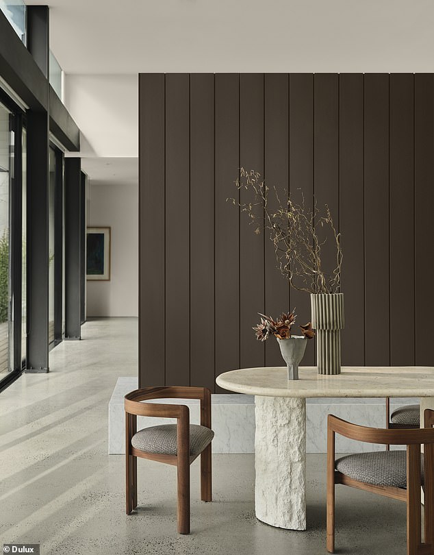
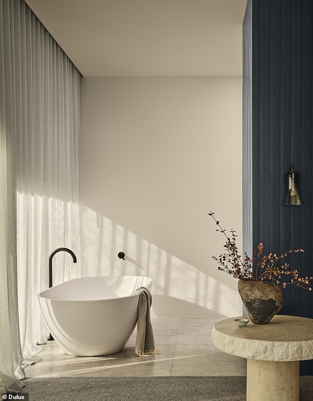
Neutral tones with an earthy touch were highlighted in the 2026 Dulux Colour Forecast
But it’s not just any muted shade, but specifically ‘warm earth-based neutrals’.
‘These trends mirror our collective desire for grounding and positivity,’ the expert explained.
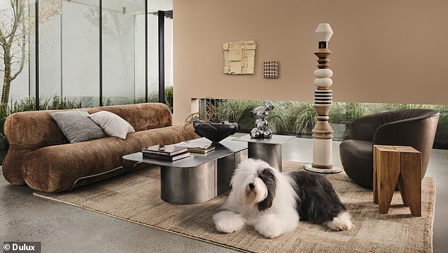
Among those predicted to be popular were warm and luxurious whites, golden browns and subtle concrete greys.
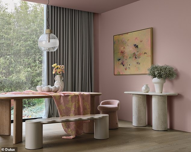
Meanwhile, adding a touch of colour is expected to be executed in a much gentler way than we’ve seen in previous years, with Andrea highlighting the growing push for ‘soft pinks and vintage rose tones’ alongside ‘tender pastels and muted berry shades’.
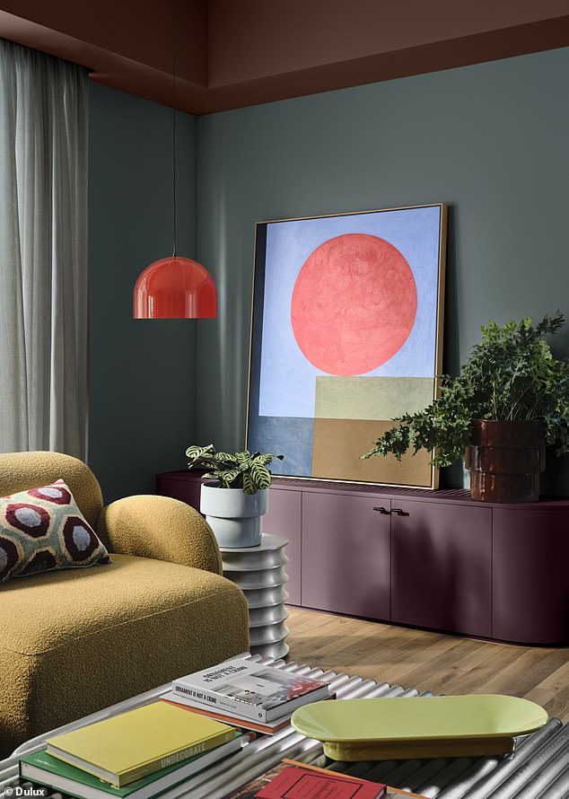
Similarly, ‘playful berry hues, pinks and rich accents such as burnt orange’ are set to be the new go-to as an accent points that make a statement.
Andrea explained that although these colours are far more subdued compared to previously popular accent colours in recent years, these gentler shades ‘used sparingly’ are still able to ‘bring personality and optimism into spaces’.
Soft green tones have also been having an interior design moment in the past few years – and Andrea predicts that this green-loving vibe will continue, but with a particular and unexpected shade emerging as a popular choice in the report.
Dulux Colour and Communications Manager Andrea Lucena-Orr explained that ‘in times of uncertainty’ our choice of colour and design ‘tends to gravitate toward stability’
A resumed preference for warm neutral tones was interpreted as a reflection of a broader yearning to make our home spaces comforting, nurturing and positive safe havens
‘Among the most notable changes this year is the rising dominance of spearmint green, complemented by soft earthy pinks that pair beautifully with browns and burgundies,’ Andrea said.
This perhaps unexpected colour palette speaks to the broader trend of a desire to reconnect with nature.
‘There’s a strong shift towards emotional reconnection – with ourselves, with others, and with nature. This translates into a need for warm, calming interiors that encourage reflection and joy,’ Andrea said.
Other nature-inspired greens that will remain popular over the upcoming year are sage and moss.
Overall, this year’s forecasted colours reflect a driving shift to making our home spaces comforting, nurturing and positive safe havens.
Andrea advised that taking heed of this year’s trending shades when renovating or updating a space will help to ‘create a calm, purposeful atmosphere’ and ‘sense of home’.
Dulux has accordingly created three distinct palette offerings for the year; Ethereal, Elemental and Evoke.
The uplifting and quietly luxurious Ethereal palette features a pastel-like blend of gentle greens, mauves, and blush pinks.
Dulux have created three distinct paint palette offerings for the year to reflect the change in colour trend preferences
The interior colour prediction report explained that the new preference of accent shades was softer and less bold or energetic
The Evoke range features blush pinks, burnt oranges and warm golden tones, which are ideal for those looking to add ‘personality and depth’ to their interiors.
Finally, there’s the Elemental palette, which is the more grounded and foundational palette built around warm whites, neutrals and golden browns.
Andrea described the former range of shades as ‘a timeless, cohesive palette that feels quietly confident’.