

North America
 Image: Nintendo
Okay, so the North American design is pretty busy, right? We’ve got an image of the console and controllers in the centre, six games listed over on the right (including the newly-released Star Fox 2), and the main logo over on the bottom.
We love the colour scheme here; the blacks and reds work really well, and it gives the box a slightly more ‘mature’ aesthetic.
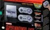
Europe
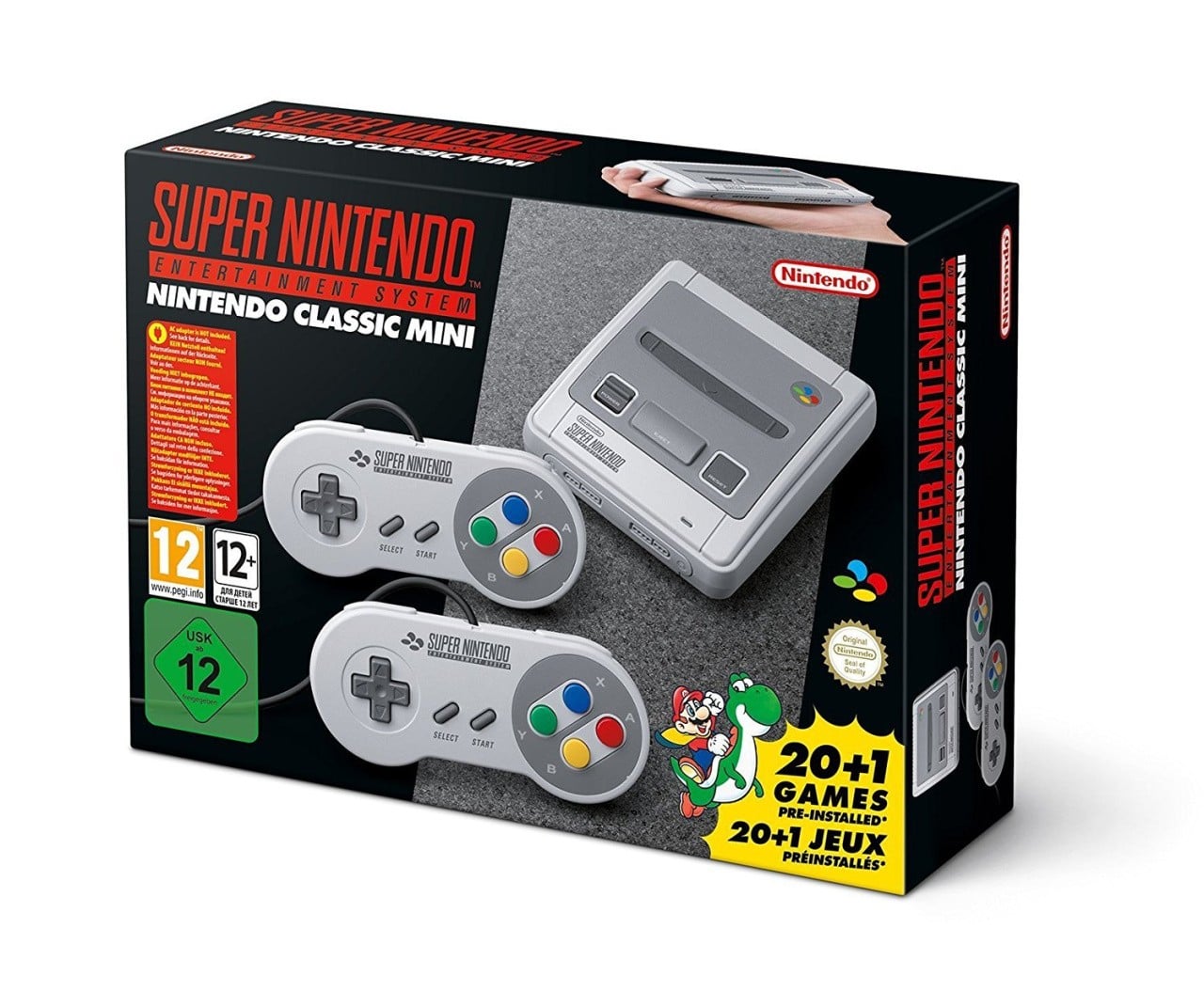 Image: Nintendo
Europe’s approach is similar, but also… not. We’ve still got the black/red colour scheme, but there are no specific games listed on the front. Instead, we’ve got a small bit of key art from Super Mario World in the bottom right. Minimal, but effective.
What on earth is going on with the age ratings, though? Why are they so big?! Ew, no… Not for us.
Japan
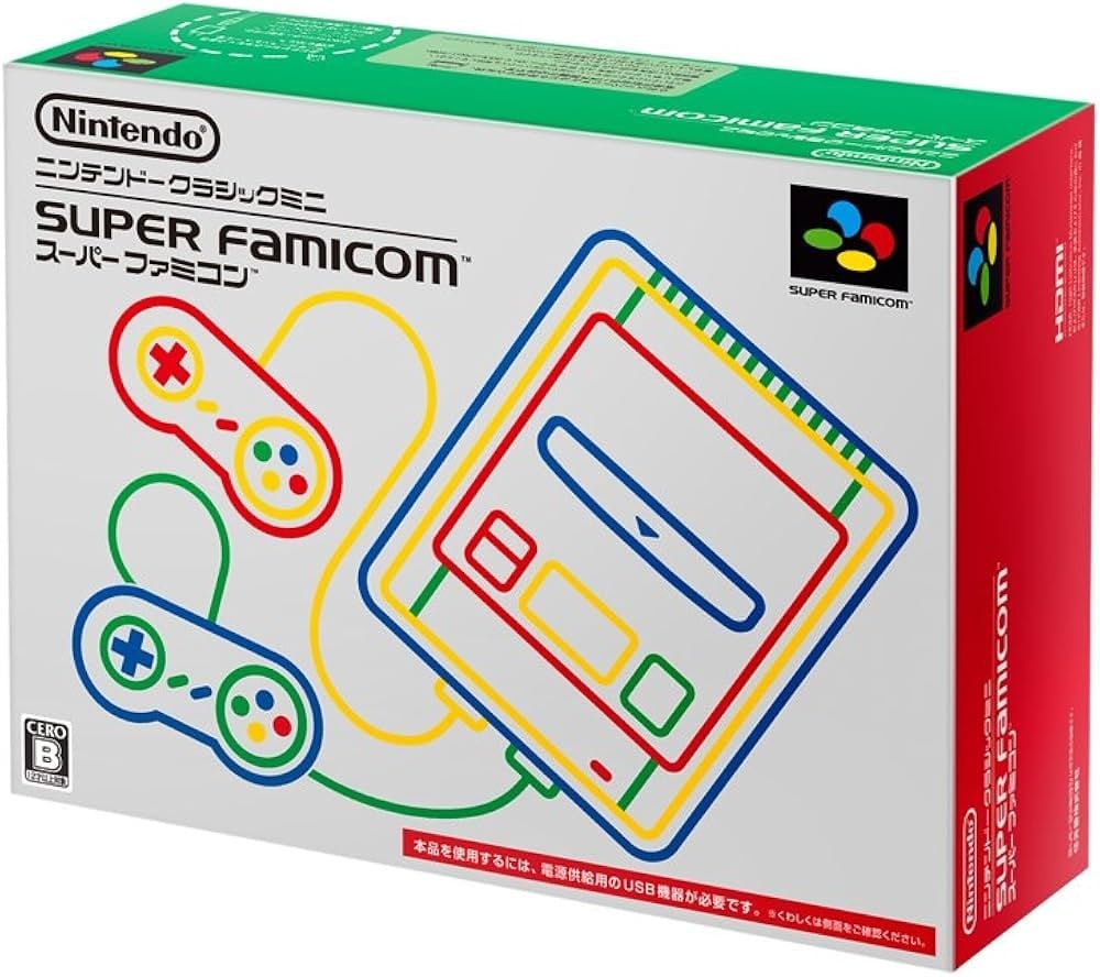 Image: Nintendo
Oooooh. Ooooooh. Okay, we’re trying not to be biased, but oooooooooh.
This one is really nice. If North America and Europe’s designs can be called cluttered, this is the absolute opposite. Instead, we’ve got a minimal approach that swaps out the black colour scheme for white, while the outlines depicting the console and controllers add a lovely bit of colour.
Which region got the best SNES Classic mini box art? (1,261 votes)
North America25%
Europe26%
Japan49%
Thanks for voting! We’ll see you next time for another Box Art Brawl.
Related Games
See Also