
So as to not compromise the carboot’s integrity and roots, its identity had to revolve around the culture and the everyday experiences of it’s communal environment. Bringing in these cues, and pushing them to the forefront, Studio Joe created a characterful and flexible system. Key elements are a simple logo based on a coin, “perfectly imperfect” hand-painted typography with “highlighter-style scribbles”, a sticker pack event info and callouts, alongside a stacked treatment of the coin visual motif. All of this is tied in with “witty and charming tone of voice,” Joe rounds off. One of these quips reads ‘trade your clutter for cold hard butter’, another reads, ‘Sunday service’.
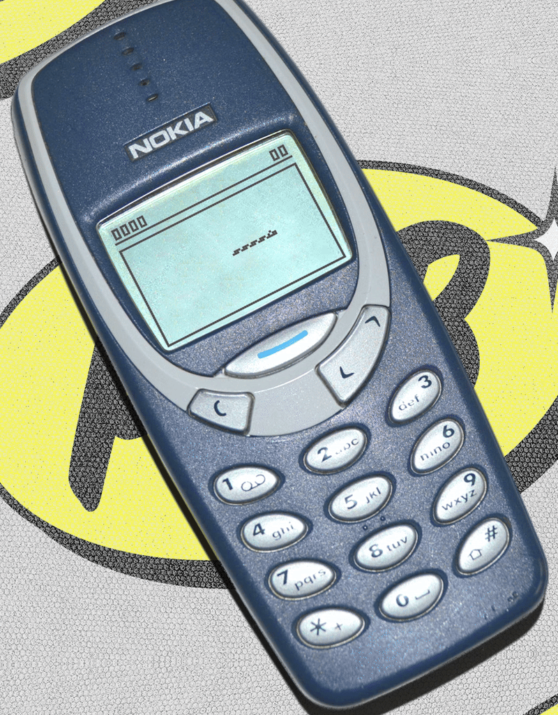
The nostalgic experience marries in with the importance of strong and snappy copy in Studio Joe’s work. Old market signage must convey key information quickly, like price listing and types of items, only communicating what’s necessary to that stall. Joe expands: “short, sharp characterful statements lead the way, leaving the rest of the system to fall into place.” Another key pillar of the analogue experience is harking to early tech. The coin motion draws its movement from the famous bouncing DVD logo and Nokia’s Snake.
Moving further down this route, Studio Joe’s choice to use Nokia imagery was deliberate. With the 90s aesthetic “more than just being on-trend,” the simple brick mobile represents how “the mobile phone changed everything – it was a lifeline to your people,” Joe says. Thos symbolism of connection is the running thread for Peckham Carboot’s new identity, taking customers through a timewarp, away from hyper-connection towards a simpler spirit of experiential connection. Why shop online when community is just down the road?