

As we plough on through December, it is the time for pro cycling teams to release their new kits for 2026. For some, this is the best part of the year, before the reality of racing gets involved, when we can just imagine how good the jerseys will look on the road.
Rather than writing up each team individually, we thought it would work better if we collated them together, unless someone does something mad. When all the kits are out, we can do our usual arbitrary evaluation of them too, so do look out for that. In this guide, we will cover all the WorldTour teams, and notable other squads, but not all, otherwise it will get a bit overwhelming, apart from particular exceptions.
You may like
Lidl-Trek
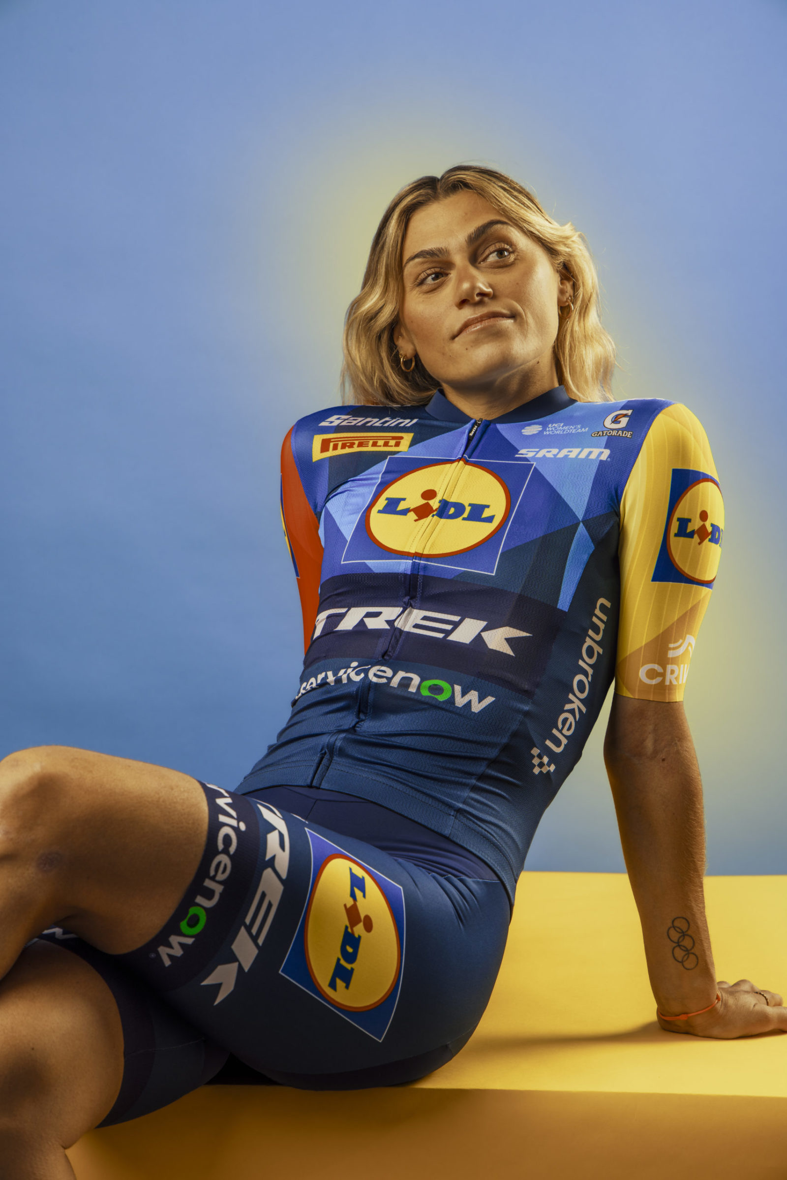
(Image credit: Lidl-Trek/Santini)
Lidl-Trek‘s kit is different. Definitely. There’s less red on the front, more blue, and there’s a new sponsor on the front, but it is, essentially, the same as last year. There’s nothing wrong with that! It’s a good kit! “Our favourite colours” is what the team said. Keep it simple. The men and women use the same kit, which is good.
The team say: “With a fresh twist on a fan-favorite design, Santini have delivered again with the 2026 Lidl-Trek kit. Pairing the ultimate fabrics with playful colours, the latest design delivers looks as well as performance.”
Decathlon CMA CGM
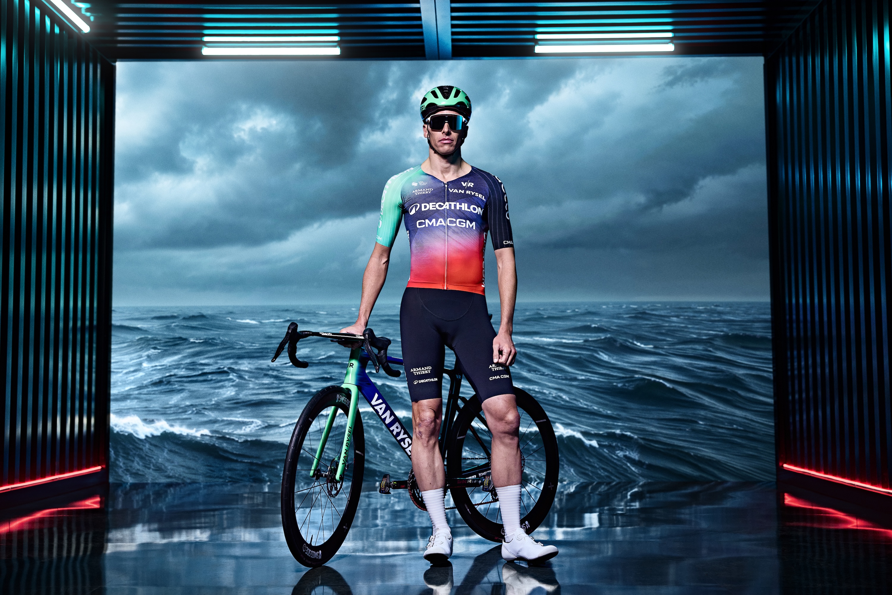
(Image credit: Van Rysel)
Sadly, there’s no exciting bumf to go with the new Decathlon CMA CGM kit, but with a new name comes a new colour – red. The brown shorts are sadly still in the dustbin of history, with new sponsors CMA CGM bringing the new colour. One sleeve is still teal (?) while the other is a lot darker, rather than the dark blue it was before.
Red Bull-Bora-hansgrohe

(Image credit: Red Bull Content Pool)
Now, Red Bull-Bora-hansgrohe‘s kit is yet to be officially announced, but seeing as all the riders in the plane stunt were wearing a new kit, let’s assume this is the new one for 2026. It’s a lot whiter than before, with royal blue sleeves, and less navy. It is similar to the special kit they used at the Tour de France this season.
You may like
SD Worx-Protime
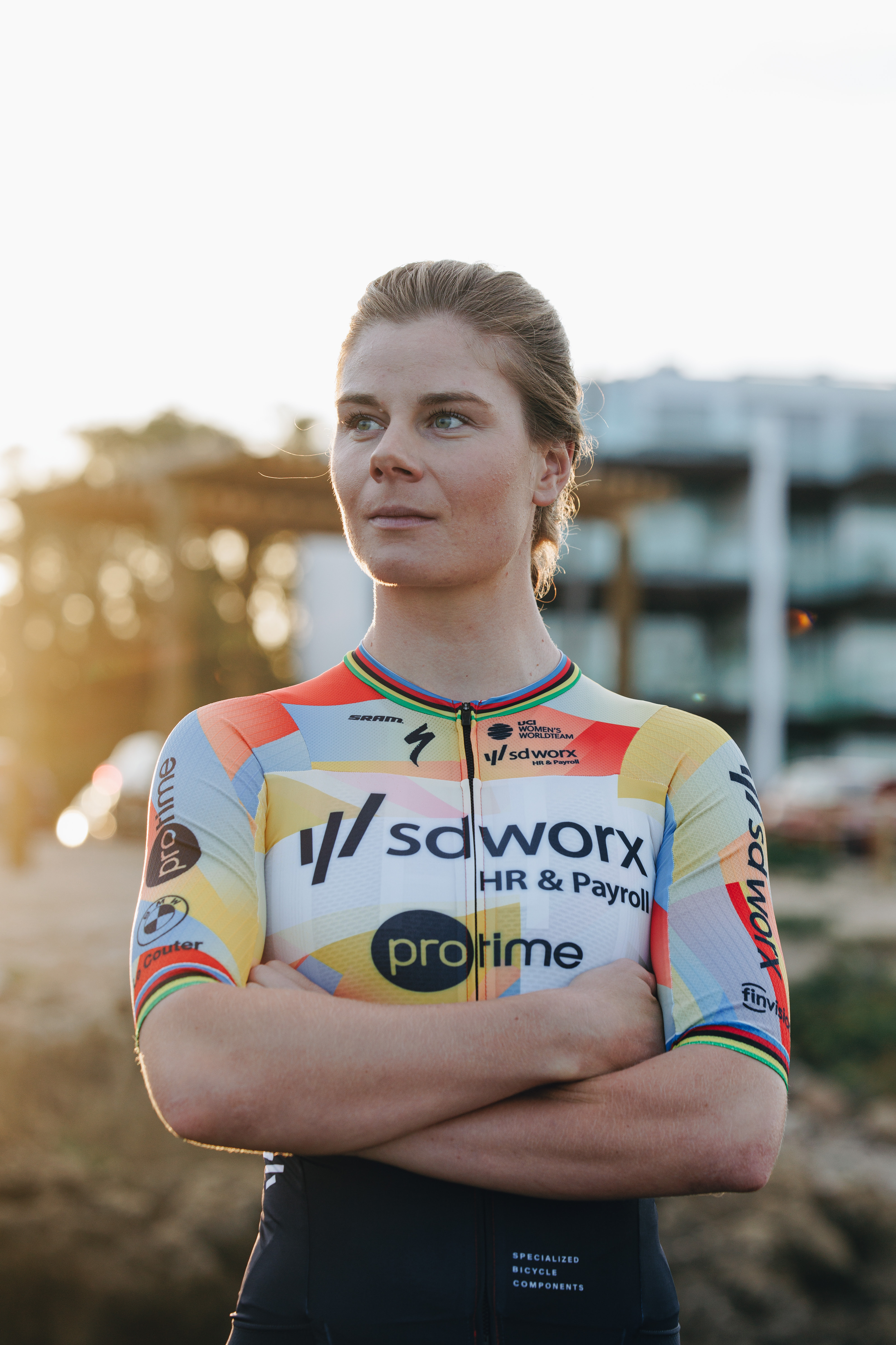
(Image credit: Specialized/Etienne Schoeman)
SD Worx-Protime have veered away from the purple and pinks of recent years, and instead will race in this primary colour-heavy jersey which is called “New Dawn”
It’s designed by Specialized, and is paired with black shorts. Notably, Lotte Kopecky will be racing in it, not longer being world, European, or Belgian champion, for once.
According to the press release: “The new jersey reflects the team’s and sponsors’ ongoing drive for innovation. Standing still is not an option – continuously reinventing ourselves in every aspect is a core value at SD Worx-Protime. The new design symbolises our rich history through the spark, now multiplied and displayed in various shades. This emphasises the team’s slogan: we spark success.”
NSN Cycling
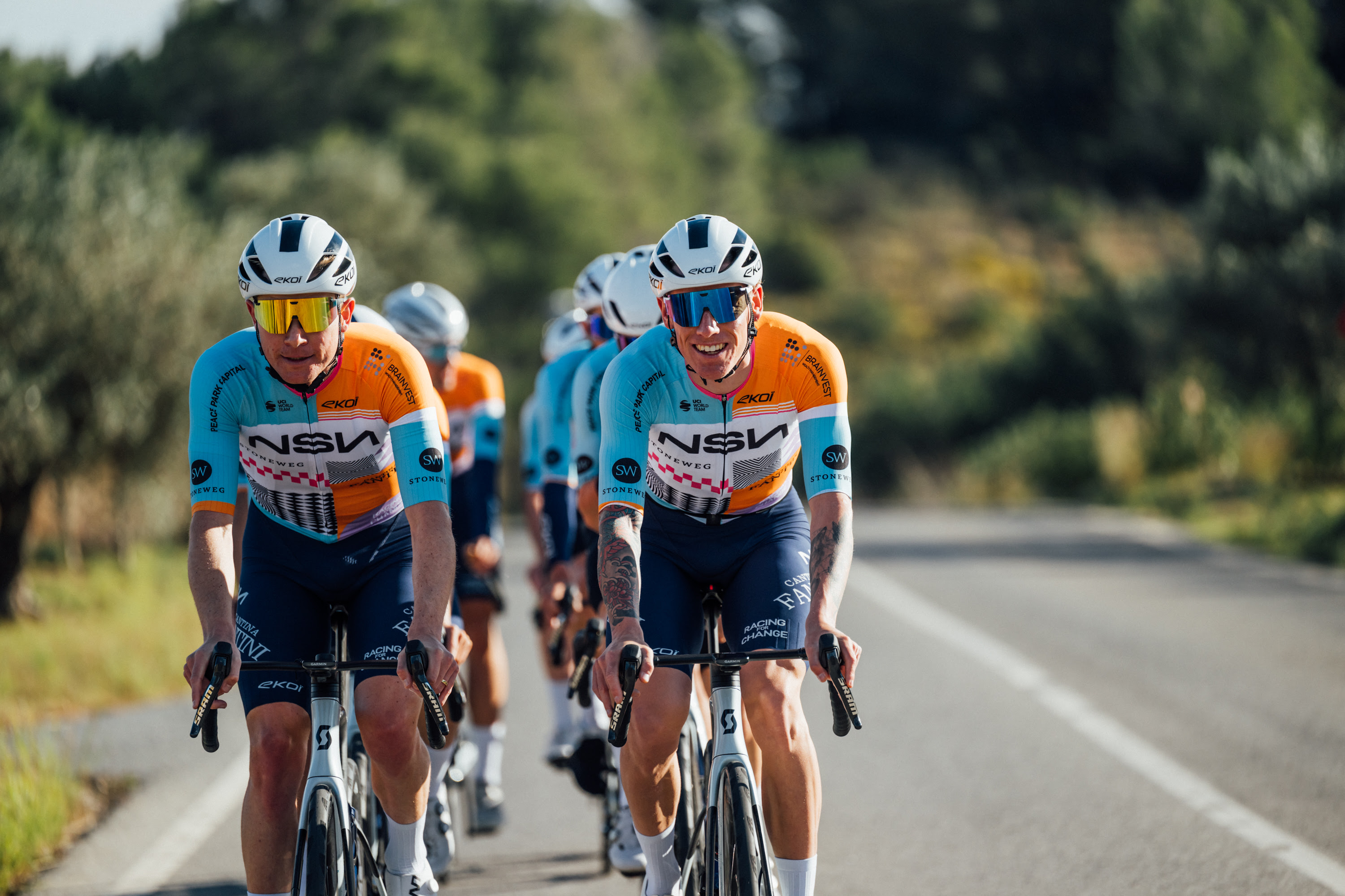
(Image credit: Chris Auld/NSN Cycling)
The team formerly known as Israel-Premier Tech have become NSN Cycling, and will be wearing a busy kit next season, with a base of sky blue and orange. The jury is out over whether this will be easy to notice or to lose in the peloton. They’re also riding Scott bikes now.
If you want to know why it looks like this, the press release says: “It’s designed by Stijn Dossche of stycle.design, is inspired by the Mediterranean city from which the team’s new identity has been forged.
“Its design blends geometry, colour blocks, and patterns reminiscent of contemporary Barcelona – a city that never stands still, where tradition meets modernity, where Mediterranean light becomes art, and movement becomes identity.”
Just in time for the Tour de France Grand Départ in July, then – that’s in Barça.
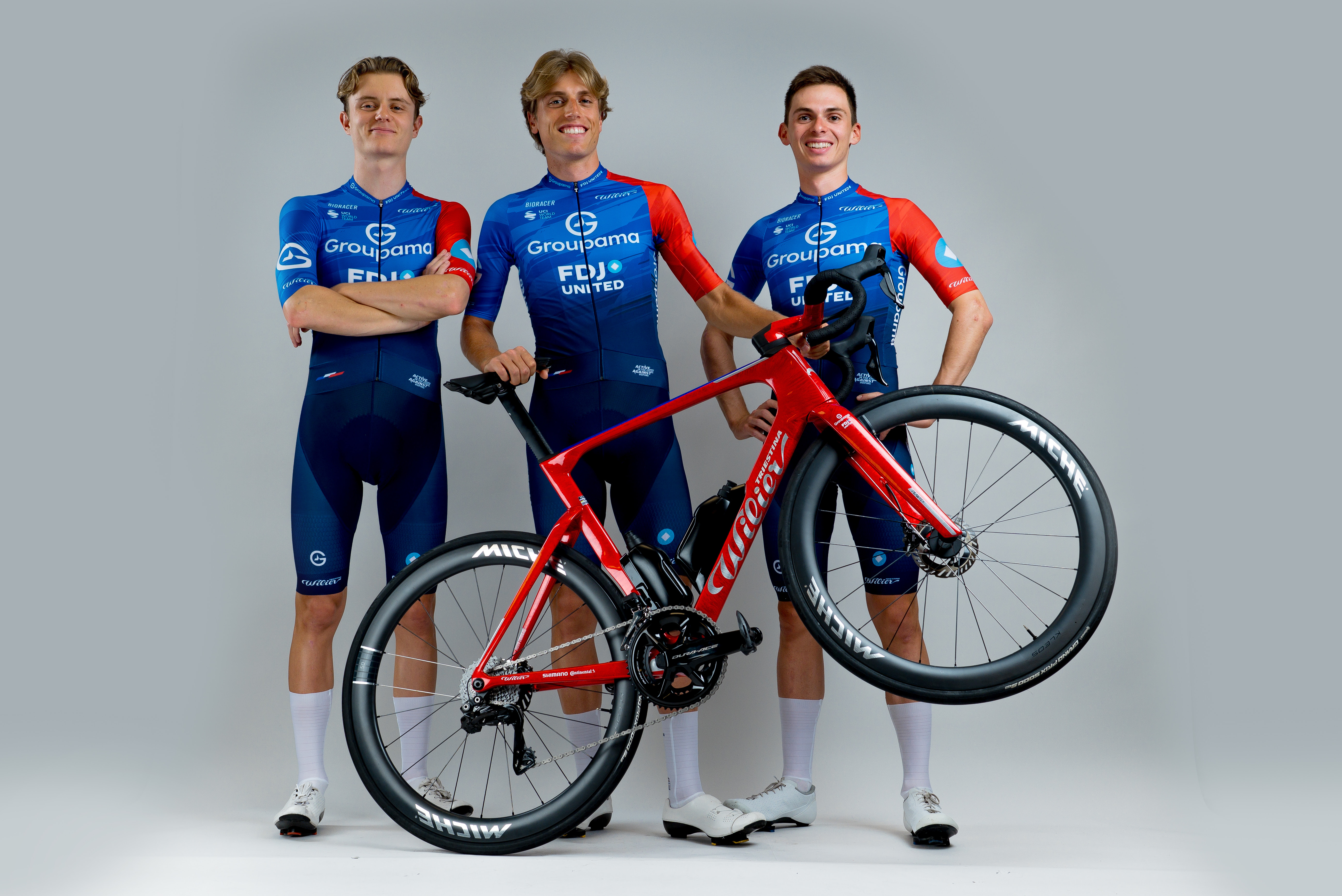
Groupama-FDJ United
(Image credit: Groupama-FDJ/Nicolas Götz)
Another new name, though less dramatic, is Groupama-FDJ United. The French stalwarts are slow to change their kits, normally, and the same is true next year. It’s the fetching number they wore at this year’s Tour, although it’s now made by Bioracer rather than Alé. Essentially, it’s royal blue with a red accent sleeve.
Cofidis
Cofidis are another French team barely changing their kit for 2026. The men’s and women’s teams, now both ProTeams, will use the same red and yellow jersey as this season, although the shades might have been slightly altered, and the sponsors have moved around a bit.