
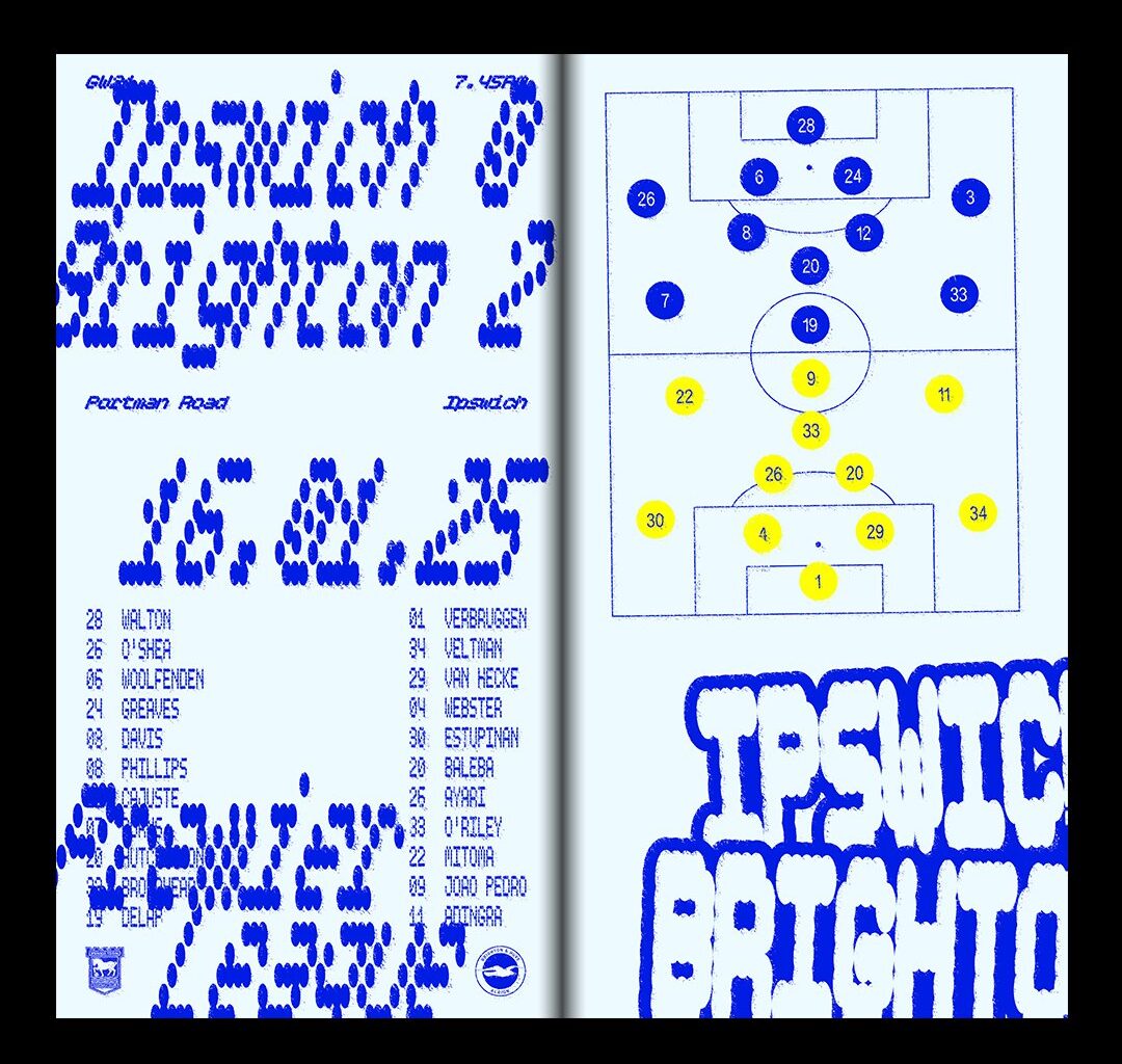
Each match was given a spread that documented the games line-up and results, with a layout that played homage to the visual culture of Brighton and the team they were playing. To align with his chosen club’s colours, Alfie kept the colour scheme of the publication to blue on white, but broke the flow up with cup matches being featured on a predominantly blue background. Structurally, most of the spreads feature the formations and pitch markings on one side with type on the other, although in some case Alfie let the typography supersede all other elements, like the spreads for Brighton’s match against Leicester and Ipswich, the latter of which sees the starting line-up taken over by a big bubbly type. While some of the typefaces take inspiration from the games themselves – like the LED screens or stadium typography – many come from Alfie’s hefty type bank that he’s built up over the years. “Some I’ve never had the chance to use, or some are from projects that didn’t make the cut,” he says, “so this project was a great excuse to have a play with typefaces that I really admire.”
For Alfie, the spreads that work best are the ones that take direct inspiration from the rival team. Some are quite direct fits, like his use of Johnston (the typeface used for London Underground system) for their match against Fulham, and a charming cursive font for the match against Bournemouth – a fellow seaside town – to mimic the feel of a nostalgic holiday postcard. Some spreads take things one step further, reflecting Alfie’s experience of the match. For the teams match against Newcastle, “the furthest journey of the season”, Alfie used Margaret Calvert’s iconic road signage as a symbol of the slog.
As the project was just for his own joy and appreciation, Alfie really made use of his creative licence. “For the away loss against Crystal Palace (every Brighton fan’s worst nightmare), I intentionally used a typeface that’s difficult to read, so I wouldn’t have to be reminded of the result!” For Alfie’s sake, let’s hope next season he doesn’t have to use any more illegible lettering.