

Back in December, Utah launched a logo for the 2034 Winter Olympics, to a mix of praise and criticism from design fans. With the Milano Cortina 2026 games in full swing, the controversial design has recirculated, this time with a much warmer reception.
Unapologetically bold, the Utah 2034 logo is understandably divisive. There’s no formula for creating the best sports logos, and in a sea of corporate design, Utah’s unique stylistic choice is a refreshing take on the trends, proving that breaking convention can be a winning move.

(Image credit: Utah 2034)
Featuring an abstract, angular typeface finished with soft corners, the Utah 2034 logo embodies the natural shapes found in the state’s geography and iconic petroglyphs. The design was created to unite the diverse communities across the state, but the state’s Governor, Spencer Cox, has admitted that the logo wasn’t initially well received, claiming in a recent press conference that “It’s really brought people together because everyone seems to not like it.”
You may like
Despite its frosty reception at first, design fans on Reddit have warmed to the divisive look. “I like it, I know a lot of people hate it, but to me it represents the state’s iconic landscape,” one user wrote, adding “it’s certainly not as generic as other Olympic city logos in the past.”
Another chimed in writing, “I love it – retro but futuristic,” while one user praised its practicality. “It fits in clean equal-width blocks for characters, and UTAH and 2024 can stack vertically to maintain a clean, simple box, too. This makes it practical for collages and digital use surrounded by advertisements and event photos. The unusual typography keeps it significant amidst geometric picture and video elements,” they explain.
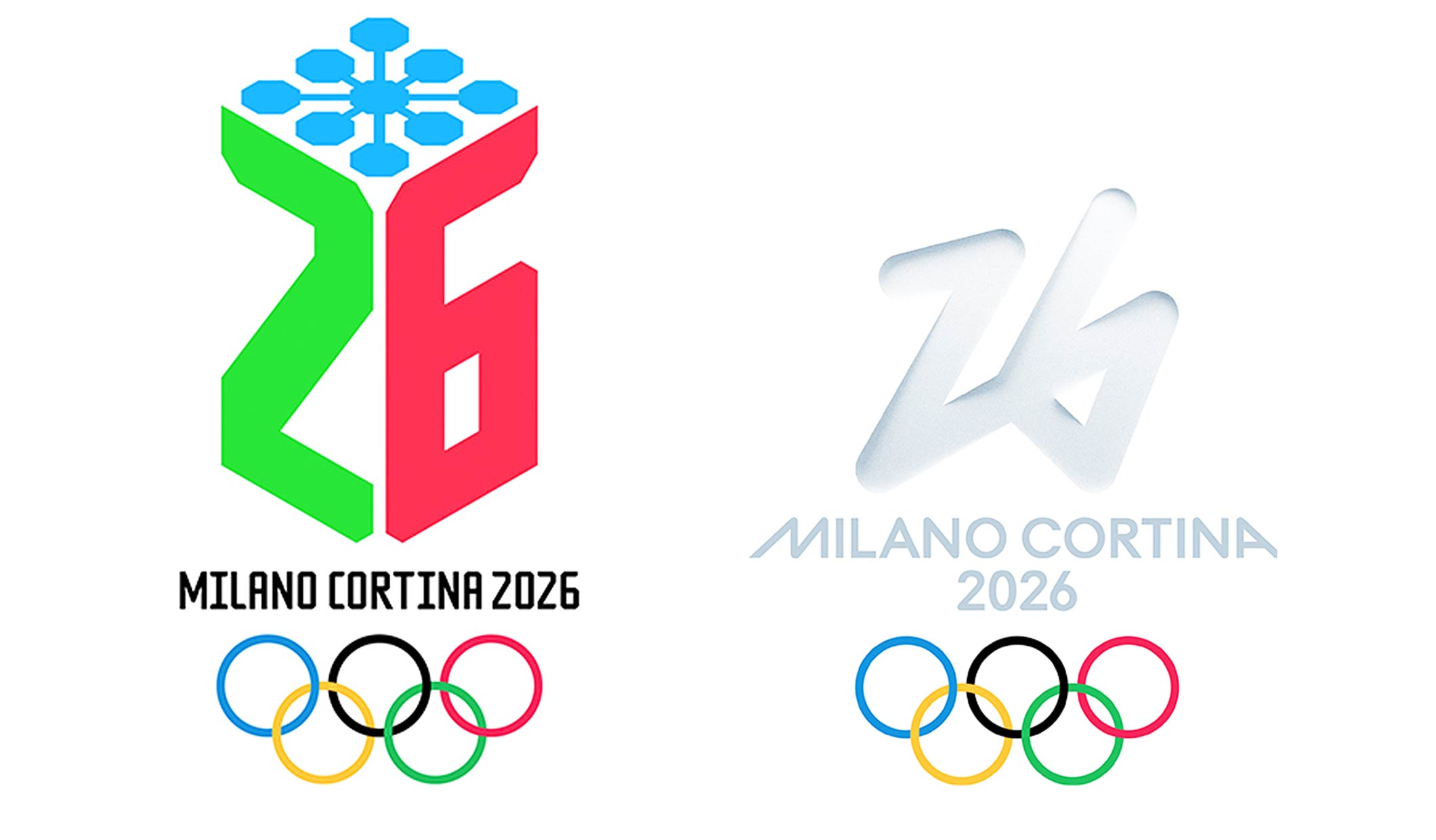
Utah’s logo is a stark contrast to the current dynamic logo of Milano Cortina 2026. (Image credit: Milano Cortina 2026)
If you’re still feeling a bit cold towards the design, I have good news. This Utah 2034 logo is a transitional design, holding space for the official logo set to launch in 2029. With such divided discourse around this initial design, I’m intrigued to see how the identity will evolve.
For more design inspiration, check out how the look of the Olympic Winter Games Milano Cortina 2026 was created or take a look at the Milano Cortina 2026 Olympic and Paralympic posters