
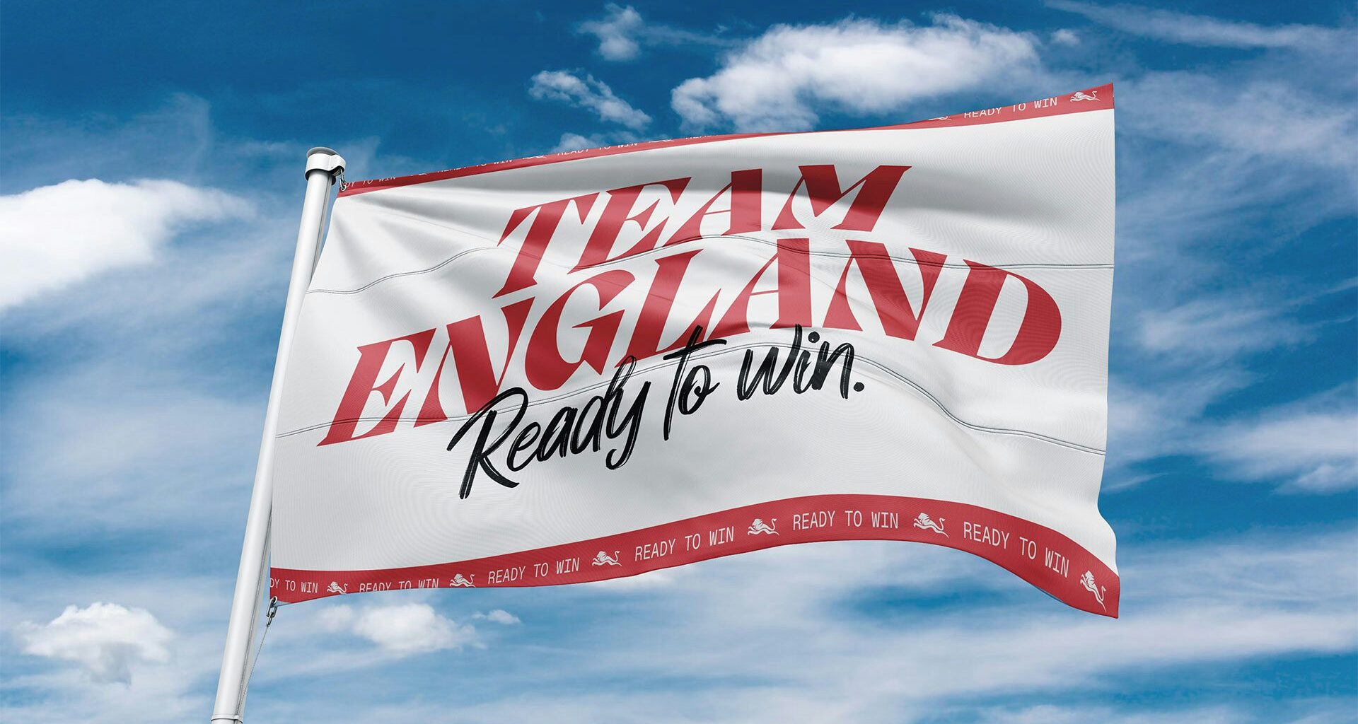
Having rebranded Team England for the 2026 Commonwealth Games, Form’s Alex Andlaw reflects on the challenge of working with a contested symbol
Two intersecting red lines on a white background. For a flag so simple in its form, the St George’s Cross carries a heck of a lot of baggage. In theory, it should be one of the world’s most straightforward national symbols. Yet domestically, it has become fiercely contested: at once a marker of pride and belonging, and, for some, an emblem burdened by increasingly fraught political and cultural associations.
Considering its current status, not to mention its enduring colonial overtones, the St George’s Cross poses a particularly tricky challenge for designers. Chiefly, if the flag is a mandatory part of your design brief, how do you repurpose it without slipping into cliché, nostalgia or something more insidious? And what responsibility do designers have to acknowledge the various conflicting interpretations such symbols accrue over time?
Those questions sit at the heart of Form Brands Studio’s work for Team England ahead of the 2026 Commonwealth Games in Glasgow. The London-based creative studio was tasked with creating a new campaign identity, recently launched under the banner Ready to Win, that would inspire athletes, staff and supporters alike while navigating what Englishness means today.
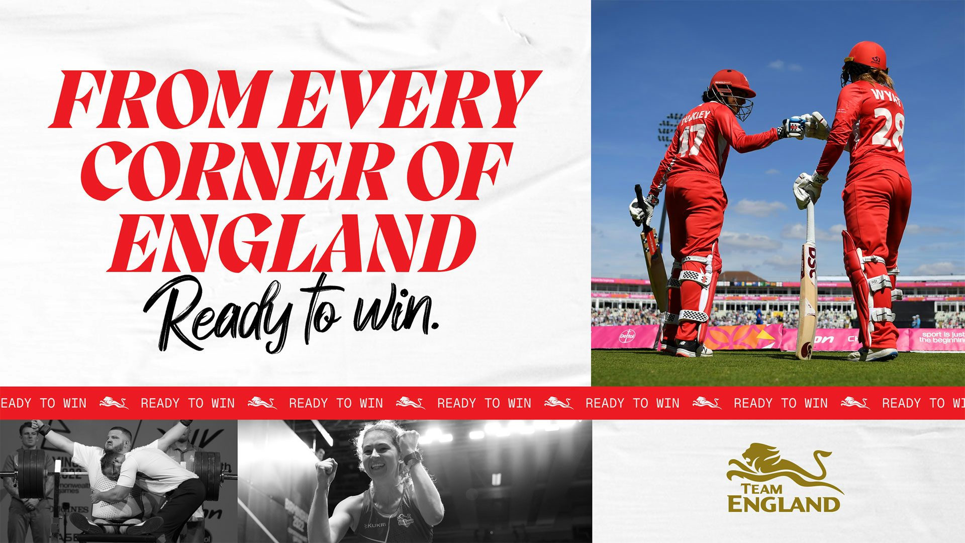 All images: Form / Team England
Sign in