
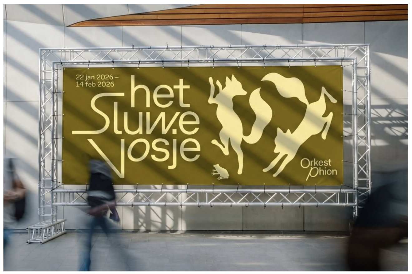
The decision to use typography came from the fact that while orchestras tend to have a permanent home, Phion Symphony Orchestra is a travelling ensemble. The group has no base or a recognisable building, so the design studio saw a need for something other than place or architecture to ground its identity. “We chose to make music the foundation,” explains Falco. “Phion needed a visual system they could expand with every concert, so they’d remain recognisable to their audiences while still giving each show a unique image.”
The appeal of GT Planar is that it can be played with for each concert, slanted in different directions to evoke the mood of the performances. “It always starts with the music, not the layout,” says Falco, referencing a series of animations that illustrates the system’s full potential. “Before we design anything, we ask what the piece feels like – calm or restless? Does it build slowly or hit you right away? A restless piece bends the letters hard and breaks the word apart; a calm piece stays open and quiet,” Falco explains.
In that sense, the identity truly does embody the conductor’s baton – expressive, precise, and capable of holding everything together in single strokes.