
It’s Día del Nuevo Uniforme in San Diego.
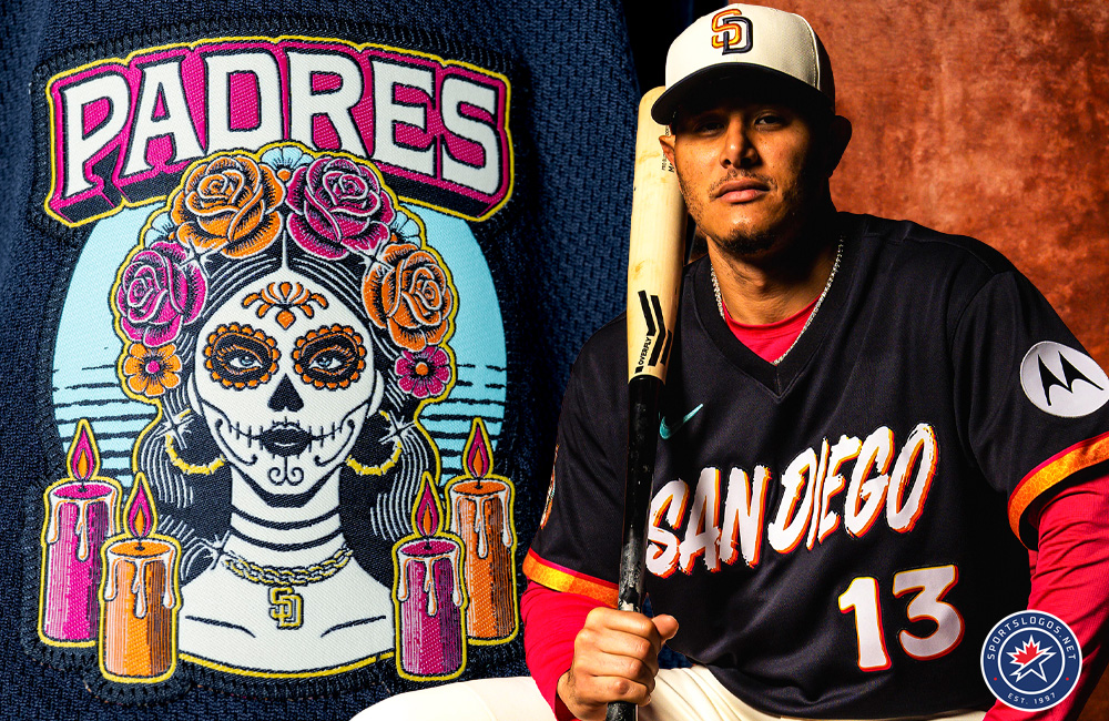
This morning, the San Diego Padres unveiled a new City Connect uniform that, like its predecessor, focuses on its unique binational region, culture, traditions, coastline, sunsets, and families, this time all through a much darker overall look.
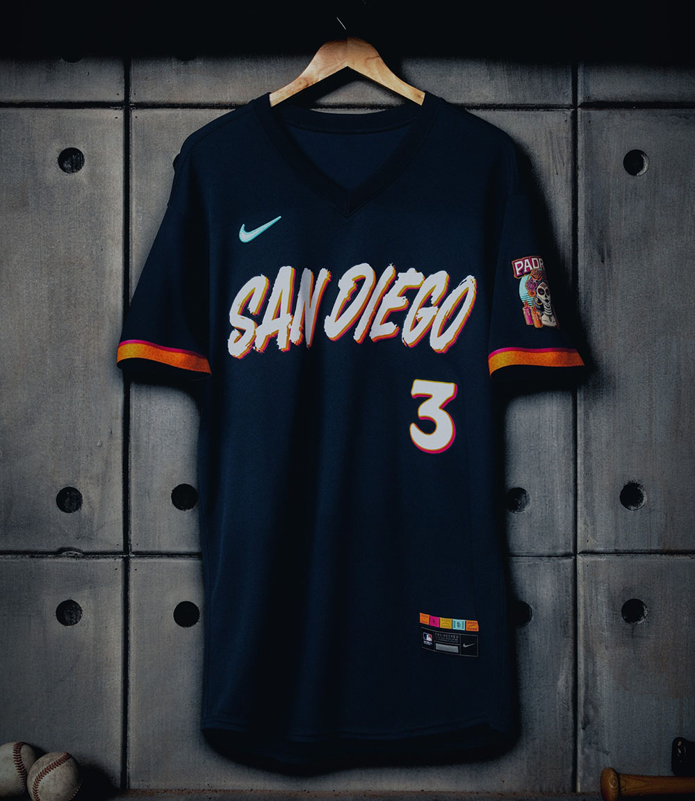
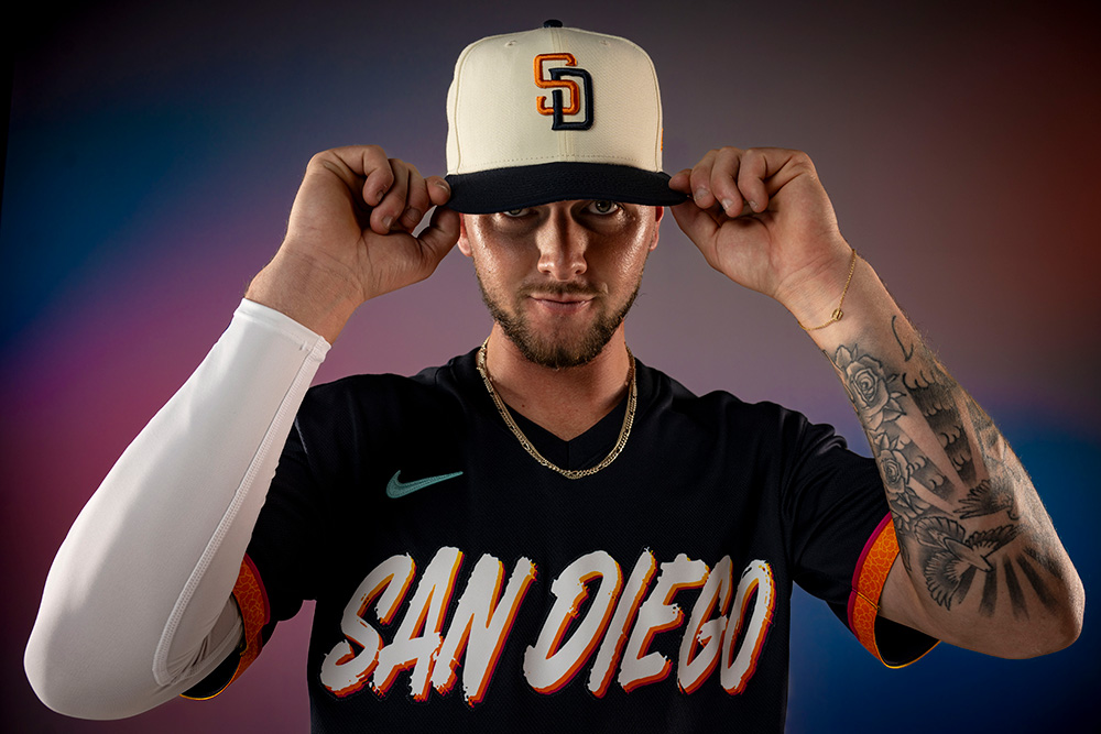
The new set does away with the over-the-top brightness of the old set. Instead, it presents an obsidian blue jersey with bone-coloured pants, a bone-and-obsidian cap, a recoloured “SAN DIEGO” wordmark across the chest, and bright accents in marigold, aqua, fireberry, and Padres gold.

SHOP: San Diego Padres new 2026 City Connect caps and jerseys available now!
The updated “SAN DIEGO” wordmark now sits in white with an orange dropshadow in a style that’s very close to what was worn with the previous City Connect set. According to the notes we received from the team, the wordmark draws its inspiration from the shared coastline, local sunsets, and the overall active lifestyle of the region. The player’s number sits to the lower left of this wordmark in the same colours and font.
Certainly, the most prominent new addition to this uniform is the sleeve patch. The Padres have gone with a La Catrina design tied to Día de los Muertos, showing a skeletal female figure wearing a floral crown, surrounded by four ofrenda candles and set against an aqua Pacific Ocean backdrop. The club says the patch is meant to honour traditions, families, and loved ones remembered through the Día de los Muertos holiday.
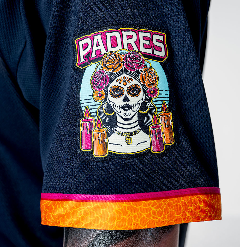
That same theme continues through the orange striping at the end of each sleeve and down the side of the bone-coloured pants, where a bright, thin pink stripe joins a sublimated marigold pattern. The marigold, according to the Padres, was selected for its close connection to Día de los Muertos and its symbolism of joy and the beauty of life.
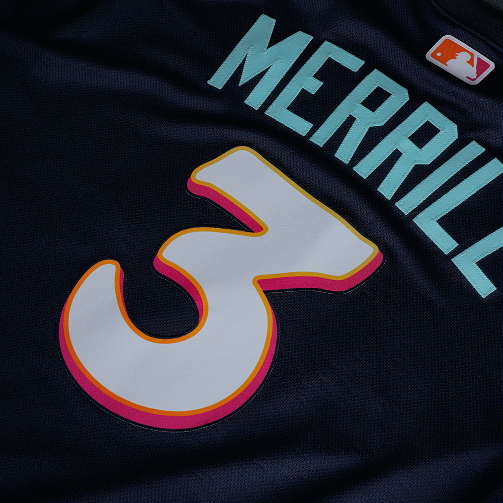
On the back of the jersey, the player’s number follows the same style as the number on the front – white with a pink dropshadow and orange outline. The player’s name is arched above in a block light blue typeface, the MLB logo above all that in an orange/white/pink colourway.
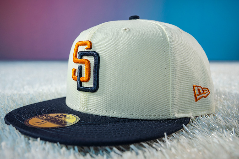
The cap features a bone crown, obsidian bill and button, and an interlocking “SD” on the front in orange and blue, a tribute to the caps worn by the 1998 National League champion Padres. At the time of writing this, I’d yet to see a photo of this, but the team told me that inside the cap is a floral pattern which serves as “a nod to one of the greatest teams in franchise history” as well as “Padres legends taken too soon.”
![]()
Down at the jock tag, we see “Papel picado” styling along with a fun little timeline of Padres logos throughout the club’s history in orange, pink, yellow, and blue.
Like the first Padres City Connect set, this one focuses on the broader binational region as much as the city itself. The difference this time is in the presentation. The louder beachy palette of the original has been pulled back and replaced by something darker, heavier. A little more ornate, with the Día de los Muertos elements brought much more clearly to the forefront of the design.
SHOP: San Diego Padres new 2026 City Connect caps and jerseys available now!

The Padres will debut this new set tomorrow night against the Colorado Rockies and then wear it for every Friday home game throughout the 2026 season.
Padres 2026 City Connect Uniform Schedule:
April 10 vs Colorado Rockies
May 1 vs Chicago White Sox
May 8 vs St Louis Cardinals
May 22 vs Athletics
June 5 vs New York Mets
June 26 vs Los Angeles Dodgers
July 10 vs Toronto Blue Jays
July 31 vs San Francisco Giants
August 7 vs Houston Astros
August 21 vs Minnesota Twins
September 4 vs New York Yankees
September 18 vs Miami Marlins
September 25 vs Arizona Diamondbacks
Click through for the full stories on the Atlanta Braves, Baltimore Orioles, Cincinnati Reds, Kansas City Royals, Milwaukee Brewers, Pittsburgh Pirates, San Diego Padres, and Texas Rangers.