
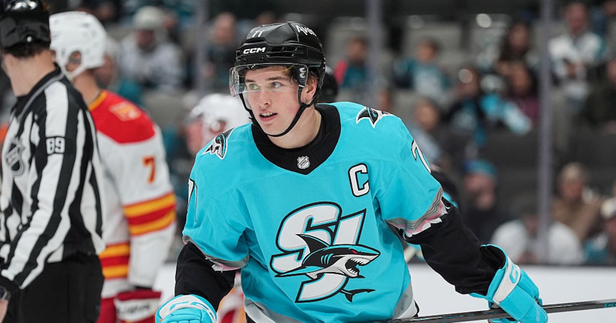
The Ducks and Sharks are drawing positive reviews for their Hometown Remix jerseys, while the Blackhawks are not the only Original Six team to face criticism. SPORTSNET’s David Morassutti ranked the Ducks atop his list and wrote it is hard not to put those jerseys at No. 1 “when they’re bringing back so much nostalgia from the Mighty Ducks era.” The combination of green, purple and gold “immediately transports you back to the 1990s” (SPORTSNET.ca, 11/2). THE SCORE’s Sean O’Leary wrote the Ducks jerseys will “strike a nostalgic chord for a whole generation of hockey fans who grew up with Charlie Conway and the District 5 Mighty Ducks” (THESCORE.com, 11/2). DAILY FACEOFF’s Tyler Kuehl wrote if you “don’t like the Ducks’ remixes…then clearly you don’t love hockey.” He added going “all out with the green and gold from the first Mighty Ducks film absolutely checks all the boxes” (DAILY FACEOFF, 11/2).
SHARKS ATTACK: DAILY FACEOFF’s Kyle Morton likes the Sharks jersey and wrote, “This is an unserious concept as a whole, and including the gums and teeth on the sleeves is the exact correct amount of whimsy to throw into one of these looks.” Morton: “I like the ‘SJ’ wordmark and this new version of the logo” (DAILY FACEOFF, 11/2). USA TODAY’s Mike Brehm wrote the Sharks have the best jersey, as the new shark logo “looks more menacing than the regular logo.” It is “not biting a stick and it’s popping through the letters SJ” (USA TODAY, 11/2).
PENGUINS ARE MARCHING: ESPN.com’s Greg Wyshynski ranked the Penguins No. 1, writing that if the “primary ethos of the Hometown Remix project is to connect the jersey to the city, then Pittsburgh gets enormous credit for doing it without relying on … architecture or weather phenomena.” Wyshynski: “It doesn’t mine franchise history for an obscure look from which to draw; it’s reimagining the team’s primary logo for the better part of 55 years, although it nods to previous team color schemes, too” (ESPN.com, 11/2).
TOO STUCK ON TRADITION: In Vancouver, Paul Chapman wrote one thing to come out of this project is that the NHL is “terrified of doing anything creative with an original six team,” as most of those jerseys feature “just the regular concepts barely touched.” Chapman: “If MLB can produce Yankees hats in different colours, the Leafs can do more than just putting a different old-timey leaf on a white jersey.” He noted there were “some real eye-catchers in there,” pointing out the Penguins, Sharks, Ducks and Panthers (Vancouver PROVINCE, 11/2). In Utah, Brogan Houston ranked the Red Wings last, noting they had the opportunity to do “something different.” Adding the “word ‘HockeyTown’ doesn’t constitute ‘different” (DESERET NEWS, 11/2). DAILY FACEOFF’s Steven Ellis: “What the heck was Montreal thinking there? I don’t love the all-white look, and I have a few of their white jerseys. I just wish the logo had some actual color there” (DAILY FACEOFF, 11/2).
GOING BACK FOR SECONDS: In Tampa, Eduardo Encina noted the Lightning basically brought back the same “pirate skull patch logo” from February’s Stadium Series game with just a “subtle tweak.” The Hometown Remix jersey “pays homage to the Lightning’s history while also recognizing Tampa Bay and continuing the Gasparilla theme that the league leaned into heavily for the Stadium Series game” (TAMPA BAY TIMES, 11/2).