
A team of 20 designers turned to the exuberant, ephemeral natural world and to the grittier L.A. street scenes as inspiration for the look of the 2028 Olympic Games in Los Angeles.
You’re reading the Essential California newsletter
Sign up to start every day with California’s most important stories.
By continuing, you agree to our Terms of Service, which include arbitration and a class action waiver. You agree that we and our third-party vendors may collect and use your information, including through cookies, pixels and similar technologies, for the purposes set forth in our Privacy Policy such as personalizing your experience and ads.
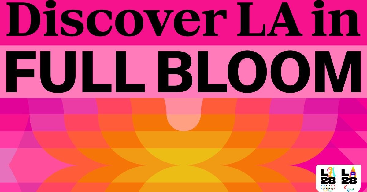
LA28 organizers unveiled the initial results Monday — a “superbloom” of vibrant and playful colors, meant to evoke a spring awakening and the city’s official flower, the bird of paradise, along with typography inspired by mini-malls and street artists. Come the summer of 2028, that look will cover everything from street signs and Olympic venues to T-shirts, billboards and the (still unidentified) mascot for the Games.
The designers chose an array of bright, sun-soaked colors — ranging from a “sagebrush” green to a “poppy” (like the state flower) to an almost periwinkle “bluebell” to a magenta-ish “scarlet flax.” They also unveiled a larger rainbow of colors linking those signature hues, an approach they said will allow a “revolutionary” array of options, as the Games’ design continues to be refined.
“We put a lot of pressure on our team to create something that is not only beautiful and transmits the energy of the city,” but also allows maximum flexibility, said Ric Edwards, executive design director for LA28. He said the prism of colors is supple enough to appear on anything from a rugby ball to the exterior of an arena.
An early rollout to the Olympic colors and designs 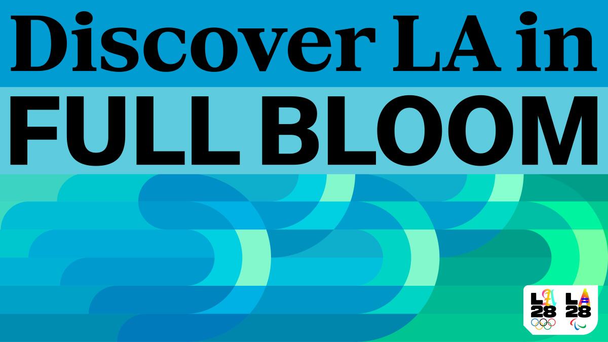
The visual identity of the LA28 Olympic and Paralympic Games, rooted in one of nature’s most spectacular phenomena, the California superbloom, will showcase the region in a bold and colorful way, say designers for LA28.
(LA28)
Edwards and Geoff Engelhardt, LA28 head of brand design, showed the media images of the colors and typography modeled on the sides of buildings, parking structures, a diving platform and a crowd-control barrier alongside road racers. The Olympic torch, cauldron and LA28’s mascot will also be outfitted in the signature colors.
Organizers have emphasized early preparation for all facets of the Games. Monday’s rollout comes more than two years before the July 2028 opening ceremony. They said the designs will continue to be refined up until the Games. (In 1984, L.A.’s “avant-garde” pastels, as the L.A. Times described them, made their debut just five months prior to the march of the athletes into the Memorial Coliseum.)
The designers said the three new typefaces they presented had been inspired by L.A. street scenes. Monday’s rollout came after two years of preparation. LA28 officials did not say how much they spent on the work, which was also informed by the Culver City-based design studio Koto.
How the ’28 Olympic colors recall the 1984 Summer Games’ design
The bright color scheme will remind some people of the vivid pastels that drew mostly rave reviews when they covered streets and venues for the 1984 Summer Games in Los Angeles.
Museum retrospectives celebrated the look and praised Deborah Sussman, one of the lead designers, for not being captive to the U.S.A.’s traditional red-white-and-blue palette. At the time of a 2014 retrospective, L.A. Times critic Christopher Hawthorne wrote that L.A. triumphed in 1984 by “celebrating rather than trying to disguise the ephemeral, even beautifully fragile quality of the built environment in Los Angeles.”
Sean Adams, dean of visual arts and communication at Art Center in Pasadena, was a student during the ‘84 Games and recalled how the Olympic design that year “transformed the idea of Los Angeles ….grimy, car washes, mini-malls, crime, and lost glamour to energetic, cutting edge, vibrant, and most importantly, Pacific Rim oriented.”
“I applaud the vibrant tone of the ‘28 Olympics. Bright is always better than funereal,” Adams wrote in an email to The Times. “I connect the idea of the bloom to the energy of the city and its diverse cultures and people.”
Expect ‘cascading waves of color’
Although Adams and another designer, Maureen Erbe of South Pasadena, voiced support for the newest Olympic color scheme, they weren’t as fond of LA28’s typographic concept. It’s “a bit of a mystery to me,” said Adams, while Erbe said the typefaces “feel arbitrary, with no apparent significance to the choices.”
But both emphasized how design progresses and said they look forward to seeing how the type evolves and is applied. Both said they are rooting for the LA28 designers. Said Erbe: “I can’t wait to see this explode across our city’s landscape, in cascading waves of color.”
Today’s top stories 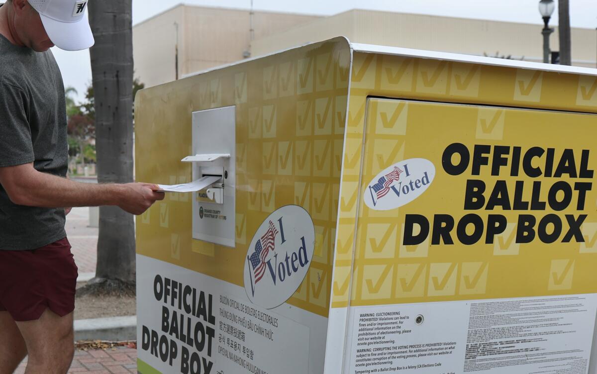
Californians may be forced to put their ballots in the mail well before election day to be certain they will be counted.
(Allen J. Schaben / Los Angeles Times)
Californians may need to mail ballots earlyThat’s the likely outcome of a Republican challenge to mail ballots that came before the Supreme Court on Monday.The court’s six conservatives sounded ready to rule that federal law requires that ballots must be received by election day if they are to be counted as legal.Iran called Trump’s claim of negotiations ‘fake news’President Trump and Iranian officials gave conflicting statements Monday about a possible deal to end the war.Trump extended a deadline he’d set for bombing Iranian power plants and claimed negotiations were underway, while Iran denied having any dialogue with Trump officials.Data centers are under scrutiny by California lawmakersA proposed data center in Imperial County has triggered fierce community opposition, with residents fearing impacts on air quality and rising utility bills.The facility received an exemption from environmental review, leaving residents without answers about health hazards as California lawmakers debate regulating AI data centers.What else is going onCommentary and opinionsThis morning’s must-readOther must-readsFor your downtime 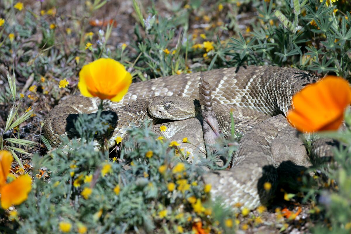
A visitor to a Lancaster flower field came across this rattler.
(Raul Roa / Los Angeles Times)
Going outStaying inA question for you: What is the best place to see wildflower blooms in California? Send us pics!
Email us at essentialcalifornia@latimes.com, and your response might appear in the newsletter this week.
And finally … your photo of the day 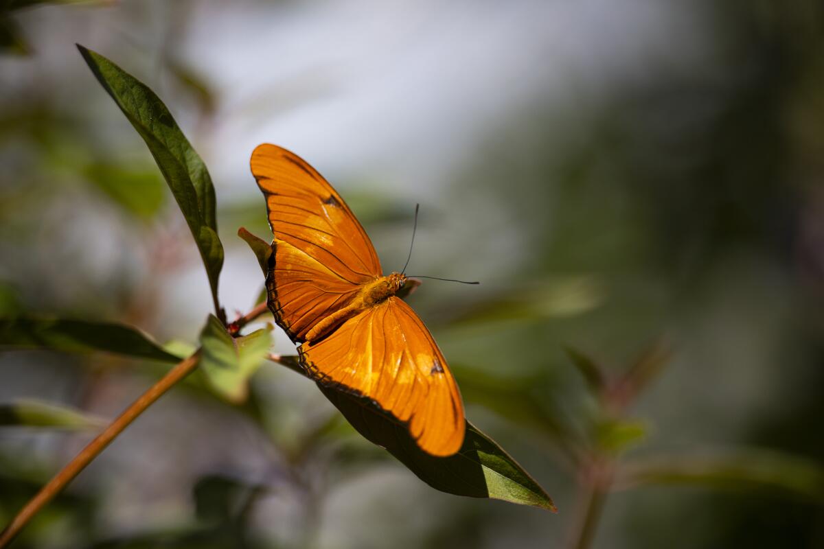
A Julia Longing butterfly sits on a leaf during the “Butterfly Pavilion” outdoor exhibition at the Natural History Museum in Los Angeles.
(Kayla Bartkowski / Los Angeles Times)
Today’s great photo is from Times photographer Kayla Bartkowski at the Natural History Museum’s Butterfly Pavilion.
Have a great day, from the Essential California team
Jim Rainey, staff reporter
Hugo Martín, assistant editor, fast break desk
Kevinisha Walker, multiplatform editor
Andrew Campa, weekend writer
Karim Doumar, head of newsletters
How can we make this newsletter more useful? Send comments to essentialcalifornia@latimes.com. Check our top stories, topics and the latest articles on latimes.com.