
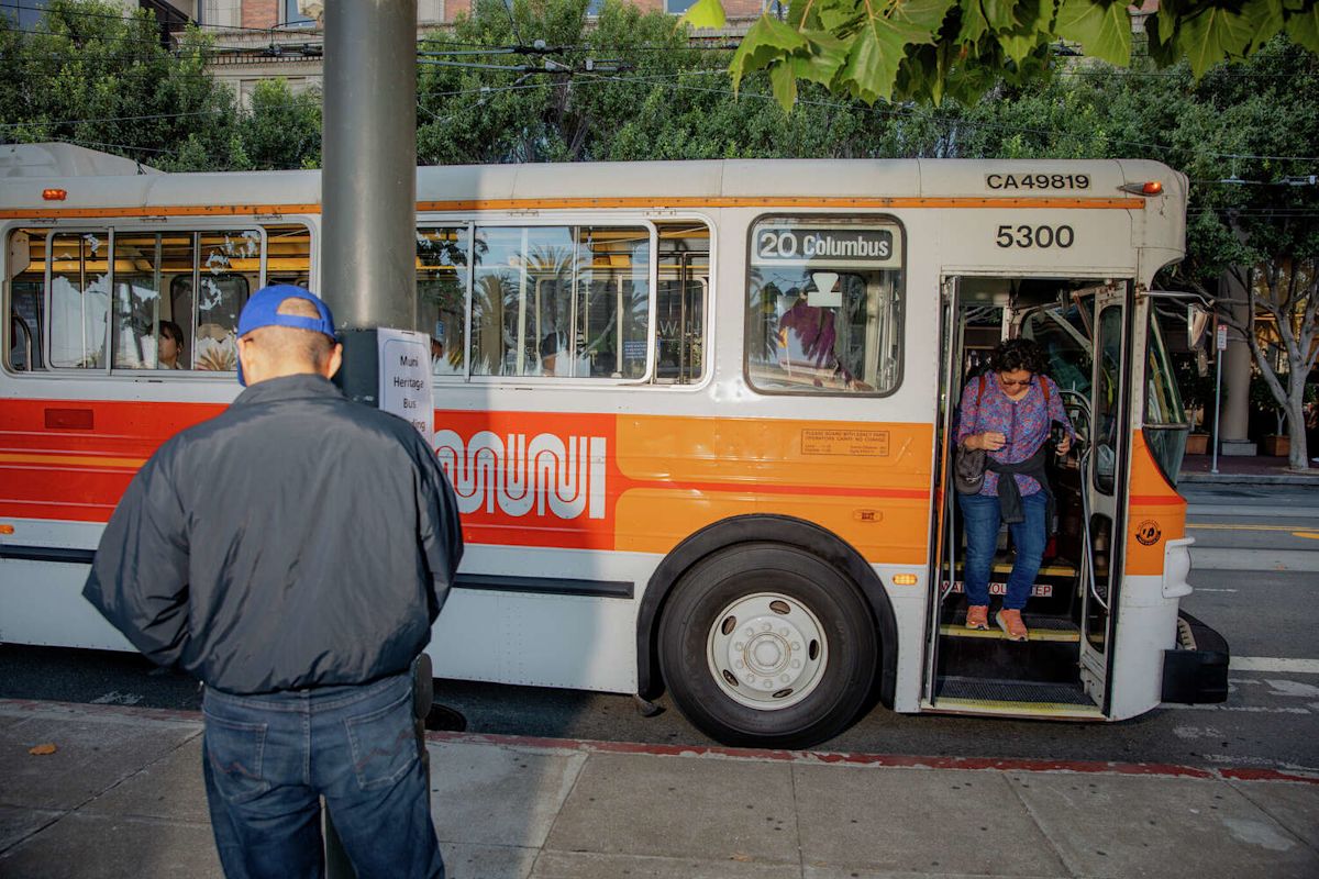
It was 1974, and news broke in the Chronicle that industrial design titan Walter Landor had been hired to rebrand Muni. Landor’s namesake San Francisco firm designed logos for Wells Fargo, Shell Oil and six airlines. Now it was taking on a lowly public bus?
Chronicle columnist Herb Caen was confused. And weirdly resentful.
“Walter Landor is about to spring a new color scheme for our monsters,” Caen wrote. “Will a new color scheme make GM’s godawful buses any quieter or less dangerous? … Our buses are famous for traveling in bunches, why not paint them banana yellow?”
Live event: San Francisco Time Machine with S.F. Muni and Mayor Art Agnos on Aug. 26 at Gray Area. Get your tickets today.
Half a century later, the logo that Landor created has survived and grown in popularity, arguably turning those mobile monsters into a symbol of civic pride. In addition to official vehicles and uniforms, the Muni logo now adorns thousands of stickers, beanies and soccer jerseys; you are far more likely to find 30-something San Franciscans with the Muni “worm” on their chests than T-shirts featuring the Golden Gate Bridge.
Landor didn’t just create a logo that endured. He built the ideal avatar for a future he couldn’t have possibly imagined, a throwback oddity that’s embraced by modern pro-transit progressivism, while standing as the antithesis to so-perfect-it-feels-imperfect AI aesthetics.
“There’s humanity in the form. There’s craft,” said Teemu Suviala, chief creative officer for Landor Associates, which now has 30 global offices from Tokyo to Berlin. “It’s not perfectly computer-generated. You see the differences in the spaces between the lines. There’s a handmade quality that even a non-designer could feel.”

San Francisco 49ers fans partied on Union Street after the team’s Super Bowl win, climbing on top of a Muni bus and stopping traffic on Jan. 24, 1982. (Steve Ringman/S.F. Chronicle)
How did we get the worm? The San Francisco Municipal Transportation Agency was a bit of a disaster in the early 1970s and in need of a rebrand. Buses had three different color schemes and two different logos. Bus stops posted outdated schedules. A new light rail system that required its own look was under construction alongside BART tracks beneath Market Street.
“Things were kind of messy,” said Muni staff photographer and archivist Jeremy Menzies. “People didn’t necessarily know, ‘That’s Muni, that’s the bus.'” Muni leaders were against the wall, and Menzies can guess their thinking: “We’ve got to make this uniform. We’ve got to make it look more modern. We’ve got to get our stuff together.”
Walter Landor didn’t need Muni’s business. By 1975 Landor’s firm was 34 years old, headquartered on the swank Klamath, a restored 1920s steam ferry that had stellar views and threw the best parties. Landor installed supermarket shelves on board so clients could see how their products would look. At one point, the Chronicle reported, 30% of the items in Safeway’s frozen food section sported a Landor design.
Why tie his name to one of San Francisco’s lowest-regarded agencies? His daughter Susan Landor Keegin, who worked at the agency in the 1970s, says it might have come down to stewardship.
The German designer had fallen in love with San Francisco on a bus trip and fought an uphill battle to build a business across the country from the industry’s hub on Madison Avenue.
“He said, ‘I don’t want to be in New York. I want to stay here,'” Keegin said during a recent interview on the Klamath. “He didn’t ride the bus. But he loved San Francisco and wanted good things for the city.”

Muni logo designer Walter Landor is surrounded by package designs and corporate logos in 1979 on the Klamath ferry, which was his firm’s headquarters from the 1960s to 1990s. (Mike Maloney/S.F. Chronicle)
Muni spent $100,000 on the logo, curving letters meant to elicit the city’s hills. It was like nothing else out there, and yet instantly discernible. The color scheme, white with two contrasting shades of orange – “poppy gold” and “sunset glow” – turned the buses into beacons, visible against the stone and marble of the Financial District, the colorful homes of the Haight-Ashbury, or the green expanses of Golden Gate Park.
“The whole idea was that it wasn’t trendy, it wasn’t just for now, it was something that would live forever,” Keegin said. “And look at Muni. It’s done exactly that, right?”
Photos from the Muni archive show a splashy rollout on Feb. 4, 1975, on par with a new product announcement from Nike or Coca-Cola. A 49ers cheerleader was hired to model the women’s uniform.

From left: San Francisco Public Utilities Commissioner Welton Flynn, logo designer Walter Landor and Muni General Manager Curtis Green at the presentation of new Muni equipment, logo and colors at the Potrero Division on Feb. 4, 1975. (San Francisco Municipal Transportation Agency)
But the new design debuted with a shrug. The Chronicle covered the change with just seven paragraphs on Page 5. The Examiner didn’t write a word. The only review came from Caen, who apparently coined the meant-to-be-derogatory name “worm.” And he continued insulting the buses for years.
“The new Muni colors, red and orange, are inflamed, angrifying as fried food,” Caen wrote in 1980. “The logo is called ‘the Muni Worm,’ ignoble phrase, and if and when the Muni Metro subway ever works, Market St. will resound only to the silence of rubber-tired buses.”
Keegin said her father would have hated the “worm” name.
“He was all about feeling and vision as opposed to something concrete,” she said. “He was very intuitive (about) how the words would feel. ‘Worm’ was not a nice image.”

A 14-Mission Muni bus passes a round bike stand in San Francisco. (Richard H. Grant/S.F. Chronicle)
By the 1990s, Muni seemed to agree with Caen. In 1996 the agency held a $5,000 contest for Academy of Art students to come up with the best replacement logo. The winner’s design was a simple look that resembled an airplane pilot’s wings.
“It’s time to get rid of the worm and bring on the wings!” SFMTA General Manager Emilio Cruz told the Chronicle.
But the backlash was fierce, the new plans fizzled, and the worm stayed.
The past two decades have seen public sentiment toward the agency change. The Muni Diaries blog premiered in 2008 as both a support group for and celebration of transit travel. “Muni Diaries Live” storytelling events still sell out. Special Muni vehicles such as the open-air Boat Tram have reached celebrity status.

San Francisco commuters board and depart a Muni bus bearing the familiar logo on Cyril Magnin Street in 2015. (Scott Strazzante/S.F. Chronicle)
A new generation of Bay Area teens has ditched their cars and embraced transit. When the transit agency “sponsored” the SF City FC soccer club a few years ago, the resulting popularity of new team worm merch pulled the club out of debt and helped propel attendance at Kezar Stadium from a few hundred fans to 2,000 or more.
Menzies, who started at Muni in 2011, has seen the popularity of Landor’s logo surge in real time.
“We used to joke, ‘All you have to do is post something from the Landor livery in color, something from the 1980s or late 1970s, and it would just explode,” he said of the agency’s social media.
Landor’s Suviala, who lived in San Francisco until recently, said he’s not surprised in 2026 to see 50-year-old transit logos fuel hometown pride. They represent something we all own, he said, and a “commitment from authorities to do good for the people.”
“It’s been around forever,” Suviala said of the worm. “It represents something that is stable, and there’s safety and comfort in it. This is a crazy time (for design) right now. All of the decades are in fashion at the same time. Because we’re looking at that comforting space of the past.”

An early version of the SF City FC soccer jersey which sold more than 700 units in a week in October 2023. (Courtesy SF City FC)
Walter Landor, who died in 1995, didn’t live to see kids in soccer jerseys bearing his design. But Keegin said her father enjoyed seeing the logo show up in random places. Even if city leaders once soured on the design, his love for it never wavered.
“It’s always there, he would see it every day,” Keegin said. And he “absolutely was super proud of it.”
Subscribe
There’s more to San Francisco with the Chronicle. Subscribe today for just 25¢.
This article originally published at Meet the man who designed Muni’s ‘worm’ logo, and the cranks who wanted to kill it.