
PORT ST. LUCIE – The City Council approved two public art installations during its final meeting of the year on Dec. 8, one for the planned Greco Park shopping plaza at the northeast corner of Southwest Greco Lane and Port St. Lucie Boulevard, and the other at the Import Mex headquarters on Tom Mackey Boulevard.
Planner Bethany Grubbs introduced both items that evening, beginning with the Greco Park request.
“Before you is a public art application for onsite art on the Greco Park Major Site Plan property,” she said. “The art is proposed by the same artist that came before you for Harbor Village 18 off Gatlin [Boulevard]. I’m going to turn it over to Jose Chavez, the agent for the project.”
“We’re excited to bring another project to the city and another piece of art to complement the project,” Chavez said of the two 8,783-square-foot retail/office buildings planned for the site.
Chavez, in turn, asked Miami artist Juan Ramon Carvallo – known professionally as J. Carvallo – to describe his proposal for the site, which will incorporate Americans with Disabilities Act access.
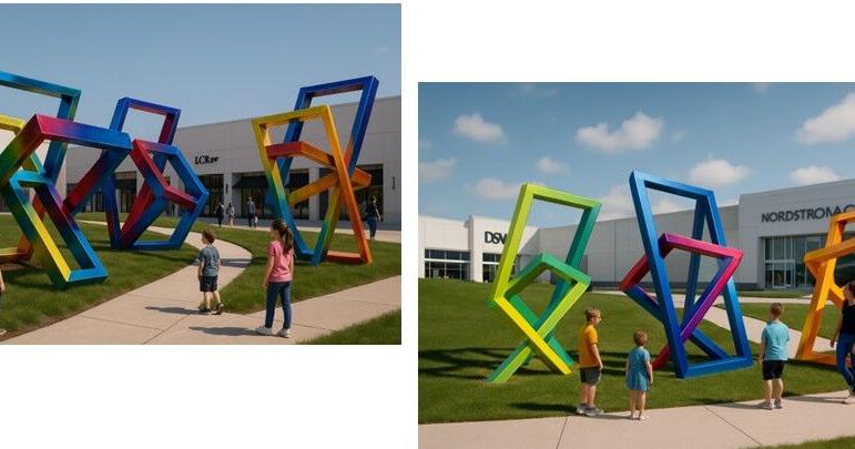
“In this installation, I’m considering a walk-through sculpture experience,” Carvallo said. “The idea is to activate the public space. There’s a ramp going into the corner of the project, and the idea is to integrate that ramp into the sculpture itself. I’m proposing three 10-foot-high parallelograms that seem to be evolving.”
Carvallo immediately asked Chavez to confirm the height difference of the installation from street level to the top tier of the project.
“It ends up being about four to five feet and is consistent with other properties along Port St. Lucie Boulevard where there’s an ADA ramp,” the latter said. “The artist has laid that out to complement the art so it doesn’t look like a piece of infrastructure but becomes an interactive feature.”
“That’s why it’s three pieces,” Carvallo explained. “One at the lower level, one at the mid level of the ramp and then one at the parking level. The idea for this is to integrate that public space and make the public interact with the sculptures.”
Vice-Mayor Jolien Caraballo immediately asked about nighttime illumination.
“What is the plan for lighting?” she asked. “I didn’t see it in the concept plan.”
“We’ll do exactly what we did in the Harbor Village project,” Carvallo replied. “It’s lit from below, so at night you can see it from the street. Of course, the lighting here will be a lot stronger because the ones on the previous projects were closer to the actual retail.”
For her part, Mayor Shannon Martin questioned the artist about his color choices.
“Is the plan to utilize these really bright and bold colors?” she asked.
“I did for the previous one,” Carvallo responded. “It’s within my style, and that’s what I do. The difference on these is I’m using gradients, so it won’t be solid colors. But yeah, they’re bold colors, green, blue and orange.”
Mayor Martin, however, expressed a different preference.
“I really appreciate what’s done down there, [but] this is not really Miami,” she continued. “I would like to see the colors of Port St. Lucie branding used as opposed to these bright, bold colors. I would like to see our color palette utilized. I think the sculptures are cool, but I’m not a fan of the colors.”
Vice-Mayor Caraballo agreed, pointing out to Carvallo that the Sandhill Crane on the city’s logo did have a bright red on its crest, as well as a couple of other strong colors.
“I think the color palette we came out with the Port St. Lucie rebranding does provide the ability to use solid colors that are bright and bold,” she said. “I think it would actually look really good and be complementary to the city.”
Grubbs, in turn, attempted to encourage the artist with the city’s color choices.
“We have a palette that has probably 15 colors on it that I can provide you,” she said.
That pleased Carvallo.
“I do color oppositions, and you do have the red and green,” he said. “You have the blue and black, so definitely I could work with that.”
The Council then unanimously approved the artwork, with Grubbs immediately proceeding to the Southern Groves piece.
“The application before you is for Project King, now known as Import Mex,” she said. “The artist, Mr. [Dale] Rogers, is the same artist that fabricated, constructed and installed the bull & cows over at Cheney Brothers.”
Rogers, based in Haverhill, Massachusetts, proceeded to describe his artistic proposal for the company.
“This is a Latino-based art piece [with] vibrant colors representing the Latino culture and Origami-type feel,” he said of the Chinese art form that the Mexicans have adopted as their own. “It’s a faceted piece that embodies the papercraft used throughout the Latino culture in their festive décor.”
Having listened to the previous discussion on the mayor’s color preferences, Rogers particularly emphasized his choice of vibrant colors as he pointed to images on the overhead screen.
“Here’s some of the color palettes that we picked from and some of the different styles of recurring patterns,” he explained. “Here are more examples of the colors we chose to go with in this outdoor sculpture representing Origami, or folded paper. The piece is about seven feet by seven feet. This does show it standing on point, but there will be three points of contact with the ground to make it very stable.”
An Import Mex representative, Arco DesignBuild Manager Michael Solimando, provided more details.
“This site off Southwest Tom Mackey Boulevard is the parcel located next to the Accel International Holdings facility,” he said. “From the previous presentation as well, this will be lit with canned lighting from the ground level to make sure it’s well lit up at night.”
Afterward, Mayor Martin continued to express her desire to utilize the city’s color scheme.
“I think the colors are a little much [and] I would rather see them along our palette,” she said.
She failed to get Board consensus this time, however, with Councilwoman Stephanie Morgan the first to support Rogers’ color scheme for the Import Mex artwork.
“I was okay on the last one, but this is significant with their logo,” she said. “That’d be like asking Starbuck’s to not use their green [and] to use turquoise. I just feel that this one is okay being on Tom Mackey, and it is their logo. I pulled up their website, and it’s right there.”
Councilman David Pickett concurred.
“When you look at the Latin culture, he pulled it right from the palette,” he said. “I’m fine with the colors he chose.”
After another Import Mex representative described the company’s branding with those very colors, Mayor Martin decided to make the artwork an exception to her color preference.
“I do like the design [and] the shape of it,” she said. “Since it represents part of the Latin culture and is the brand logo, I will be supporting it.”
The City Council then voted unanimously for approval.