
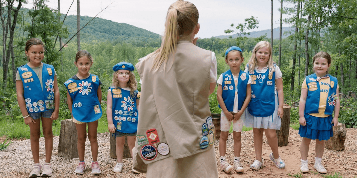
Premiering at Sundance, the documentary brought a vibrant, playful energy to the screen, shaped in large part by graphic designer Rob Carmichael’s bold visual approach.
Drawing deep inspiration from decades of Girl Scout Cookie box designs, Carmichael fused retro aesthetics with contemporary digital techniques to create the film’s distinct GFX style. He began by digitizing hand-crafted elements in Illustrator and Photoshop before bringing the designs to life in After Effects. Working closely with Nahmias, Carmichael developed a cohesive visual identity – from the title card to the animated graphic sequences – that honored the brand’s nostalgic roots while feeling fresh and cinematic.
We sat down with Carmichael to talk through his creative process and get an inside look at the design workflow behind Cookie Queens.
How did you first get into graphic design for films? What drew you to it?
Rob Carmichael: In college, I had a small DIY-style record label and used to do all the packaging design myself, mostly to save money. Over time, many of the bands I worked with went on to bigger and better labels—ones with actual budgets. Many of them asked to work with me as their designer, which seemed funny to me at the time since I have no formal training as a designer, or in art at all!
Working with bands was exciting, and I think they trusted me to understand their creative visions I always liked solving problems, and both design and art direction let me do that for the things that felt important to me.
Can you tell us a bit about this project and how you became involved?
RC: My wonderful wife, Alysa Nahmias, directed and produced Cookie Queens, so it was pretty much a foregone conclusion that I would work on the on-screen Graphic Effects (GFX). As she and her team were figuring out the ways they wanted to frame the story, Alysa and I would talk about ways to amp up the energy and personality with visuals. This would happen over dinner with the kids or late at night once things were quiet in the house. I’ve known her for almost 30 years, so we were pretty much on the same page from day one of “Cookie Queens.”
What was the inspiration behind your graphic design work on this film? What were you trying to achieve, and were there any challenges you had to overcome?
RC: The main inspiration for the visuals for the film was the evolution of the Girl Scout Cookie packaging throughout the years. The various versions of the cookie packaging and other ephemera were visually fascinating.
I’ve also always been interested in the display typeface of the late 70s and early 80s—my youth —so we centered on type that draws from that era for a nostalgic feel.
Which Adobe tools did you use throughout this project, and why did you choose them?
RC: I come from a print background, so my first steps always take place in Illustrator and Photoshop. First, conceptualizing, then working out the details of type, and finally positioning and color. In recent months, I’ve become a big fan of Photoshop’s Generate Image Assets. What a timesaver! Once things were conceptualized, I brought everything into After Effects to sweeten things up a bit, animate, in a few cases, and make sure everything was perfect, color and positioning-wise.

Describe your favorite piece or component of the project. How did it come together, and how did you achieve it?
RC: My favorite part of the project was the transitions from reel footage to a full screen of solid pop of color with white text. I like the rupture of that moment, organic to artificial, and the nod to Goddard. I also really enjoyed amping up the color to encapsulate the punky sense of girlhood and youth that Alysa was trying to achieve.
Any advice for aspiring graphic designers or those who are hoping to get into graphic design for the film industry?
RC: The biggest thing I would recommend is to make friends with other creative folks who are not designers—filmmakers, musicians, authors, etc. Offer to help them out on projects you can really get behind. For the first 5 years of my working professionally, I had a day job and did design work in my spare time for projects that inspired me. After some time, the folks who I had worked with moved on to more prominent positions and invited me to work with them again!