
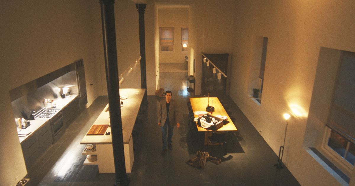
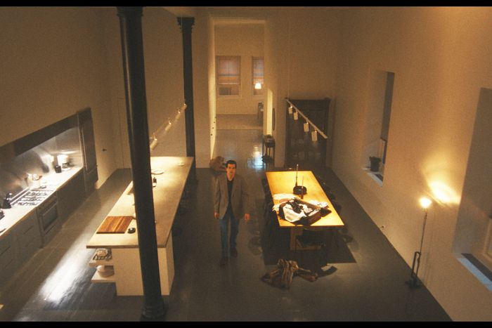
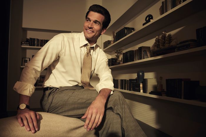
“A note that Ryan gave very early on was that he wanted the show to kind of be a showcase for ’90s minimalism,” says Love Story’s production designer, Alex DiGerlando. Ryan Murphy’s series about the doomed love of John F. Kennedy Jr. and Carolyn Bessette has certainly sent West Village girls to C.O. Bigelow for Bessette’s tortoiseshell headbands, but the same is true for Panna II. The show is equal parts a fairy tale about the era’s cityscape and interiors. Some of the sets were built to be mostly true to life — like Jackie Kennedy Onassis’s apartment at 1040 Fifth, which was based off interiors shot for a Sotheby’s catalogue of her estate. Others are more fantasy — John Jr.’s loft at 20 North Moore was drawn up from real floor plans but largely an invention as is the fact that the streets in 1994 are miraculously trashless. (New York City is Camelot here.)
DiGerlando spoke to us about bringing in “period correct” chairs for the Odeon, the two distinctive eras of Calvin Klein’s minimalism, and sprinkling in some of what Kennedy really did own — from a crystal skull to George Washington’s sword. Our conversation has been lightly condensed and edited for clarity.
Did you experience any of this world firsthand?
I grew up outside New York City, in Summit, New Jersey, but visited Soho and Tribeca a lot. I also went to NYU when they were living here, so I graduated right around when they died. Trying to re-create the city just of that time was filtered through my memory. We used a restaurant, Panna II — there’s no direct evidence of them having eaten there that I know of — but that’s a place that I ate at when I lived down there. It’s not like the high-echelon restaurants that some of the other scenes took place in, but if you lived in New York City at the time, you knew that place and you’ve eaten there. At the same time, Love Story tries to be a modern fairy tale, so this is a sanitized version of New York. There’s not as much trash on the street.
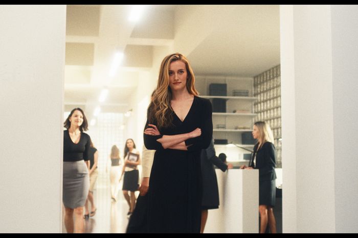
Sarah Pidgeon as Carolyn Bessette in the re-created Calvin Klein office.
Photo: FX
You can’t have trash in a Ryan Murphy show.
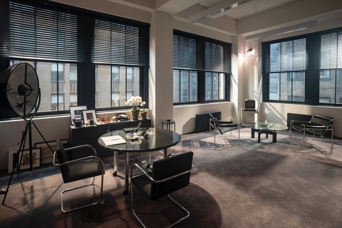
A note that Ryan gave very early on was that he wanted the show to kind of be a showcase for ’90s minimalism. And he had a very distinct palette in mind, which was black, white, gray, nude, camel, blush — Calvin Klein colors. Part of the reason that I think he wanted to do that is he really wanted the glamor of the actors to pop. He didn’t even want wood in the show. I mean, we broke the rule, because there were some places where that doesn’t make sense. But for the Calvin Klein office and showroom, it was obviously easy to do and that was the metronome for the look of the whole show.
Calvin Klein’s executive suite with Marcel Breuer’s Wassily chairs in the foreground and Mies van der Rohe chairs in the background.
Photo: FX
How did you figure out what those Calvin Klein offices should look like?
The show spans from 1992 to 1999 — which covers two distinct eras for Calvin Klein’s interiors. And the well of images from Calvin Klein runs deep, but you can’t just search it. I spent so much time scrolling through, and found that from the ’70s through the early ’90s, the design of the space was by the architect Joe D’Urso, who also did Calvin’s apartment. He was all about using industrial materials in high-end applications and part of a kind of high-tech, minimalist movement. So you’ll see powder-coated gray steel industrial shelving, those three-pronged exterior floodlight sconces, or a round, black granite table on chrome legs with wheels that D’Urso made for Calvin’s office. But in 1995, Klein opened a Madison Avenue flagship store designed by John Pawson. And that’s a whole different kind of minimalism, where every seam is hidden and every surface change ties into another space. We decided that the look for our show in general should be the more Pawson era, but I tried to put some of the D’Urso flourishes in, so we ended up with a mix of the two eras.
Klein was photographed in his office with this Fortuny lamp. The industrial shelving shows Joe D’Urso’s taste.
Photo: FX
This seating area was based on one shown in a shoot for the release of Klein’s Obsession fragrances and features Anglo-Indian neoclassical side chairs that match those 1990s images.
Photo: FX
You mentioned the Madison Avenue showroom — which I remember going to. The one you built felt so right, so nostalgic, but it’s different. It’s in the office, right?
They had a showroom in the building that when a celebrity would come, they would bring them into the showroom and it would sort of be like the experience of going shopping. And the showroom was actually one of the more challenging sets I’ve ever had to do. In a movie set, usually we have a lot of set dressing that we can fill in and that hides any imperfections. But we wanted something that was focused on minimalism. You can’t hide behind anything. And if we didn’t have certain details designed in thoughtful ways, they could read that on-camera as sloppiness.
The bones of the building were based on the real Calvin Klein headquarters. Even Klein’s rolling TV cart, in the far right corner, has an industrial edge.
Photo: FX
Like what?
Like everything. It took forever for us to figure out where to place the spotlights on the ceiling so that they would hit the dresses in the exact right way, and we had to actually cut those holes multiple times. But when we moved those holes, we had to redo the entire ceiling, because the finish that we used on the ceiling is very finicky. Then I had this idea that I wanted the mirrors to be so large and go floor to ceiling, but if it goes up that high, then the camera will see the soundstage. So we had to build out more of the set to hide the stage. Then there’s the problem that you can’t get mirrors that big so there was going to be a seam, but we didn’t want a seam to cut an actor’s face in the middle. And for any line — vertical or horizontal — that we had in that set, I wanted to follow that line through to something else, like Pawson would. So to make the seam in the mirror not feel jarring, we lined it up where the headers are in the architecture of the real office building. That was really hard to line up.
Wow.
It was very important to me that the glass shelves were floating, so we put the support for those shelves behind the set and cut slots for the glass to come through. The problem is we made them so long that the glass was bowing under the weight. And anyone else would’ve maybe just put a bracket under the shelf to hold it, but that wouldn’t have been acceptable to Calvin. So we tried to honor that. The whole idea of Calvin historically, but also Calvin has a character in the show, is that he’s a perfectionist and he holds his staff to such a high standard.
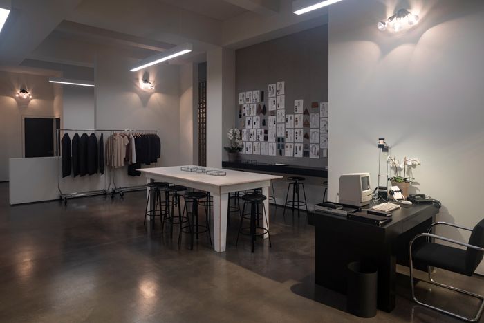
The industrial lamp sconces designed after D’Urso in a workroom where Pidgeon’s character is shown dressing models.
Photo: FX
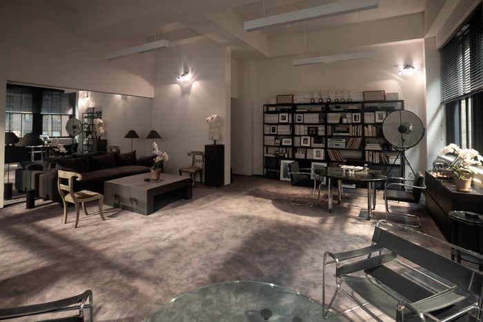
I loved how everyone seems to have the same black desk, the same Tizio lamp.
That desk is based on Kim Basinger’s desk in 9½ Weeks. And if you’re looking at chic spaces from that era, that lamp just shows up. The other thing about these minimalist spaces is, with very few exceptions, there’s no art on the walls. The way the light hits different surfaces becomes the artwork in a way. And the light is coming through the glass brick walls. I wanted that to create the illusion that there was more activity going on beyond where we were filming, so we could have extras walking in the background. It gave some life to the set.
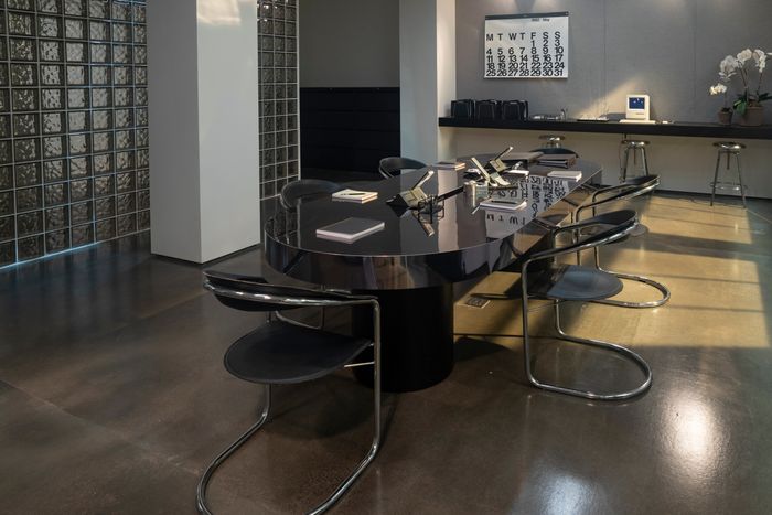
A conference room in which Kennedy pursues Bessette in the show. A Stendig wall calendar and Arrben Canasta chairs predate the series’ timeline, showing how Klein fit into a broader history of minimalism.
Photo: FX
We see the glass brick a few times in the offices but also at the apartment in Tribeca.
I wanted all of our main sets to be in conversation with one another. I don’t know if you noticed this, but Carolyn’s apartment has some similarities to John’s loft, with a painted floor, but it also has some ties to Jackie’s. The color palette of Jackie’s and Carolyn’s sort of mirror each other, and the color palette of Calvin’s and John’s mirror each other. And that was just sort of something that just kind of happened organically.
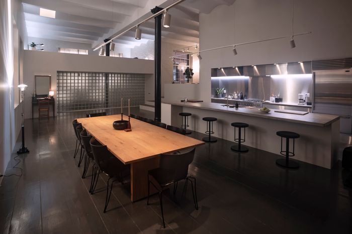
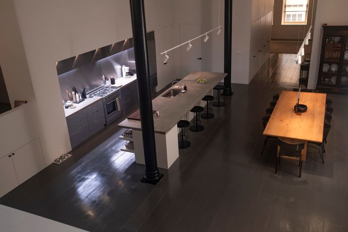
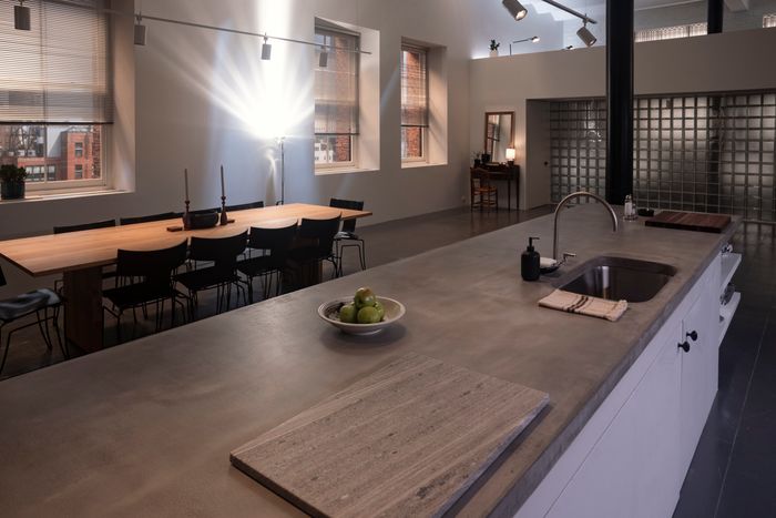
The Tribeca loft set includes a lofted bedroom over a wall of glass brick that leads down to a raised living area, then to the main floor with a kitchen and dining area.
Photo: FX
I looked up the real Tribeca apartment and saw he bought it for $700,000 in 1994. It sold in 2000, but we don’t know much about what happened in between; there are so few photos.
There were some real-estate listings of other apartments in the building, and you can find the floor plan of that online, so we were able to figure out what the basic feeling of the apartment was. The living room in the real apartment is kind of the big L shape with the dining table kind of where it was. And the primary bedroom was kind of in that same spot. We made the second bedroom his office. But there are very limited pictures of his apartment. And Ed Burns owns it now and shot a movie in there.
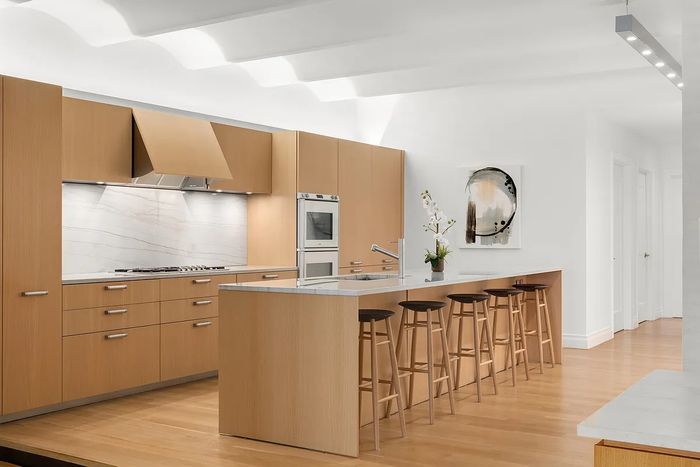
The kitchen was invented with materials that appear throughout the show, and the apartment in general was based off floor plans and listing shots of other units — including this kitchen in 4E, which has a similar layout. From left: Photo: FXPhoto: Douglas Elliman
The kitchen was invented with materials that appear throughout the show, and the apartment in general was based off floor plans and listing shots of o… more
The kitchen was invented with materials that appear throughout the show, and the apartment in general was based off floor plans and listing shots of other units — including this kitchen in 4E, which has a similar layout. From top: Photo: FXPhoto: Douglas Elliman
Did you watch it? Newlyweds?
I watched the trailer. But we wanted to push the real apartment, in a way, to a certain level of glamor and aspiration. Kennedy didn’t hire a decorator. He was more DIY as I understand it. But we wanted it to feel like Carolyn was making a real journey from her small apartment to his. So we also looked at a lot of these very cool, sleek, minimalist apartments from movies from the ’70s, ’80s, and ’90s. 9½ Weeks, the Year of the Dragon. Another big reference was American Psycho.
I could feel that.
We were also thinking about artists’ lofts. You could imagine that an artist had that before John bought it, and there would’ve been paint splattered all over, so you could have sanded the floors down or you could have just painted the floors gray, which is what we did with a super-high gloss. And a lot of those great apartments had lofted bedrooms and lofted living rooms. I think the real ceilings were somewhere between nine and 12 feet, and we made them 16 feet so that we could accommodate for that. But the general layout was the same.
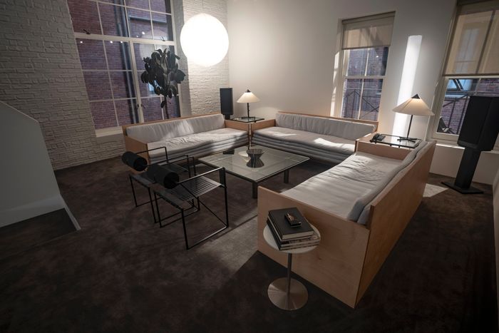
A lofted living area has a pair of 1982 Seconda chairs, by Mario Botta, and plywood seating reminiscent of Donald Judd designs.
Photo: FX
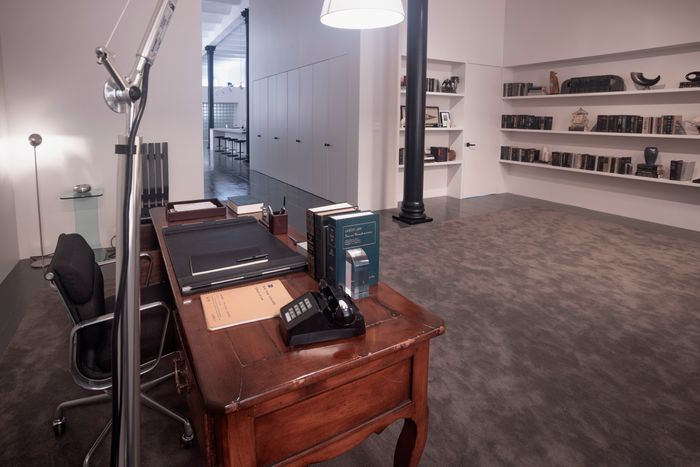
Floor plans for the apartment show a large bedroom at the back of the space, which the show envisions as an office where Kennedy works at a desk that might have been a family heirloom.
Photo: FX
You guys shot street scenes outside the real building, and there are a ton of local restaurants in the show. How were you thinking about choosing those?
I said early on to the producers that I don’t want to shoot in any generic spaces. Every restaurant or club that we’re in should be meaningful to the time and to the place and should be places that we know that they would’ve been at. So shooting on North Moore Street, we used Bubby’s on one end of the street and Walker’s on the other end of the street. We shot at the Odeon. The cool thing about shooting at these iconic places is a lot of them are, they’re, well, they’re well maintained but are pretty much unchanged other than the little modern conveniences, point-of-sales devices and stuff — which we had to remove. But at the Odeon, we took it one step further because they had these very cool sort of wicker chairs now, but that’s not what they had at that time period. Lydia Marks, the set decorator, and her team were able to source the exact chairs that they had that time period. So it was real pain in the ass, but we took out all the chairs and brought in the period-correct chairs.
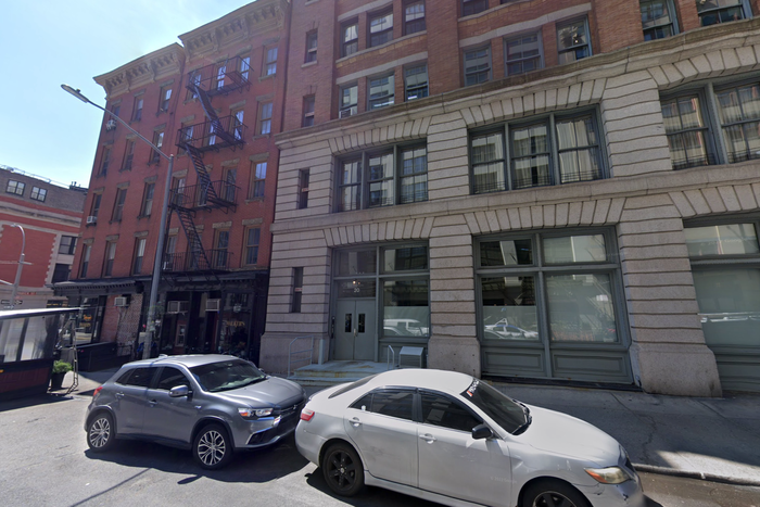
A Google Maps shot of 20 North Moore.
Photo: Google Maps
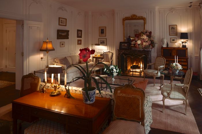
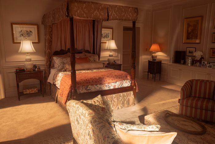
Speaking of period-correct chairs, tell me about his mother’s place, at 1040 Fifth Avenue.
Rosario Candela designed the building and there are lots of books on his work, and in those books are the floor plans of her apartment. We really did a pretty much direct match to the rooms that we re-created. But we didn’t have any photos of the bedroom, so we took some liberties for that. After she died there, they had an auction through Sotheby’s, and there’s a very thick catalogue with a handful of really great photos of the apartment staged as it was when she lived there. She just had cool, eclectic taste and was obviously a very worldly person who liked to accumulate things from her travels. So she is the opposite of minimalist, and we were taking the show in this minimalist direction. At first we sort of built a virtual version of Jackie’s apartment but then took all the patterns out. But it felt more like a fancy hotel and not as personal. So we pushed some of the pattern back into it and made it a little bit more idiosyncratic again.
The art and antiques are almost exactly what’s shown in the catalogue, but the show pushed the palette toward neutrals.
Photo: FX
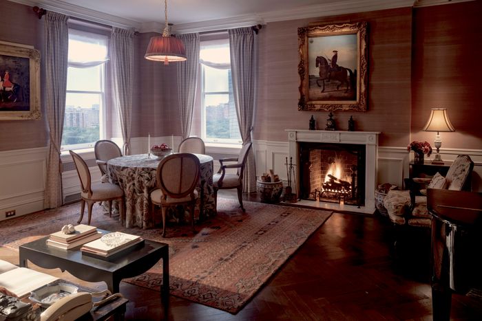
The dining area and library peers into a parlor.
Photo: FX
The production built most of the layout of the real apartment, skipping an office and inventing a bedroom.
Photo: FX
Any favorite details?
The artist who painted the official White House portraits also painted some personal family paintings for the Kennedys, and there’s this great painting of her on a couch reading to the kids when they’re really young. After being First Lady, she became a book editor at Doubleday. So that felt meaningful. We had one of our scenic artists paint our own version and had that in her bedroom.
The invented bedroom.
Photo: FX
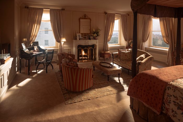
The set was built with fake views over Central Park (right).
Photo: FX
I could see the show kind of setting up an argument that Kennedy lived in this sleek apartment, but he’s also drawn to the old-world interior of the Odeon, or his mother’s apartment. And he has lots of antiques in his place: this big dresser, this writing desk, some antiques.
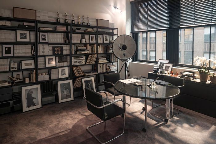
There weren’t a lot of photos, but there were details we found about what he owned. We read in George magazine that they had Robert De Niro posing for a cover as George Washington, and the art department was scrambling to find a sword and John was like, “Oh, I have one. And it actually belonged to George Washington.” And there was an article that interviewed an intern who worked there who talked about how John would have parties at his loft and invite everyone from the highest of the high to the lowest intern, and the kid was just amazed that people were putting glasses down on the table right next to the president’s scrimshaw collection. Of course, I had to look up what a scrimshaw was, which is a whale tooth that has a nautical illustration etched into it. And apparently JFK collected those and they were in his office in the Oval Office and John inherited those. So anytime we would find a little tidbit like that, we would try to incorporate it.
Shelves in Kennedy’s home office were also decorated with antiques (left), and an antique writing desk (right) found a home in an open dining area. From left: Photo: Kurt Iswarienko/FXPhoto: FX
Shelves in Kennedy’s home office were also decorated with antiques (left), and an antique writing desk (right) found a home in an open dining area. Fr… more
Shelves in Kennedy’s home office were also decorated with antiques (left), and an antique writing desk (right) found a home in an open dining area. From top: Photo: Kurt Iswarienko/FXPhoto: FX
The George office also has antiques on a shelf and this huge painting.
That came from some research that I found. This big painting on canvas of George Washington’s head might’ve been in a conference room, but we put it in his office. The offices were just in an office building, nothing superspecial. They didn’t seem to really put a lot of money or energy into the décor. I felt that that was interesting from a character perspective, but I also wanted it to look good for what our directive for the show was. So we tweaked it a little bit. I mean, the most iconic thing about George is those covers. They’re so cool. So we blew those up and used that to decorate the space.
It’s believably a crappy media office. Did I see an eight ball on the table?
Oh, maybe. In one of the pictures of him in his office, he has this crystal skull on his desk and we did that. We put that in there somewhere. Sometimes you see this — it’s like, you can’t make this up. You, I wonder what the story behind that was or why he had that. And when I say some people’s instinct is to scrub that stuff out, to me it’s like any little detail like that, just even if you don’t know what it means, it just tells you something about the character; the fact that he had that thing, it doesn’t fit into the perfect box of what we imagined. But then again, had I not seen a million pictures of him wearing a backward Kangol hat, I don’t know that I would’ve guessed that that was him either.
Sign Up for the Curbed Newsletter
A daily mix of stories about cities, city life, and our always evolving neighborhoods and skylines.
Vox Media, LLC Terms and Privacy Notice
Related