
The Breakthrough Years, 1945–50
Princeton University Art Museum
March 15–July 26, 2026
Princeton, NJ
When you fall in love with someone’s artwork, you feel an instant connection, but also a sense of rupture. How can something from the outside cut so deep on the inside? This was my experience seeing Willem de Kooning’s paintings for the first time as a young man. I identified with his wild shapes and loose gestures, but was also undone by them. Naturally, I was excited to see Willem de Kooning: The Breakthrough Years, 1945–50 at the Princeton Art Museum, not just to revisit my own fascination, but to examine what happened in de Kooning’s work during these five pivotal years and what the artist might mean for us today.
After immigrating as a stowaway from the Netherlands to the United States in 1926, de Kooning eventually settled in New York City, absorbing its popular culture and urban terroir. He was forty-three years old when he had his first solo show at the Egan Gallery in 1948. The contents of this exhibition make up the majority of The Breakthrough Years.
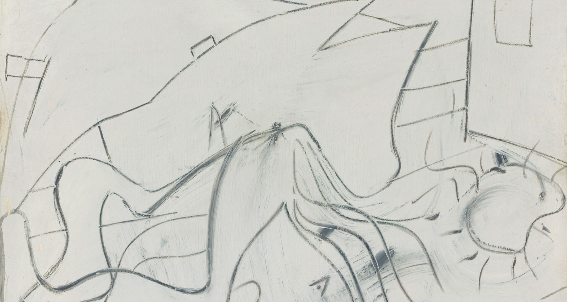
Upon entering the gallery, Untitled (Reclining Figure) (ca. 1945) hangs to your left. The earliest and most pared down painting included here, it is an armature for what’s to come. A layer of white paint is applied to a thin wooden board and drawn through with charcoal, the dry material breaking apart as it sweeps through wet paint. Even though the title suggests only one figure, to my eye there are two in this composition, one overtaking the other in a violent struggle. Perhaps it is a single being in the process of its own unraveling, a metamorphosis. Either way, something is being unleashed from the artist’s unconscious—violent, erotic, or otherwise. I wonder if de Kooning ever saw Alberto Giacometti’s early sculpture Women with Her Throat Cut (1932). The resemblance is unsettling.
De Kooning’s solo show in 1948 was referred to as “the black-and-white exhibition.” In fact, only half of the paintings were purely black and white. The rest included browns, ochres, greens, and reds. But critic Clement Greenberg remarked that de Kooning’s blacks were not just tones, but vivid colors themselves. Black Friday (1948) demonstrates this. In it, de Kooning used a commercial paint which was cheap and dried fast, allowing him to build up layers quickly. It is a predominantly black composition, sticky like tar and rough like asphalt. Its parts are outlined in white, inverting the usual way we see space, and at its base flashes of pink and green slash through and over the surface. Though abstract, the painting’s forms suggest body parts and architectural features. The components feel upended, regurgitated, and thrown against the picture plane. The suggestion of a house provides a tentative sense of location, but most of the black shapes resemble limp phalluses, organs, and limbs. There are also bouncing orbs and Os, all manner of fissures and slashes, and a foreground form that is referred to as a table, but I see as a crawling roach or beetle.