
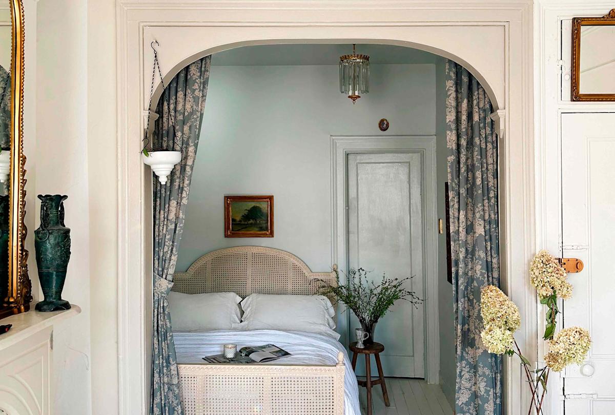
As @hummusbirrd, Brigette Muller displays a self-described “French romantic” style that has captivated many of our followers. “As a kid, I was always up at night when I was supposed to be sleeping—just rearranging my room,” Muller says. See how she chronicles the transformation of her 560-square-foot, 1928 railroad-style apartment in Brooklyn into an elegant retreat using a Provençal palette. C’est magnifique!
Q: What inspired your home’s palette?
Maybe because I’m a redhead and my hair clashes with bright colors, I’m drawn to neutrals. I feel like I fit into that world. I love a muted blue, a muted green. They’re classically old-world French colors as well—I must have been French in a past life. And I incorporate brass and gold accents because I love romance, charm, and a certain kind of calmness.
Q: How can you use color in an open floor plan?
I like having a through line but also differentiating the spaces. For example, the archway in my living room is currently painted the same shade (Farrow & Ball Light Blue) as the trim in my bed nook and the walls and ceiling in my dressing room. But otherwise, the living room is white, the bed nook has wallpaper, and the dressing room is color-drenched.
Q: Do you have any tips for acing neutrals?
Balance is key. I try to pair light muted neutrals with something grounding. I incorporate some element of bronze or black into every space because you need an anchor.
Q: How can readers achieve a similar style?
Think about softness, especially in textiles. I call myself the “curtain queen” because I have so many curtains: not just on windows, but also separating the bed nook and other areas. And both my living room couch and chair are draped with linen fabric.
Q: What are some easy ways to add color to a room?
First is paint. It doesn’t even need to be the walls—just painting the trim or a door can make such a difference really quickly. Another is through textiles, such as curtains, blankets, rugs, and pillows. One of my favorites is flowers. It’s so quick—just go out and buy some beautiful flowers to breathe life into a space.
Brigette’s Favorite Paint Colors
Revere Pewter by Benjamin Moore: It’s on my cabinets, and it’s my number one most-asked-about color because it’s the perfect taupe. I also have it on some trim and on my kitchen doorway. It’s perfectly balanced. It’s not too green. It’s not too red. It definitely looks different depending on the room’s lighting, but it’s always beautiful. If you’re scared of color, start here.
Light Blue by Farrow & Ball is another favorite. And that’s drenched in my dressing room. It’s just perfect to me; it makes me feel so calm.
French Gray by Farrow & Ball is another color I’ve used before. It’s a really, really beautiful green that pairs really well with blue.
Advertisement
Advertisement
Read the original article on Better Homes & Gardens