
Rothko in Florence
Palazzo Strozzi, San Marco Museum, Laurentian Library
March 14–August 23, 2026
Florence
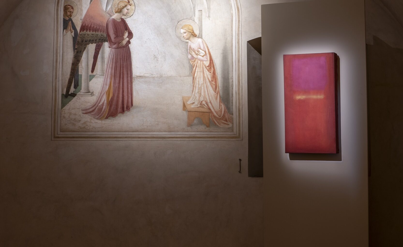
Contemplating painting should be work. The monks of the Convent of San Marco in Florence spent a sizeable portion of their mature lives sitting in their cells staring at Fra Angelico’s frescoes, praying for the salvation of the world, aided in their spiritual labors by those painted images. It is a revelatory gesture to forcibly wrench the modern viewer into a similar frame of mind while looking at the work of a modern master—Mark Rothko—in the medieval location. The statement that the religious devotion of the monastic life is the same devotion necessary to contemporary art, is clear, and this is a great accomplishment. Though Rothko has taken over Florence, at the Palazzo Strozzi and the Laurentian Library, the recalibration to a new, or very ancient, means of observing art begins at the Convent of San Marco.
Five paintings by Rothko have been placed in five of forty-four cells painted by Fra Angelico and his workshop in the convent (the term “convent” applies to any cloistered community within the city walls—for men or women). In the first cell, we find the playful Noli Mi Tangere (1440–41), in which a dreamy Christ trips the light fantastic in front of a restrained Mary Magdalene, paired with an untitled work from 1958: a thin strip of rosey-red at top, a thin strip of vermillion at bottom, and a pink square dominating the center, all on a background of rich golden yellow. There are resonances between the Magdalene’s coral dress and Rothko’s spectrum of red/pink tones, but what is most synergistic between the two artists is the use of glowing color as a focus of meditative intensity. This is also true of the golden yellow of the figures’ hair and Rothko’s background, but the notion of traditional complementarity between colors is of less concern than their ability to hold the eye.
Among the Fra Angelico/Rothko pairings, all of the combinations have a visceral impact. In the fourth cell, the Crucifixion with the Virgin and Sts. John the Evangelist, Dominic, and Jerome (1439–43) is presented next to another untitled work from 1958. Amongst Beato Angelico’s novel color choices, there is the deep blue and black troubled sky behind Christ, the black habit of St. Dominic, and the blood-covered wood of the crucifix, gorgeously matched against Rothko’s horizontal, tripartite arrangement of Payne’s Gray, earth tone, and Payne’s Gray on light gray background. Rothko’s uneven striations recall the five figures and bleak barren landscape of the crucifixion, and the abstract stripes flicker like a mournful Morse code. In the sixth cell, a Transfiguration of Christ (1440–42), in which the savior appears in a luminescent mandorla in front of his Apostles is paired with Gethsemane (1944), a surrealist assemblage of forms which features an ovoid figure with a piercing red eye, whose skate-wing-like appendages windmill outwards, mimicking the gravitational pull of Beato Angelico’s Christ figure. Interestingly, Rothko was not the only artist to paint terrifying New Testament-inspired dark, almost demonic, figures in 1944—Gethsemane and Francis Bacon’s Three Studies for Figures at the Base of a Crucifixion both feed off of the terror, horror, and ecstasy of miraculous visitation. Rothko would write in his essay “The Romantics Were Prompted” (1947), that “the most important tool the artist fashions through constant practice is faith in his ability to produce miracles when they are needed.” It would not be surprising that three years later, when Rothko saw San Marco in person for the first time in 1950, he discovered in Fra Angelico a fellow maker of miracles.
But the creation of miracles are not the only thing which Rothko seems to have shared, or even intuited from his visits to Florence and Fra Angelico’s frescoes. Heraldry and its strict hierarchies of color, which infuse almost all aspects of medieval painting, and especially Fra Angelico’s stark compositions, are in open dialogue with Rothko’s works on view at the Palazzo Strozzi. The diagrammatic structure of heraldic forms and symbolic color generated a painting style at times as abstract in the eleventh through the fourteenth centuries as Ab Ex was in the 1940s and ’50s. Rothko in Florence is chronological, so the exhibition begins with the painter’s figurative works, and we are faced with Rothko’s brooding and hunky self-portrait (1936) as we enter the show. It is the small Interior (1936) which presages the later mature abstractions, and also references a vignette of renaissance architecture. It has an ascending tripartite form: green, white, and red, layering the colors in order of importance the same way Vitruvius would rank orders of columns, with green acting as a frequent anchor color for Rothko. The blind seer Tiresias of 1944 is of the same ilk as Gethsemane in San Marco. In the first room of true abstractions, titled “Multiforms, Pre-classic and Early Classic Works,” we see three very similar olive greens leap frog from canvas to canvas, first as an undulating pool in an untitled Multiform from 1948, assuming a vertical rectilinear position in No. 24 (1949), then a chunky central rectangle on a mostly orange and white canvas in No. 11/No. 20 (1949), and finally evolving into classic Rothko format in the MoMA’s No. 3/No. 13 (1949). These all predate his visit to Florence: Rothko had already sussed out the entrancing power of hierarchically structuring his colors.