
The creative team was tasked with developing a single design that reflects two iconic brands, serves two very different sports, feeds data-hungry fans
As NESN and Sportsnet Pittsburgh cameras go live this week for MLB Opening Day 2026, Red Sox and Pirates fans are seeing a brand-new look. The creative team behind the two RSNs, both of which are part of Fenway Sports Group, has created a sweeping new graphics package built around vibrant team colors, a mix of new-age and nostalgic imagery, and a technology infrastructure designed for today’s data-hungry fans.
“The way we display data and tell the story of the game is constantly evolving,” says Bethany Marshall, director, creative services, NESN and SportsNet Pittsburgh. “We needed a graphics package that could serve those needs from a functional perspective. From a lifecycle perspective, it was definitely time for a refresh of all our graphics across the board. We took a holistic look at everything and came up with something that I believe is very vibrant and color-forward.”
Time for Refresh: Wholesale Redesign for Both Networks
NESN partnered with GameDay Creative on the comprehensive overhaul, which includes a new in-game scorebug, insert graphics, show opens, studio shows, and the full wraparound package for both NESN and Sportsnet Pittsburgh.
“The typical lifecycle of a network’s graphics package — maybe five to seven years — is getting smaller because everything moves faster,” says David Koppett, executive producer for both networks. “The technology itself is evolving faster, but so is the language of sports, the rise of data and analytics, and [the need to] play out graphics on multiple platforms.”
With metrics like exit velocity, launch angle, and spin rate moving from advanced-analytics niche to mainstream-viewing ubiquity, it has never been more important to incorporate data into every single play of the broadcast.
“We’re in a radically different place in terms of the language and lexicon we use to talk about sports than we were five to seven years ago,” notes Koppett. “Updating all of that is one of the great benefits of creating a package like this. The final product is a single cohesive look that not only taps into those [metrics] but also carries emotional resonance for fans.”
Marshall adds, “Since both teams have such a rich history, we wanted to bring out that nostalgia wherever possible. But we also wanted to have a new-age style throughout the package. It was important to us to find that right balance.”
Design Philosophy: Functionality, Legacy, Color, Trading Cards
Design discussions began roughly a year ago, with intensive creative decisions kicking off last summer. For Marshall, three foundational pillars guided every decision throughout the process: pure functionality, highlighting the iconic Red Sox and Pirates brands, and embracing color as much as possible.
“These have to be elements that enhance the stats and storytelling of our broadcast but can also translate across multiple platforms and multiple screen sizes because of all the different ways fans interact with our brand today,” says Marshall, referring to functionality.
As for the legacy of the respective ballclubs, it doesn’t get much more storied than the Red Sox and Pirates. After all, the first World Series in 1903 featured the Red Sox (then the Boston Americans) and Pirates.
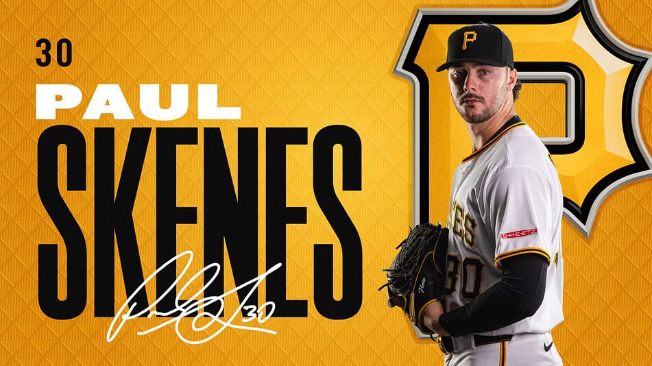
“We are representing two of the most storied pro-sports franchises with their own legacies,” Marshall adds. “We know how strong fans’ emotional ties are to these teams, their colors, and their brands. So we’ve opted to lean into the brands, colors, and legacies of both teams.”
When Sportsnet Pittsburgh became part of Fenway Sports Group in 2023, it adopted NESN’s on-air look, so a redesign focused on team colors will mark a major new direction for Pirates broadcasts. And, for Red Sox fans in particular, the introduction of team color into the scorebug will be immediately noticeable — a significant departure from the network’s previous, more stoic approach.
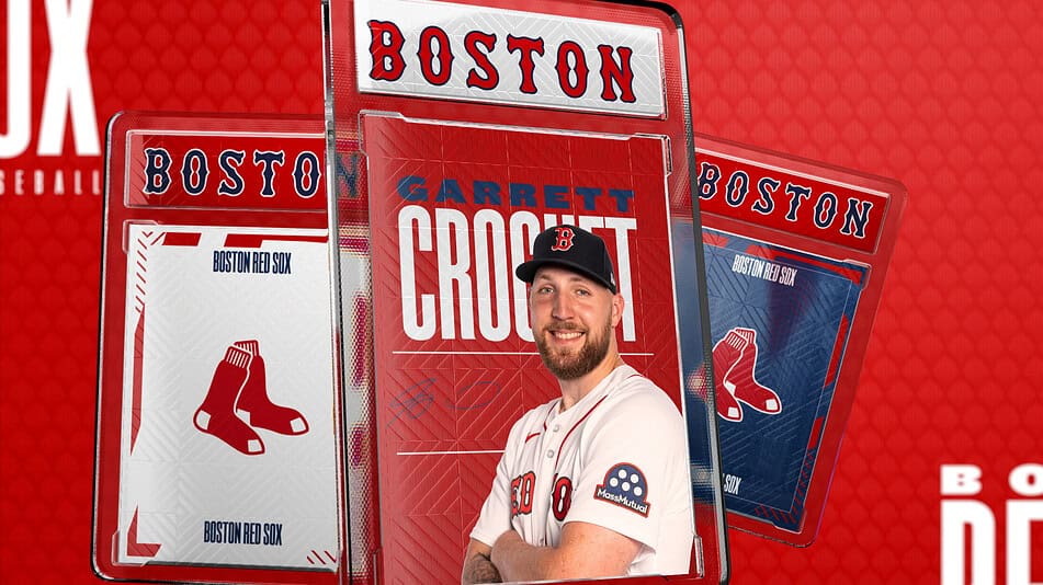
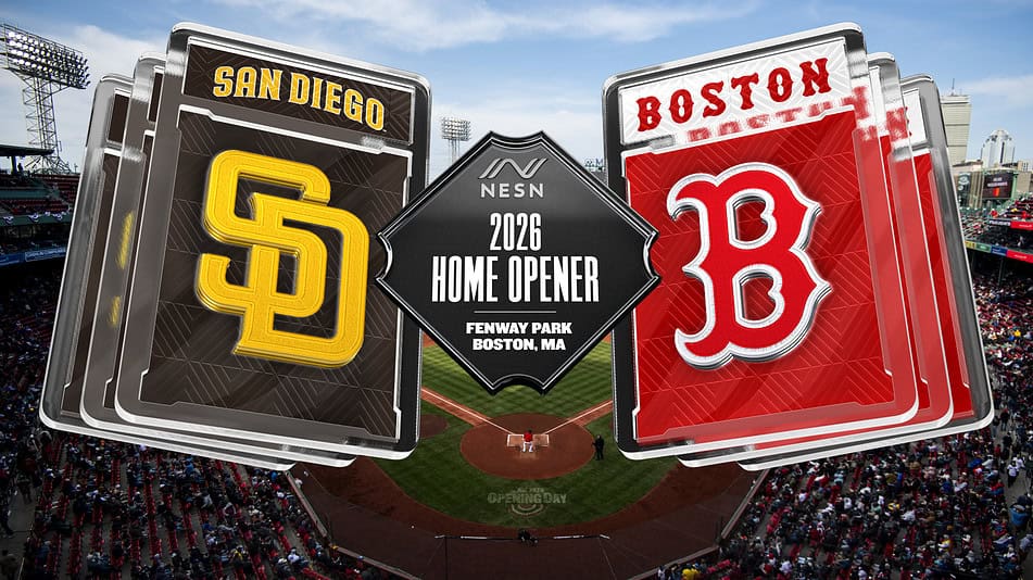
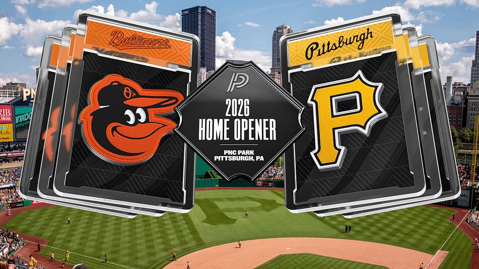
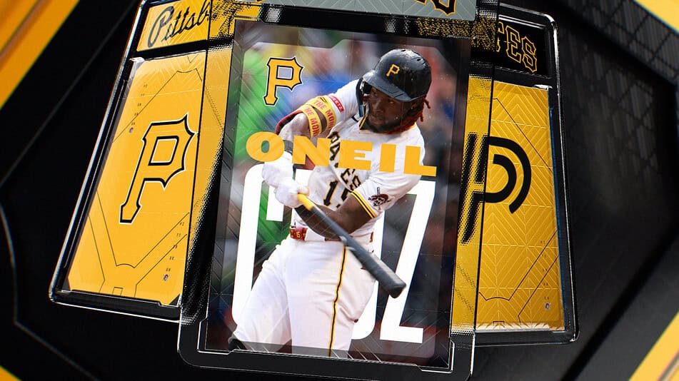
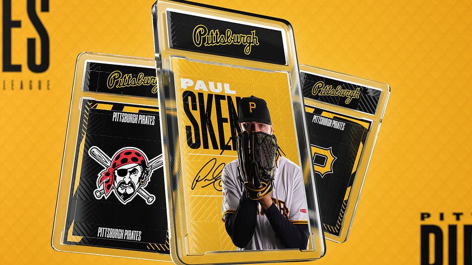
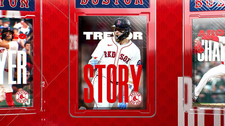
Marshall and her team began brainstorming ideas early on in the process and landed on an unexpected but familiar visual anchor: the trading card.
“As we were thinking about who we are as networks,” she says, “we started to focus on [our role] in capturing these huge and memorable moments for fans. We tried to think of tangible things that also do that, and we came upon this idea of trading cards. Trading cards are not only having a big resurgence right now, but they’re also a very important part of the sport’s history.”
As a result, the foundation of the package is inspired by sports playing cards — specifically, the rare “one-of-one” trading cards that collectors prize most highly.
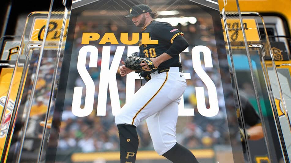
“Sports are meant to be fun, energetic, and memorable,” says Scott Flato, partner. GameDay Creative, which collaborated with NESN on the project. “We wanted that spirit to come through in the design. We loved the idea that the most iconic moments in sports can be captured, framed, and remembered so we quite literally blended that card philosophy into a practical broadcast-delivery system.”
That said, NESN and GameDay Creative understood that the entire package couldn’t be just card-based imagery repeated over and over. Therefore, the team opted to use the motif strategically by reserving it for big moments, standout players, and memorable highlights where it can have the most impact.
“This approach allowed us to tap into a sense of nostalgia while also creating a flexible visual system that feels modern,” says Flato. “It’s a framework that we hope can continue to evolve and support storytelling across the broadcasts.”
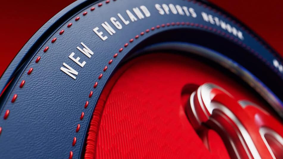
Beyond the trading-card motif, the team leaned into what Marshall calls “foundational textures”: tangible materials associated with the physical world of sport. Every team logo carries a stitching texture similar to the embroidery on a baseball cap.
Distinct Cities, One Shared Vision: Serving Two RSNs at Once
The creative team was faced with a unique challenge in developing the new look: a single design system serving two distinct franchises, two distinct cities, and two passionate fanbases. Because the package had to function across two networks (NESN/SNP), four teams (not only the Sox and Pirates but also the Bruins and Penguins come NHL time this fall), and two different sports, versatility was critical from the outset.
Marshall and her team addressed the challenge by making team color and team brand the organizing principle, ensuring that each network’s package feels genuinely its own and both emerge from the same creative DNA.
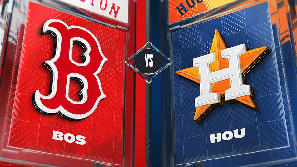
The solution extended to city-specific visual patterns. Pittsburgh’s package incorporates design elements drawn from the trellis work of the city’s iconic bridges and the triangle geometry that characterizes the Allegheny County landscape. Boston’s package carries its own set of locally resonant visual references.
Critically, both networks maintain production staff living and working in their respective cities, directly involved in the design process throughout. Says Marshall, “We’re lucky to have boots on the ground in both towns, producing hundreds of games a year and involved throughout the process and throughout the design decision-making.”
Because the package must serve not only separate teams but also separate sports, the system had to be able to handle the set of stats, storytelling needs, and broadcast rhythms unique to each.
“We set out to build a system that balances both form and function,” says Flato. “From a live-production standpoint, that means ensuring that everything is intuitive for operators and end users, the templates are easy to work with and can grow and scale, and the package can be adapted over time. Opening Day is the stress test, but the system is designed to evolve, and, throughout the season, we’ll continue refining workflows and adjusting elements based on feedback we receive from production after the first games.”
Artistic Xpression: Moving to a New Graphics Platform
Behind the visual transformation is a significant technology shift. NESN and Sportsnet Pittsburgh have moved their broadcast-graphics playout to Ross Video Xpression, a platform they had already deployed in their studio environments but are now extending fully into game broadcasts.
“We were going to switch platforms no matter what, because we were working with [an out-of-date system],” Koppett says. “We knew we needed to be updated one way or the other. We already had Xpression in studio at both networks, so we were familiar with it and it was built in our infrastructure already. It made a lot of sense for us.”
The timing of the transition aligned well with the broader creative overhaul: instead of migrating the graphics piecemeal, the teams rebuilt for the new platform from the ground up as part of the package refresh.
The studio component of the project was, in effect, a parallel effort. While the in-game graphics and the studio graphics share the same visual language — colors, logo treatments, design elements — the workflows and platforms differ. Studio graphics interact with automation systems and carry different sponsor formats. “It is almost like doubling the work of the project: basically, doing all that work a second time,” Koppett acknowledges. “But it is the same package and the same look.”
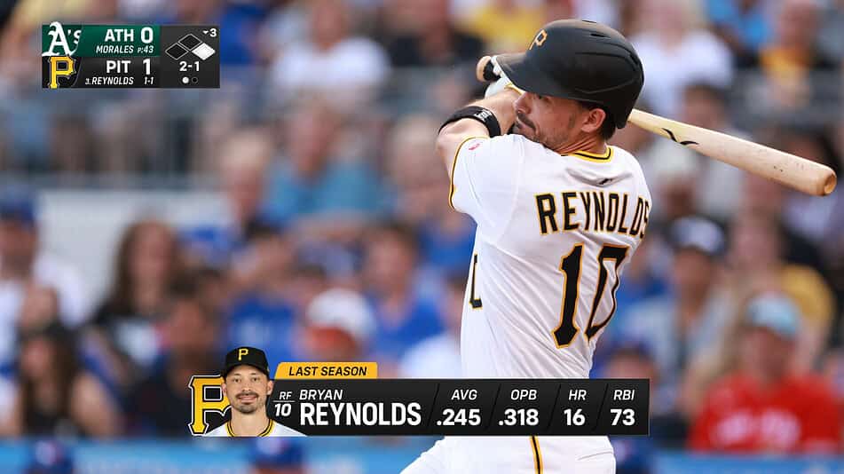
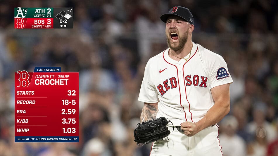
The Scorebug: More Than a Cosmetic Upgrade
Of all the elements in any new package, the scorebug always receives the most fan attention. The new bug is slightly larger than its predecessor, in part to accommodate team logos within the display footprint. It’s a big change that brings color and brand identity directly into the persistent on-screen element. The slightly expanded footprint also creates flexibility for data-based contextual graphics to drop in and out seamlessly.
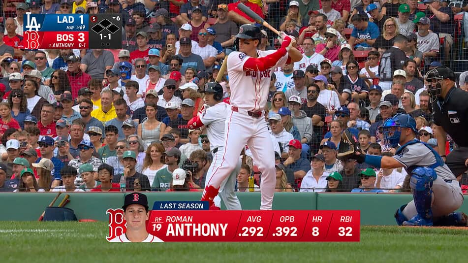
The production team worked closely with TV Graphics, its scorebug-technology provider, to build a bug capable of carrying a significantly richer data payload than before. For example, exit velocity can now be auto-triggered on the scorebug, and contextual pitch data will be displayed in real time. Additionally, information from the new Automatic Ball-Strike (ABS) system will be fully integrated.
“We are making a concerted effort to use the scorebug as a platform for game data more than we have in the past,” says Koppett. “We’ve probably spent more time on how exactly that is going to function and flow for the scorebug operator than we have on any other single element.”
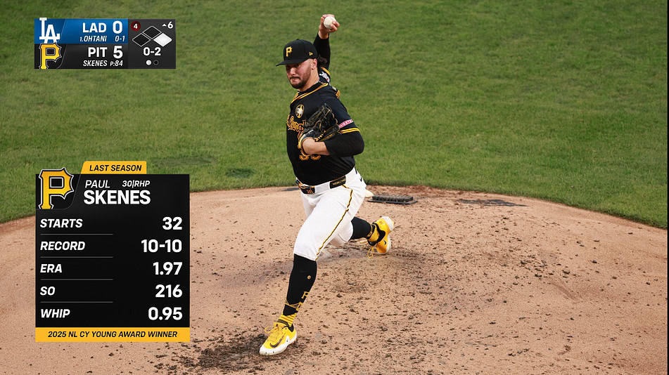
Marshall and her team also put major emphasis on improving multi-platform readability for the redesigned scorebug. “Focusing on the score being bold and legible — thinking about somebody watching on their phone while riding the T or somebody watching on their tablet in the airport, making sure that it works visually for every single screen size.”
A Year in the Making, a Season Ready To Begin
The package was built and largely completed — with assistance from Academy of Lower Thirds — prior to Spring Training, allowing a series of rehearsals for the Boston and Pittsburgh production teams. Every live Spring Training production in the old package was mirrored by a shadow rehearsal running the new one so that, by the time the season begins today, each city will have logged more than a dozen full dress rehearsals. These rehearsals mark the final chapters in what has been more than a year-long creative odyssey behind the scenes.
![]()
“A graphics package is hundreds of deliverables and thousands of variations of the ways that you can build graphics,” Marshall says. “The project represents thousands of hours of work between vendors and dozens of folks internally. It’s something we’re very proud of and are excited for fans to see. I can’t wait to see all that hard work finally come to life for our fans.”
The work ran in parallel with everything else that goes into preparing two regional sports networks for a full baseball season.
![]()
“For us,” says Koppett, “we’re doing this across two groups and two cities that work together and pull together as one to get this ready. It’s an unbelievable privilege for us to televise the teams that we get to televise. These are not just any old cities, any old teams. These are hundred-year, multiple-championship franchises that mean everything to their towns, and we’re excited to add an extra layer on top of all that with this new package.”