
To mark 30 years in the Ontario Hockey League, the Erie Otters have opened up their crayon box to reincorporate a colour from their past.
Earlier this month, the Otters launched new primary and secondary logos featuring red, a colour they had dropped from their palette back in 2017. The team called it the latest “evolution of a franchise Erie made its own.”
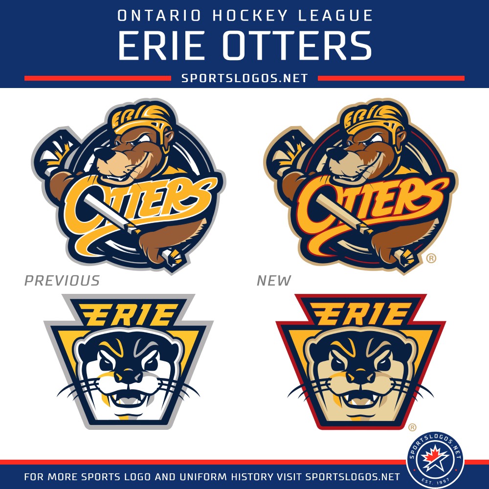
For the 30th anniversary ahead of the 2026–27 season, the Otters would reveal a new brand taking elements from the past and present, coming together for an exciting future. The new primary logo introduces brand new colorways to the 2019 logo that bring together elements of the past and bring them into a modern age. The reintroduction of red is sure to be a fan-favorite part of the rebrand, with it coming back into rotation for the first time since 2017. Familiar elements from the 2019 logo remain, such as the Otter’s helmet spelling out ‘Erie’.
The keystone-shaped secondary logo — a nod to Pennsylvania’s nickname, the Keystone State — with a more realistic-looking otter also got recoloured, with red appearing in the outermost outline.
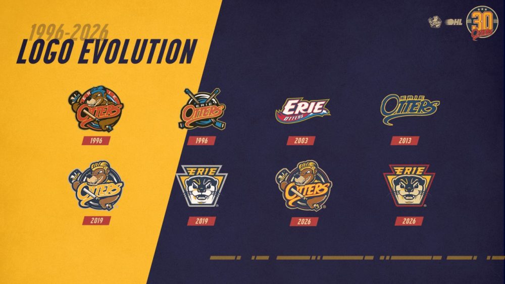
When they entered the OHL in 1996, the Otters’ logo featured a hockey stick-wielding otter wearing a blue helmet popping out of a red circle and behind a red “OTTERS” script. That lasted until 2016, when a navy blue and gold version of the script became the team’s primary logo. The team reversed tack in 2019, though, going back to a version of the otter in their new colour scheme.
 Courtesy Erie Otters
Along with the primary and secondary logos, the Otters also unveiled a 30th anniversary logo, which will feature on the shoulders of their jerseys in the upcoming 2026-27 OHL season.
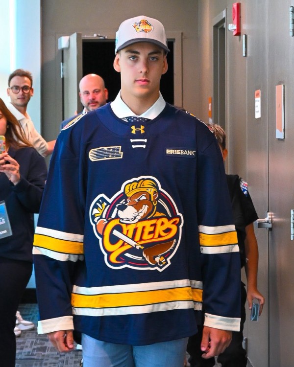
Speaking of jerseys, the Otters rolled out new sweaters with the recoloured primary logo at the OHL Priority Selection, which took place on June 12 and 13 in Kingston, Ontario. And while red has returned to Erie’s logos, it’s conspicuously absent from the jersey’s stripes.
The sweaters given to Erie’s draft picks had a navy blue base with the primary logo on the front. Two white stripes sandwich a yellow stripe around the waist and sleeves, with thin navy blue stripes in between. The numbers on the back and sleeves were set in a yellow block font with navy blue and white outlines. Names on the back were one-colour white.
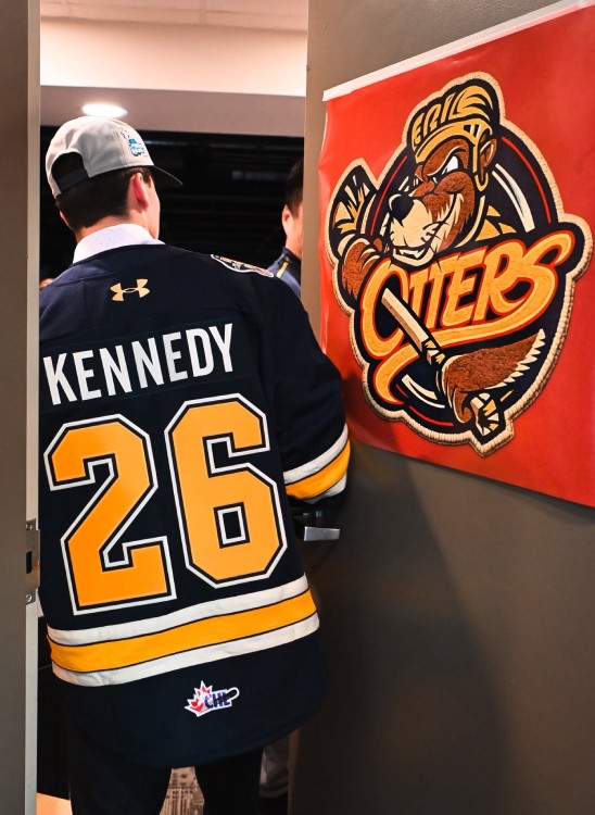 Courtesy Erie Otters / Facebook
In their 30-year history, the Otters have won the OHL championship twice, in 2002 and 2017, but came up short in both trips to the Memorial Cup. They were the first Canadian Hockey League team to have four consecutive 50-win seasons, which happened between 2013-14 and 2016-17; the first two of those seasons featured future NHL superstar Connor McDavid.
Six of the Erie Otters’ first seven games in the 2026-27 OHL regular season are on the road, with their only game at the Erie Insurance Arena during that stretch being against the Kitchener Rangers on Saturday, September 26.