
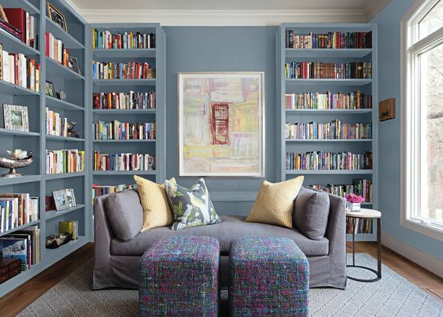
In an era of political turmoil and at times unsettling technological development, marketers at Pittsburgh-based paint firm PPG Paints have selected the 2027 Color of the Year in large part for its calming attributes.
Artifact blue, from PPG’s Glidden brand, is described by the company as a “warm, smoky” and rich hue that mixes classic and modern vibes as it “sweeps in with a calming energy.” At the same time, the company says it allows homeowners to move away from using cool grays as omnipresent neutrals.
Those hooked on “millennial gray” and the lazier house-flippers among us alike might do well to take note of that last part, as any dedicated touring of updated houses will quickly illustrate.
“Not every home update needs to be dramatic to feel different,” said Glidden marketing manager Ashley McCollum. “Artifact is that perfect ‘hit reset’ color. Not a reinvention — just a fresh realignment. It’s the color of reset, but without erasing your personality.”
The choice continues a trend of choosing warm colors for PPG Paints, which last year selected warm mahogany also as an alternative to popular dark grays and blacks. In 2025, it chose the inviting but modern purple basil.
While the idea of choosing a color of the year is — at its core — a marketing tactic to get people thinking about the colors around them, the ability of color to affect mood is a scientific idea that needs more research but has shown indications of viability. According to Mental Health America, bright, warm colors tend to stimulate energy and happiness, while cool, subdued colors can be soothing and calming.
When it comes to those associations, however, it is unclear how much of those associations are universal versus learned concepts.