
The Tennessee Titans unveiled new uniforms and a new logo — but the light blue design is stirring memories of Houston’s Oilers era.
HOUSTON — For a handful of games over the last few years, the Tennessee Titans have worn the old Houston Oilers Columbia blue uniforms. Now, that color scheme will be the Nashville norm.
The Tennessee Titans dropped what they’re calling their “fresh new look” Thursday night. But for some of you, longtime Houston sports fans, you saw that light blue and those red accents, and you knew exactly whose memories they were dressing up.
On paper, this is a Tennessee story. The Titans rolled out a new logo, new uniforms, and what they describe as a visual identity built to represent both the franchise’s history and its home in Nashville as they head into “the next chapter of Titans legacy.” The team calls it a look that pays homage to the Luv Ya Blue days as the Oilers, while also weaving in nearly 30 years of football in Tennessee — a bridge between Houston’s past and Nashville’s present, at least from their point of view.
From here in Houston, it lands a little differently. The team that left town is now leaning harder than ever into the colors and vibes of the one that stayed behind in people’s hearts.
Titans President and CEO Burke Nihill said the goal was to blend eras.
“We wanted to come up with something that took the best parts of all of that and bring it together in a way that makes sense,” he said, adding that he feels the organization is “building on the legacy of what got us here” and setting the course for decades to come.
That “legacy,” of course, includes the Houston Oilers — the franchise Houston lost.
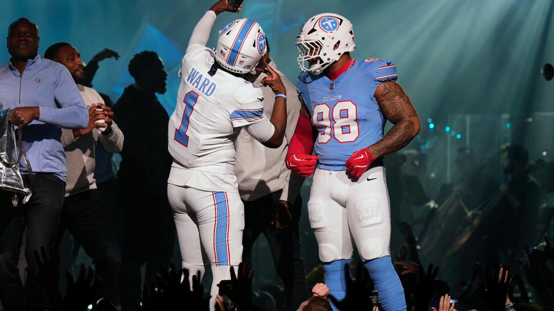
On the field, the Titans’ blue jerseys and white pants will now be the primary home look, with white jerseys as the main road uniform, paired with either light blue or white pants. The team will also keep the option of wearing white at home. At Nissan Stadium, “TITANS” will sit stitched above the numbers on the chest, while on the road, the same space will read “TENNESSEE.” The light blue jerseys get white numbers outlined in red; the white jerseys flip the emphasis, using light blue numbers with that same red outline. Numbers appear on the front, back and on the shoulders.
Inside the building, the team insists this was driven by their own people. The Titans say the light blue — their “Titans blue” — is both unique and clearly popular with current players and their fan base, a conclusion they say came from uniform sales on recent Oilers throwbacks and from surveys and focus groups. Erin Swartz, the team’s Senior Vice President of Brand Marketing, called Titans blue “a really bold color, a really powerful color” and pointed out that seven other NFL teams already use navy. To her, this lighter shade gives Tennessee something that feels more distinct.
“So, it’s a way for fans to uniquely show their support, and really fill stadiums both home and away with Titans blue to support their team,” she said. “We wanted to give them that tool to kind of stand out, as Titans fans.”
The logo is changing, too, in a way that keeps Tennessee front and center while still nodding to the past. The new primary mark drops the flames entirely. In their place: a redesigned white “T” set inside Titans blue in a circle, trimmed with white and red, and anchored by three white stars meant to represent all corners of the state. That logo will ride on both sides of a white helmet with a white facemask and a new stripe down the middle.
Nihill argues this isn’t a break from what fans know.
“I don’t think it’s a departure from anything,” he said. “It’s more of an evolution of the best of who we’ve always been and who we want to be going forward.”
He pointed out that the old helmet logo — the one that featured flames and sword-like Greek elements — is part of that “best of who we’ve always been,” calling it familiar and important even as the organization moves on to something it believes will “stand the test of time.”
From a Houston vantage point, the message sounds like this: that old look is now retro merch; this new one, dripping in light blue, is the future. The past gets a throwback line, but the present is branded in a color Houston once claimed every Sunday.
The Titans say plenty of the details are specifically Nashville and Tennessee, not Houston. That helmet stripe, and the one running along the pants and sleeves, is described as a “6-string stripe” that uses navy, white, red and Titans blue to mirror the feel of a guitar — a nod to Nashville’s musical identity. Three navy stars, placed on the back neckline and tucked under the arms, are there to represent the state’s three grand divisions. The wordmark font across the chest is called Woodblock, meant to reflect Nashville’s creative energy, traditional printmaking and classic “whittle letters,” while the numbers themselves take their cue from old-school collegiate uniforms.
Inside the jersey, there’s a collar tab that simply reads “WE,” paired with the Tennessee Tri-Star. It’s a small piece of fabric with a lot of meaning for the people in that locker room. Nihill said new head coach Robert Saleh loved the idea that “we” would be the last thing a player sees before pulling the jersey on, a reminder that “this is about the team.”
The Titans also introduced a secondary “The Football” logo, which weaves the letters TN — or NT, depending on how you read it — and three stars into a football-shaped outline, billed as a cultural representation of the team’s home and community. That concept, like so much of this rebrand, is rooted in Tennessee geography and symbolism, not Houston.
Nihill said the whole process took years and touched “everything” about the franchise’s visual identity, from uniforms to logos and wordmarks. The team leaned on fan, alumni, and community feedback from surveys and focus groups before settling on what it now calls a look that is “uniquely Nashville, Tennessee, and the Titans.”
The timing isn’t random. The rebrand lands alongside big changes in the organization: a new coaching staff, a reshaped roster, and a new stadium on the way. For Nashville, it’s a clean narrative: new era, new building, new look. For Houston, it’s another reminder that the Oilers chapter officially belongs to the franchise that left.
“This is something that evolved,” Nihill said. “I do hope our fans feel proud when they see it.” He added that during the process, the organization kept hearing one particular line: “These are the best uniforms in pro sports.”
“And now,” Nihill said, “this is the Titans’ uniform.”
In Houston, the response might be a little shorter: they can call it Titans blue if they want. We know what it used to be.
Got a news tip or story idea? Email us at newstips@khou.com or call 713-521-4310 and include the best way to reach you.