
One San Antonio university’s rebrand has alumni and locals coming out of the woodworks to launch their complaints.
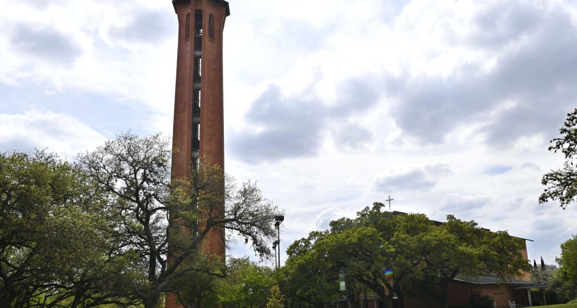
Trinity University, founded in 1869, unveiled its branding overhaul on Wednesday, July 29. Since the early 2000s, the school had used its iconic Murchison Tower as the logo — however, along with a new website came a new look that swapped the bell tower for a solar motif.
The rebrand was created in partnership with Massachusetts-based Mackey Strategies and Maryland-based E&A Collaborative. The new logo features two concentric and spiky suns, and a spokesperson for the school told MySA the sun motif appears on a seal from 1870 onward as well as in several graphics and campus architecture. However, not everyone was enthusiastic.
One commenter under the school’s Instagram announcement said, “the new logo does not reflect the Trinity community and alumni,” and others questioned its connection to the school. Amid hundreds of comments, nearly all negative, alumni and locals compared the new logo to Anthropic’s Claude AI assistant and OpenAI, the company behind ChatGPT. Another said, “now everybody on [LinkedIn] is going to think I went to university at a La Quinta.” Other comments reached for bathroom humor we won’t be repeating in this article.
Speaking to MySA, a spokesperson for Trinity University defended the logo, saying it “really can’t be farther from the truth” that the sun doesn’t represent the school. The spokesperson evoked sunlight moving through the campus and across buildings, also citing the image’s history on the seal, which will still be in use. Additionally, they said the bell tower will continue to be an icon of the school — “I mean, it’s not going away.”
Every once in a while, universities will refresh their image in order to stand out in a competitive field. In 2025, for instance, the University of Texas at San Antonio stepped back from their UTSA moniker to honor their merger with The University of Texas Health Science Center at San Antonio, becoming UT San Antonio. The new crest featured orange waves.
Trinity’s marketing team felt it was time, and the spokesperson said the logo was workshopped with “300 stakeholders, including alumni, including professors and professionals, and including faculty and staff and students.” As for the comparisons to AI models or motels, that’s because “the sun is ubiquitous,” according to the spokesperson. They added that the logo is unlike others among higher education and liberal arts universities — and that’s “the arena that we’re competing in.”
The logo is meant to usher in “a new day for Trinity,” representing ideals like knowledge, enlightenment and adventure. Ultimately, the spokesperson said they are “not totally taken back by negative comments” but believe people “will hopefully warm up to it” once it is no longer new.
Plus, there’s a bright side, so to speak.
“On one hand, that’s really great to see that people are excited about about the logo, that they care about Trinity, and they have these emotional connections. That’s what you want from your alumni,” the spokesperson said.