
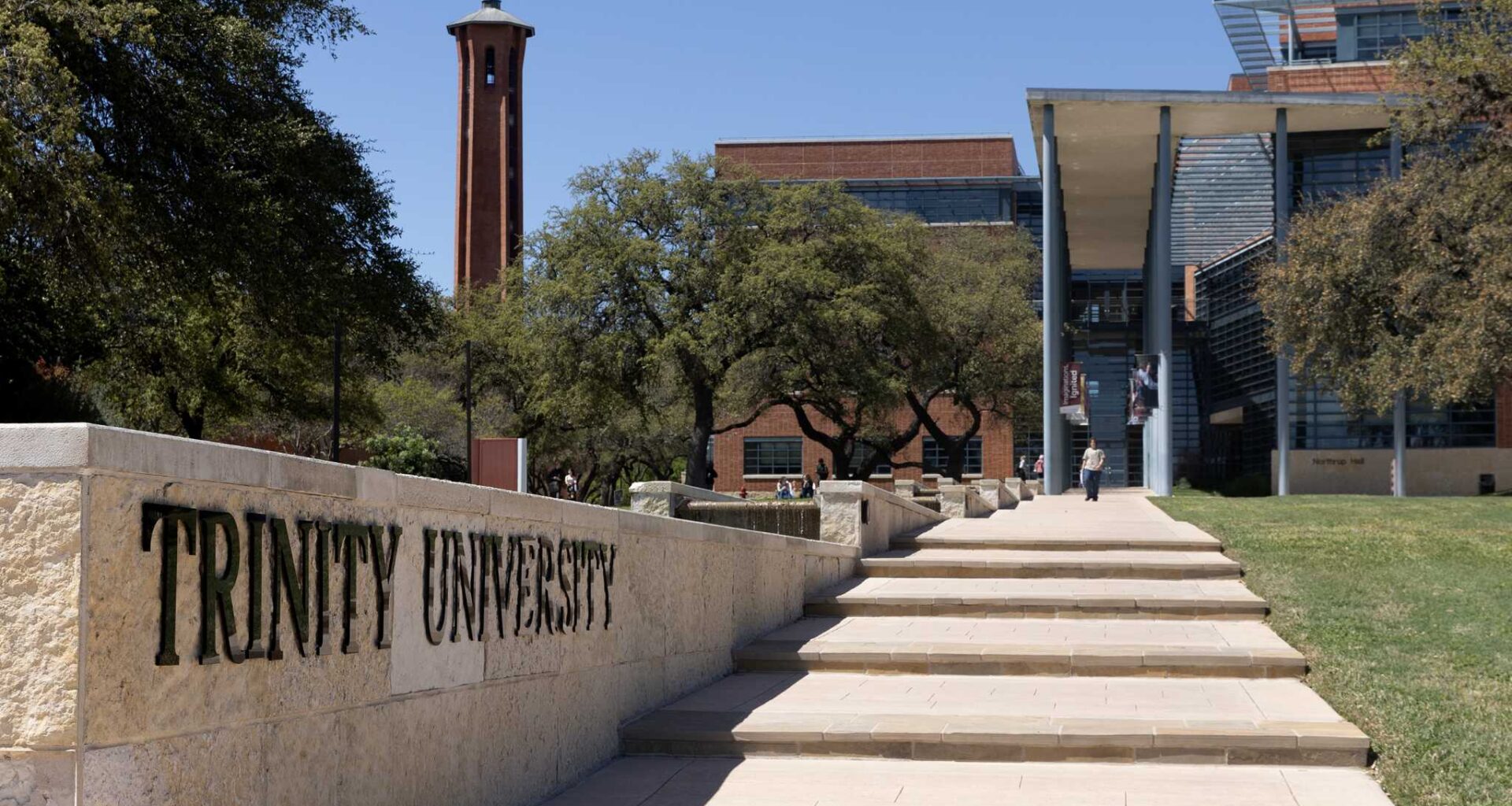
Murchison Tower rises above Trinity University’s hilltop campus in San Antonio. The landmark appeared in the university’s primary academic logo from 2003 until Trinity replaced it with a geometric sunburst in July 2026.
Jessica Phelps/San Antonio Express-News
Trinity University spent nearly a year consulting more than 300 people before unveiling a geometric sunburst to replace Murchison Tower in its primary academic logo.

University officials touted the rebrand as an opportunity to return to a historically significant symbol that differentiates Trinity from other colleges that often use bell or clock towers in their branding.
Article continues below this ad
But after Trinity unveiled the sunburst on Thursday, backlash was immediate: Some alumni compared the new emblem to a hotel or bank logo and demanded the tower’s return. Others questioned whether the redesign was worth the cost — an amount Trinity declined to disclose.
By Friday morning, Tom Evelyn, Trinity’s vice president for strategic communications and marketing, had responded to about 60 emails about the logo. Some were “not very nice,” said Clinton Colmenares, a university spokesperson.
Despite the criticism, Trinity is standing by the sunburst. Colmenares described the backlash as an expected response to a significant change.
“We expected this,” he said. “It’s difficult for some people, but this is something that’s positive for the university, and we’re behind it.”
Article continues below this ad
Trinity University announced a rebrand earlier this week, debuting a new logo featuring a sunburst.
Trinity University
‘Return the tower’
Former San Antonio Councilman Manny Pelaez, an attorney and 1997 Trinity graduate whose wife also attended the university, called the design boring and compared it to logos used by hotel chains Days Inn and La Quinta or Frost Bank.
“People are flipping out,” Pelaez said. “The reason everybody hates it is, one, it looks boring, and two, it removes the Trinity tower from the logo.”
Article continues below this ad
The announcement drew hundreds of social media comments. Critics called the sunburst generic or corporate.
Former Mayor Ron Nirenberg, a 1999 Trinity graduate who teaches at the university, offered a more measured assessment.
“The tower is iconic, and I do miss it,” Nirenberg said. “When logo changes happen, it takes a little time for it to settle in, and immediate responses are not always the permanent ones.”
Article continues below this ad
But the tower logo was not universally loved before Trinity replaced it.
Trinity launched the tower logo in 2003 after Sharon Jones Schweitzer, a 1975 Trinity graduate who was then assistant vice president of external relations, led a rebranding effort. Faculty and staff involved in that effort also helped vet the new logo and support it, Colmenares said.
April Ancira, vice president of Ancira Auto Group and a 2002 Trinity graduate who has served as a university trustee since 2019, said she encountered little support for retaining the tower among alumni, trustees and university employees involved in the recent redesign.
She said alumni had repeatedly joked about the shape of the tower logo.
Article continues below this ad
“Some of the humor behind the tower was that it looked kind of — I don’t know a better word — but phallic,” Ancira said.
Celebrated San Antonio writer and poet Naomi Shihab Nye, a former Young People’s Poet Laureate, said the new sunburst logo is more memorable than the tower logo it replaced.
Nye still visits Trinity, volunteers on campus and speaks to classes. Yet when initially asked to describe the university’s existing symbol, she could not recall it.
“The bell tower is a little bit forgettable, I guess,” she said. “As much as I love it, I think the sun they’re going to use is more memorable.”
Article continues below this ad
The 1974 Trinity graduate independently recalled that the tower had been the subject of crude jokes during her student years, decades before it became Trinity’s primary logo.
“There were some profane jokes that were often repeated by people, including some professors, regarding the tower,” Nye said.
What do you think of Trinity University’s rebrand?
Why Trinity chose the sun
University officials said the sunburst is not a rejection of Trinity’s history but a return to its early roots. Trinity was founded in 1869 in Tehuacana, Texas. A sun representing knowledge and enlightenment appeared in its official seal the following year, and variations marked university publications, yearbooks and marketing materials for decades.
Article continues below this ad
“We’re really returning to the image that carried us from the start,” Anh-Viet Dinh, Trinity’s director for creative strategy, said in the university’s announcement.
The new icon consists of 24 triangular rays intended to reflect Trinity’s midcentury modern campus, designed by architect O’Neil Ford. University officials say the triangles echo architectural patterns found across campus, while a smaller sun formed by negative space represents “the warmth of a college and the strengths of a university.”
Colmenares said Murchison Tower remains meaningful to alumni and San Antonio residents, but bell and clock towers are common among university logos.
“The bell tower doesn’t stand out,” he said.
Article continues below this ad
Inside the selection process
Ancira said trustees and other participants in the logo redesign were shown several versions of the proposed new logo and could recommend changes or reject the concepts.
“We could have said, ‘You know what, go back to the drawing board,’” she said.
Ancira said the design resonated with participants after they learned how frequently the sun had appeared throughout Trinity’s history, including on the seal printed on her diploma. She acknowledged that participating in the process probably influenced her response.
Article continues below this ad
Schweitzer also participated in the latest process as a “brand ambassador.” She called the sunburst “striking” and said it creates a “stronger sense of place that’s broader than just campus.”
E&A Collaborative is the firm that created the logo and other visual elements, officials said, but Trinity has not publicly identified the individual who designed the sunburst.
Competing nationally
Pelaez pointed to what he considered an irony: Evelyn previously led a brand refresh at Furman University that retained the school’s bell tower logo.
Article continues below this ad
Evelyn joined Trinity in March 2025 after more than eight years as Furman’s vice president for university communications. Colmenares, who worked with him there, said Furman’s tower logo predated Evelyn and remained in place during the refresh.
Trinity needs a more distinctive identity as it increasingly recruits students beyond Texas and competes with universities across the country, Colmenares said.
Trinity received more than 11,000 applications this year and admitted about 28% of applicants, he said. Its acceptance rate was closer to 50% a decade ago.
After decades in U.S. News & World Report’s regional rankings, Trinity moved into the publication’s national liberal arts category in 2023 at No. 55. It now ranks No. 37.
Article continues below this ad
Nye said the sunburst fits Trinity’s history, its hilltop campus and its longtime association with the phrase “university in the sun.”
Later Friday, Nye emailed Colmenares and asked him to share her gratitude with the university president.
“Trinity has always been a shining, sunny memory for me,” Nye wrote.
Article continues below this ad