
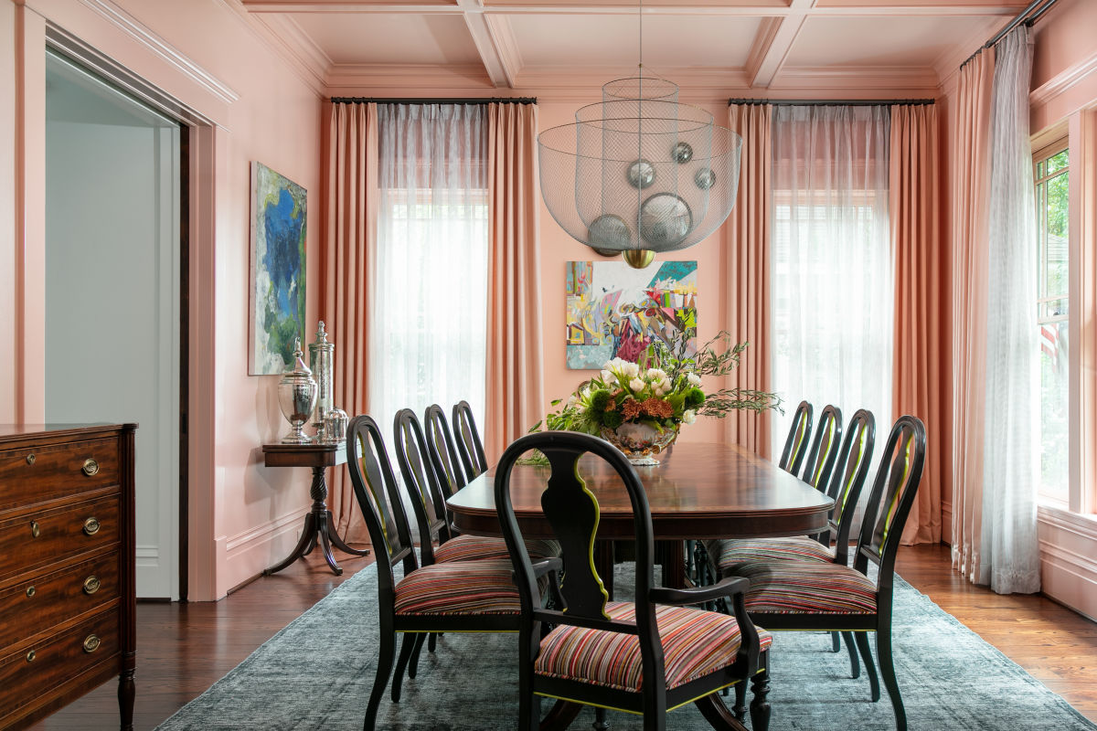
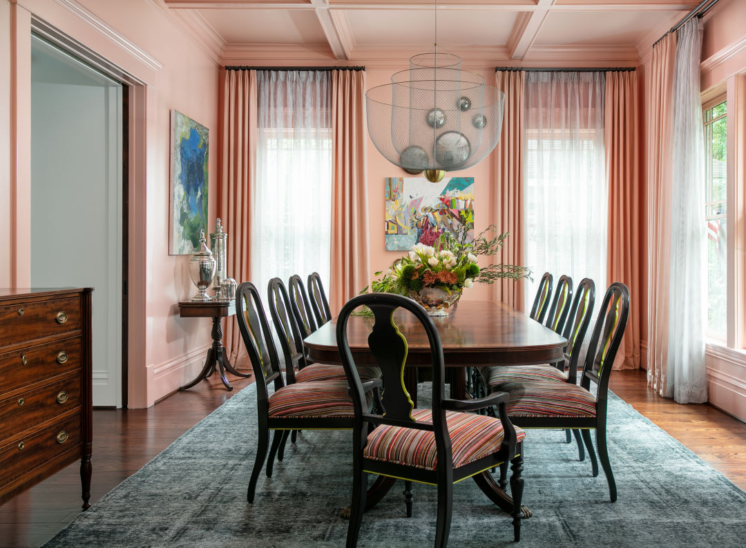
A pop of colorful paint can change an entire room.
It’s no secret that when it comes to home decorating, you’ll get the biggest bang for your buck in a can or two of paint. When a home feels dull or dated, a fresh coat on your home’s walls and ceiling can make everything seem a little brighter and newer.
While gray paint colors have dominated home décor choices for the past 15 years, the cool reign is officially over. “We are 100 percent getting away from gray,” says Houston interior designer Jana Erwin of Nest Interior Design Group. “Everyone I work with now is interested in a warmer palette.”
Warm beiges and shades of taupe are top picks for anyone not choosing bright or creamy whites. “That said, white is still great and will always be great,” says Erwin. Her top pick for a crisp white is Sherwin-Williams Pure White, but other popular shades include Extra White, Snowbound, and Greek Villa, as well as Benjamin Moore’s White Dove, Chantilly Lace, Simply White, and Cloud White. “Those who don’t like color or who want a more muted palette are leaning [toward] warmer whites.”
Andee Parker, owner of Casa Bella Design Group, which does remodeling and new home construction, agrees. Increasingly, people are leaning toward natural woods and beige paints, such as Sherwin-Williams shades Grecian Ivory, Alabaster, and West Highland White (full disclosure: I used Alabaster on kitchen and bathroom cabinets in my own home, and I love it.)
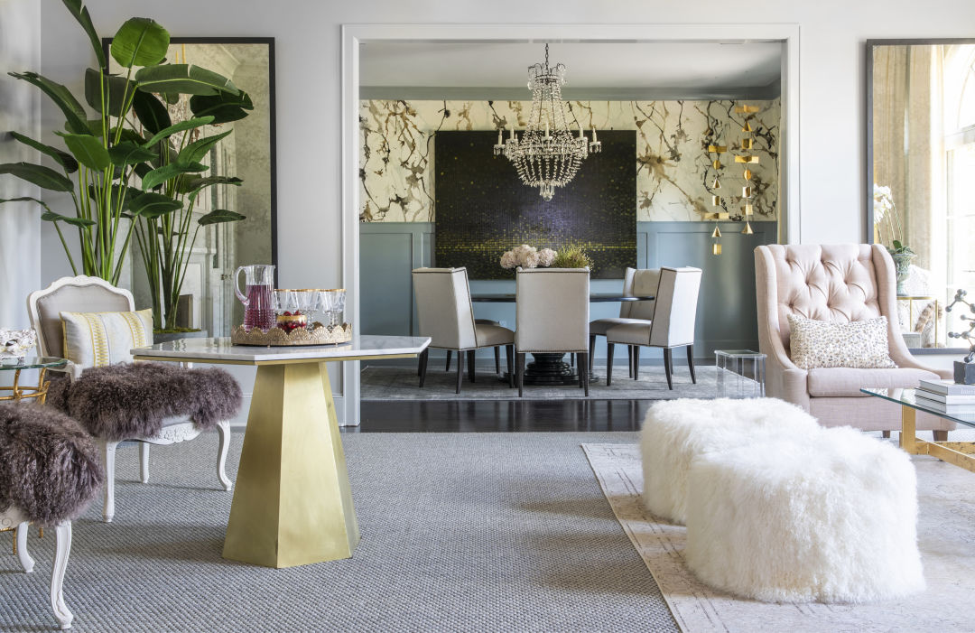
Jana Erwin of Nest Interior Design Group chose Benjamin Moore Revere Pewter for the walls, ceiling, and trim in the living room of this River Oaks home. The nearby dining room repeats Revere Pewter on the ceiling but pairs it with Benjamin Moore’s Brewster Gray on the paneling beneath hand-painted wallcovering.
Beyond whites and light neutrals, both interior designers are also turning to bold colors in paint, lacquer, and wallpaper.
Parker recently jazzed up a kitchen island and a wine bar with Sherwin-Williams Urbane Bronze—a rich, earthy brown that brought depth and warmth. Bold or dark colors are perfect for smaller spaces that are separate from living areas, including small powder bathrooms, she adds.
“If someone doesn’t feel brave enough to extend color all through the room, let’s do an accent wall,” Parker says. Master bedrooms, studies, and home bars—“sleek and sexy even in a traditional home”—are other areas that do well with a pop of color, Erwin says, but there’s a way to do it: “In a bedroom, it should be behind the bed. In a dining room, it should be the wall with a buffet or sideboard.”
Color-washing, a decorative technique that uses thinned paint or a glaze over a base coat to create soft texture, is another option that works well on walls, trim, or even the ceiling—most often in earthy tones, like muted salmon-pink, brown, or deep turquoise, which are super on-trend.
Whatever you do, it’s important to choose a color scheme that matches well, from the inside out, Erwin says. A red-brick Tudor in River Oaks can handle a moodier interior palette that flows with the deep red tones, but such rich colors in, say, a white farmhouse in Round Top, would likely feel out of place. Your own personal style is also worth considering.
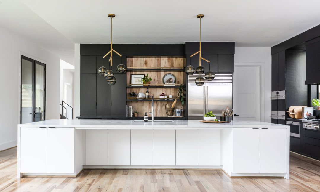
Designed by Jana Erwin of Nest Interior Design Group, this modern kitchen features cabinets painted in Sherwin-Williams Iron Ore and the island, walls, and ceiling in Sherwin-Williams Pure White.
“A lot of times, whoever is most into the house things, the color palette comes off of what they like to wear, what looks good on them,” Erwin says. “If you’re more fashion-forward, it’s fun to add a pop of color that’s not expected.”
Erwin and Parker use flat paint on walls and ceilings and satin or eggshell on trim. Both note that paint sheen reflects light, adding texture when applied to trim and cabinets. It’s best to keep it simple because the glossier the paint, the more it will show flaws.
Hiring pros can be the easiest way to repaint your home, but it will cost. If you’re doing a single room or smaller area—or if you want to save some cash—do it yourself. The most important part of a DIY job isn’t even the actual painting—it’s the prep work. Here’s what you need to know before you dip that brush.
Paint Tips for the DIYer
Test it. Paint samples can look one way in a store where you pick them out but might look completely different in your home. Paint a test strip and look at it at different times of the day.
Protect the floors. A canvas drop cloth is easier to navigate than plastic options—and it’s reusable.
Ventilate. If using an oil-based paint, make sure you have good ventilation; open windows and/or nearby doors if you can.
Prep. Clean, sand, and repair your walls or other surfaces to create a smooth base.
Prime it. Any place you’ve used spackle for repairs will need primer to ensure a consistent sheen. If you’re going from a darker to a lighter color, a coat of primer first will make the job easier.
Order matters. Always paint the trim before painting the walls. It’s easier to tape off a crisp line against finished trim than to cut in around freshly painted walls.
Fix it. If you see wall imperfections after the first coat, sand them down with fine-grit sandpaper (220+ grit) or steel wool. Wipe off any dust left behind.
Use the right tools for the job. Angled brushes are great for cutting along trim and in corners while rollers tackle big open surfaces. Check the nap of the roller foam to get the smoothest finish—you’ll need a heavy-nap roller for textured walls.
Extend your reach. Extension poles reach the top of taller walls, while paint trays work well with rollers and brushes.
Tape it off. Painter’s tape allows for a sharp, even line where you paint. Press the edge firmly so paint won’t seep underneath. Peel back slowly when it’s time to remove it.
Source: Sherwin-Williams.com