
The headline on the Pantone website calls its Color of the Year “a whisper of tranquility and peace in a noisy world.” The reaction to the always highly anticipated announcement was anything but. Everyone had something to say about the unexpected choice.
Still, the fact remains that white is never not one of the biggest colors of any year.
Dallas designers met the news from the trendsetting organization with some laughs and some questions. And — read on — some practical ideas, too.
“Disappointment? Is this a joke? Really?” says Kate Thacker of Kate Thacker Home, laughing. “Those are my initial thoughts.”
Get updates from Abode
White never goes out of fashion, even if finding the “right” white can be a challenge.
Courtesy Hues to You
Katy Morgan, managing business partner of Hues to You, says lots of people associate white with an absence of color. On top of that, white and its cousin, off-white, are perennially in demand.
“It’s already incredibly popular, so I don’t think [the Pantone announcement] is going to change anything as far as the paint world goes,” Morgan says.
“People have been painting spaces white for decades and will be for decades later,” says Courtney Warren of Courtney Warren Home. White’s popularity is undeniable, but Pantone’s choice is still a surprise: “Just because in years past, this has been a color that is quite a statement,” she adds.
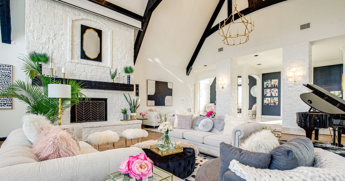
Pops of color keep white from being boring in a colorful workspace by designer Kate Thacker.
Sheryl Lanzel
Design side
Annual color pronouncements tend to arrive in the trappings of a decree, but designers don’t necessarily see them that way. Warren says good design is a long game, not something that swings from year to year.
It’s not that Pantone’s trend statement is meaningless. Thacker says the warm, rich brown of Mocha Mousse, Pantone’s 2025 pick, was indicative of what’s showing up now. But by the time it was announced, designers were already working with the color, making the announcement more of an “affirmation” than a directive.
She doesn’t see that as clearly in the Cloud Dancer pick.
“It’s not something that’s going to set the tone for something new,” Thacker says.
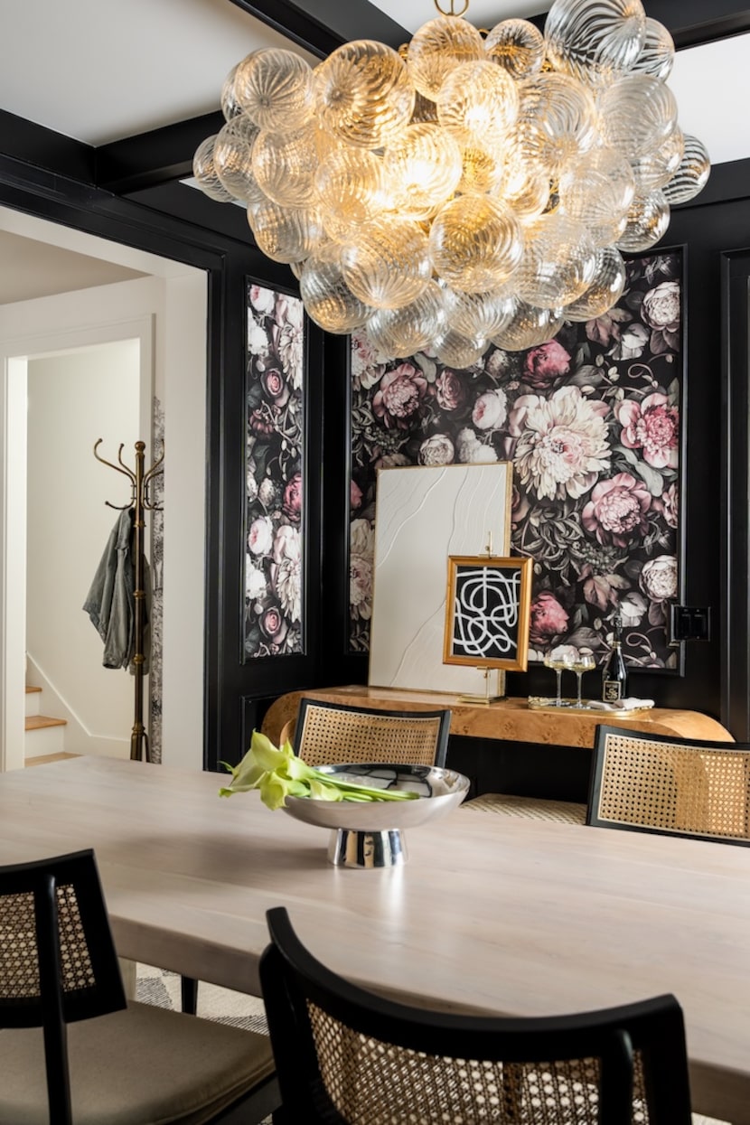
Some people find an extreme contrast jarring, but designer Kate Thacker made it work in this black-and-white dining room.
Courtesy Kate Thacker
Morgan has never had a client specifically request a Pantone Color of the Year, but the choice has come up more broadly in conversations. If anything, she expects the 2026 pick to influence choices about other colors. Clients who were thinking about deep, moody colors could be influenced to go lighter or less intense. White can be harder to match with the darkest colors because the extreme contrast can be jarring, Morgan says.
And if you’ve ever browsed paint card racks, you know the dizzying array of choices that falls under the heading “white.”
“Finding a good white paint is not as easy as you would think,” Warren says. (If you want to find out all the shades she landed on for her own home, you can email her.)
Thacker wonders if the Pantone choice might make it a little harder to convince clients to go bold. “I really feel like a lot of my battle with clients is injecting color, so this definitely doesn’t do me any favors,” she says.
Bright side
White isn’t going anywhere, and all these designers were using it long before one version got an official Pantone designation.
Thacker loves how white sets off other tones. “It really lets the other colors shine,” she says.
Clients who want all-white walls are “usually people who wanted to showcase other things in their space,” Morgan says. Unique or colorful furniture or art can pop against a backdrop of white.
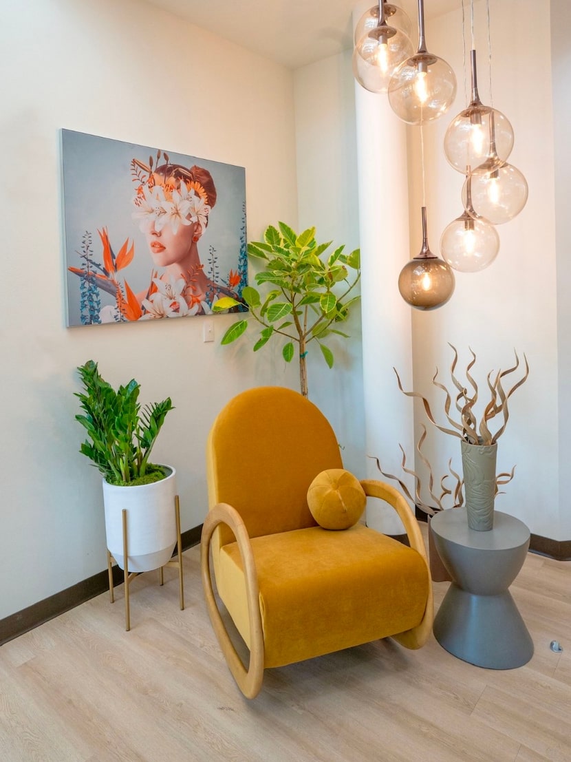
White walls are the perfect backdrop for dramatic art. That’s why art galleries paint their walls white.
Courtesy Hues to You
“It’s like a blank slate — you can put any type of color around you,” Morgan says.
If you decide to try Cloud Dancer on your walls in the new year, be sure to infuse the room with texture, interesting shapes and splashes of color elsewhere. These “will keep the space from feeling cold and boring,” Morgan says.
Warren says the same rules apply to white as to every other color choice.
“I urge my clients to look past a trend toward a design style they love,” she says. “If a space makes them happy and feels like them, it is never going to go out of style.”
If a trend appeals to a client, Warren suggests incorporating it sparingly so it’s easy to switch if it starts to feel tired. Trends “are just the cherry on top of a delicious, layered ice cream sundae,” Warren says.
For 2026, perhaps the trend sundae will start with some nice scoops of vanilla.
Love homes, gardens and design? Get more good stuff from Abode by following us on Instagram, Facebook and LinkedIn.