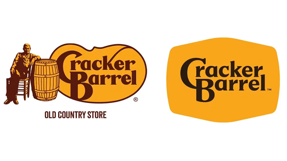
If you haven’t read about Cracker Barrel’s rebrand kerfuffle yet, where have you been? Even mainstream news sites are picking up on the outpouring of disbelief over the logo’s stripped back new appearance. Vintage Americana is no more, it seems, as the intricate logo has been replaced by a bland orange blob. And with Cracker Barrel already apologising, the brand is only too aware of the issue.
Naturally Reddit is awash with chatter, and there’s even one designer who had “a crack” at redesigning the logo themselves. The design is being applauded in the comments, and I have to say I’m quite a fan of the concept – it definitely . See the design below and decide if you agree.
Took a Crack at the Barrel from r/graphic_design
Analytical notes on the original logo and official redesign explain what this designer wants to do in their own version (something we love reading about for all the best logos out there). These are a nice touch when assessing the reasoning behind the final design. Statements like “a callback to the original illustration would be nice” and “I prefer the warmer brown” and “I miss the border”.
You may like
The result is a logo that is rooted in the brand story, retaining the actual barrel through better use of shape and, with it, the. personality that was lost in the real redesign. This designer also kept the original subtitle to scaffold consumers who don’t know the brand.

(Image credit: Cracker Barrel)
The comments on the thread are overwhelmingly positive.
“Nice work. You found a nice middle ground that still has some character, but is a much simpler design,” said one fan.
“Much better direction than the new,” said another. But they did have one suggestion. “Haven’t seen your exploration so I’m not sure if you’ve considered a couple things to experiment with. The barrel hoops look like old luggage straps at first glance. Have you explored using anything to indicate barrel staves?”
While one person hilariously said “Looks like a fat belly with suspenders” many comments agreed that sort of works, actually. “Reminds me of how bloated I am when I eat there,” says one response. And even the designer sees a benefit to the connotation: “Weirdly enough the original man on the drawing is wearing overalls so I thought it could be a subtle nod to him as well as the bands on a barrel. But I’m definitely stretching a bit!”
Seeing how different designers would approach a project is a fascinating venture into how different the consumer world could look if rebrands were given to different teams. Of course, these solo designers don’t have hoards of shareholders offering their opinions so it is much easier for them to get unscathed designs put on paper.
What do you think of the official rebrand and this version? Let us know in the comments.

