

Andy Walker / Android Authority
In early August, more users received Google’s updated music player redesign for Android Auto. Many questioned why core elements were altered without any functional purpose. The album art box was made smaller, the seek bar was thinned and narrowed, important text was compressed, and the background was no longer drawn from the art. Thankfully, I haven’t received this UI update yet, but I already dislike it. It made me realize an important Android Auto issue: its user interface and user experience suffer with each change Google rolls out.
Google’s design goal for Android Auto, at least as stated in its marketing material, is to keep drivers “focused on the road.” But what does this really mean? As a driver, a functional, human-centric, practical, and reliable interface would foster focus in the car. There’s a reason why certain in-car elements remain standard across most vehicles. The less time a driver spends searching for or looking at a UI element, the more concentration and focus is paid to the road. Therefore, a user interface environment should support these needs, right? I’d argue that recent Android Auto updates and several existing UI issues have not.
Should Android Auto let you customize its UI even more?
36 votes
Yes, I want Google to give me more control of my experience.
89%
No, the current level of customization is fine.
11%
Google says focus on the road, but Android Auto is determined to distract me

Andy Walker / Android Authority
I view Android Auto as an extension of my dashboard’s controls, and I expect it to support me while driving and accomplish tasks quickly, effectively, and reliably. This includes helping me navigate, making my music easily accessible, and simplifying responses to texts and calls if necessary. While it can and does allow me to complete these tasks, it’s not without struggle.
Don’t want to miss the best from Android Authority?
As I established in the intro, Google regularly makes distracting and disruptive UI changes to Android Auto, shuffling around design elements, changing long-established functionality of core apps, and adding non-essential visual flourishes that favor aesthetics over function. It does all this without addressing the fundamental issues or existing UI problems.

Take the recent media player changes, for instance, which contradict its design goal of “focus” first. Shrinking the album art and minimizing textual info means drivers must divert their gaze from the road longer to see what track is playing or how much time is left. Smaller control surfaces are more difficult to target and control. These tweaks aren’t practical or driver-centric, especially for those who don’t travel with a passenger.
There have been other questionable UI alterations, too. Recently, Google rolled out its Material You visual design to the system, but this hasn’t been without issue. Many users have noticed washed-out, overly contrasted text on duller backgrounds. While some car displays remain relatively legible even with these changes, others are much harder to use. Icons are trickier to identify due to glowing halo effects around them, while higher contrast washes out text and roads on mapping apps. There’s currently no option to revert these changes or disable Material You color sampling until these problems are addressed. While it’s positive that the UI now adheres to a more recent design language, this change compromises Android Auto’s legibility and fidelity for aesthetics.
Google regularly makes distracting and disruptive UI changes to Android Auto, without addressing existing issues.
A more recent change affects Google’s major driving app. Waze on Android Auto rolled out an annoying view shift whenever a route heads towards a roundabout or a major intersection. This means drivers are caught off guard by an unannounced change to a core interface behavior before entering potentially dangerous traffic furniture. Users panned the change, and there’s still no way to revert to the original functionality.
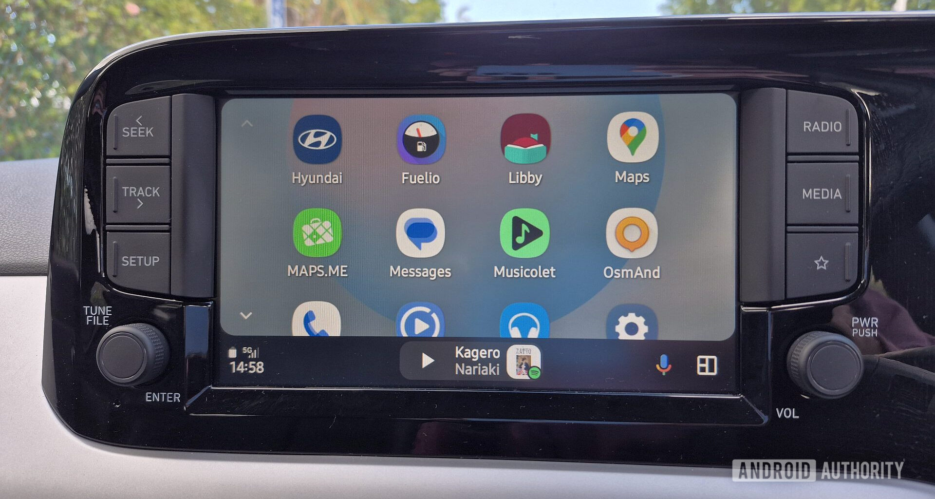
Beyond these recent changes, Google has yet to address longer-standing UI annoyances. Perhaps the most annoying for me is Google Maps’ massive search bar, which occupies a valuable chunk of the map. This functionally useless search bar cannot be minimized into a smaller icon and starts expanding every time I open the app.
Assistant’s unreliability only casts more light on the UX issues

Calvin Wankhede / Android Authority
You could argue that I shouldn’t use or even look at my Android Auto screen while driving. While I consider it a part of my dashboard and fair game in certain situations, I’ll agree with you for argument’s sake. Google provides a tertiary control method with an assistant. That sounds great on paper, but it unfortunately has its own set of problems in practice.
Ironically, while Assistant is still surprisingly good for adding groceries to my shopping list, setting reminders, or opening apps on Auto, it struggles with driving-related tasks. This is especially evident when using it to control Google Maps.
Assistant is surprisingly good in Android Auto, until you request a driving-related task.
Several weeks ago, I was driving home from a vacation along a narrow country road and craved reassurance that I was heading the right way. I triggered Assistant using the button on my steering wheel and said, “Navigate home,” but Maps didn’t choose my saved home location. My partner also tried, but with the same result. Eventually, she used the screen, but since we’d navigated to other places during our trip, my home address wasn’t immediately available in the search’s drop-down menu. She had to trawl through saved locations in my unorganized lists manually. This process took the best part of five minutes, by which time I was already on the main road home.
Both voice controls and Google Maps’ UI failed us that day, and it isn’t the only time, either. If Google doesn’t want drivers to use the screen while driving, a core hands-free control method like Assistant should work reliably.
The core problem with Android Auto: Google decides how you drive
Andy Walker / Android Authority
Look, I’m aware that software design is propelled by innovation, and I quite like the direction that Android is heading in with Material 3 Expressive, but Auto is not a smartphone interface. It doesn’t benefit from the “move fast and break things” design philosophy. It’s a car control interface, and changes to it can be distracting and dangerous.
Google insists on deciding how drivers use Android Auto, but as the driver, I should be the one to determine what setup works for me. There’s a reason why car manufacturers allow drivers to reposition their seats, steering columns, and mirrors.
Google insists on deciding how drivers use Android Auto, but as the driver, I should be the one to determine what setup works for me.
Thankfully, Auto’s interface isn’t a static piece of equipment in the car, and its issues aren’t insurmountable. Google could snap its fingers and revise its strategy, and relinquish more UI customization and controls to the driver overnight. Here are a few quick-fire examples:
Google could roll out more accessibility enhancement toggles to Android Auto, allowing drivers to pick their preferred DPI, element, and text sizes to better suit their vision and their car’s display.
It could introduce a simple way to accept or forego a UI tweak to a product, whether a major tweak like Material You or a minor adjustment like Maps’ annoying search bar.
Maps could introduce many UI customization options here, including selecting which elements to display on the map, a default quick list of navigable places specifically for the car, and the option to order other lists more effectively.
If Google intends to push innovation, perhaps it’s time to stagger Android Auto into Canary, Beta, and Stable builds.
Of course, Google could make Auto a more driver-centric experience in many other ways, and I’d love to hear your ideas too. However, these minimal changes would go some way to honor the service’s goal of fostering driver focus.
Does Android Auto’s UI need to push innovation?
For the most part, Android Auto is a solid product that does help me accomplish various in-car necessities. I believe that Google has nailed the UI in certain aspects, from the split-screen view to the ease of bringing the music player or navigation app to the foreground. Simple, predictable, practical. That being said, the experience is not as driver-centric as it could or should be.
Recent changes that Google has implemented actively go against the product’s core mantra, diverting drivers’ focus from the road. I’m pro-innovation, but only if those innovations improve user experience and functionality, and this stance is no more critical than in the car.
Thank you for being part of our community. Read our Comment Policy before posting.