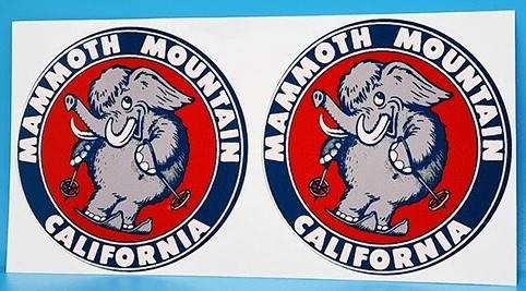
 Blast from the past; who has the best vintage logo? | Photo: ISOG
Ski resorts have always been about more than just the slopes—they carry a sense of identity and culture that shows up in everything from trail maps to apparel. The resort logo often serves as one of the most lasting symbols. While marketing teams may update logos to keep things modern, it’s often the older designs that leave the strongest impression.
Vintage logos carry a nostalgic charm, reminding skiers and riders of past trips, powder days, and the culture of earlier eras. They capture the unique character of each mountain in a way that newer branding often can’t match, offering a glimpse into the history, style, and spirit that continue to shape the sport today.
We asked our readers: What ski resort has the best vintage logo? After combing through the responses, these are the top five. Keep in mind that logos may have changed numerous times over the years.
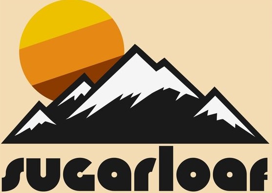 Vintage Sugarloaf logo. | Photo: Redbubble
This logo from Sugarloaf, Maine, is a prime example of the bold, graphic style popular in vintage design. The stark black and white mountain peaks stand in sharp contrast to the warm, striped sun, creating a dynamic and eye-catching image. The groovy, rounded font for “Sugarloaf” perfectly complements the illustration, giving the entire design a laid-back, yet confident, vibe that evokes a feeling of retro cool.
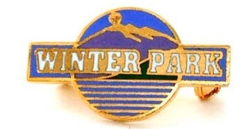 An old pin with Winter Park’s vintage logo. | Photo: Etsy
This logo from Winter Park, Colorado, features a streamlined, classic design that perfectly encapsulates the aesthetics of vintage ski resort branding. The bold, gold lettering is set against a vibrant purple and blue mountain landscape. The clean lines and strong colors give it a timeless and elegant appeal, making it a sophisticated example of the era’s promotional art.
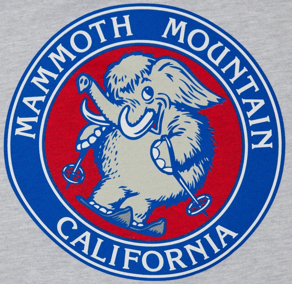 Old school Mammoth Mountain logo. | Photo: Mammoth Mountain
This classic circular logo for Mammoth Mountain features a charmingly retro illustration of a woolly mammoth on skis, adding a fun and memorable personality to the brand. The bold, primary color palette of red, white, and blue, along with the clean, graphic lines, gives it a timeless, sporty feel. The playful yet strong design perfectly represents the resort’s name and its adventurous spirit, making it a beloved piece of vintage ski culture.
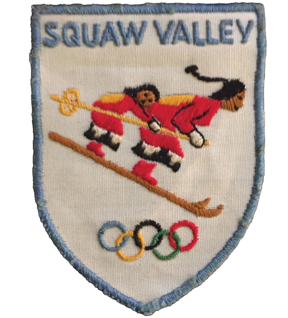 An old patch logo from Squaw Valley, CA. | Photo: Alta Journal
This logo for the formerly known Squaw Valley is a fascinating piece of ski history, directly linked to the 1960 Winter Olympics hosted there. The central figures show a dynamic design that captures the movement and excitement of the sport. The inclusion of the Olympic rings at the bottom firmly places this logo in a specific, celebrated moment in the resort’s history. It’s a striking and historically significant logo that represents a pivotal era for the resort, which has since been renamed to Palisades Tahoe.
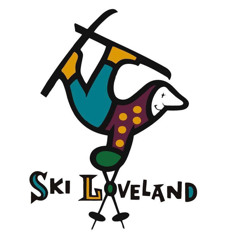 Ski Loveland came in at number one. | Photo: Loveland
The playful, hand-drawn design of the Loveland Ski Area logo, featuring a gleeful, tumbling skier, captures a sense of pure, uninhibited fun. Created by renowned children’s book illustrator Garth Williams (of Charlotte’s Web and Little House on the Prairie fame), the logo’s timeless charm has made it an enduring symbol of the resort. Its simple yet expressive lines and classic color palette make it a standout example of vintage design that still feels fresh today.
At the end of the day, the best vintage ski resort logos aren’t just graphics from another era—they are symbols that connect us to the roots of the sport. They remind us of long chairlift rides, family ski trips, and the distinct character of mountains that shaped our love for skiing. Even as resorts continue to modernize their branding, these classic designs hold a timeless appeal that keeps the spirit of skiing’s past alive. Looking back at them is less about design trends and more about honoring the memories and traditions that define the mountains we cherish.
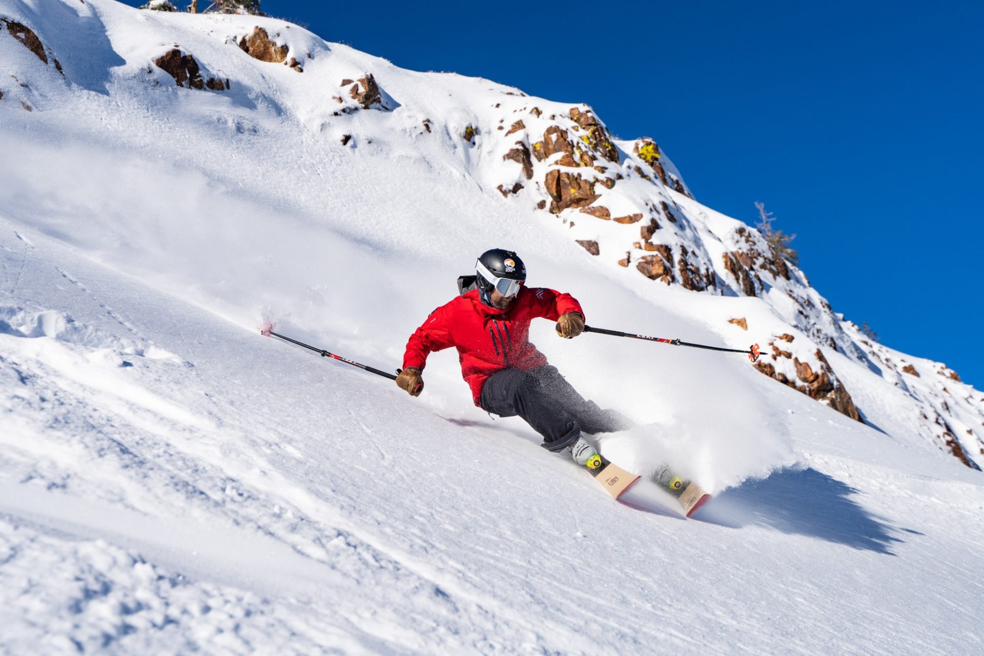 Logos and names may change, but the skiing stays the same. | Photo: Palisades Tahoe
