
Every now and then you come across a piece of evidence that feels strong enough to cut through the noise and change minds.
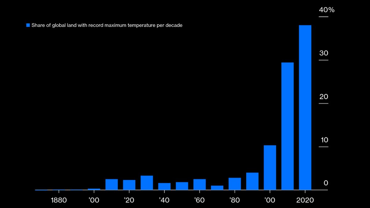
Zeke Hausfather, a climate scientist at Berkeley Earth, recently produced a stark illustration of just how quickly the planet is heating up as a result of the greenhouse gases humans pump into the atmosphere. It’s a chart, published in his Substack newsletter The Climate Brink, breaking down the percentage of the world’s land that has experienced its hottest month on record in each decade since the 1870s.