
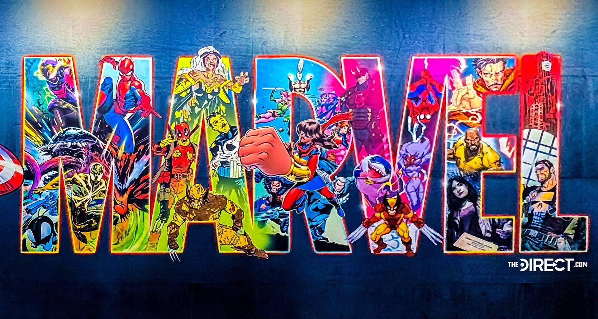
Marvel has revealed a brand new logo at this year’s New York Comic Con, and it’s packed with character cameos. From fan favourites to new friends, the design has sent Marvel fans in a spin, trying to spot hidden easter eggs.
Despite the logo design being popular among many Marvel fans, some found it a little overwhelming, to say the least. Others felt a little short-changed that their favourite characters were omitted, pointing to a potentially divisive new era for Marvel.
New logo for Marvel at #NYCC(📸: @TheDirect) pic.twitter.com/FaygTtMKpZOctober 9, 2025
A vibrant spin on the classic Marvel wordmark logo, the new design is packed with iconic characters from across the studio’s franchise. Some seemed to get more love than others, with Wolverine and Spiderman appearing three times each, while classics like Thor, Captain America, and Hulk were mysteriously missing. (Although major fan service points must be awarded for the Jeff the Land Shark appearance.)
You may like
While some fans appreciated the array of cameos, others found the overly bright, crowded design a little too much, with one fan writing, “While I appreciate the effort to be vibrant, this new logo just feels too busy and visually overwhelming.” Another added, “I feel overstimulated looking at this,” while one fan called the new design “The ugliest one so far.”
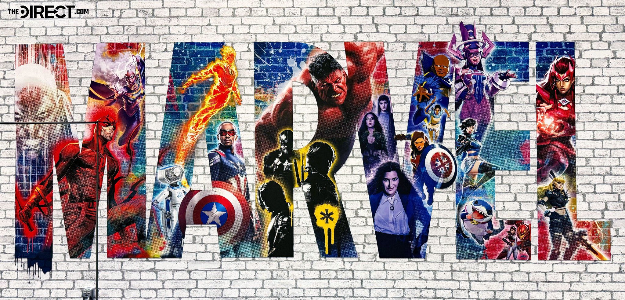
(Image credit: Marvel/The Direct)
While I admit the new Marvel logo is perhaps a little headache-inducing, I’m almost certain the studio will release another design in the near future, given that they only dropped its previous design last year. For more comic book content, check out our superhero logo quiz.