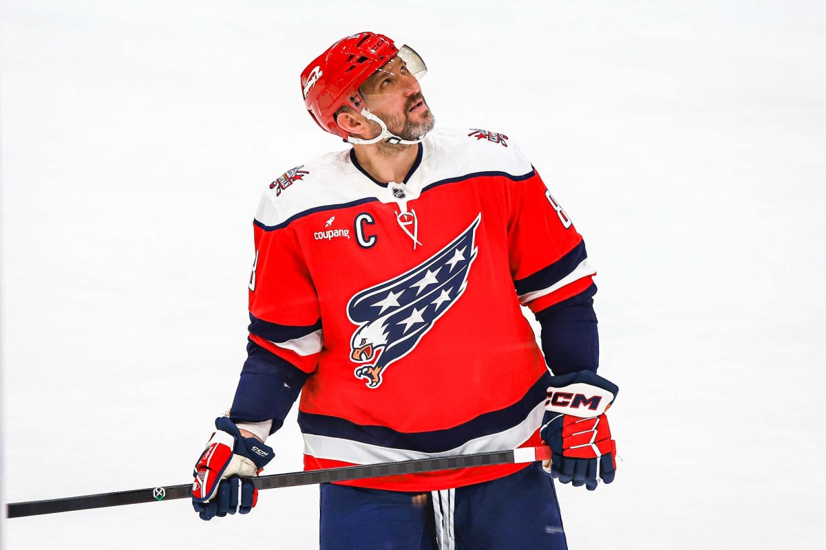
The Washington Capitals released a public survey on Monday, both on social media and email, focused on the team’s design identity.
“Share your feedback about the Screaming Eagle and current Capitals jerseys,” the Capitals implored followers on X. (You could also win a signed jersey.)
Days after releasing a new Screaming Eagle third jersey, the questions took stock on how Capitals fans felt with the current look and feel of the team as well as which logos they preferred most.
Some of the questions asked were focused on:
The primary color you are drawn to when wearing Capitals gear
Rating the Screaming Eagle, Weagle, Capitol Dome, Blue ‘W’, original, and primary Capitals wordmark logos
Rating the team’s current jersey selection in comparison to other NHL teams
Specifically rating the Red/White/Blue Screaming Eagle jersey, current white away jerseys, black Capitol Dome jerseys, 2018 Stadium Series jersey, 2023 Stadium Series jersey, original jerseys, the Blue ‘W’ jerseys, the current red home jersey, the 2015 Winter Classic jersey, and the black Screaming Eagle jersey
Explaining why you liked or disliked jerseys
So what does it all mean? Some readers had a hunch and seemingly everyone appeared to appreciate having their voice heard.
“I think they’re planning for the next rebrand once Ovi hangs em up and getting rid of the current reds (which I personally don’t like),” Capitals fan Ryan D told us on X. “Primary logo, and which blue are they using, navy or royal.”
“To me, what they’re doing is trying to figure out whether or not they should retire the current primaries and make the new alternates our primaries after Ovi retires,” Adam said.
“I definitely think a rebrand is coming, when and how seems unsure,” Zach E. said. “But I do appreciate how in-depth it was and how much input they allowed. I went all in all the classic the Screagle & Dome, and emphasized how boring the word logo is.”
“It’s exciting to see that they’re potentially taking us seriously after we’ve been asking for a rebrand for years,” Kieran M. said. “Really looking forward to what that means going onward, the future is bright on all fronts at this point.”
The Capitals’ poll comes after two successful Reverse Retro releases featuring the Screaming Eagle logo, and the positive reception to their recent release featuring the Screagle — a red, white, and blue third jersey, that appears in part to pay homage to their original logo and jersey design. Not only have the Screaming Eagle jerseys been popular with fans, but also with players, especially with Alex Ovechkin who wore the logo during his first two years in the NHL.
“I think we should wear it a lot,” Dylan Strome said of the Screagle design last week.
Last season, the Capitals were also reportedly considering putting the Screaming Eagle logo in the regular rotation.
While the retro designs from the 90s have elicited good feelings, the Capitals wordmark logo has seemingly fallen out of fashion with many others. In a national poll conducted by hockey statistician and social media personality @JFreshHockey, the Capitals were rated to have the worst home jerseys in the NHL for a second consecutive year.
If you haven’t participated in the poll yet, a link to it is included in the embedded tweet above.

