
From very early on in the project it was this idea of “mixing and tailoring” that informed the entire visual direction of the brand identity for Lotta, all of which started to take shape around a singular sketch of the logo. Set in Herbus, a typeface deigned by Eliott Grunewald, the brand mark for Erly was designed to “mirror the gentle, circular motion of blending droplets into moisturiser – the letters softening and merging in a way that evokes compounding”, Lotta tells us. “I wanted to find something with that sort of circular movement, and found Herbus worked perfectly to convey that sense of motion.”
The purposefully stacked letterforms flow seamlessly into one another, and this mark became the distinct stamp of the playful and sophisticated brand personality. When you find a composition that beautiful it’s hard not to make it centre stage, so that’s why the logo sits at a scale larger than the products boxes, wrapping around their edges in the brands packaging system. Lotta and the team spun this harmonious composition into multiple variations and scales, some stacked, some horizontal, some with layers of colour that outlined the letterforms to “subtly reinforce the theme of personalisation woven throughout the brand”, the designer says.
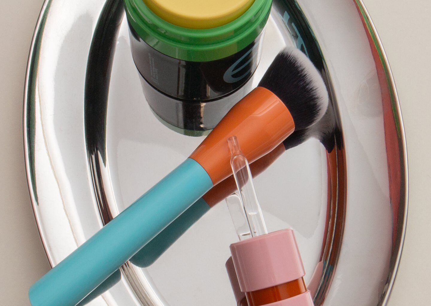
Colour was also a large focus of the brief for Lotta and something that stirred her decision making throughout, a fixation which is clear to see in the studios approach to packaging. The range’s sophisticated, muted tones have been expertly paired with playful neon hues that bounce off of one another – “like the earthy rust that balances the brighter pink on the serum cap”, Lotta says. “Relying on colour and a confidently scaled logo gave the packaging a sense of both confidence and playfulness.”