
After failing miserably in mobile with Windows Mobile, Microsoft’s Hail Mary in 2010 turned out to be something truly special and remarkable. Windows Phone, with its live tile interface, was something truly unique and different when compared to the one-dimensional homescreen experience Google had with Android and Apple had with iPhone OS (before it was just “iOS”).
Windows Phone was not just different, but better, in an age where so much of the info we use on our phones is in app silos that require us to open multiple apps to get info. Windows Phone lets you glance at your homescreen and get important updates and data, all from a beautiful, vertical-scrolling tile-based user interface that was truly ahead of its time (and by the way, you can get your Android to look like Windows Phone).
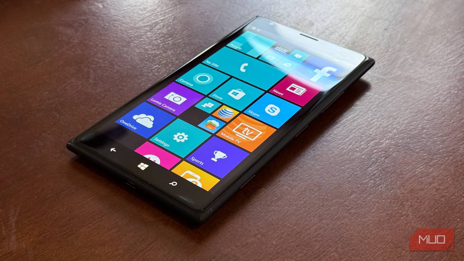
The Live Tile interface explained
A truly glanceable experience with less hunt-and-peck
What are live tiles? They come in three sizes, and can either be a square icon app shortcut, or, if you expand the tile into one of three sizes (small, medium, and expanded), you can increase the tile into one of two widget sizes that will show you relevant information from the app. Here are some examples of the two live tile widget sizes and what they could show you:
Weather app: current conditions / five-day forecast
Sports app: current score/scores from other games
People app: unread message count/preview of most recent text/Facebook update or Twitter post
Calendar app: next appointment/snapshot of agenda
The concept behind live tiles is well encapsulated in the above ad spot, which Microsoft ran in 2011, when Android and iPhone OS were the main platforms, so much of the interaction came from being immersed in apps. Windows Phone offered a new model: an interface with live and active tiles that could show you information so you could glance and go.
Live tiles were alive
It was playful yet informative and intentional
The above review of Windows Phone 8.1 does a fantastic job of conveying what Windows Phone did best with its live tiles: it offered a fun, whimsical, yet highly useful interface that lets you use your phone quickly and intentionally without spending too much time going in and out of apps. It was a wonderful way of operating that was the opposite of what Android and iPhone OS offered.
Live Tiles was an interface with live and active tiles that could show you information so you could glance and go.
Android has always let you customize everything
But it’s a bit of a wild west
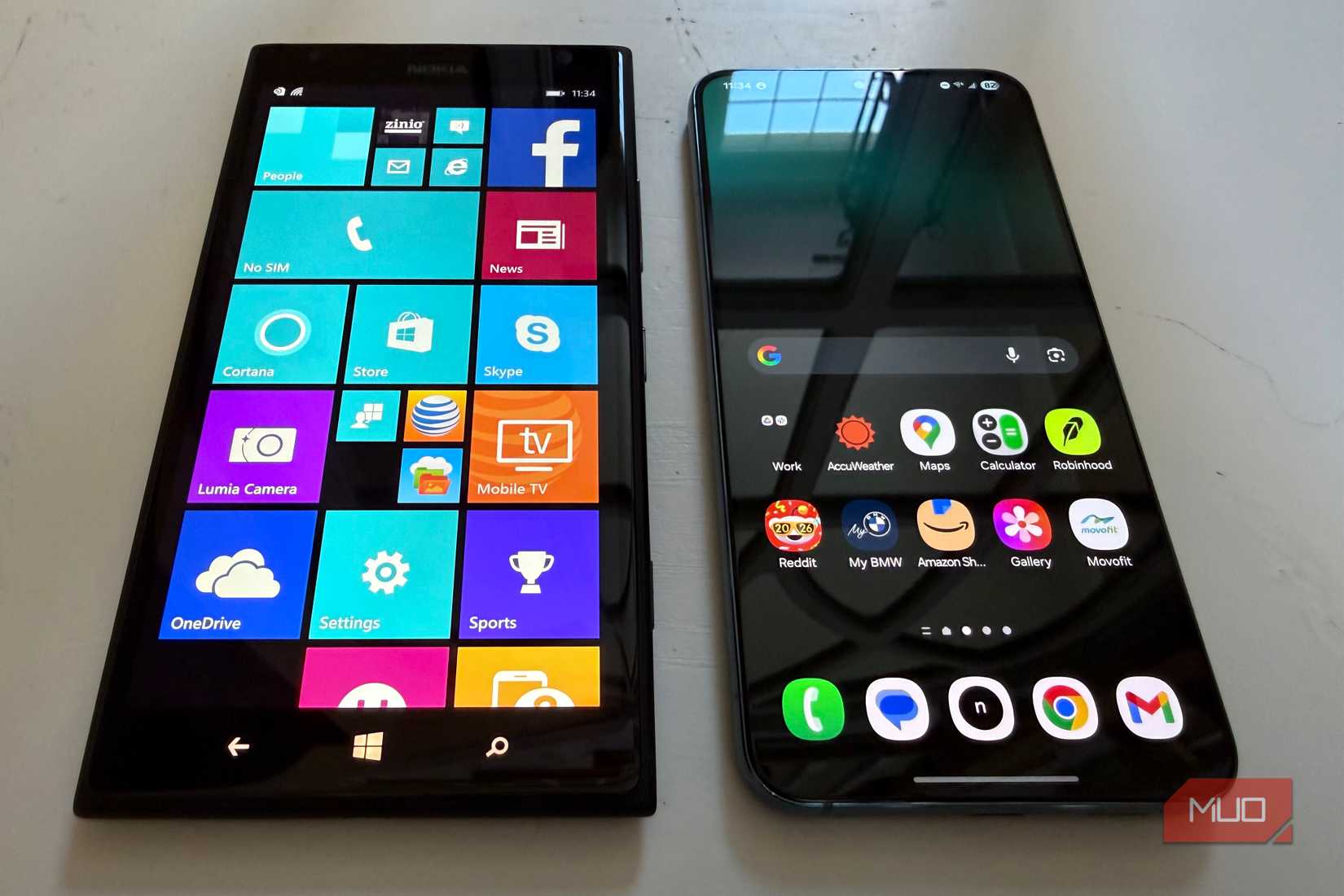
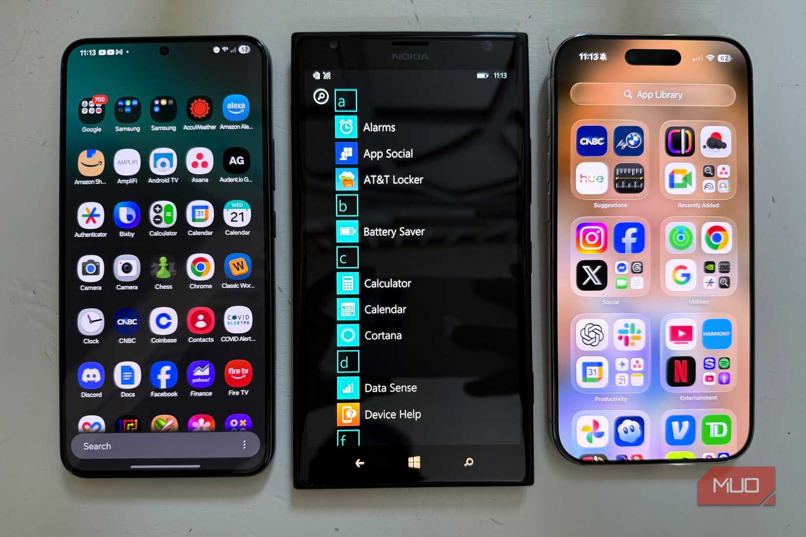
Credit: Brandon Miniman / MakeUseOf
The Android platform has always been the most versatile when it comes to homescreen design. From nearly day one, you’ve been able to add widgets, adjust grid size, and even change the Android launcher entirely. But this is a double-edged sword: I’ve seen many Android homescreens that are collections of disparate widgets and icons, sometimes offering no visual cohesion.
Windows Phone, on the other hand, had a wonderfully consistent UI due to the limitations of live tiles, which could only be 1×1, 1×2, or 1×3 in terms of grid size. It was hard to mess up Windows Phone with these constraints: all third-party apps had to adhere to the same design language, and it made for a very consistent look, no matter how you set it up.
iPhone’s homescreen is mostly unevolved
An app grid with some widgets (but only recently)
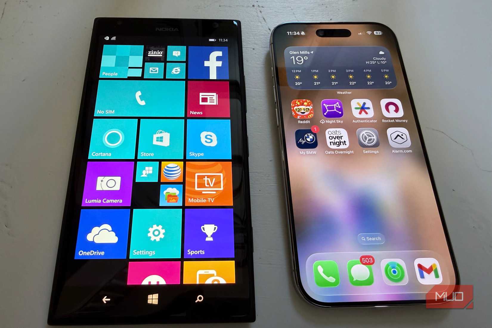
Credit: Brandon Miniman / MakeUseOf
Let’s consider iOS. Starting in iOS 14, Apple finally let us put widgets on the iPhone homescreen, and it wasn’t until iOS 18 that you could place an icon anywhere you wanted. Apple has been notoriously strict when it comes to limiting the homescreen experience, and as a result, most iPhones looked exactly the same until a few years ago, when you could add widgets and place icons wherever you wanted.
Windows Phone offered a brilliant compromise by again restricting the size and shape of live tile widgets to one of three sizes, and all with the same shape, and you could place these tiles anywhere you wanted, even if they didn’t align to a perfect grid like on the iPhone.
Related
I brought Windows Phone tiles back on Android and it’s awesome
Bring back the iconic design of a Windows Phone with this easy-to-use smartphone launcher.
Windows Phone Live Tiles is still a better way
It was perhaps a bit too early, but it had the right idea
Credit: Brandon Miniman / MakeUseOf
In 2026, we’re learning how to have a healthy relationship with our technology. Modern phone experiences are still very much app-based, with info and functions living in silos that can only be accessed within individual apps. Over a decade ago, Microsoft had a better idea: make the homescreen glance-and-go with live tiles that could present you with information at a quick glance, but never at the expense of the wonderful fluidity and consistency of the Windows Phone Metro UI design aesthetic.
While Android with Material 3 Expressive and iPhone with widgets on the homescreen have come a long way, they still lack the wonderful consistency and playfulness that live tiles offered.