
In Rachel Christopoulos’ Mount Horeb studio, an in-progress painting of a forest scene with light spilling through dense branches sits on a wooden easel. Purple, blue and yellow paint dots the surrounding furniture, and the room is filled with an assortment of prints, stickers and postcards.
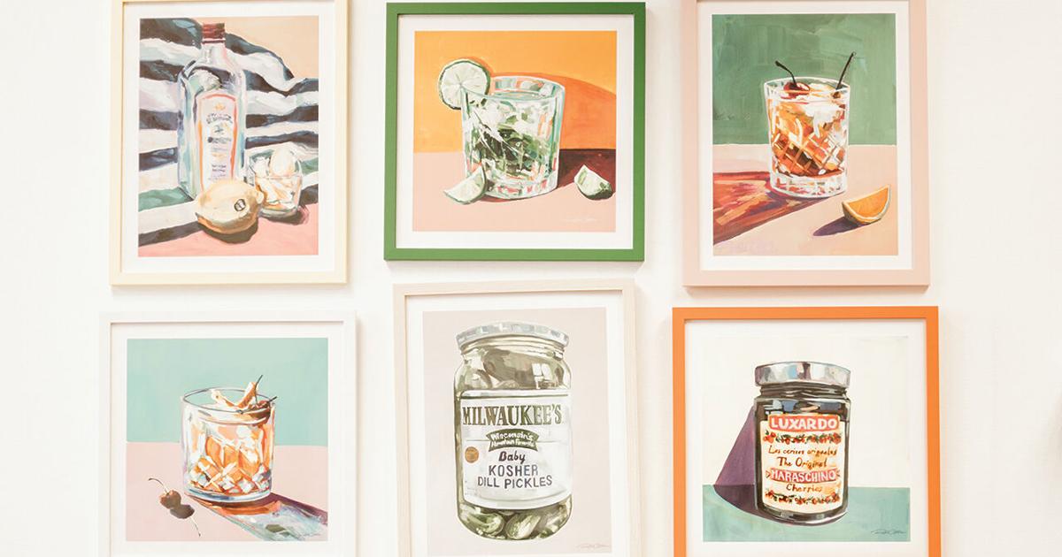
While her studio is a testament to her signature aesthetic — an “impressionist pop art” style that incorporates vibrant colors and visible brushstrokes to capture light and movement — it was only eight years ago that Christopoulos first picked up a paintbrush.
“It was horrible,” she says, remembering when she locked herself in a spare bedroom to drudge through unremarkable first attempts. “I was like … ‘This is not working out. What am I doing?’ ”
But over time, her practice paid off. Christopoulos’ work has been featured by major art supply brands like Strathmore and Michaels. She also hosts a podcast, “Art Crisis,” that discusses the problems creatives face today, like dealing with burnout, balancing passion projects and creating products that sell.
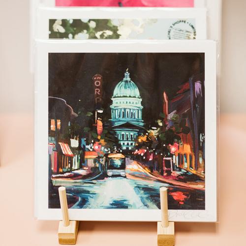
With depictions of Midwestern landscapes and scenery — like Devil’s Lake State Park or the Memorial Union Terrace — Christopoulos aims to capture the essence of a place or object instead of recreating a reference photo exactly. Every painting starts with a layer of neon pink or bright orange, and then a “very loose, very messy, blurry blob of colors,” says Christopoulos. With each layer, she adds more details and colors, tweaking as she goes.
“I want [my artwork] to feel fun and dreamy and approachable,” says Christopoulos.
From the Artist: Rachel Christopoulos

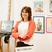
Photo by Christine Dopp
Signature Style
I usually describe my work as impressionist pop art. It’s very color focused. But I also paint a lot of pop culture things. Very Wisconsin things. I don’t want to limit myself to the things that have always been seen as fine art.
Make It Work
If I have to clean it up and take a color out or put a different color in … I’m brainstorming on the canvas. [I ask myself], “What needs to go? What do I have to [add to] this? How do I crack this so it’s harmonizing?” It’s layers and layers of problem-solving.
Let the Light In
I play a lot with light in my pieces because it allows me to bring in so many more colors. The more color, the better. The more I can push it into that kind of psychedelic world, the better I feel about what I’m making.
Earned Confidence
Learning how to trust myself and my art has been one of the biggest things for me as an artist. … I feel really good about what I’m making 1769639770. It feels very authentic to who I am and what I enjoy most in life.
Close
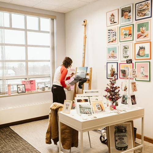

Christopoulos has studio and exhibit space in Mount Horeb’s Makers Market Square, a year-round indoor marketplace with art exhibits, a maker’s mall and public studio spaces. About two days a week, she works out of Artisan Studio 6, which also offers a display of prints and exclusive products for purchase.
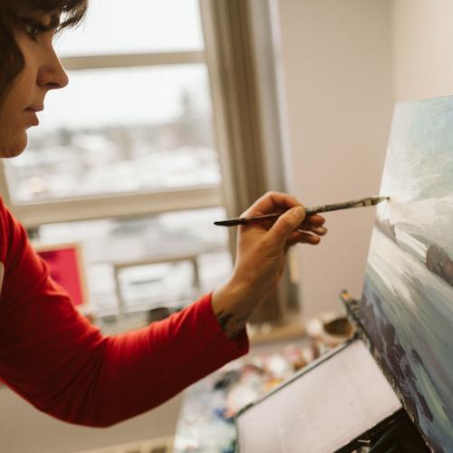

Working with acrylic paint — which dries quickly and layers well — allows Christopoulos the freedom to adjust as she paints. “I love how forgiving it is,” she says. “It is amazing to be able to just reshape and rework a piece as many times as it needs. It feels like I’m never stuck.”

The only color Christopoulos rarely uses, surprisingly, is black. To create contrast or shadows, she’ll use Prussian blue (a very dark shade of blue) or purple. “I think that helps my paintings not get so heavy or dull,” she says.

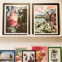

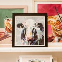
Christopoulos focuses on Midwestern culture and scenery — so, naturally, there are a few cows alongside the other scenes in her print shop. Her “608 Cow Print,” which depicts a Holstein with a yellow ear tag referencing Madison’s area code, is one of her most popular pieces.
Christopoulos has studio and exhibit space in Mount Horeb’s Makers Market Square, a year-round indoor marketplace with art exhibits, a maker’s mall and public studio spaces. About two days a week, she works out of Artisan Studio 6, which also offers a display of prints and exclusive products for purchase.
Working with acrylic paint — which dries quickly and layers well — allows Christopoulos the freedom to adjust as she paints. “I love how forgiving it is,” she says. “It is amazing to be able to just reshape and rework a piece as many times as it needs. It feels like I’m never stuck.”
The only color Christopoulos rarely uses, surprisingly, is black. To create contrast or shadows, she’ll use Prussian blue (a very dark shade of blue) or purple. “I think that helps my paintings not get so heavy or dull,” she says.
Christopoulos focuses on Midwestern culture and scenery — so, naturally, there are a few cows alongside the other scenes in her print shop. Her “608 Cow Print,” which depicts a Holstein with a yellow ear tag referencing Madison’s area code, is one of her most popular pieces.
Rachel Christopoulos | Instagram: @rachelsshoppe.co | rachelsshoppe.com
Sophie Wooldridge is a student at the University of Wisconsin–Madison and an arts associate editor at The Badger Herald.
COPYRIGHT 2025 BY MADISON MAGAZINE. ALL RIGHTS RESERVED. THIS MATERIAL MAY NOT BE PUBLISHED, BROADCAST, REWRITTEN OR REDISTRIBUTED.