
The sun came out in the UK for what felt like the first time all year, so naturally, I’ve officially started my countdown to spring. Did this sunshine also influence Livingetc’s March color crush? Most likely. Pêche Parfait is orange’s more delicate, elegant, and playful cousin, and it’s the perfect inspiration for your spring decorating plans.
Okay, Pêche Parfait as a spring color palette might not be the most out-there take, but there is a warmth and naturalness to it that makes it a standout compared with other pastels. “Perched between red and yellow on the color wheel (slightly closer to red than true orange), it’s tempered with white, and sometimes has a hint of pink for a little rosiness,” explains Livingetc’s color expert, Amy Moorea Wong. “Like the summery fruit it shares its name with, it feels soft, emanates warmth, and exudes a hazy, gentle mellowness.”
It’s a far cry from February’s color crush, Obsidian Heart, but hey, what is good interior design without a bit of balance and surprise? There is so much inspiration to be found here, so if you’re looking for something to brighten these increasingly warm days, here’s everything you need to know about Pêche Parfait.
You may like
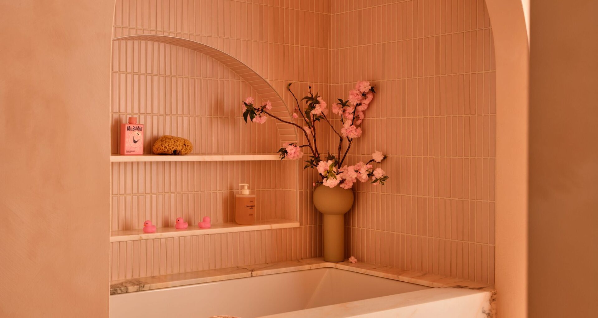
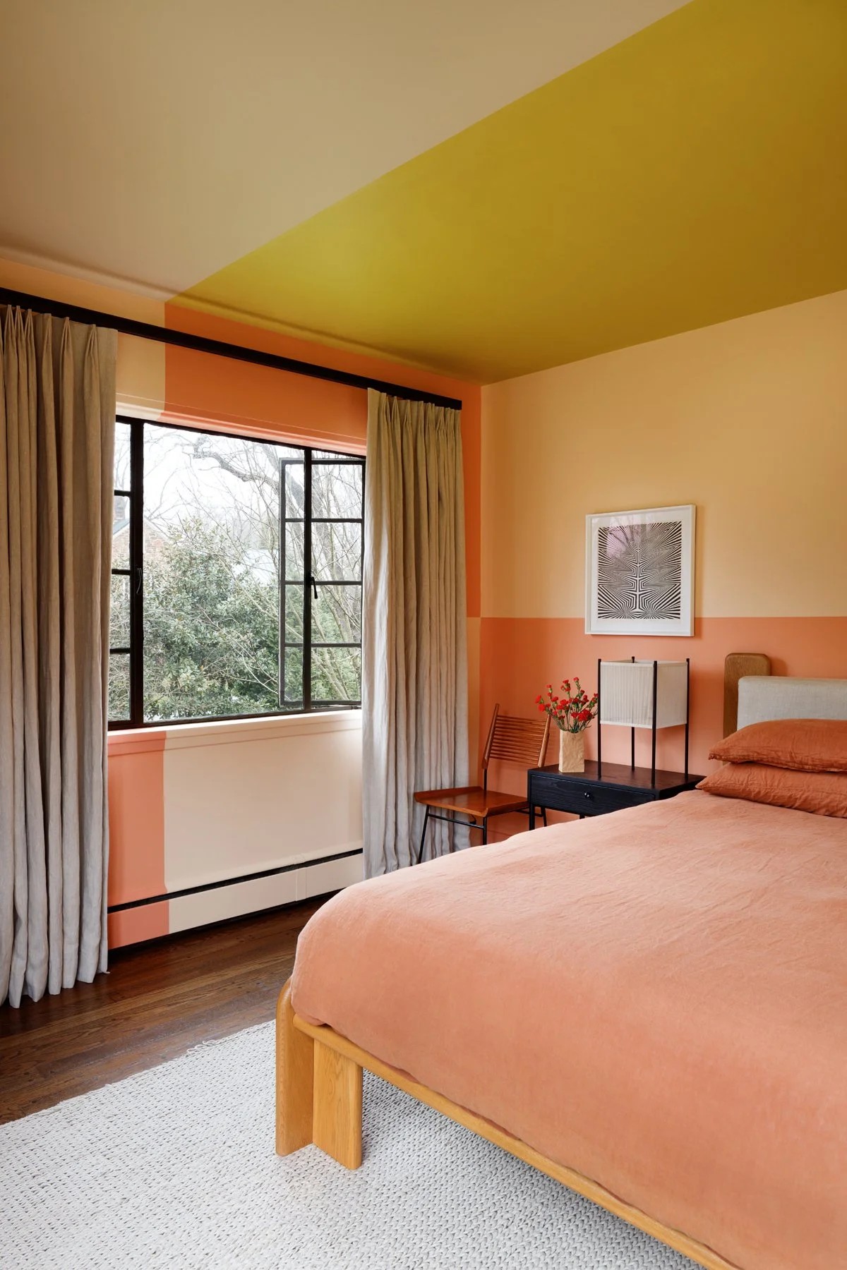
As a color, Pêche Parfait is bold but enveloping.
(Image credit: Read McKendree. Design: Chango)
As explained by Amy Moorea Wong, Pêche Parfait sits somewhere between red and yellow (with white undertones, as is the case with pastels), which makes it an easy addition to any warm color scheme. It’s radiant, but soft.
“Pêche Parfait’s pale but radiant tone makes it feel young, jovial, free-spirited, and spritely,” she adds, “while its pushed back, powdery, gauzy-ness lends it refinement, poise, and grace, so it reads as considered and finely balanced.”
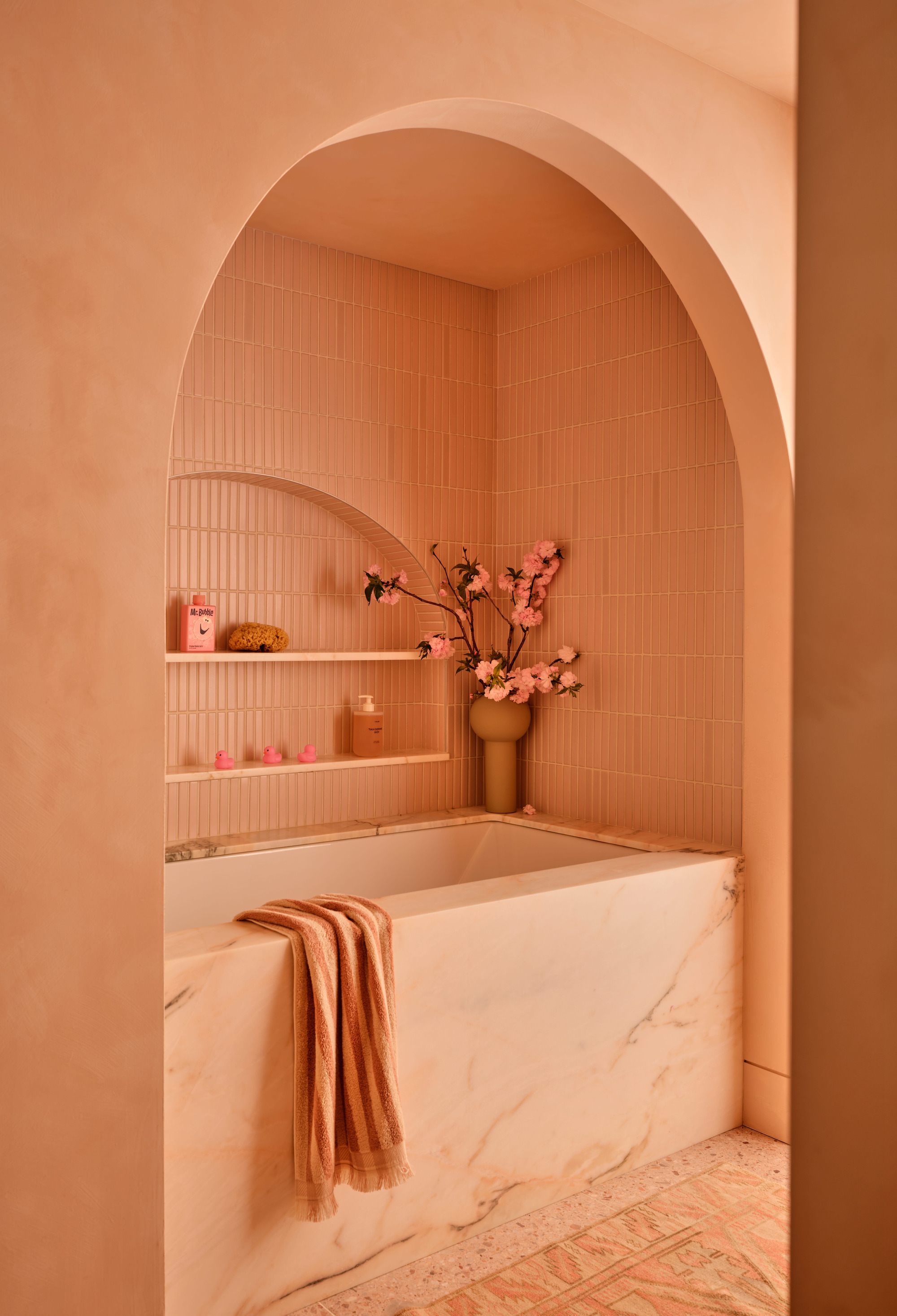
Even a space completely drenched in Pêche Parfait feels warm and inviting rather than overwhelming.
(Image credit: Read McKendree. Design: Chango)
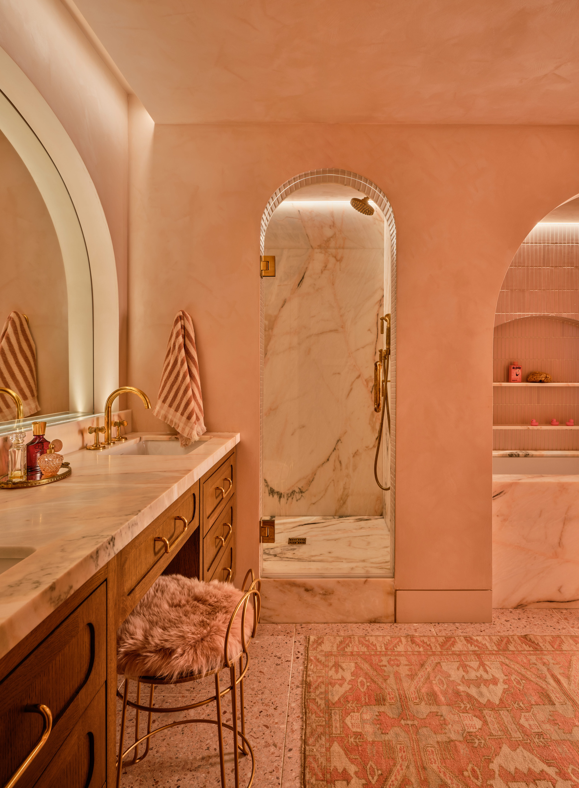
Peach tones have a reputation for being a bright, pastel variation to decorating with pink, but there is more nuance to it than that — and no, it’s not the same as pink. Pêche Parfait is closer to terracotta and brighter versions of plaster, making it a more neutral (read: easier) shade to introduce into an interior.
“In the home, Pêche Parfait almost glows with soft sunlight and with a velvety, fruit-like finish,” says Amy. “It brings in the sun, making walls hum with subtle energy, and can work both as an attention-pulling statement hue or as an almost-neutral organic backdrop thanks to its links to nature.”

Little Greene
Shrimp Pink™

Lick
Orange 05: Peach Orange Paint

Farrow & Ball
Ointment Pink
How to Use Pêche Parfait in Interiors
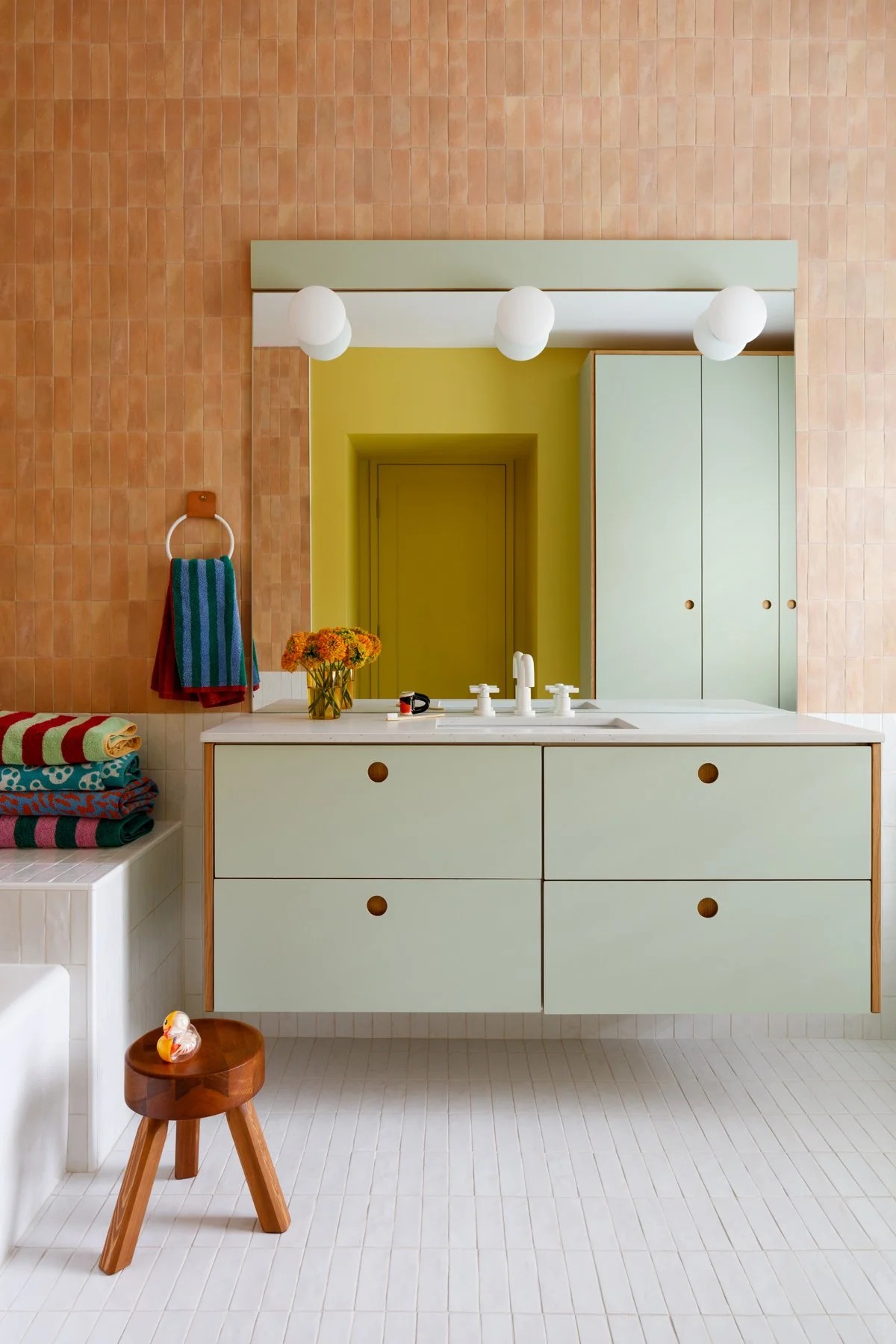
Here, mint and peach make for a contemporary spring-inspired color combination.
(Image credit: Jennifer Hughes. Design: Surrounded by Color)
As peach can technically be categorized as a natural color, it has a chameleon-like ability to work with a range of hues. So don’t be fooled, there are plenty of colors that go with peach, or Pêche Parfait, to be specific.
Virtually any shade of green will play nicely with Pêche Parfait (remember red and green are complementary colors). “Try moss or olive for something more muted, or apple green for a bit of a kick,” suggests Amy.
Would you dare to pair Pêche Parfait with January’s Sour Lime? Now that’s an electrifying combination.
What to read next
Even this color block feels less obvious with Pêche Parfait’s gentleness.
(Image credit: Jennifer Hughes. Design: Surrounded by Color)
If you want something a little calmer, try a tonal color combination. “Rose and blush pinks add layers to Pêche Parfait’s pretty softness,” says Amy. With tonal color drenches, you can play with creating a room immersed in the warmth of peach. “Or for something bolder, teal brings illumination, and saffron injects some vibrant spice,” Amy adds.
With Pêche Parfait, you’ve got options when it comes to decorating. Whether this shade is inspiring you to grab a paint brush and coat the walls or to start with a simple table lamp or decorative vase, Pêche Parfait is inoffensive in the best kind of way. It’s a fabulous color to incorporate into your spring refresh, and here are a few Pêche Parfait-inspired pieces to do just that.
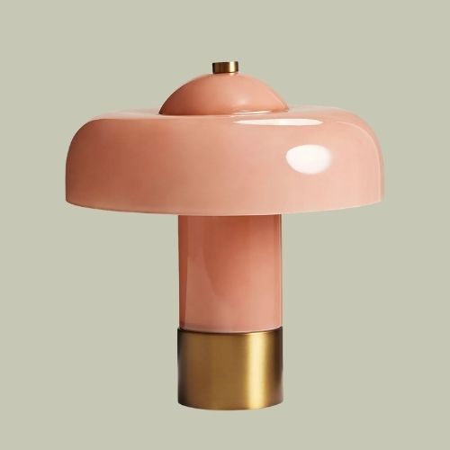
Soho Home
Giovanni Moulded-Glass Table Lamp
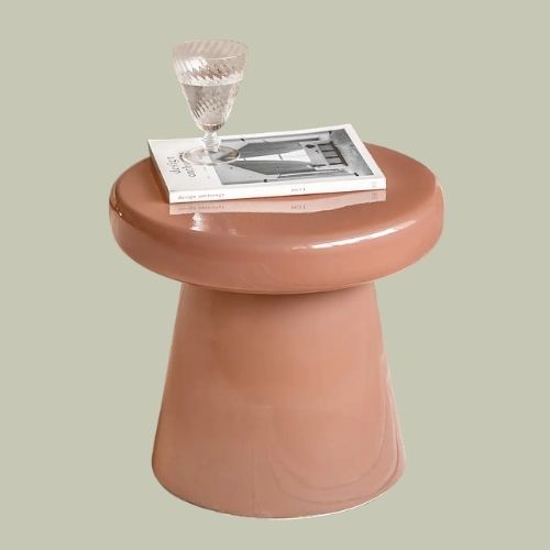
Dunelm
Ambrose Side Table
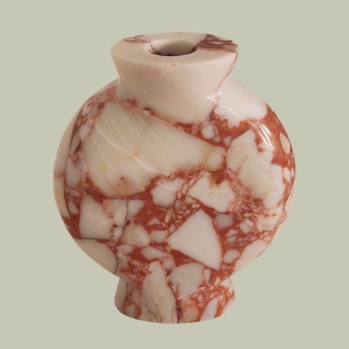
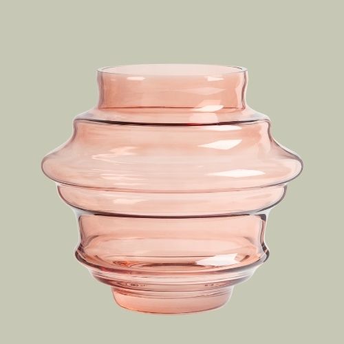
Soho Home
Marble Sesso Vase
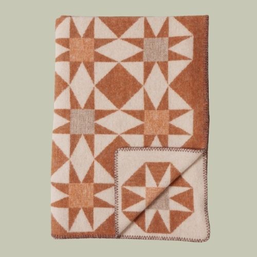
TOAST
Jacquard Star Wool Blanket
H&M Home
Large Tiered Vase in Pink
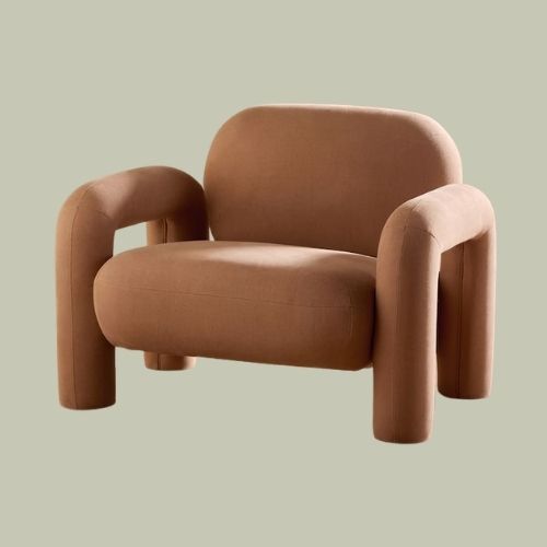
MADE.COM
Bobo Accent Chair in Tea Rose Pink
Decorating with color doesn’t always have to mean electrifying blues and dauntingly deep burgundies (although these are fabulous too). Pêche Parfait is gentle on the eyes, but still warm and cheery.
Loving all the color inspiration? The Livingetc newsletter will keep you up to date on all the latest color trends.