
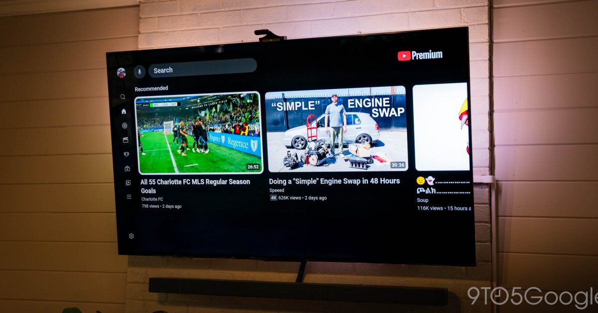
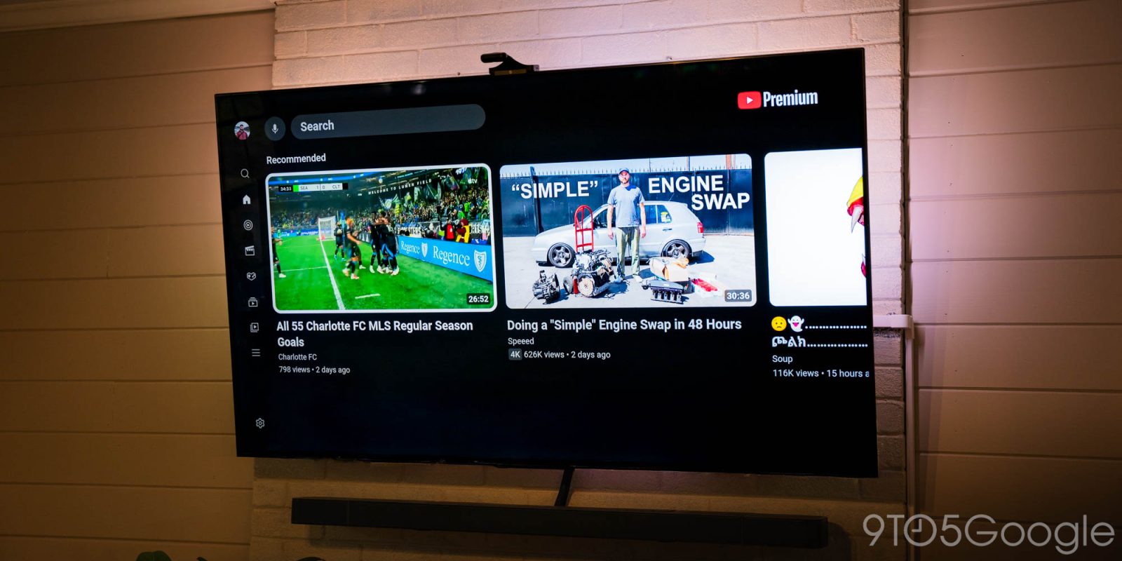
The YouTube app for TVs, including Google TV, is rolling out a new design for the sidebar that makes it easier to access your library while also showcasing some of your recently-watched channels.
Showing now for some users, this new sidebar design for YouTube on TV is a relatively minor, though welcome update.
The existing sidebar, from top to bottom, has shortcuts for Search, Home, Music, Movies & TV, Podcasts, Subscriptions, Library, and a “More” overflow tab, with a Settings option at the very end. It works, but it means you have a lot of clicking around to do in order to reach your Subscriptions and Library, which are two of the most-used sections.
The new sidebar keeps Search and Home at the very top, but with a new section underneath that contains Subscriptions and Library, alongside two direct channel shortcuts – we’re not sure if these are recently-viewed, recently-subscribed, or just algorithmically-determined channels. They appear on the sidebar even in its collapsed state.
Advertisement – scroll for more content
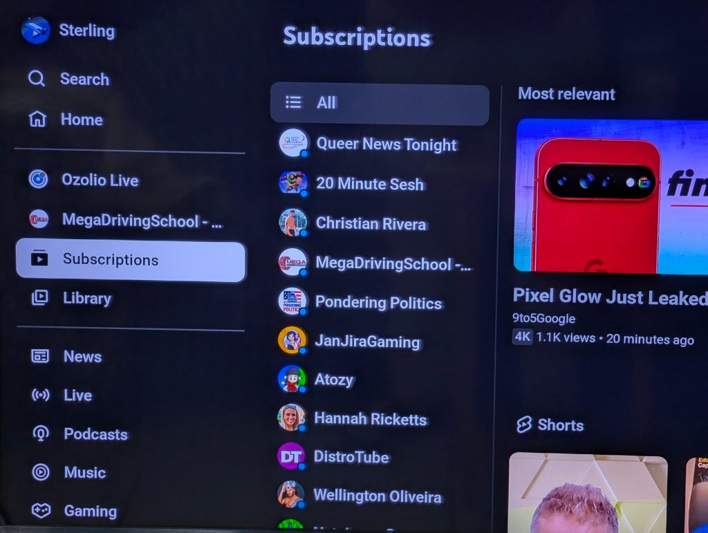
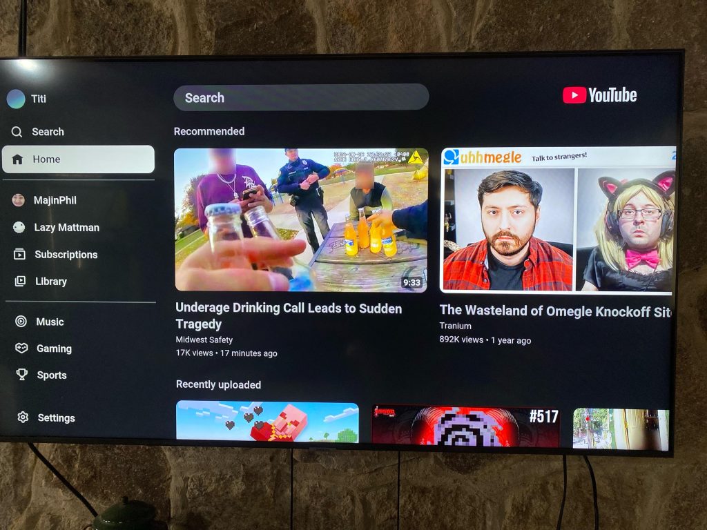
Below that you’ll see shortcuts for News, Live, Podcasts, Music, Gaming, and Sports, but this seems to change depending on your TV. A Settings button remains at the bottom.
We’ve yet to see this UI on one of our devices, but it appears to be a server-side change. One of our readers noticed the update on Google TV, while a Redditor spotted it on a Samsung TV.
Let us know in the comments if you’re seeing this change, and how you feel about the tweak.
Thanks Sterling!
More on YouTube:
Follow Ben: Twitter/X, Threads, Bluesky, and Instagram

FTC: We use income earning auto affiliate links. More.