
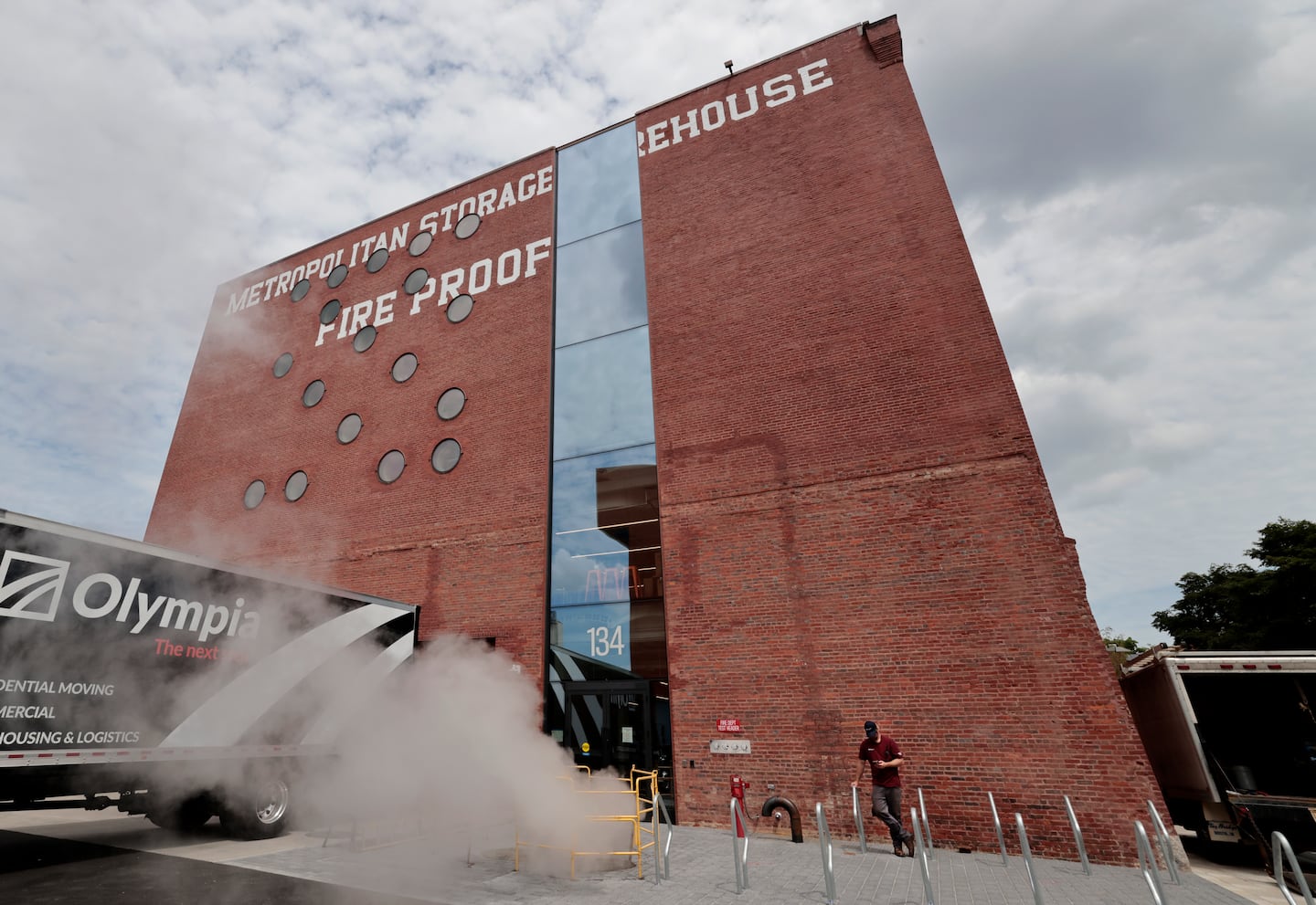
“The Metropolitan Storage Warehouse company is about to erect a building which will be, in many of its features, without parallel in this country,” the Cambridge Chronicle declared in June 1894.
Get Starting Point
A guide through the most important stories of the morning, delivered Monday through Friday.
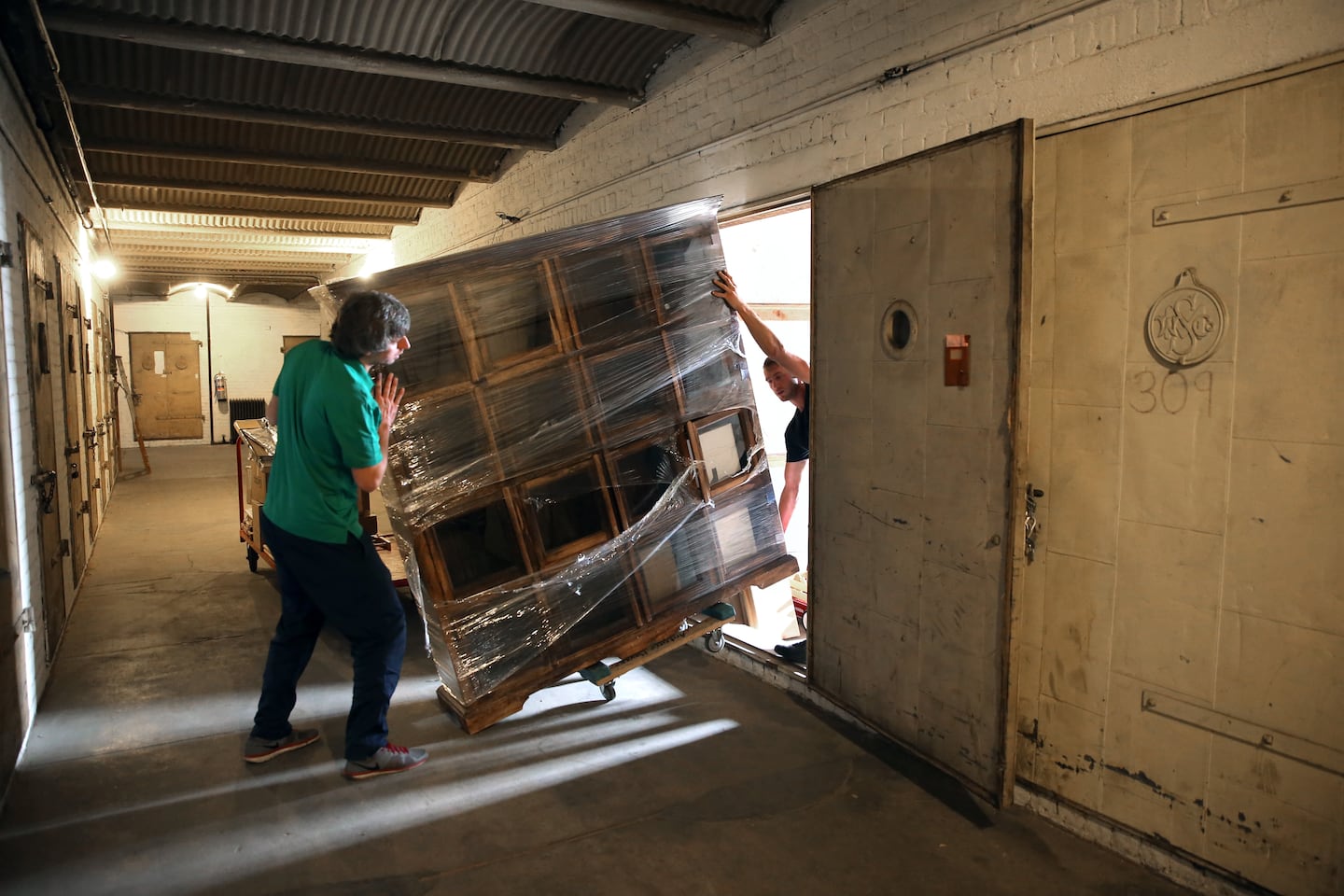 Interior of the Metropolitan Storage Warehouse in 2015.David L. Ryan
Not just big, the behemoth is distinctive — or, if you will, without parallel. Certainly, this is a building that means business. Its 2-foot-thick walls loom. They forbid. “FIRE PROOF” proclaim large white letters on the facade.
Yet that looming and forbidding and fire proofing come with a touch of romance. The MET is whimsical as well as grim. It has a tower and crenellated cornices and slit-like windows. The exterior even sports some fleurs-de-lis. The overall effect is of a late-Victorian version of a castle or medieval fortress.
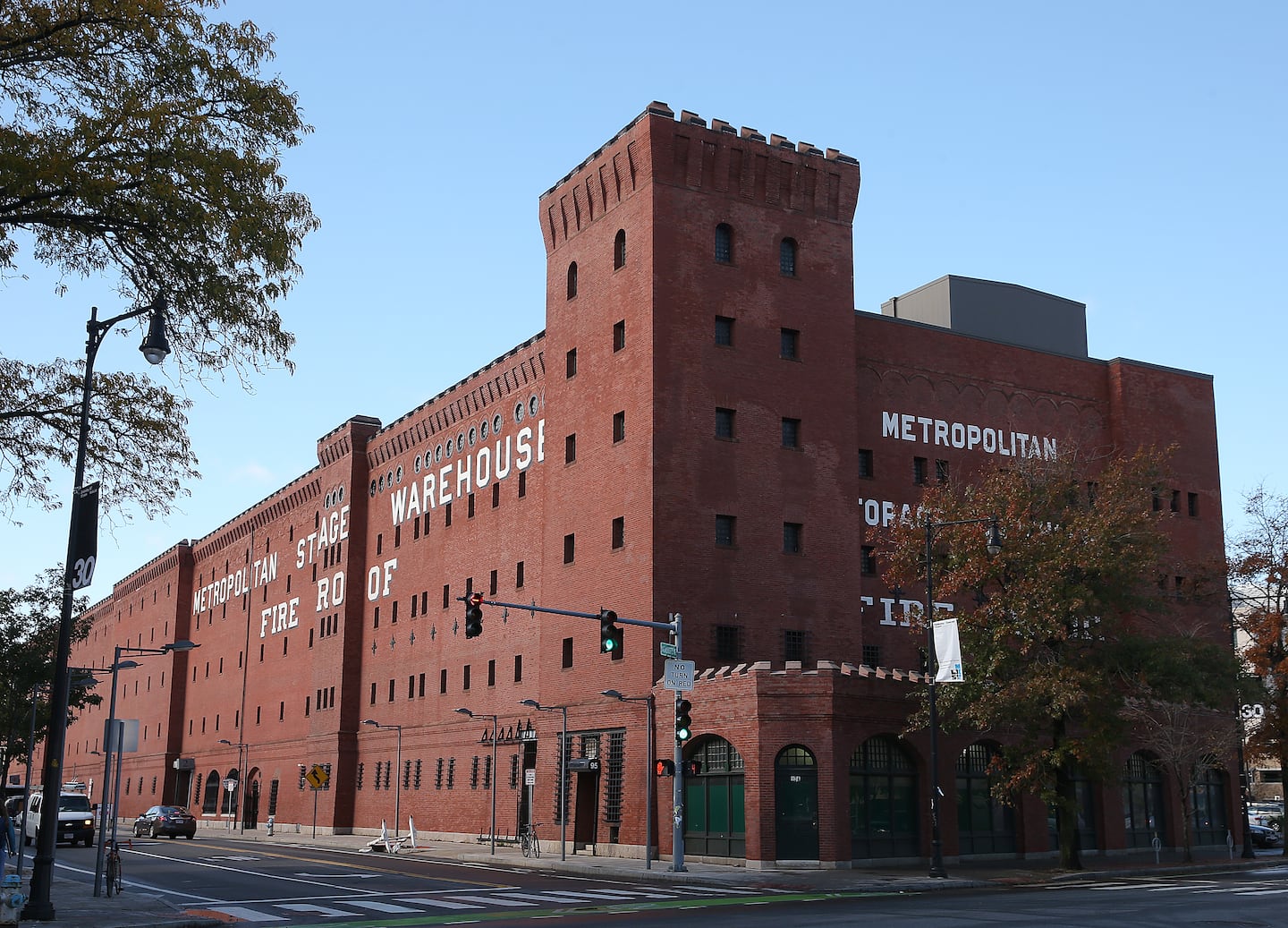 The Metropolitan Storage Warehouse in 2015.David L Ryan/Globe Staff/file
So for all that the MET’s an intimidating structure, it’s also easy to love. It’s dismaying to think that MIT, which bought the building in 1962, considered tearing it down in the ’70s. Think of its new role as making amends for that near blunder.
The warehouse has known change. During its first two decades, several additional sections were added to it. Now it’s really knowing change. Over the past few years it’s been undergoing a transformation almost as startling as demolition would have been, or it is when seen from the inside.
Built to house things, the MET had an interior that got minimal natural light and had column-filled, low-ceilinged spaces — “little masonry wall chambers that were storage closets,” says Brian Tabolt, a senior associate at the New York architectural firm Diller Scofidio + Renfro.
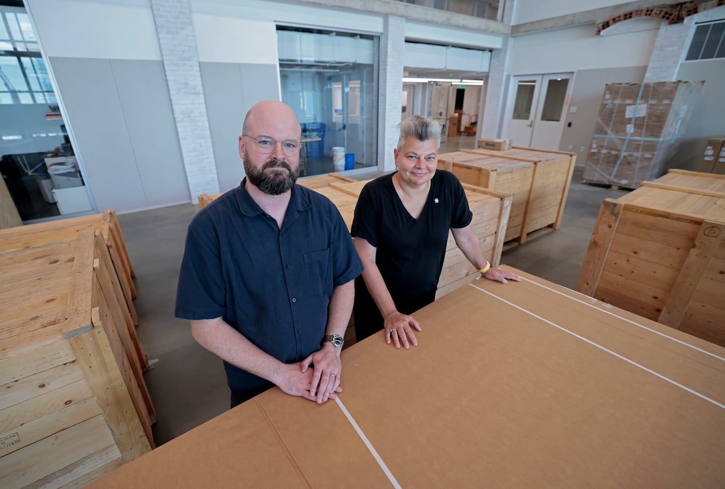 Architect Brian Tabolt, left, and Ana Miljački, head of MIT’s department of architecture. Pat Greenhouse/Globe Staff
Now the building’s purpose is changing — and changing dramatically. It’s welcoming people, which means putting a premium on light, high ceilings, and open floor plans. Or as Ana Miljački, head of MIT’s department of architecture, succinctly describes the MET’s transformation, “making it usable by humans.” To meet those new needs, the building isn’t so much being turned inside out as outside in.
The new residents are particularly alert to issues of light, height, and openness, since they’re the faculty, staff, and students of SA+P. The MET will also be home to MIT’s department of urban studies and planning, its Center for Real Estate, the Leventhal Center for Advanced Urbanism, Project Manus (focused on campus makerspaces), and the Morningside Academy for Design.
Since 1938, the architecture school has had its quarters about two-10ths of a mile down Massachusetts Avenue, hard by the institute’s famed “Infinite Corridor.” That’s prime campus real estate. The MET is prime real estate in a different, outward-facing, way.
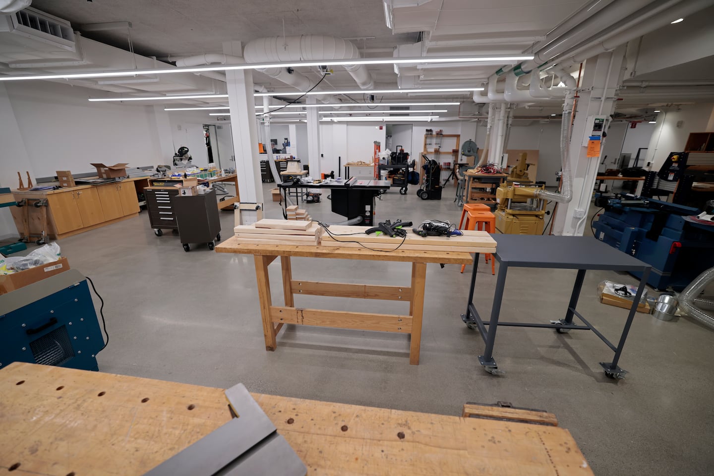 Wood shop inside the MIT School of Architecture and Planning’s new home, inside the Metropolitan Storage Warehouse.Pat Greenhouse/Globe Staff
“The special aspect of the new home for [SA+P] is the sheer scale and its location there on Mass. Ave.,” says William Rawn, of William Rawn Associates and a 1979 graduate of the school. The firm is best known for Seiji Ozawa Hall, at Tanglewood.
“Coming from Harvard Square, with a mish-mash of retail things along Mass Ave., all of a sudden there’s what is arguably the most powerful and prominent building of that whole lineup. Its prominence is a very important signal that you’ve entered MIT and that the School of Architecture and Planning has a central role in that prominence.”
Faculty and staff moved in on Aug. 17. The first day of classes is Sept. 8. That day there’ll be a ceremonial procession to the MET from MIT’s Rogers Building, where the Infinite Corridor begins (or, depending on your orientation, ends). The official dedication is Oct. 1.
Although MIT declines to disclose the renovation’s cost, it’s safe to say that a new building would have been both considerably less expensive and taken far less time to complete. But using an existing building, even one that posed so many challenges, was essential, says Miljački.
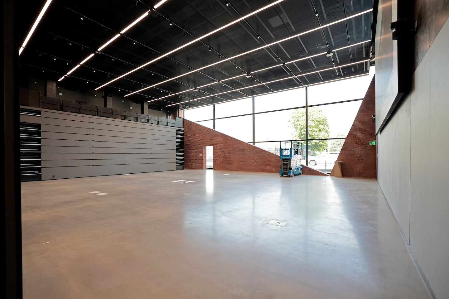 Auditorium space with retractable seating inside the MIT School of Architecture and Planning’s new Metropolitan Storage Warehouse home.Pat Greenhouse/Globe Staff
“It sets us on the path to think about the built environment differently,” she says. “We have a building we can use didactically to speak about the way in which we need to shift the center of the discipline toward preservation, toward thinking about the planet. So that will be phenomenal to be able to, you know, be reminded of how such a building can look and work and be transformed.” More than just a new home for SA+P, the MET’s an ongoing lesson and constant reminder for students.
After the warehouse closed, MIT considered making it into a dorm. Nothing came of that. In 2019, after the decision was made to put SA+P there, DS+R was brought in. Bostonians are familiar with the firm’s design for the Institute of Contemporary Art. Other high-profile DS+R projects include New York’s High Line elevated linear park, the most recent renovation of the Museum of Modern Art, and Los Angeles’s Broad Museum.
Architecturally, MIT is “a living museum,” Tabolt says. Architects who’ve designed campus buildings include Alvar Aalto, Eero Saarinen, I.M. Pei, Frank Gehry, and Steven Holl. “The bar was high for experimentation and for speaking to that legacy,” Tabolt says.
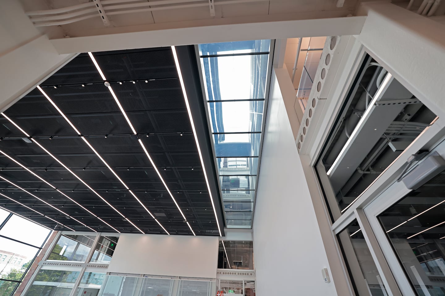 View of the interior of the MIT School of Architecture and Planning’s new home in the Metropolitan Storage Warehouse.Pat Greenhouse/Globe Staff
He remembers his first visit to the MET and the conflicting feelings it inspired. “With the siting and the location of the building, it was like, wow, this is an amazing opportunity. You could see the scale of what we were tackling from the beginning. So that was great.
“And then you go inside and realize what we were up against. … The building was incredibly segmented, the interior hallways unlit. You could imagine the spaces as prison cells and it wouldn’t have been too much of a stretch.”
Redesigning the MET is an example of adaptive reuse: taking an existing building and repurposing it while retaining as much of the building’s original character as possible. The basic question was how much adapting was allowable to make reuse feasible while still keeping the building recognizable.
A crucial decision, made in conjunction with the Cambridge Historical Commission, was twofold: major changes with the interior were allowable, even unavoidable; while alteration should be kept to a minimum with the exterior.
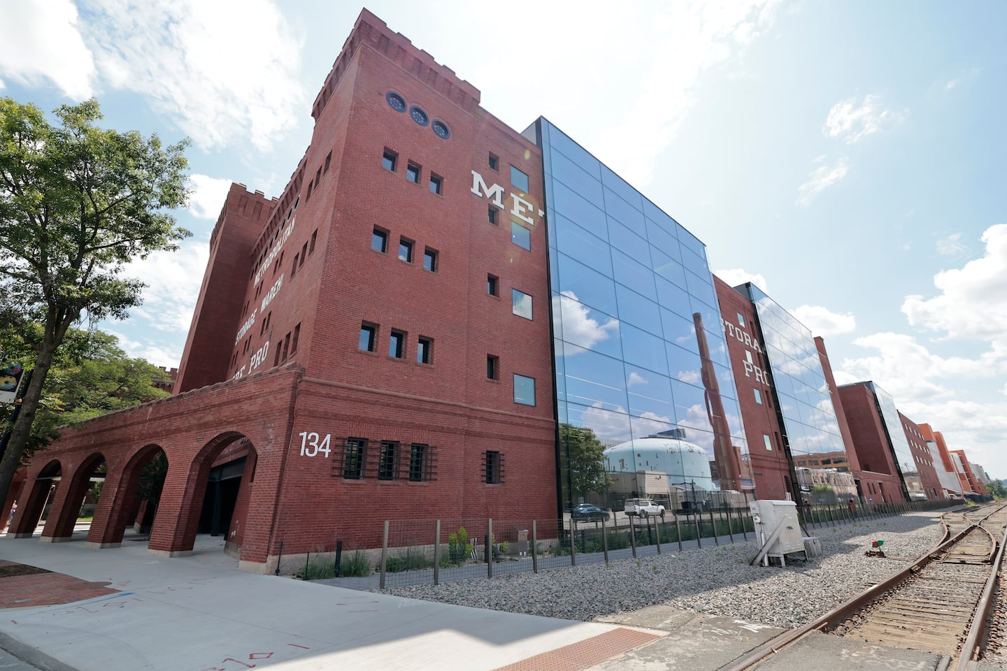 View of the north side of the Metropolitan Storage Warehouse, new home to MIT’s School of Architecture and Planning.Pat Greenhouse/Globe Staff
The most notable exception is on the MET’s north side, the one facing toward Central Square. Large, multi-story windows both allow in natural light and make for a striking textural effect, with the juxtaposition of glass and brick. On the other three sides, changes are much less apparent. The fleurs-de-lis and old signage remain.
There was considerable back and forth between DS+R and the historical commission during the design process, but both sides express satisfaction with the outcome.
“The adaptive reuse of that building,” says commission chairman Charles Russell, “is one of the peak experiences of my career, and I’ve been here more than 50 years.”
Adaptive reuse, Russell adds, “often seems to bring out the best in designers. When they rise to the challenge we get a wonderful product. This rises to the top of the list.”
Many of the interior changes are invisible: installing seismic protections; moving all electrical equipment to the second floor as a climate-resilience measure; reducing the overall area to a little less than 200,000 square feet. Others are highly visible: the abundance of natural light; the expanse of communal spaces; brick cutaway arches revealing the old interior’s surface.
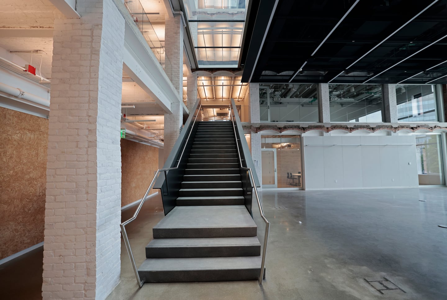 Staircase inside the Metropolitan Storage Warehouse, new home of MIT’s School of Architecture and Planning.Pat Greenhouse/Globe Staff
The most striking change may be a set of stairs that form a kind of spine for the interior. The stairs serve as a sort of ascending corridor, alluding to its infinite counterpart from SA+P’s old neighborhood.
As attractive as the interior is, the reasoning behind the various changes has even more to do with pedagogy than aesthetics. “As spaces,” Miljački says, “our studios used to be a lot more like labs, but now they are grand and full of light and celebratory in a way that hopefully enables better work.”
Mark Feeney can be reached at mark.feeney@globe.com.