

Over a decade after the service first launched in 2015, Apple has quietly revealed a brand new logo for its audio streaming service, Apple Music. And if this bold new look is anything to go by, reports of the death of minimalism have not been exaggerated.
This week, the company launched Apple Music Hall, a brand new music venue in London. The intimate 600 capacity venue sits in Battersea Power Station, and promises to “close the gap between intimacy and production value”.
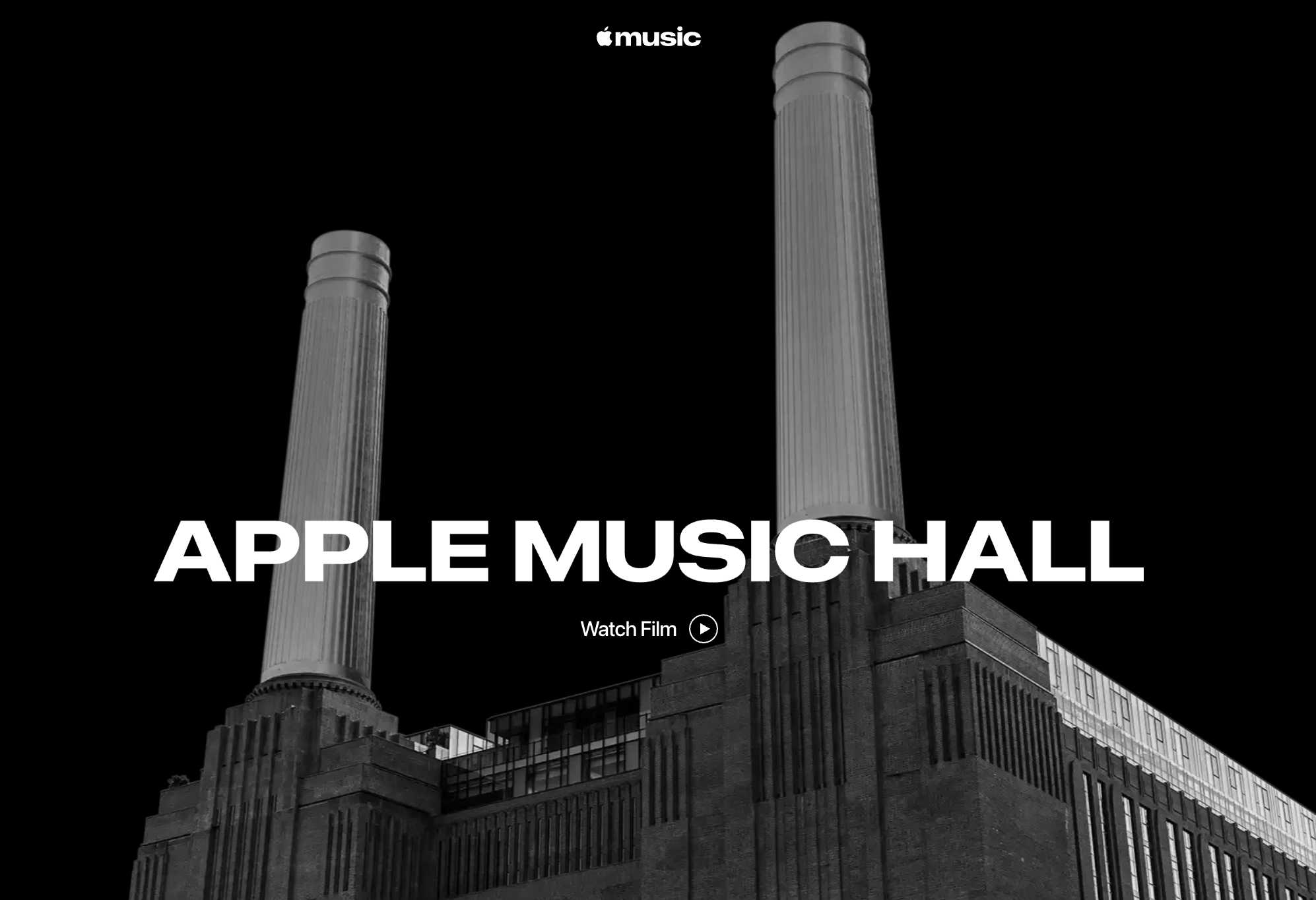
(Image credit: Apple)
The venue’s website features a new take on the Apple Music wordmark, doing away with the clean and minimal San Francisco font in favour of a bold, lowercase design.
Latest Videos FromCreative Bloq
There’s a decidedly retro look to the new design, with many claiming to be getting strong Y2K vibes. “Feels like the font from a music magazine cover or something you’d see on a cassette insert,” one Redditor comments.
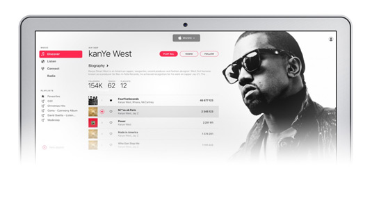
Apple Music launched in 2015
When Apple shifts away from a design trend, the world takes notice. Back in 2013, the brand arguably single-handedly killed skeuomorphism when iOS 7 introduced a sea of flat design. Then came Liquid Glass, which spawned countless imitations last year.
You may like
And so, this maximalist bold text could tell us a lot about the next few years of Apple design – and design in general. Maximalism has been in for a while, but with its colourful new laptops and Gen Z-baiting TikTok ads, Apple has been tentatively rediscovering its sense of fun. We’re now seeing how that might translate into actual design systems for Apple. The future’s bold.