

Welcome back to Part II of the NHL Season Preview, brought to us by Wade Heidt. Yesterday, we took a look at the Atlantic Division, and today we’ll have the Metropolitan Division. On Monday we’ll have the Central Division, and finally, on Tuesday (the day the NHL Season starts), the Pacific Division.
Enjoy!
Here’s Wade.
• • • • •2025-26 NHL Season Preview Part II: Metropolitan Division
by Wade Heidt
The unmistakable, beautiful sound of skates carving up the ice is upon us. The NHL regular season starts October 7. This means it is time for the 2025 Uni Watch NHL Season Preview.
We will break down what you need to know this season for uniforms, logos, ice designs, and more.
There are some notable events during the season:
The NHL Global Series will be in Stockholm, Sweden. A couple of games will be played November 14 and 16 between the Penguins and the Predators.
The 2026 Winter Classic will be played on January 2 at loanDepot Park in Miami. The Panthers will host the Rangers.
The 2026 Stadium Series game will occur on February 1 at Raymond James Stadium in Tampa. The Lightning will host the Bruins.
There will be a break between February 5 and 25. NHL players will be returning to the Olympics in Milan.
What are my qualifications to write this year’s Uni Watch NHL Season Preview besides being obsessed with uniforms? I was born and raised in Saskatchewan. You pretty much learn to skate a minute after you learn to walk growing up there. I have seen the real grassroots of the game. It is part of my lifestyle.
I will cover the facts, as well as share my opinions. Some will agree with my opinions, some will disagree. I love hockey uniforms with traditional striping, more than one colour on the gloves, and stripes on the pants. Also, what the heck is a breezer? They are called hockey pants.
Let’s get going with a team-by-team breakdown. Here is what you can expect to see in 2025-26.
==========
Metropolitan Division
CAROLINA HURRICANES
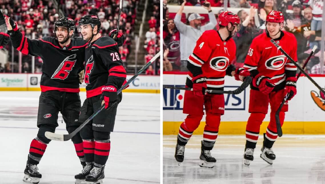
Unusually for a primary uniform change in the NHL, Carolina is redesigning only their road uniform this season while keeping the home uniform intact.
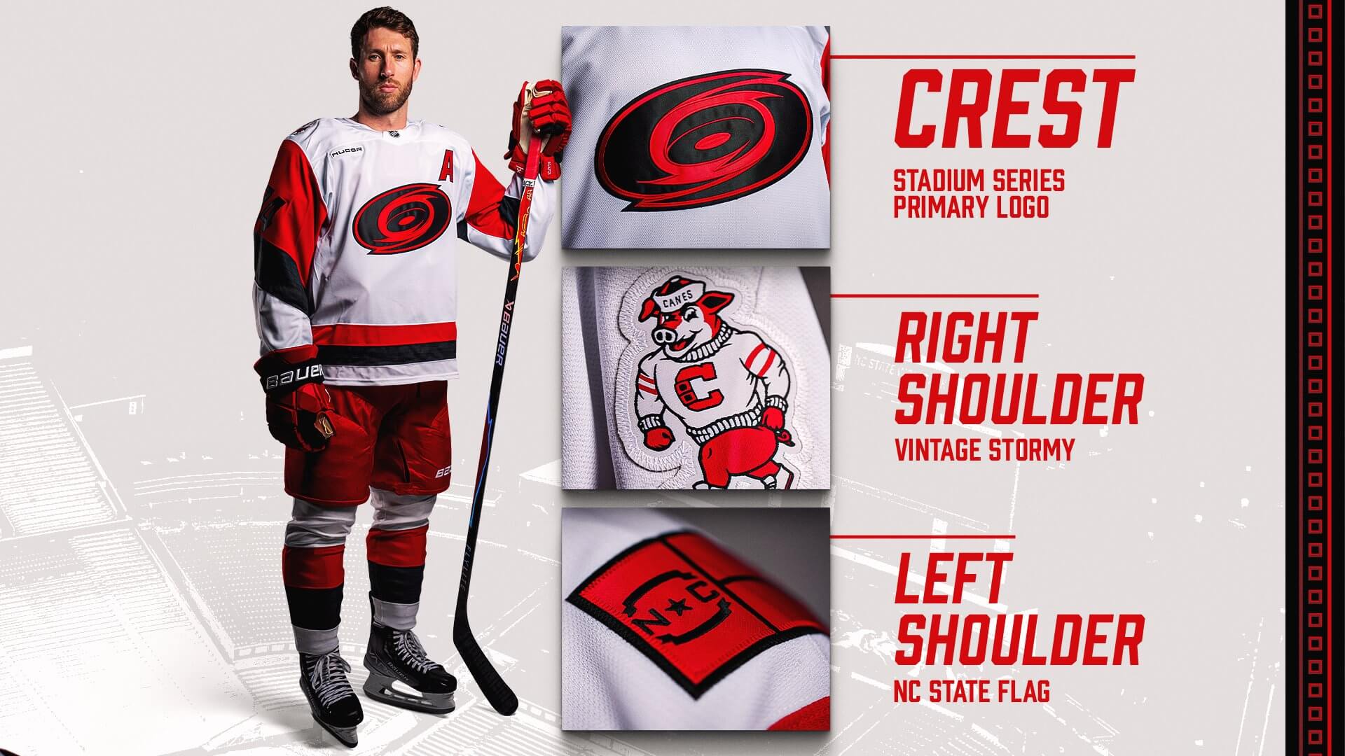
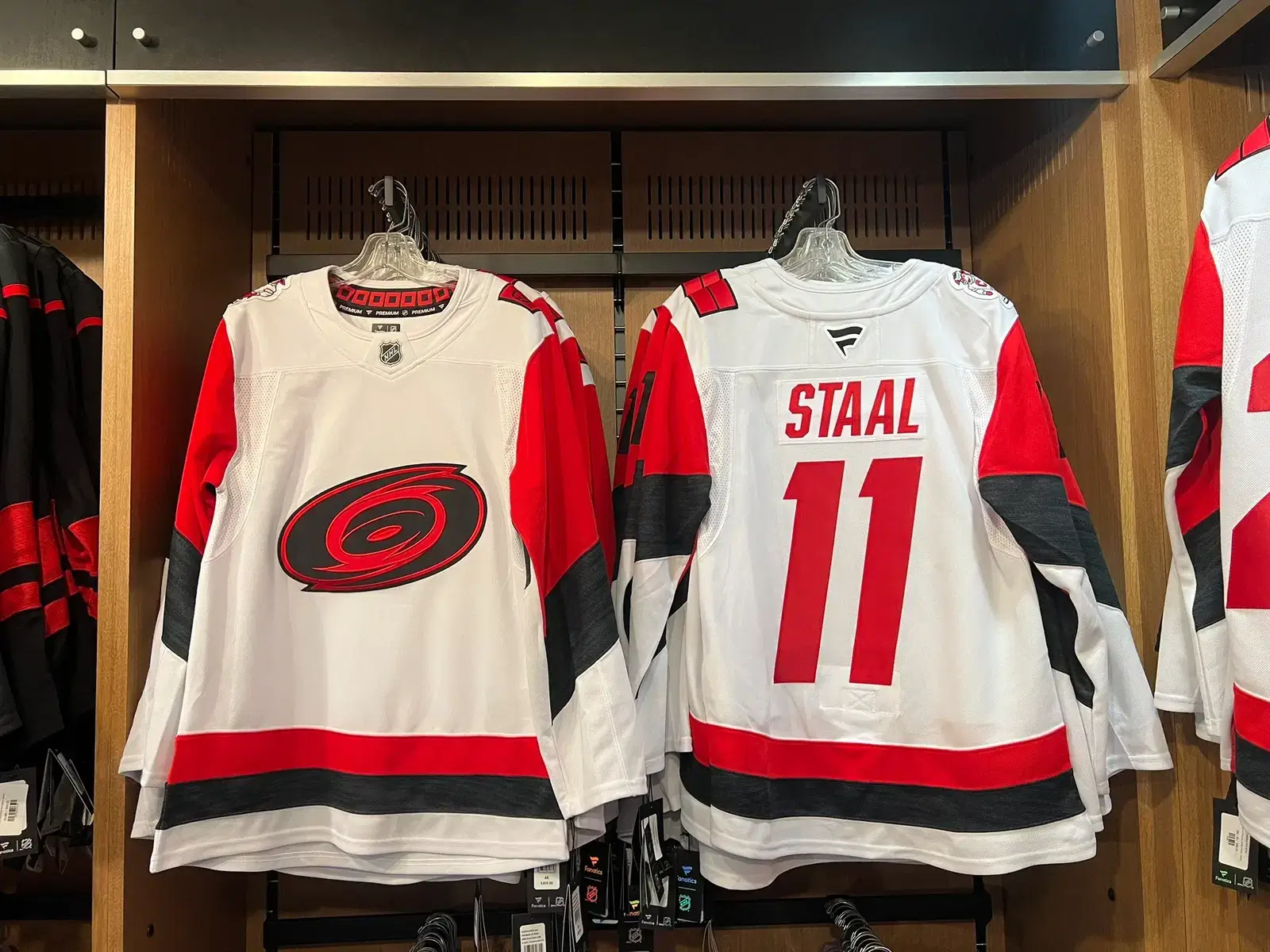
The new road uniform design is inspired by the club’s 2023 Stadium Series look. It features the primary logo in two colours on the front. The North Carolina flag is on the left shoulder and Struttin’ Stormy is on the right shoulder.
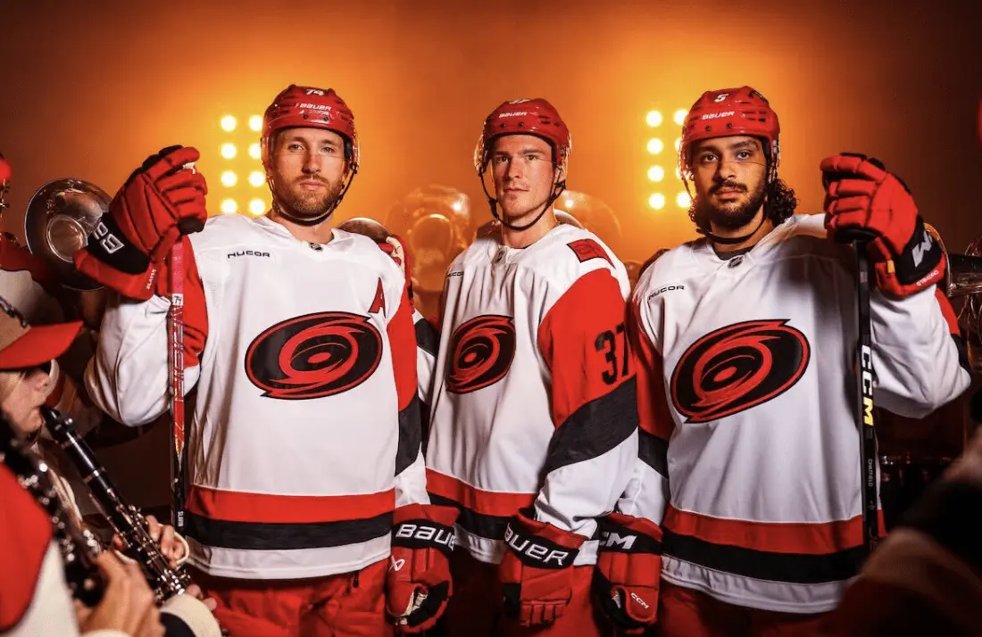
The Hurricanes seem to take pride in busting through NHL uniform conventions. The result is an inconsistent look between the home and road uniforms. It’s somewhat chaotic for the purpose of being so: Different designs, logos, number font.
The black sleeve numbers on the new road jersey are angled and will be hard to read on the red background from a distance. I am not a fan of the shoulder patch choices. The team wears a North Carolina flag on one shoulder. They are the Carolina Hurricanes. It doesn’t seem a good choice if South Carolina isn’t recognized. They made the decision to put their pig mascot on one shoulder. I’m not sure most fans would know they have a pig for a mascot. It doesn’t feel like it fits. Shouldn’t Stormy be wearing skates?
You can read more details about the new uniform here. Now a comparison of how the old road uniform looked on the ice compared with the new one:
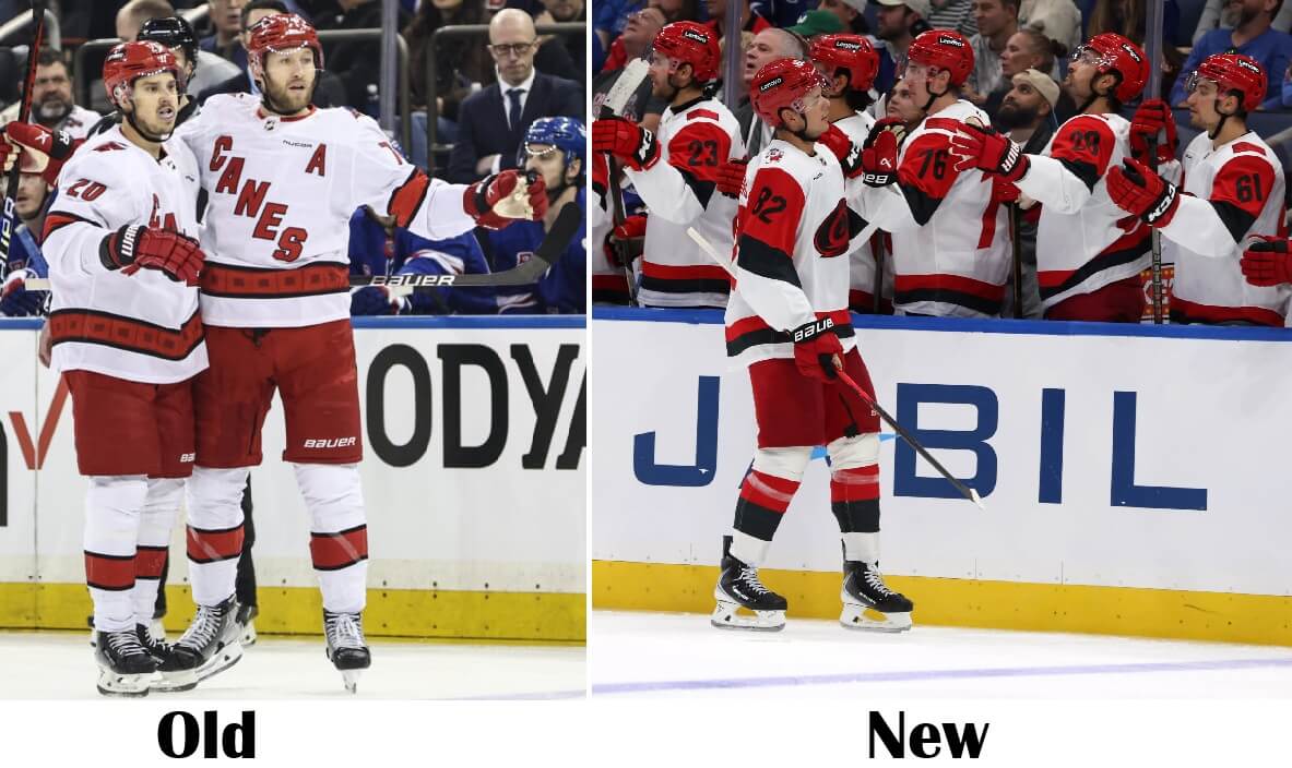
I don’t remember Carolina wearing a white helmet at all last season except for the Whalers throwback. Their recent post about their helmet advertiser this year includes a white helmet. This leads me to believe it may be a white Hartford Whalers uniform that will be worn during Whalers Night on January 29 against Utah. An old Adams Division opponent would be more appropriate for this game.
I have not seen an alternate uniform schedule. I would expect the red alternate will be back. Their red third happens to be the team’s only uniform featuring the primary logo in its primary colourway.
I never thought I’d say this, but that’s what happens as time progresses: I long for the Hurricanes to return to their classic uniforms of 1997 as their primaries. This team needs to wear red at home and needs that consistent look. The black primary uniform was intended to be an alternate and its design warrants that.
__________COLUMBUS BLUE JACKETS
A special milestone for the Blue Jackets this season. It is their 25th anniversary season. Let’s take a look at the 25th anniversary logo.
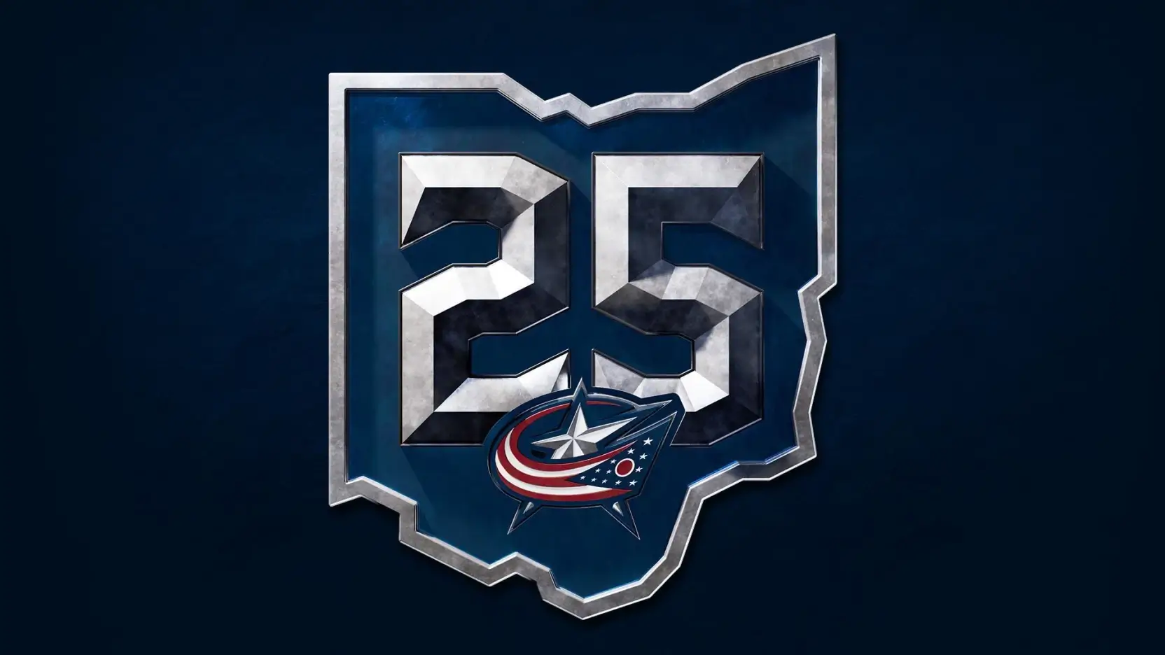
There’s more here if you love the storytelling detail about a logo. With a celebration as significant as this, the logo will appear as a patch on the jersey. As well, the logo will be part of the centre ice design this season.
25 years of Blue Jackets hockey at center ice 🔵🔴
(via @BlueJacketsNHL) pic.twitter.com/oFLNlnnjQG
— SleeperNHL (@SleeperNHL) September 6, 2025
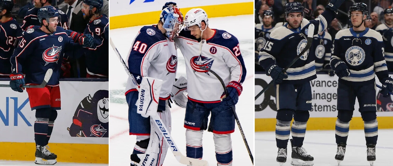
The Blue Jackets are a rare team that wears different colour pants at home and on the road. I feel the navy pants with the white uniform has been an upgrade compared to the red pants.
Looking towards the future, Columbus could use a redesign to get rid of the Reebok Edge hangover that afflicts the waist striping of the current uniform. The sock striping could definitely be improved. Contemporizing details of last season’s Stadium Series uniform into an acceptable primary uniform could be a good base to start from.
__________NEW JERSEY DEVILS

The Devils are consistent. When they have a uniform, they stick with it for a long time. There appear to be no changes this season.
I wish for New Jersey to return to the more conventional jersey striping that they wore when they won Stanley Cups. Lack of waist stripes on a jersey in general will receive my disapproval. They experimented with their signature design, but it’s time to go back.
There is not much life left in the alternate uniform. The Devils are calling it the Jersey Jersey Bye Bye Tour. The black alternate will be worn 11 times more. I consider this great news! It’s a uniform with issues and the crest gave it a tongue-in-cheek feel. With this team identity, I feel New Jersey has so much potential to do something better with a third uniform.
It said “Jersey” and changed the game.
Be here for every stop on The Jersey Jersey Bye Bye Tour as we celebrate the final season of our iconic threads.#NJDevils | @pepsi
— New Jersey Devils (@NJDevils) September 22, 2025
__________NEW YORK ISLANDERS

The Islanders have what I need for a hockey uniform: Two colours that work well in combination. Proper jersey striping. Stripes on pants and no mono-colour gloves. A classic logo that with its simple creation resonates brilliance. They went astray from their original look on Long Island before, but they are not making that mistake again.
The club has no regular alternate uniform currently. That is fine. Take your time to get it right. The last few third uniforms haven’t been anything to write home about.
__________NEW YORK RANGERS
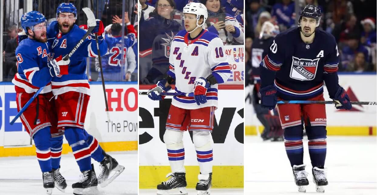
The Rangers are a part of the Original 6 crew that is celebrating their 100th anniversary. Here is the Centennial logo for the Broadway Blueshirts.
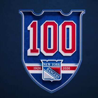 The Centennial logo will be at centre ice in Madison Square Garden.
Setting the stage for year 100. pic.twitter.com/YuOuvpmoqT
— New York Rangers (@NYRangers) September 2, 2025
The Centennial jersey has been unveiled and will be worn 10 times this season.
Undeniably ours. pic.twitter.com/MAZ9tVwrNW
— New York Rangers (@NYRangers) September 18, 2025
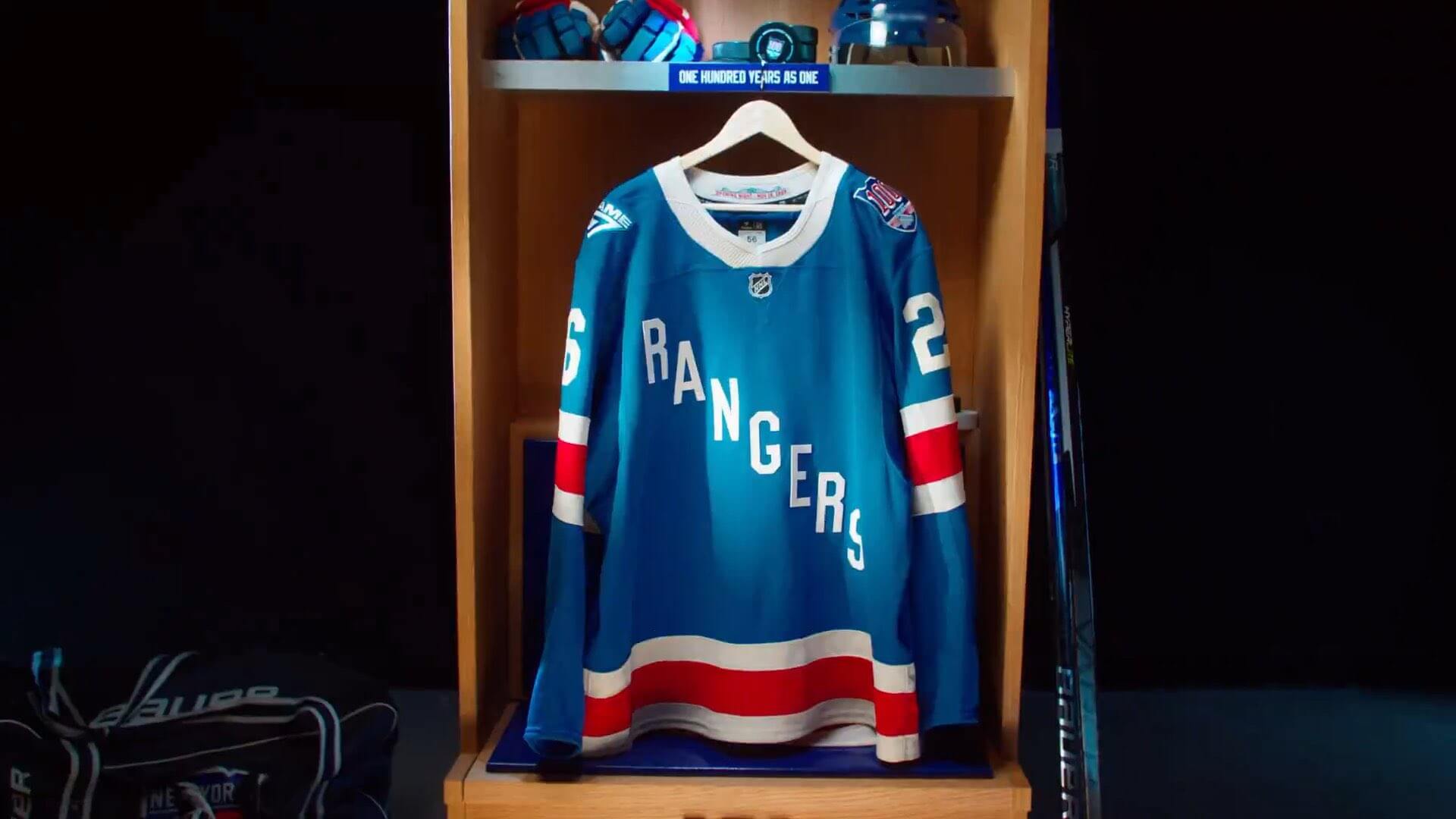
The Rangers have only released the jersey so far and not the entire uniform. It is basically the original 1926-27 jersey with some tweaks. The blue is a bit lighter. I like that the tailoring around the collar imitates that of jerseys made in the era. I am intrigued about what the complete uniform will look like. Promo photos now show the regular gloves. Will it end up being tan pants and gloves like the 1926 uniform? What about the helmet with the differences in shades of blue?
You can read more detail about the Centennial jersey here.
The Rangers have unveiled their new centennial jerseys. 🍎🗽 pic.twitter.com/Yob90aPzJ7
— Hockey Jerseyz (@HKYJersey) September 18, 2025
If the current regular alternate is sticking around (don’t know if it is on hiatus this season), New York could potentially wear 5 different uniforms this season. They are visiting Florida for the NHL Winter Classic, which means there likely will be a special uniform.
The primary uniforms for the Rangers are splendid. An example of how a simply designed uniform can age like fine wine. No need for a logo on the jersey. The team name in diagonal lettering has become a uniform detail deeply associated with the club.
The Rangers will wear a memorial helmet decal all season long for former goalie Ed Giacomin.
__________PHILADELPHIA FLYERS

No uniform news out of Philadelphia. This recent redesign was introduced in 2023.
Is it just me? When I see this uniform, it looks like the unfinished 1980s-1990s design. Like it was shipped from the factory before everything was sewn on.
The contrasting nameplates made sense on only the orange jerseys in the prior template. It paid homage to when they had to put the white nameplates on the orange jerseys in the 1975 Stanley Cup Final for TV because they had only one nameplate style that they wore with the home white jerseys. It doesn’t make sense on this current uniform, especially the white nameplate on the orange jersey, considering the width of the white sleeve-length stripes.
We have not seen an alternate uniform schedule yet. I have not heard anything about the black alternate being retired. In my opinion, it should have been retired after the Flyers wore it in the 2017 Stadium Series game. I don’t care for the large sleeve numbers or ghosted numbers on the back. I think the Flyers could do a black alternate uniform that would look so much better.
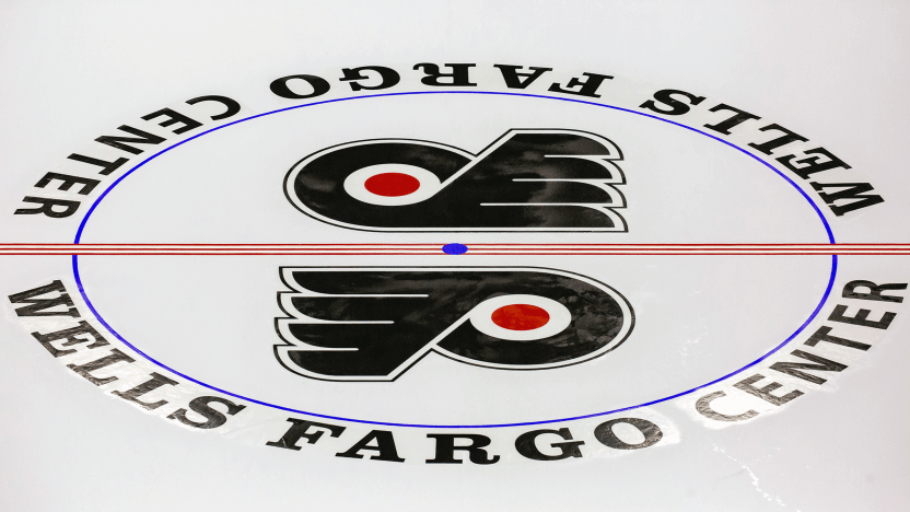
I really appreciate the Flyers going with the double logo design at centre ice. I wish more teams would go back to this. The present-day NHL centre ice design has become so generic with every team having a single logo. There used to be more variety in the past.
__________PITTSBURGH PENGUINS

No changes to the primary uniforms in the Steel City. That is good news.
A little less than ten years ago, the Penguins made a fantastic decision returning to these great uniforms. Many current NHL teams have returned to their old uniforms and/or colour schemes. In general, it is usually a huge aesthetic upgrade and success. The Penguins are an example of this. The Vegas gold (let’s be real – the beige) didn’t feel right to me as their trim colour.
I have displayed the alternate uniform worn by Pittsburgh since 2021 at the top. The feeling is there will be a regular alternate uniform this season. The rumour is there may be a new one in the works.
In early 2025, the Penguins started to do some market research, polling fans about which throwback jersey they preferred. There’s been no announcement or leaks yet, but we may see a new alternate that is based off a throwback uniform again. I would be a proponent of this double blue gem of a throwback as an alternate but that never seems to be part of the plan.
__________WASHINGTON CAPITALS
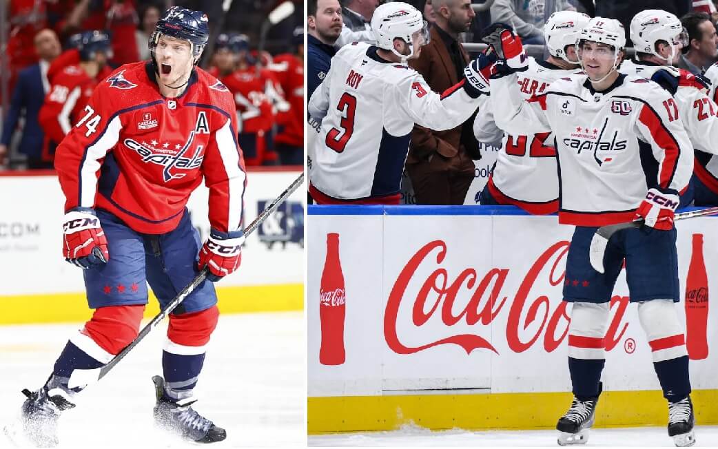
The Capitals are troopers, suffering from the most massive Reebok Edge hangover that a team can. I give them credit. They have stuck with these jerseys since 2007. Complete with the random striping down the arms and the side panels.
Washington has introduced a new alternate uniform. The Screaming Eagle will stick around.
A look for the past, present and futurehttps://t.co/1g5cF3BlED#ALLCAPS | @CoupangInc pic.twitter.com/BHtjfVZMmq
— Washington Capitals (@Capitals) September 15, 2025
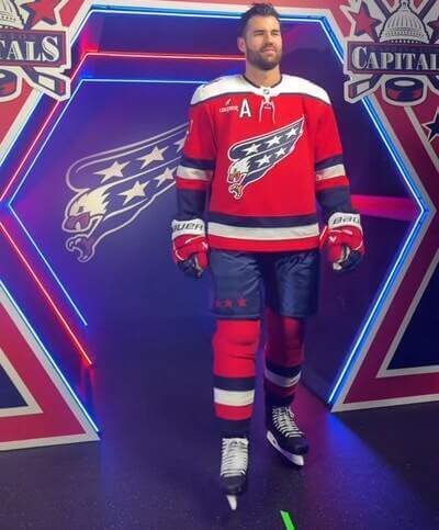 Both born in the 1990s, the Screaming Eagle logo is on the jersey front and the Capital Dome logo on the shoulders. The red jersey features white shoulder yokes and waist striping reminiscent of the original Capitals jersey.
excited screeching noises pic.twitter.com/tuDUjiYVS4
— Washington Capitals (@Capitals) September 15, 2025
The alternate will be worn for 15 games this season. You can read more details about the new alternate here.
There is also a question screaming. Why didn’t Washington just make this alternate their new primary with an accompanying white uniform when they are in dire need of a refresh? This alternate is red with navy trim just like the primary. It is an upgrade to the primary uniform and the solution we need.
I like this uniform but there is something about it that looks slightly uncomfortable. The Screaming Eagle is specifically shaped in that manner to accommodate the old angled waist stripes. It has never been on a jersey with more conventional waist stripes. There is something I will say with any Capitals uniform. It needs more stars!
• • • • •Thanks, Wade! Be sure to check back Monday and Tuesday for the remaining divisions!