
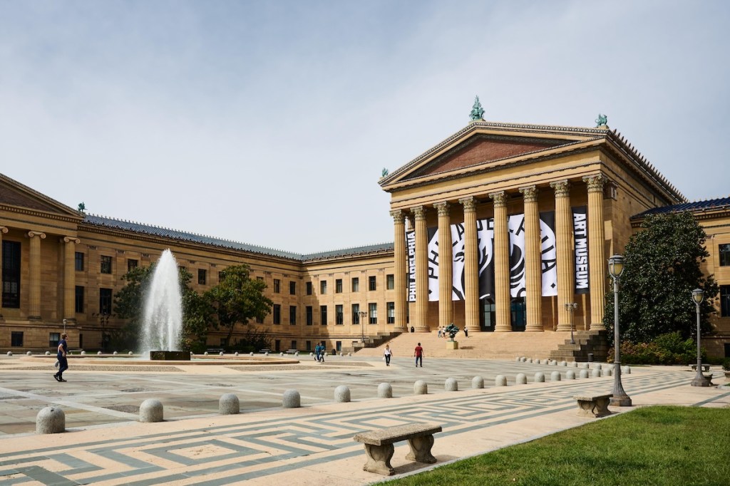
On Wednesday, the Philadelphia Museum of Art announced a major rebrand to—drum roll, please—the Philadelphia Art Museum.
In a press release, the museum said the change “places Philadelphia front and center,” though, by my read, so too does the Philadelphia Museum of Art. But who am I to stand in the way of progress?
“The Philadelphia Art Museum has long been the cultural heart of the city, and it’s our duty to maintain that role,” Sasha Suda, the museum’s director and CEO, said in a statement. “Our focus and vision are unabashedly Philadelphian; we’re opening our doors to become more collaborative and future-focused for all.”
Related Articles

For the rebrand, the museum worked with branding and design studio Gretel, whose client list includes some major heavy hitters: the New York Times, CBS, Major League Soccer club New York City FC, the Museum of Modern Art in New York, the Crystal Bridges Museum of American Art in Bentonville, Arkansas. For those last two art world clients, Gretel designed a visual archive of short-form promotional content and a members-only publication, respectively.
The PMA—err, PAM—did not just change its name but also its logo and larger brand identity, with custom typography, a website overhaul, and a new visual identity.
“This project is the result of more than a year of research, collaboration, creative development, and iteration,” Ryan Moore, executive creative director and partner at Gretel, said in a statement. “Our main objective was to ‘come down the steps’ by putting the museum in dialogue with its community, which is and always has been the city itself. This new identity reflects the future of the institution: more engaging, more dynamic, and more inviting to new audiences.”
PAM is far from the first institution to undergo a brand overhaul in recent years. In 2016 the Metropolitan Museum of Art unveiled its current logo, depicting the words The Met in all-caps red font. At the time, it was heavily criticized, with one critic calling it “a red double-decker bus that has stopped short, shoving the passengers into each other’s backs.” Still, it escaped the kind of bot-aided—and Trumpified—firestorm that attended Cracker Barrel’s rebranding earlier this year. Perhaps the best one can hope for in a rebrand is the mostly quiet shrug received by the Brooklyn Museum’s sans serif rebranding last year.