
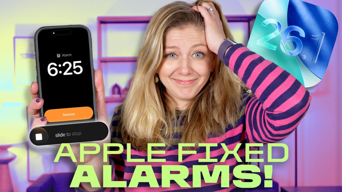
My mornings have been a little rough since switching to iOS 26. I’d often sleep past my alarm, wondering why the “snooze” I usually rely on didn’t go off on my iPhone. But it seems I wasn’t alone in my woes, and that the new alarm design was to blame.
It was easy to accidentally smack “stop alarm” instead of “snooze” with both buttons now on top of each other. (Not helping the situation is my myopia, because I can’t see squat when I wake up without my glasses on.) But those bleary-eyed problems are fixed with the iOS 26.1 update that forces you to slide a finger to stop an alarm. (If you hate the slider, you can change it back under accessibility settings.)
But there’s more reason to not snooze on this iPhone update. In this week’s episode of “One More Thing,” embedded above, I go over the biggest changes in iOS 26.1, including ways to lessen the opacity of Apple’s Liquid Glass menus (which can become more of a “frosted”-glass look).
And Apple’s design shifts this week go beyond the iPhone. If you fire up Apple TV (perhaps to catch the premier of Pluribus), you’ll notice a new colorful Apple TV logo. And Apple retail stores are said to be getting a little refresh in their displays next week.
It’s no surprise Apple is sprucing up its look with Apple’s 50th anniversary right around the corner. Things will certainly get a little snazzy over the next few months — and maybe Apple TV logos are just the start.
If you’re looking for more One More Thing, subscribe to our YouTube page to catch Bridget Carey breaking down the latest Apple news and issues every Friday.